Putting the 'role' back in role-playing games since 2002.
Donate to Codex
Good Old Games
  • Welcome to rpgcodex.net, a site dedicated to discussing computer based role-playing games in a free and open fashion. We're less strict than other forums, but please refer to the rules.

    "This message is awaiting moderator approval": All new users must pass through our moderation queue before they will be able to post normally. Until your account has "passed" your posts will only be visible to yourself (and moderators) until they are approved. Give us a week to get around to approving / deleting / ignoring your mundane opinion on crap before hassling us about it. Once you have passed the moderation period (think of it as a test), you will be able to post normally, just like all the other retards.

GUI and Colors

Paranoid Jack

Scholar
Joined
Jul 3, 2006
Messages
186
Thanks for the old thread I have only been lurking for a few months so I have yet to read most of the old stuff I was drawing my info from a recent interview and the few old screens I had seen. I must admit the old look wouldn't have turned me away but the new look is much better.

From the RPGDot June 2nd Interview: http://www.rpgdot.com/index.php?hsaction=10053&ID=1227

RPGDot: You originally started development with a 2D engine and switched to 3D using the Torque engine. At the time, some of your fans criticised you for focusing on graphics with this decision. Looking back, did you make the right decision and how did the change benefit the gameplay?

Iron Tower: Time will tell whether or not we've made the right decision. Back then it seemed to me that way too many people were writing the game off because of the "dated" look. The 3D version certainly gets a better reaction and more interest, so no complaints here.

The benefits are mostly on the visual side: locations, character models, animations, etc.


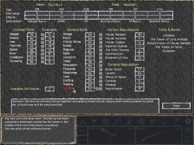
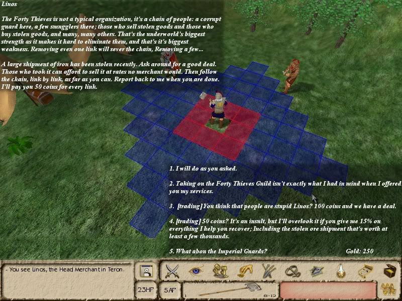
On topic: I like the current GUI, its much better than the one they had initially where only dialog was shown, but it still places the focus on the dialog, where it should be. I see the character window as an utility, just to make sure you know who you're talking to and not keep the world and dialog so separated. But since the current dialog GUI accomplishes that imo, i don't see the need to change it.

I can't agree with you more.
 

FrancoTAU

Cipher
Joined
Oct 21, 2005
Messages
2,507
Location
Brooklyn, NY
Moving to 3D was the best decision VD made. Old school gamers will buy it regardless because of the gameplay aimed at them. AoD might actually sell some copies to newer gamers now and lead to ya know.... the game being financially sucessful.

Vogel is the only sucessful 2D RPG maker out there and he has a smaller team than VD, one of which is his wife. Plus, Vogel targets the game starved Mac market.
 

suibhne

Erudite
Joined
Aug 21, 2003
Messages
1,951
Location
Chicago
Theoretically, the switch to a 3D engine should also make it much easier to produce new content (weapons, character models, etc.) than in an artwork-intensive 2D system. Did you find this to be true, VD? The interview makes it sound like you made the change only for buzzword-compliance.
 

John Yossarian

Magister
Joined
May 8, 2006
Messages
1,000
Location
Pianosa
FrancoTAU said:
Moving to 3D was the best decision VD made. Old school gamers will buy it regardless because of the gameplay aimed at them. AoD might actually sell some copies to newer gamers now and lead to ya know.... the game being financially sucessful.
Well, we can say this now, but moving to Torque could have caused to delay the game for 2+ years, which might have made some of the team members to quit and the whole shit wouldn't have been completed. Thankfully it didnt turn out that way, but there was no way to be sure beforehand, and thats what people were worried about. Well, that and that some of them werer being impatient little bitches :)
@suibhne, i think they've said it made much easier to have unique designs for weapons, shields, etc, since now they dindt have to make one character model when carrying a short sword and another for a long sword.
 

Nick

Iron Tower Studio
Developer
Joined
Apr 21, 2004
Messages
317
Location
Over the hills and far away
Another advantage of a 3D engine was the "weight" of the animations. While thousands of rendered PNG frames with AA edges could take up to 100 MB, the size of those animations exported from 3dsmax in Torque's format (DSQ) is counted in kilobytes. Now we have much, much more of them than was planned initially.
 

Vault Dweller

Commissar, Red Star Studio
Developer
Joined
Jan 7, 2003
Messages
28,024
suibhne said:
Theoretically, the switch to a 3D engine should also make it much easier to produce new content (weapons, character models, etc.) than in an artwork-intensive 2D system. Did you find this to be true, VD?
Not really. We did everything in 3D and then converted to 2D. The only real difference is that it's insanely easier to show details/equipment on characters. In 2D any extra item like a helmet duplicates all animations. Let's say you want to add a shield. Now you have each single handed weapon x all armor types x all actions (attack, walk, hit, fall, death) with this particular shield. Want to have 4 shield types? x 4. Add 4 helmets? x4 again. Etc.

Now we can show every weapon (not type) in every color (so, now you can see if something's armed with a mithril sword - gives you a chance to reconsider), tons of civilian clothing - great for disguising, 8 armor types, 8 helmets, 4 shields, 4-5 visibly different attacks, etc. It would have been impossible in 2D.

The interview makes it sound like you made the change only for buzzword-compliance.
It was a combination of factors, but mostly, like I said, it was because the game was being dismissed. The 3D thing buys it a fighting chance.
 

vazquez595654

Arbiter
Joined
Jul 21, 2005
Messages
1,090
Location
Malta
vazquez595654 wrote:

Dark grey stone


Like this?

Nice work, I'm sold. VD, what do you think? Easier on the eyes, no?

testgui.jpg
 

Seboss

Scholar
Joined
Jan 27, 2006
Messages
947
Dark grey stone is much better IMO. It's not only easier on the eyes but more classy as well.
 

Hazelnut

Erudite
Joined
Dec 17, 2002
Messages
1,490
Location
UK
I like it better too, but it would be great to have some options for personal taste - even if there's only two.
 

Claw

Erudite
Patron
Joined
Aug 7, 2004
Messages
3,777
Location
The center of my world.
Project: Eternity Divinity: Original Sin 2
vazquez595654 said:
Nice work, I'm sold. VD, what do you think? Easier on the eyes, no?
No. The contrast is much softer in VD's version, this hurts my eyes.

Maybe if the white was a little less bright. Frankly I feel the yellow-brown GUI fits the mood of the game better.
 

FrancoTAU

Cipher
Joined
Oct 21, 2005
Messages
2,507
Location
Brooklyn, NY
Is it a pain in the ass to implement a couple different colors like that? I didnt mind the light brown thing you had going, but I do dig that grey one more.
 

Vault Dweller

Commissar, Red Star Studio
Developer
Joined
Jan 7, 2003
Messages
28,024
Claw said:
vazquez595654 said:
Nice work, I'm sold. VD, what do you think? Easier on the eyes, no?
No. The contrast is much softer in VD's version, this hurts my eyes.
Yep. The light version is much softer and has a nice desert tone.

FrancoTAU said:
Is it a pain in the ass to implement a couple different colors like that? I didnt mind the light brown thing you had going, but I do dig that grey one more.
No clue yet. We'll do what's been suggested to show our respect to Sovy for actually doing something instead of bitching, and then let you pick.
 

suibhne

Erudite
Joined
Aug 21, 2003
Messages
1,951
Location
Chicago
Vault Dweller said:
We'll do what's been suggested to show our respect to Sovy for actually doing something instead of bitching, and then let you pick.

Any chance you can do both and leave it up to the user? Or would that require re-skinning the whole interface? (And is that impossible/too much work? :wink: )
 

Paranoid Jack

Scholar
Joined
Jul 3, 2006
Messages
186
Claw said:
vazquez595654 said:
Nice work, I'm sold. VD, what do you think? Easier on the eyes, no?
No. The contrast is much softer in VD's version, this hurts my eyes.

Maybe if the white was a little less bright. Frankly I feel the yellow-brown GUI fits the mood of the game better.

I didn't think it would happen.. but I agree with Claw the white is too bright and hurts my eyes... may be due to my LCD. Whites are brighter and darks are darker on a LCD in my opinion.
 

Crichton

Prophet
Joined
Jul 7, 2004
Messages
1,208
Alright, I hauled out "the gimp" and tried to make a little mock-up of what I was suggesting

3edit.jpg
 

Vault Dweller

Commissar, Red Star Studio
Developer
Joined
Jan 7, 2003
Messages
28,024
I don't think it's very convinient to read, especially if the options are across the screen. Besides, it looks ok now, but if the background changes to desert (there are desert locations), white on light brown will look questionable at best.

I prefer to see a separate screen when I'm presented with something to read, assuming the text is more complex than "evil threatens us, chosen one - kill it, kill it now!". Still, thanks for the effort. What does the hive mind think?
 

John Yossarian

Magister
Joined
May 8, 2006
Messages
1,000
Location
Pianosa
I like it, but as VD said, im worried about the text being difficult to read in other places or when things are laying around behind the text. In any case I prefer irontower's version.
 

Sovy Kurosei

Erudite
Joined
Dec 29, 2004
Messages
1,535
Paranoid Jack said:
I didn't think it would happen.. but I agree with Claw the white is too bright and hurts my eyes... may be due to my LCD. Whites are brighter and darks are darker on a LCD in my opinion.

Is this a bit better? Don't mind the JPEG artifacting. :wink:
 

hiciacit

Liturgist
Joined
Aug 25, 2005
Messages
406
Location
I've been there
Vault Dweller said:
I don't think it's very convinient to read, especially if the options are across the screen. Besides, it looks ok now, but if the background changes to desert (there are desert locations), white on light brown will look questionable at best.

I prefer to see a separate screen when I'm presented with something to read, assuming the text is more complex than "evil threatens us, chosen one - kill it, kill it now!". Still, thanks for the effort. What does the hive mind think?

I like the original one better and like you said, this is going to be difficult to read depending on the background. Or you'd have to do something to ensure the text is always readable, like fading the view to a monochrome light-sepia tone or something :wink:
 

fraunclein

Novice
Joined
Jan 25, 2006
Messages
67
I like Crichton's dialogue screen very much. I hope Arcanum would have implemented it with convenient full-screen placement instead of the small box in the center.

As for the backround theme, I also like Kurosei's colouring better (whether with white or silvery text) - much more spiffy and fitting for a post-apocalyptic setting (and the style of the website). Then again, I don't really have any problems with the original one either.
 

k_bits

Scholar
Joined
Mar 26, 2005
Messages
210
Another vote for Chichton's dialogue screen.

Also - I like Sovy's reverse colour image but would agree that giving the player the option between that and the original sepia would be best.
 

suibhne

Erudite
Joined
Aug 21, 2003
Messages
1,951
Location
Chicago
Vault Dweller said:
I prefer to see a separate screen when I'm presented with something to read, assuming the text is more complex than "evil threatens us, chosen one - kill it, kill it now!".

+1
 

As an Amazon Associate, rpgcodex.net earns from qualifying purchases.
Back
Top Bottom