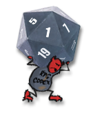
I'm putting together all the various logos that will appear on different parts of Steam. The logos are supposed to show my game's branding. I'm not entirely sure what that is.
Maybe a year or two ago I came in here with some other logos including some where I tried to ape Amano Yoshitaka. Now though I'm pretty sure I'm not going in that direction. And I'm going to do something more like what's below.
I made this image for the Steam Workshop and I kind of liked it:

So I tried making my other pictures in a similar style:

But that didn't really match the other logos and stuff that I've made and posted in various places around the internet. Those logos looked more like this:

I thought that logo worked well for my game's main Steam logo, because it matches the tiny icons that you see in other places around the site. Those icons are too small to see any details, like some girls fighting some skeletons. I just made them look like my logo over some old brown paper.

But the problem with those icons/logos/whatever is that they don't show you any of what the game is about. So I thought maybe I should try to mix the styles for the bigger icons.

I'm leaning toward that last design. And if I go with that, I might go redo the workshop icon too.
Do any of you have any thoughts on which I should go with?
Maybe a year or two ago I came in here with some other logos including some where I tried to ape Amano Yoshitaka. Now though I'm pretty sure I'm not going in that direction. And I'm going to do something more like what's below.
I made this image for the Steam Workshop and I kind of liked it:

So I tried making my other pictures in a similar style:

But that didn't really match the other logos and stuff that I've made and posted in various places around the internet. Those logos looked more like this:

I thought that logo worked well for my game's main Steam logo, because it matches the tiny icons that you see in other places around the site. Those icons are too small to see any details, like some girls fighting some skeletons. I just made them look like my logo over some old brown paper.

But the problem with those icons/logos/whatever is that they don't show you any of what the game is about. So I thought maybe I should try to mix the styles for the bigger icons.

I'm leaning toward that last design. And if I go with that, I might go redo the workshop icon too.
Do any of you have any thoughts on which I should go with?


