


-
Welcome to rpgcodex.net, a site dedicated to discussing computer based role-playing games in a free and open fashion. We're less strict than other forums, but please refer to the rules.
"This message is awaiting moderator approval": All new users must pass through our moderation queue before they will be able to post normally. Until your account has "passed" your posts will only be visible to yourself (and moderators) until they are approved. Give us a week to get around to approving / deleting / ignoring your mundane opinion on crap before hassling us about it. Once you have passed the moderation period (think of it as a test), you will be able to post normally, just like all the other retards.
You are using an out of date browser. It may not display this or other websites correctly.
You should upgrade or use an alternative browser.
You should upgrade or use an alternative browser.
the interface/solid HUD threaaaad
- Thread starter Zed
- Start date


I'd say make the button that reveals the side panel more obvious, perhaps an arrow of some sort?
- Joined
- Apr 16, 2004
- Messages
- 6,810
incline gonna inclineBack in the day we had D1 patches, now we have D1 mods. Good job, Obsidian!

prodigydancer
Arcane

- Joined
- Feb 16, 2015
- Messages
- 1,399
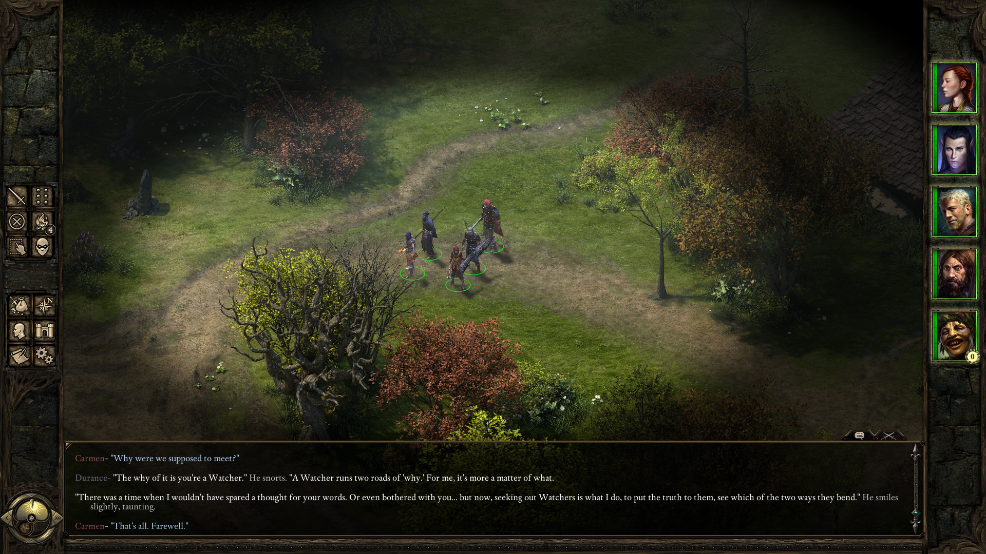
Nope, sorry. Portraits on the left are just awkward.
But your UI design is brilliant and I very much hope to see it implemented someday.
But your UI design is brilliant and I very much hope to see it implemented someday.
dukeofwhales
Cipher
- Joined
- Nov 13, 2013
- Messages
- 423
In terms of ergonomics, Obsidian is actually correct in having the log to the right hand side as it rarely requires interaction. I suspect portraits on the left just looks weird because we're used to having them on the right, but even so given the option I would use portraits on the RHS and cop the extra mouse actions.
- Joined
- Dec 31, 2007
- Messages
- 11,085
This is truly some great work Grotesque. The thing with solid HUDs though, is that they require a lot of work to look good on all resolutions. You'll either gonna have to do awkward fills/cuts, or a shiton of work. Of course you could always just provide only a fixed 1080p solid UI, since most people would be probably using that resolution.
But that would be fucking popamole. 
dukeofwhales
Cipher
- Joined
- Nov 13, 2013
- Messages
- 423
This is truly some great work Grotesque. The thing with solid HUDs though, is that they require a lot of work to look good on all resolutions. You'll either gonna have to do awkward fills/cuts, or a shiton of work.
And if anyone knows how much work this is going to be, it's this guy.
p.s. pls support 1440p.


Ellef
Deplorable


Your link wasn't embedding for me so here it is.
Sensuki
Arcane


In terms of ergonomics, Obsidian is actually correct in having the log to the right hand side as it rarely requires interaction. I suspect portraits on the left just looks weird because we're used to having them on the right, but even so given the option I would use portraits on the RHS and cop the extra mouse actions.
The log should have been in the middle, because you actually want to read what happens in the combat log. You can't read it on the fly when it's in a corner.


- Joined
- Apr 16, 2012
- Messages
- 9,008


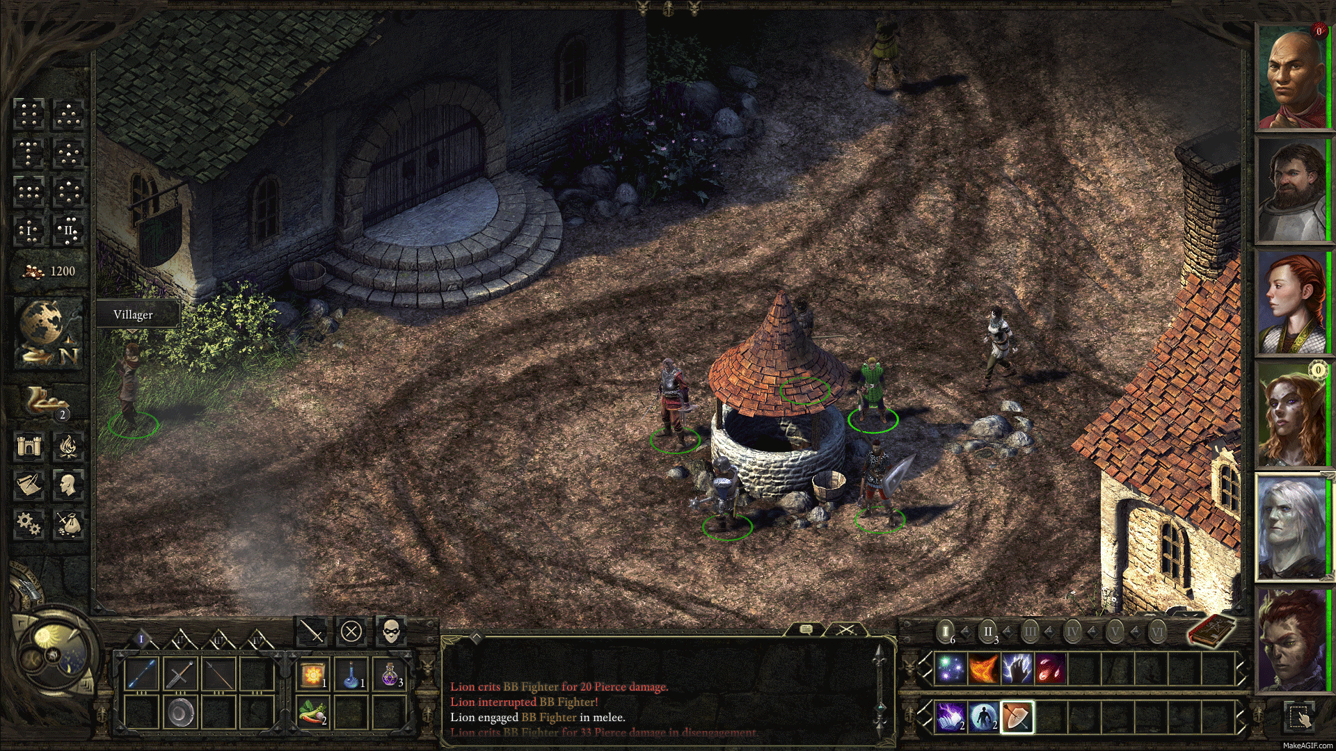
Those vertical white bordered columns at the weapon slots doesn't look good. They look like if the were just cut at the top. Otherwise, great job.

You can pick your poison from these ten variations
prodigydancer
Arcane
- Joined
- Feb 16, 2015
- Messages
- 1,399
My choice would be C.
Actually I think they don't fit at all, neither of them. There should be an option to remove it (if if becomes a reality sometimes). The pure brown wood and the lighter white coloumns don't mix well IMO. Plus, you don't use this kind of textures anywhere else on the UI, so it look really out of place. As soon as I look at the picture, it strikes me in an instant that something is not right.Those vertical white bordered columns at the weapon slots doesn't look good. They look like if the were just cut at the top. Otherwise, great job.
You can pick your poison from these ten variations")
You are doing great work with the UI, but don't overdo it.
Last edited:
Arhu
Novice
- Joined
- Apr 27, 2013
- Messages
- 5
The main UI reversed.
The spells/abilities buttons being most used during gameplay, these buttons located on the left side of the screen offers better ergonomics for right hand mouse users. (?)

I love this! Where can I download? Portraits on the right look very strange to me actually, even on some old BG2 screen shots I've seen, but this reversed version is perfect.
Surf Solar
cannot into womynz
- Joined
- Jan 8, 2011
- Messages
- 8,831
- Joined
- Apr 16, 2004
- Messages
- 6,810
That looks good Surf, but it's really uncomfortable to read text across an entire 1920+ pixel-wide screen. I hope it allows us to reduce the width of the log.Worked a bit on an UI mod of mine. I find this pretty reasonable, any suggestions what I could do better? I would need Bester 's help to recolorize the Ability and Tooltip windows though. I have no idea how they are saved as assets in the game.
On a related note, is there a hotkey to switch between combat-log and dialogue-log?


As an Amazon Associate, rpgcodex.net earns from qualifying purchases.