Putting the 'role' back in role-playing games since 2002.
Donate to Codex
Good Old Games
  • Welcome to rpgcodex.net, a site dedicated to discussing computer based role-playing games in a free and open fashion. We're less strict than other forums, but please refer to the rules.

    "This message is awaiting moderator approval": All new users must pass through our moderation queue before they will be able to post normally. Until your account has "passed" your posts will only be visible to yourself (and moderators) until they are approved. Give us a week to get around to approving / deleting / ignoring your mundane opinion on crap before hassling us about it. Once you have passed the moderation period (think of it as a test), you will be able to post normally, just like all the other retards.

The New World update #23 - first screens!

Vault Dweller

Commissar, Red Star Studio
Developer
Joined
Jan 7, 2003
Messages
28,024
http://www.irontowerstudio.com/forum/index.php/topic,7527.0.html

2017 was a busy year: we did a lot of programming and animation work, produced a lot of art assets, defined locations (quests, places of interest, key characters), factions (leaders, relationships, goals), expanded the Pit’s quests, finalized the systems, and did a lot of work on the first two locations, so we started 2018 in a pretty good shape.

Our main goal for this year is to release a combat demo. It’s a major milestone as it’s practically a game in itself. We do that, it means we have the engine (fully customized for what we need), all systems except stealth, all art assets and animation, interface, and TONS of small things that take a lot of time. It’s a massive amount of work and it took us 5,5 years to reach this point with AoD. If we do it in 2 years this time around, it will mean that we’re right on schedule for 2020 release and give us 2 years to work on quests and locations.

Here is Nick, our programmer, reporting live from his bunker:

What’s done:

- Map grid. In CSG, the tiles are aligned according to the surface angle and look better by not sticking into the ground;
- Non-combat and combat pathfinding. Two separate systems now, which allows smooth movement when exploring locations and good old tactical tile-to-tile movement in combat. Your combat path is also displayed with a nice spline, so no more uncertainty of "where exactly will my character move when I click here" kind;
- Map checking system that spawns warnings if certain map objects are not configured properly - this should decrease the amount of level-design bugs;
- Hierarchical item classes and visual item editor;
- Chargen;
- The flexible structure of character classes that allows adding new creature types with a different appearance, item slots and behavior easily. Implementing new creature type was a big task in AoD/Torque and required writing a lot of code from scratch every time;
- Party system. Better-looking party following, comparing to DR;
- Animation system based on a proper state machine this time. Animations blended with ragdoll, which should help to avoid situations like dead/knockdown characters sticking into the wall;
- Inventory system and screen. Inventory space is now grid-based;
- Character screen;
- Dialogue system, screen, and visual node-based dialogue editor;
- Cover system which provides defense bonuses based on cover type and angle of enemy's fire;
- Combat exit areas - special tiles, Fallout-style, that allow player to flee from combat and execute attached scripts;
- Overhead icons, more informative than in previous games, since they now can display progress bars, numbers, and other useful context-based information;
- Discrete hitbox/collision system. We got rid of the chaotic line of fire and attack results that were animation-based. In AoD/DR the cursor could report you that you are able to hit a target, but then, when you click, your enemy would turn around or scratch his butt, and your arrow could fly past him despite all the odds;
- RPG Camera, replicated from AoD, also includes optional orthographic projection mode;
- Doors (prototype, not final)
- Basic destructible environment;
- Building system (floors visibility, interior/exterior objects)
- Basic combat system (weapons, attack modes, THC calculation, hitting, missing, simple RNG) and combat flow (start, end, combat queue, detecting enemies, advancing turns). No status effects yet.
- Global and local quest variables and game states;

We still don't have:

- Combat and non-combat AI;
- Feats;
- Implants system;
- Learn-by-doing XP mechanics;
- Nice visual effects (laser beams, muzzle flashes, etc);
- Character creation screen and PC customization (currently in progress);
- Combat status effects (knockdown, bleeding, etc);
- Gadgets and grenades;
- Travelling between areas;
- Saving/loading games;
- Options menu;

It will take us probably around six months to finish these tasks.


Here is our work in progress. We finished the first armor set 2 weeks ago and were still tweaking it 5 min ago, so it’s as rough as it gets, function over form. Same goes for everything else – the models, hair, animations, and clothing will be worked on and improved over many months.

We posted these screens for two reasons:

- Show the state of the game (that proverbial picture that’s worth a thousand words)
- Show the targeted level of details, the art direction, and what to expect from the new engine

x_173707.jpg


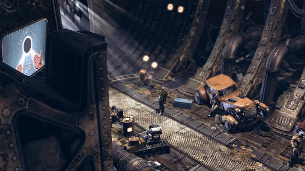
The Pit, outside of the Medical Depot.
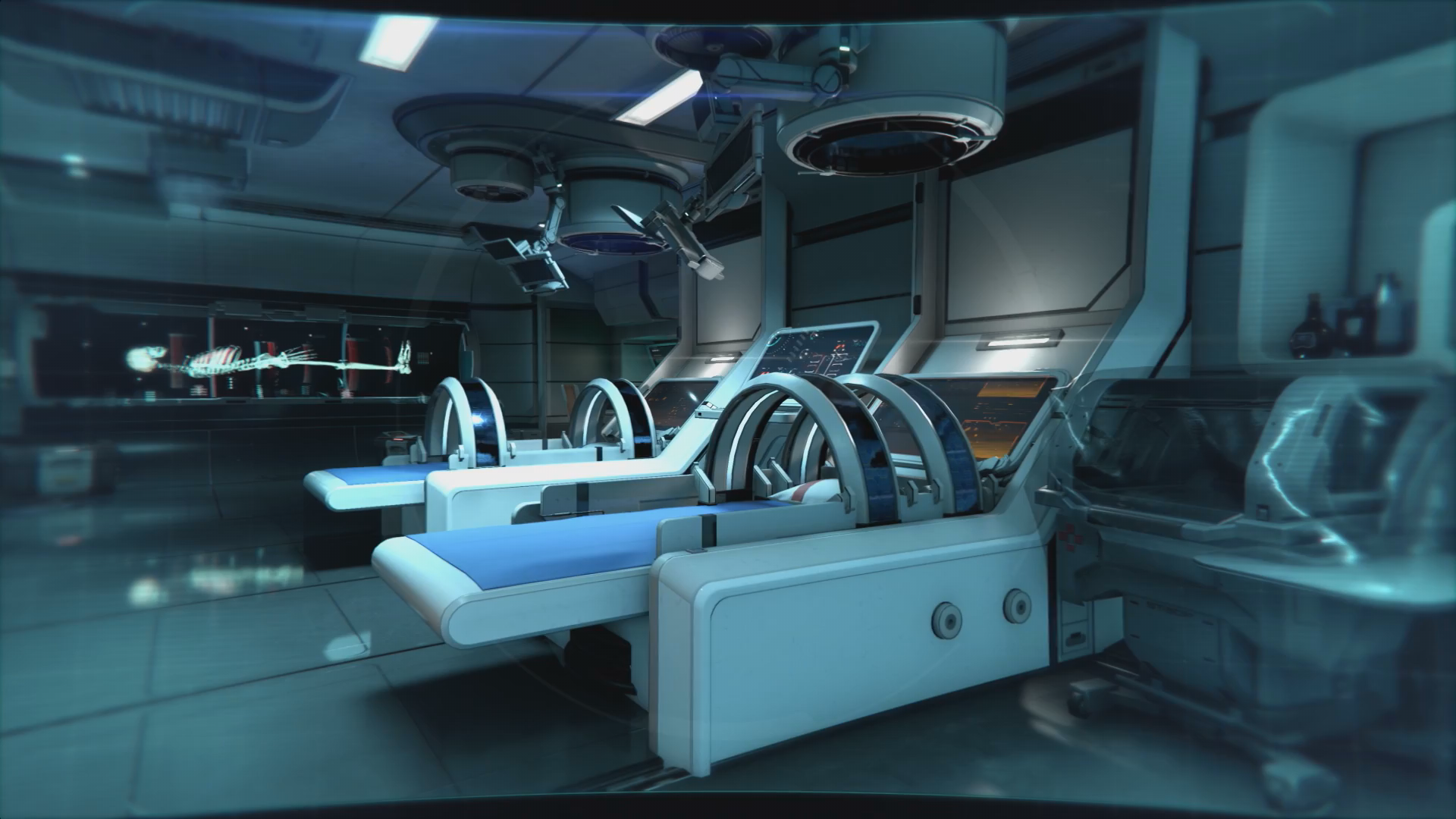
x_173719.jpg

Inside the Depot.

The actual armor models:

154815.png

Selling these fine leather jackets

154817.png

Pants with crude metal kneecaps

We'll present the armor system properly in the future updates.
 
Last edited by a moderator:

Bohrain

Liturgist
Patron
Joined
Aug 10, 2016
Messages
1,447
Location
norf
My team has the sexiest and deadliest waifus you can recruit.
I assume that the textures are still going to get worked on, but are you aiming for a worn and gritty look or something more clean and sterile?
 

AdolfSatan

Arcane
Joined
Dec 27, 2017
Messages
1,888
He ain't wrong though, I've been supporting AoD since that first combat demo and you guys delivered more than I could have hoped as a game, but if anything, it was great in spite of its graphics.
I don't doubt that the priorities are set where they ought to be with regards to the development, but you could seriously use some polishing in the art direction, this looks amateurish at best.

Also, long leather jackets have never, and will never be cool.
 

Elhoim

Iron Tower Studio
Developer
Joined
Oct 27, 2006
Messages
2,878
Location
San Isidro, Argentina
I assume that the textures are still going to get worked on, but are you aiming for a worn and gritty look or something more clean and sterile?

Worn and gritty in general. Some textures need more work in that regard.

He ain't wrong though, I've been supporting AoD since that first combat demo and you guys delivered more than I could have hoped as a game, but if anything, it was great in spite of its graphics.
I don't doubt that the priorities are set where they ought to be with regards to the development, but you could seriously use some polishing in the art direction, this looks amateurish at best.

Unfortunately, that's not free (as a matter of fact, it's the most expensive part) and we didn't earn millions with AoD. So the best we can hope is that TNW would be a great game in spite of its graphics. Again.

In any case, can you be more specific? For example, those clothes were not design to be seen up close, plus they are a work in progress.
 
Last edited:

Vault Dweller

Commissar, Red Star Studio
Developer
Joined
Jan 7, 2003
Messages
28,024
I don't doubt that the priorities are set where they ought to be with regards to the development, but you could seriously use some polishing in the art direction, this looks amateurish at best.
We could use that but not with one artist and on a limited budget.

Also, long leather jackets have never, and will never be cool.
It's a line from Monkey Island. The trenchcoat is made from bullet-resistant synthetic materials.

Care to share more about implants?

How customisbile will the char be as in what will there be implants for - large body parts like arms, legs, torso or will we be able to go in details like a big implant for the torso but also internal organs such as the heart, lungs etc.?

Will the implants come in pairs as in both arms or legs get the same thing or will it be possible to customize like, say, I want a cannon in my right arm and a blade in my left?

Will the implants be generic +5% THC or will they be hard to get game changers such as transfering your consciousness into a robot body, shooting plasma out your eyeballs, extra appendeges and so on?
Nothing fancy like that.

There are seven types of implants in the game (neural uplink, exo-spine, subdermal armor, bionic eye, various officer's implants, synthetic heart, etc). There are multiple items per type to choose from. You can get up to seven implants (that's the max your body can handle; CON-3 so if your have CON 4 you can only get one implant whereas a CON 10 gentleman can get all 7). Some implants will give you combat bonuses (THC, reaction, communities to certain effects), other implants will boost stats or unlock 'text adventure' options while exploring, including very unique branches if you manage to get a bridge officer's implants, for example.
 

Mustawd

Guest
In any case, can you be more specific? For example, those clothes were not design to be seen up close, plus they are a work in progress.

I personally don't mind the graphics. Plus, IMO the environments are already a step up from what I saw in AoD.

However, I was expecting a grittier feel to the that first screenshot.

Something more akin to this:

insomnia.jpg

Also, it's hard to know how to feel about the second screenshot, which I assume is a medbay of some sorts? It's hard to know of it looks squeaky clean on purpose or if it's just not touches up properly.

latest

If the latter, I'd take a look at some of the medbay screenshots from STASIS and compare it to yours. Similar looking assets, but its lighting and texture work give it a grittier feel.

s-fpalt2__huge.jpg


As a random aside, the Dev Diary of STASIS is a really great insight on how the dev developed his environments and 3d models. I'd reocmmend anyone interested in environment design to give it a look.
 
Last edited by a moderator:
Joined
Mar 14, 2012
Messages
1,466
Divinity: Original Sin Torment: Tides of Numenera Pathfinder: Kingmaker Pathfinder: Wrath
It looks good IMO. Funnily enough, the first screenshot gives off nuDeus Ex vibes with its yellow and brown colours, whereas the second one reminds a blue clean and sterile style of the original DX.
 

Plane Escapee

Your friend
Patron
Joined
Sep 11, 2015
Messages
221
Location
chair
Divinity: Original Sin 2 BattleTech Bubbles In Memoria A Beautifully Desolate Campaign Pillars of Eternity 2: Deadfire Pathfinder: Kingmaker Steve gets a Kidney but I don't even get a tag. Pathfinder: Wrath
I like the art direction, it reminds me of Starcraft's space station levels. To some extend, at least.
 

Vault Dweller

Commissar, Red Star Studio
Developer
Joined
Jan 7, 2003
Messages
28,024
The trenchcoat is made from bullet-resistant synthetic materials.

But will still transfer some of that kinetic energy into a concussion / blunt trauma, right?
If by that you mean it will act like AoD's DR, then the answer is yes. There are no special damage types (other than projectile, melee, energy).

Also, it's hard to know how to feel about the second screenshot, which I assume is a medbay of some sorts? It's hard to know of it looks squeaky clean on purpose or if it's just not touches up properly.
Not touched up. These aren't promo screens but rough, straight out from the conveyor type stuff for people who like to see things being assembled right before their eyes.

If the latter, I'd take a look at some of the medbay screenshots from STASIS and compare it to yours. Similar looking assets, but its lighting and texture work give it a grittier feel.
The Stasis guys are incredibly talented environmental artsits, probably the best in the business. We can't reach that high.[/spoiler][/quote]
 
Last edited:

AdolfSatan

Arcane
Joined
Dec 27, 2017
Messages
1,888
Unfortunately, that's not free (as a matter of fact, it's the most expensive part) and we didn't earn millions with AoD. So the best we can hope is that TNW would be a great game in spite of its graphics. Again.

In any case, can you be more specific? For example, those clothes were not design to be seen up close, plus they are a work in progress.
Fucking fuck, the browser crashed and I lost all I had written.
I'll try to stick to stuff that might be of applicable use.

First, an issue one usually finds in the works of artists that are beginning to delve into the shadow vs light aspect of painting, is the reluctance to employ deep contrast. The dynamic range is compressed and makes the scenery look tame because of it.
Take that first image for example: unless there's some luminescence evenly spread through the air to justify it, the shadows are lacking in depth, which in turn makes all the neon signs and lamps feel fake.

WB on both images is heavily tilted towards the red. On the first image it shows because as the other poster said, everything looks golden-brownish à la DX:HR, and in the second is most noticeable in the skin of the characters (check how some weird lilac and purple hues are created were the skin darkens due to the lightning).

Places were the textures and models have been cloned are immediately obvious to the sight. I know creating variations in the 3D models is probably not just a waste of precious time, but also incredibly ineffective in keeping a game light, but perhaps some variation on the 2D aspect could be brought to add some richness, there oughta be some minimal amount of randomization that can be used in order to save you hand-crafting each variation.
An example easy enough to apply would be to randomize the amount of white-to-yellow hue and brightness on each of the lamps both inside and outside to give the impression of a different amount of decay.
Very —very— light amounts of (coloured, not b/w) gaussian noise can be applied to similar effects too.

The other gripe I have, is that these environments don't give the impression of having being lived in. They look like what they are: a room where some props were put into to make it fit a theme.

Case for the first screenshot. I don't know how far will the decline of society be set in the world you're writing, so I'm just gonna make some assumptions based a bit on what I remember from Orphans (I must have read it over ten years ago so my memory is hazy about the details), you'll have reinterpret it in order to accommodate your specific setting:

Now, I don't know were you guys are from, but being from the suburbs of a third-world shithole, I can assure you that on the onset of a decaying society where each subsequent generation is less educated than the last, one of the first things you can notice is the disregard for order and salubrity. It's not out of revelry, mind you, these people live like fucking pigs because they simply don't know any better. Point is, that the depot is way too clean and cared-for to be believable as a depot. Specially one located in a generational ship that's emerging from a civil war.

Second screenshot is a bit of the same. It looks like a station for medical procedures alright, and one expects such a place to retain a semblance of sterility, but it doesn't look like anyone has ever worked there at all, everything is too still and perfect.

Sorry I can't explain myself any further, but I'm starving and my mind is clouded with thoughts of food, I'll continue it after eating.
 

Tigranes

Arcane
Joined
Jan 8, 2009
Messages
10,350
Oh wow, that is not what I expected in terms of visual style, though I'm not really sure what else I expected.

I hate it, but I generally hate all sci-fi styles, so that doesn't say much. I do hope that the ship has a bit more distinctive and memorable style overall - you could mistake #1 for a Shadowrun spinoff and #2 for just about any scifi game in existence. But maybe it all looks the same to me because I just don't find sci-fi very appealing, and it's OK for everyone else.

I am ignorant in the technical side of this stuff, both from a coding and drawing standpoint, so I shall be silent on that.
 

Mustawd

Guest
The Stasis guys are incredibly talented environmental artsits, probably the best in the business. We can't reach that high

I meant I found it insightful to read his blog posts on how he creates environments and his workflow. Besides, his game used prerendered backgrounds with some 3d elements. So it's different than full 3D. The level of detail attainable is much higher since you don't need to render all of it in-engine.

Anyway, thread hijack aside, I like the screens already. Looking forward to seeing the final product.
 

Cazzeris

Guest
It surely looks cleaner than the concept art:

Sketch_freemens-camp-2.jpg

Sketch_freemens-camp.jpg

Also the shadows look too soft in those screenshots, the lightning could use more work. Other than that the colors are nice, most of the props look quite detailed and the character models are an obvious step up from AoD.
 

Urthor

Prophet
Patron
Joined
Mar 22, 2015
Messages
1,872
Pillars of Eternity 2: Deadfire
The environments are fine and convey a world that isn't full on nitty gritty noir. It is in fact an acceptable type of science fiction to not be Underrail/Deus Ex/System Shock 2 and legitimately use positive colours that convey a world that is something other than dystopia.

The faces and bodies are "interesting" but faces and bodies have always been interesting in games, worst case scenario whack a helmet on it.


The real question though, is it really an Iron Tower studio game if the graphics engine looks like it's from the 21st century? We'll find out Q2 2020
 
Last edited:

Ismaul

Thought Criminal #3333
Patron
Joined
Apr 18, 2005
Messages
1,871,810
Location
On Patroll
Codex 2014 PC RPG Website of the Year, 2015 Codex 2016 - The Age of Grimoire Make the Codex Great Again! Grab the Codex by the pussy Insert Title Here RPG Wokedex Strap Yourselves In Codex Year of the Donut Divinity: Original Sin Project: Eternity Torment: Tides of Numenera Shadorwun: Hong Kong Divinity: Original Sin 2 BattleTech A Beautifully Desolate Campaign My team has the sexiest and deadliest waifus you can recruit.
Graphic whores all of you.

I'd be a whore for a great game with those graphics (so to speak). They do a good job creating atmosphere. Much better than Shadowrun IMO.
 

Tigranes

Arcane
Joined
Jan 8, 2009
Messages
10,350
The concept art looks much better, really great atmosphere that somehow disappears entirely in the first screenshot. Maybe it has to do with the scale? The sense of space, the echoing footsteps, the idle seconds, is gone in the first screen that's a crowded as a FF7 area cut.
 

Lexxx20

Learned
Joined
Nov 5, 2015
Messages
138
Location
Russia
This looks fucking GORGEOUS! I'm extremely satisfied with the current look (and state - judging by What's done section) of the game! Godspeed you, Vince and guys.

Any plans to move the ETA a bit closer? ;)

UPD. Here's a news bit at goha, feel free to comment, Vince.
 
Last edited:

Vault Dweller

Commissar, Red Star Studio
Developer
Joined
Jan 7, 2003
Messages
28,024
From the other thread:

1) These are very early screens showing the state of the game (we have controllable characters, equippable items, various assets - the healing machine, the hydroponics thing, etc), the overall direction (closer to cyberpunk rather than pure space western like Firefly), and the engine. Essentially, we're at a stage where we put together the assets but we aren't doing the 'atmospheric' pass yet as it's done when everything else is in place. However, since there's so much bitching a lot of commotion, we'll do that pass for the interior shot and show you what a semi-finished place would look like.

2) Things like piles of dirt and discarded crap will be done last as they require various 'dirt models', which have the lowest priority at the moment and won't be done until last 2019.

3) It does look different from the concepts because the concepts show the 'big picture' while these screens are close ups; having said that if we do it based on concept #2 everyone will say it looks empty. Anyway, considering point #1 the best way to compare the Pit to the concept art is when the full demo is released.

4) Yes, the ship is old and crumbling but if every area looks like that beautiful Polish building above, it will get visually boring fast. The Pit is a relatively young and still growing town, about 10 years old. The containers provide access to brand new things intended for the future colony. In comparison, the Habitat is more than two hundred years old, damaged during the mutiny and the ongoing war between the factions. The mutant city and the 'monastery' will look different as well.
 

VentilatorOfDoom

Administrator
Staff Member
Joined
Apr 4, 2009
Messages
8,600
Location
Deutschland
screenshots do have a bit of a sterile look to them but imo it's already visible that it will be a significant step up from AoD gfx-wise, so... bodes well I guess?
 

As an Amazon Associate, rpgcodex.net earns from qualifying purchases.
Back
Top Bottom