Let´s see...
the envoirment ones could maybe use a bit more variety than just the same brownish fighting-scenery shown from 4 different angles, but meh.. it's a start!
What I would like to see is the updated ones where the stretching and blurring of the bricks and sand is fixed... *hint*Flash*hint*
Yeah, the new GUI is much better. But thats no reason to stop nitpicking.
Heh... I got a list of nitpicks I made as soon as I saw them
")
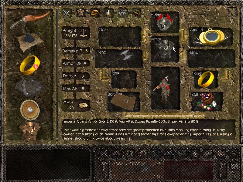
The item pics are a bit uneven. Some (like the rings) are very colorful others are rather palish. I played a bit with the colours and changed some minor things
As VD said, the items still have to be tweaked. Good sugestions.
About the scrollbar, remember that in 800x600 the bar is bigger and looks fine, and also you can use the mouse scroll. The one you draw would look WAY too big.
One thing you might check for consistency: the X close button is differently placed and its shadow is altered in different GUI screens.
The different background in the char screen is my fault. I´ll bugger Flashback on the X position
If I can offer one suggestion?
As many as you like
")
Maybe put some sort of white glow around the item images to make them contrast better with brown backgrounds. If you look at the combat screens, the small icons which let you choose actions "pop" nicely from their backgrounds but the weapon pictures don't. Because the icons are outlined in black with a small white glow around them.
That´s something I´ll keep in mind when tweaking the items.
In fact, you could probably alleviate the problem just by making the panel behind the item lists the same dark brown as the background on the stats screen. And it's probably a good idea, for consistency.
But then we will have problems with the very dark icons. Besides there is a consistency with the weapon slots in the main GUI, and using the black background too much might lead to a feeling of repetition... And I still have a lot to texture

One thing I ve just noticed though: the lower interface bar is blocked on the screenshots - does this mean that to simply switch between different interface screens I have first to close one and then click on another's icon? I.e. if I want to switch from a stats screen to an inventory screen I have to first close the stats screen and only then push the menu button for Inventory? Why make this a two step action?
That was one of the ideas of leaving it there... But it´s not implemented yet.
My one further complaint: in the inventory screen (newGui2.jpg), I think the text in the equipment slots should appear over the image of the item (and possibly centered within the slot, although I don't care as much about that). It's not a big deal, but it's slightly annoying that I can't read the text for the bottom left slot, for example. If this is a lot of effort - i.e., if the text is part of the graphic for the GUI rather than generated in-engine - then forget I said anything.
The text is part of the graphic
Besides, once you read it for the first time, you don´t need to see it everytime. You´ll remember what was each slot for.
Now time for the ego stroke
the new interface shots are really impressive and good looking
But anyway, aside from those suggestions, VERY nice, well done Elhoim.
The interface screens look better than many pro games, IMHO.
New GUI looks vastly better than the old one, it´s amazing how much GUI graphics can change the overall feeling of a game.
Thanks everybody! Your support helps me keep going :D