FeelTheRads
Arcane
- Joined
- Apr 18, 2008
- Messages
- 13,716
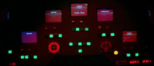
Given the mono-color theme for that panel, the rendered images makes little sense unless they redesign that panel like the character screen panel (i.e., make it color instead)
Uh.. yeah, not really. Or they could just get rid of the "mono-color" theme. It's fucking dumb to have both those shitty symbols AND rendered images. Then there's the green ones on the main interface.
"So.. we listened to you guys that you wanted more detailed items instead of those green ones, so we created them but we put them in a corner in the inventory instead."