Putting the 'role' back in role-playing games since 2002.
Donate to Codex
Good Old Games
  • Welcome to rpgcodex.net, a site dedicated to discussing computer based role-playing games in a free and open fashion. We're less strict than other forums, but please refer to the rules.

    "This message is awaiting moderator approval": All new users must pass through our moderation queue before they will be able to post normally. Until your account has "passed" your posts will only be visible to yourself (and moderators) until they are approved. Give us a week to get around to approving / deleting / ignoring your mundane opinion on crap before hassling us about it. Once you have passed the moderation period (think of it as a test), you will be able to post normally, just like all the other retards.

Why devs are so afraid of proper UI today?

Makabb

Arcane
Shitposter Bethestard
Joined
Sep 19, 2014
Messages
11,753
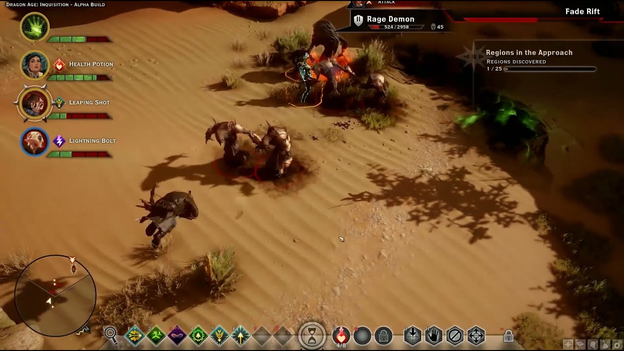
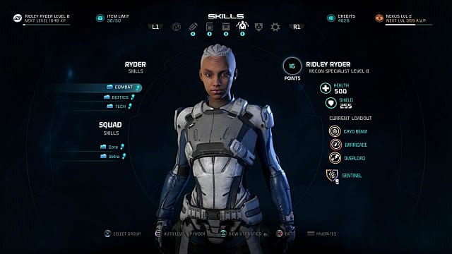
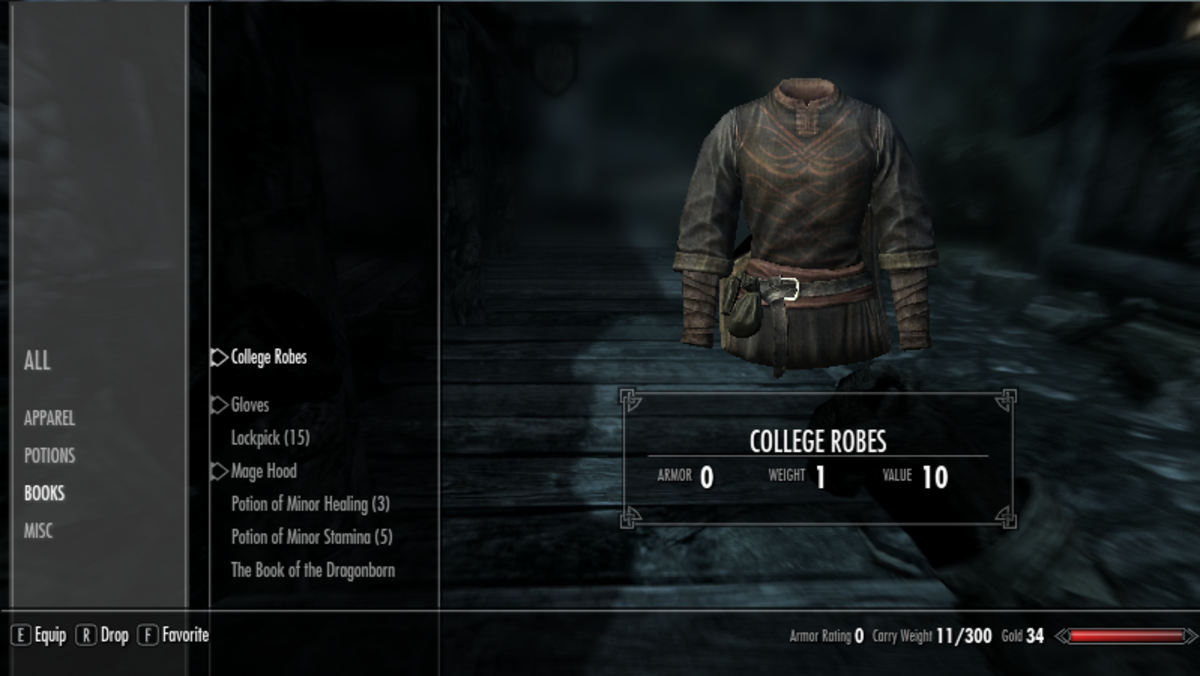
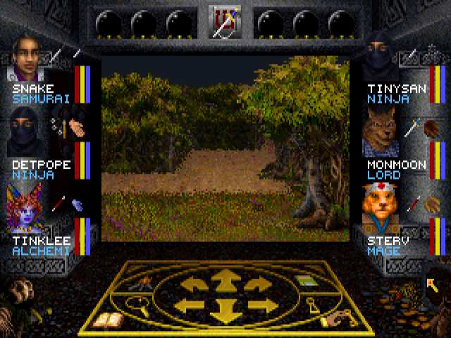
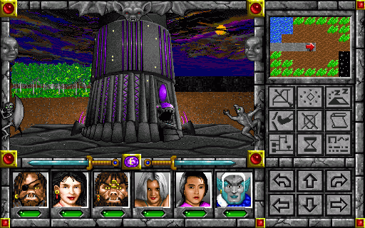
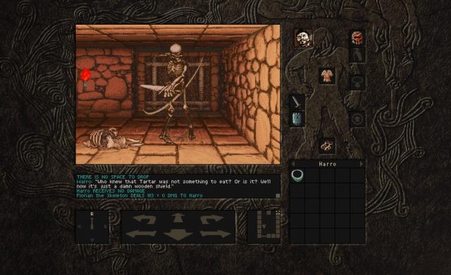
If in 90's we could play on 320x200 resolution with a UI that almost covered whole screen, leaving a small portion of window for the game
1.jpg


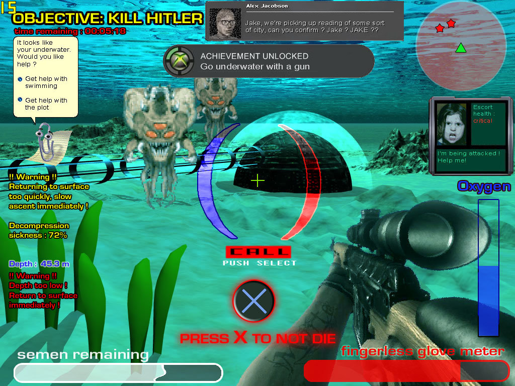
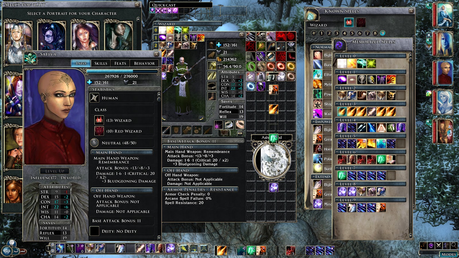
Today on 1920x1080 there should be no problem to make a good UI, leaving the rest of the screen still visible for the game.
 

Nano

Arcane
Patron
Joined
Mar 6, 2016
Messages
4,649
Grab the Codex by the pussy Strap Yourselves In
The UI covered so much of the screen back in the day for performance reasons. The gameplay screen being bigger would've resulted in ridiculously low FPS.
 

Nano

Arcane
Patron
Joined
Mar 6, 2016
Messages
4,649
Grab the Codex by the pussy Strap Yourselves In
C'mon now. Inquisition was panned for its UI. Don't try passing it off as the norm.
 

Makabb

Arcane
Shitposter Bethestard
Joined
Sep 19, 2014
Messages
11,753
And it's the norm today, because the AAAA+++++++++++++ 'RPGs' all have UI's like that.
 

Mustawd

Guest
Makabb it’s obvious that a lot of devs have taken design inspiration from MMOs.

Hotbars, generic or transparent UI background, etc. The only recent game that comes to mind that didn’t follow this trend was Pillars of Eternity. Their UI is p. stylized.
 
Unwanted

a Goat

Unwanted
Dumbfuck Edgy Vatnik
Joined
Jun 15, 2014
Messages
6,941
Location
Albania
The question is why would you, for functional reasons cover larger part of the screen with UI than you absolutely have to?

I mean your examples are obviously shit, although for very specific reasons, but old UIs were often full of wasted space, for performance reasons, if you can show the same amount of info(or more) on smaller portion of the screen, why clutter the thing even more.

Also
Makabb it’s obvious that a lot of devs have taken design inspiration from MMOs.

Hotbars, generic or transparent UI background, etc. The only recent game that comes to mind that didn’t follow this trend was Pillars of Eternity. Their UI is p. stylized.
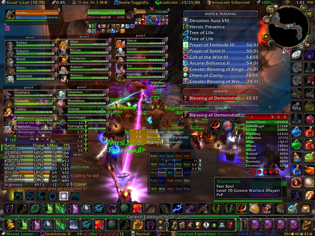
While the general idea is correct, the most popular MMO has an UI that generally looks like this for "serious" players:
S7118hD.jpg

worstui.jpg


And so on. While it looks like awful lot of clutter - it's all info.

I think that the issue of modern UI isn't so much its minimalism as is the fact if it being disconnected from the game itself. If you open inventory in majority of AAA games you're going on separate Inventory screen. Compare it to Arx Fatalis or Dark Messiah(both action-y so there's a common point with modern aaa). Much different. Then of course the console curse - big icons, very few elements visible on the screen at once etc.
 

deama

Prophet
Joined
May 13, 2013
Messages
4,401
Location
UK
The UI's Mekabb listed (the modern ones) I thought were fine, I don't see much of a problem? I mean sure, I'd prefer arx fatalis' UI, or Morrowind's, but still better than whatever shit the 80s/90s offered.
 

Grauken

Gourd vibes only
Patron
Joined
Mar 22, 2013
Messages
12,802
I do think a lot of the older games made (for obvious technical reasons) do with what they had to and integrated UIs into the gameplay window in a really neat way, there was a certain design aesthetic that has been lost somewhat. There's the obvious trade-off, we see more these days, and I'm not sure I want to go back to the days of old (except when playing old games). But I can see where Makabb is coming from

For example I love W7's interface design

Update%20004-003.png


Or Might and Magic

1-xeen_05164.png
 
Last edited:

Jacob

Pronouns: Nick/Her
Patron
Joined
Dec 24, 2015
Messages
3,348
Location
Hatington
Grab the Codex by the pussy
I do think a lot of the older games made (for obvious technical reason) do with what they had to and integrated UIs into the gameplay window in a really neat way, there was a certain design aesthetic that has been lost somewhat. There's the obvious trade-off, we see more these days, and I'm not sure I want to go back to the days of old (except when playing the old games). But I can see where Makabb is coming from

For example I love W7's interface design

Update%20004-003.png


Or Might and Magic

1-xeen_05164.png
Wiz 7's inventory menu was retarded, clicking on a set of armor on the background, very great idea.

Might and magic's UI was pretty confusing too. I keep forgetting that the bottom right button is the character screen. Thank God for hotkeys.
 

Grauken

Gourd vibes only
Patron
Joined
Mar 22, 2013
Messages
12,802
Wiz 7's inventory menu was retarded, clicking on a set of armor on the background, very great idea.

Might and magic's UI was pretty confusing too. I keep forgetting that the bottom right button is the character screen. Thank God for hotkeys.

On the whole I loved the inventory of W7 with the AC appearing on the armor for the individual pieces of armor, but yeah, the exit sign in the background of the inventory was a terrible idea. I actually learned to click there to exit the inventory by chance, and only realized on a playthrough years later that there was actually E X I T spelled out

As for the M&M buttons, lots of 90ies games had icon designs where the developers thought these were completely intuitive, but which actually weren't. I was quite happy when a lot of the developers went back to a healthy mix of text and icon buttons
 

Beastro

Arcane
Joined
May 11, 2015
Messages
8,065
Then what is the point? I'm not really getting it. The UI in 90s era PC games was usually very cumbersome. Are you saying UI in games today is worse? That's just patently false.

Pfffff, next you'll be saying that WASD is better for movement controls than the arrow keys! :roll:

The UI covered so much of the screen back in the day for performance reasons. The gameplay screen being bigger would've resulted in ridiculously low FPS.

The game I always get a chuckle over for that reason is Utopia:

serveimage


Even the computer versions weren't much better than that SNES SS:

Utopia_Screenshot.png


I do think a lot of the older games made (for obvious technical reason) do with what they had to and integrated UIs into the gameplay window in a really neat way, there was a certain design aesthetic that has been lost somewhat. There's the obvious trade-off, we see more these days, and I'm not sure I want to go back to the days of old (except when playing the old games). But I can see where Makabb is coming from

For example I love W7's interface design

1-xeen_05164.png

I will always have a soft spot for EQs origina UI, given that it still actively tried to be an RPG and get you into things in the same way:

serveimage
 
Last edited:

As an Amazon Associate, rpgcodex.net earns from qualifying purchases.
Back
Top Bottom