IMO first iteration is the best
Agree - more clearly readable.
I'm not an artist and I'm not working on the interface. Mazin did the original design and then Oscar took over. If he decides that white font is better I won't argue, but if you ask me, light green is easier on the eyes.
PS.
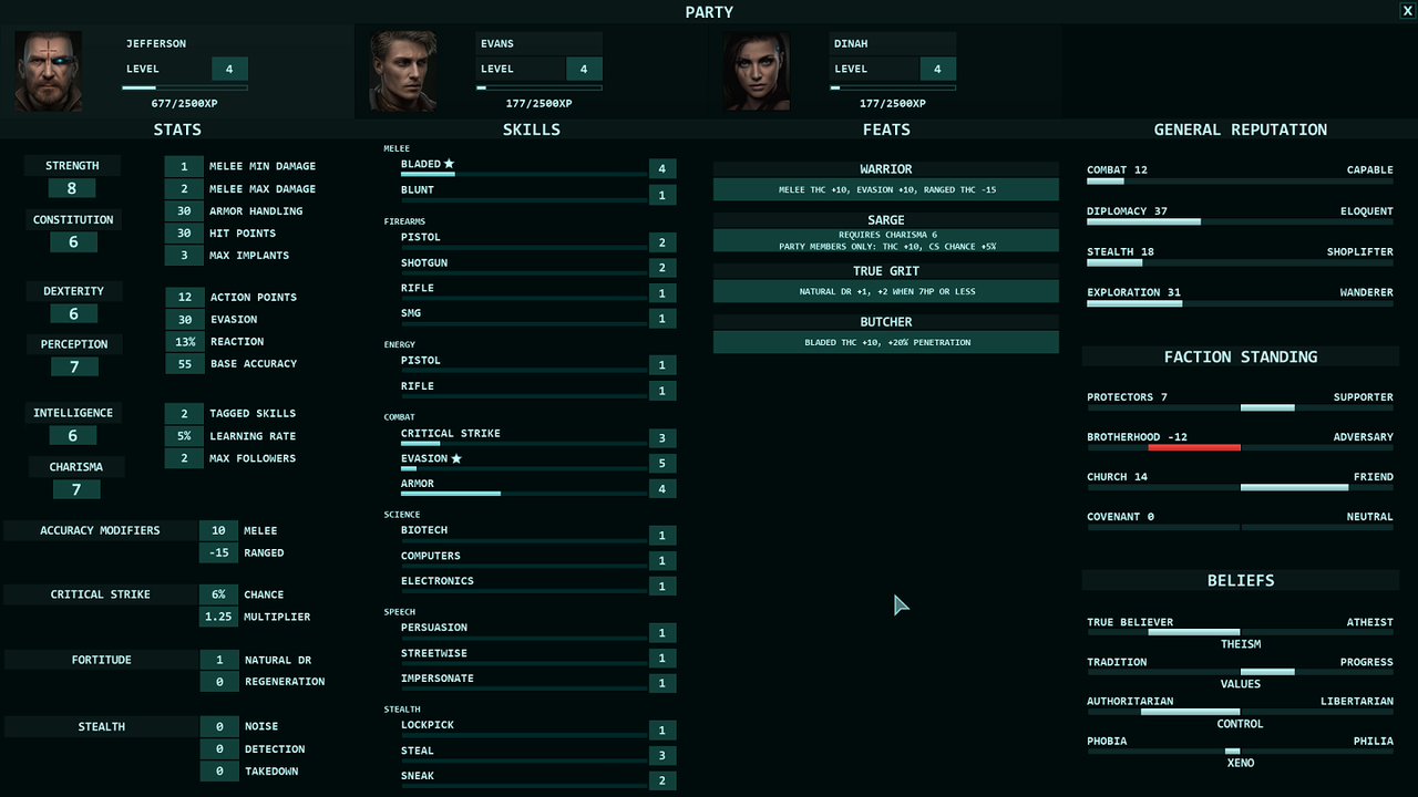
First iteration:
I really like first iteration, and that's why:
First is its logical grouping of information, information gathered/put in thematical blocks.
In a game where I can configure interface I always do logical themed blocks for info, tools available etc.
So I think I perfectly understand Ivan's logic behind such placement of information - foundation of character's build is base stats, they define the opportunities and possibilities, the potential. Skeleton of the character.
Second it's the skills that matter and often used and looked for.
Then it's secondary derived stuff, which important and in the center - the heart of the build is its feats.
To the left are things that not require immediate attention like reputation etc.
I mean, it's much better (in my opinion of course) when information put in lthemed blocks rather then smeared across the screen lke in 2d and 3d iterations.
Logic is this - the more often information is seeked by players, the closer it to the top left corner and the more seldom it is - to the bottom right.
At least approximately.
Second thing I like in 1st iteration - font, its size and colour and colour of the background is more readable, like twice in comparison with next iterations.
Also, maybe it's worth to spent some time and do at least some quick variants without much polishing and put it there and make a poll about them?