- Joined
- Nov 19, 2010
- Messages
- 1,452
First RPG I have desire to play in the last few years. It’s a sad thing when you think about it, it’s all what’s left of iso RPG rebirth.


Consructive criticism, ever heard of it? Saying it is bad without explaining why or providing alternatives doesn't help.VD, I have o lot of respect to you, you made the Codex along with a couple of others, but believe us, this UI sucks ass.
I can say a lot on the topic but generally when people in internet tell about constructuve criticism, objective/subjective, it just means that truth hurts them.Consructive criticism, ever heard of it? Saying it is bad without explaining why or providing alternatives doesn't help.VD, I have o lot of respect to you, you made the Codex along with a couple of others, but believe us, this UI sucks ass.
your job as designer is to figure out why. for explaining why you can hire experts. your clientele doesn't work for you to do job for you.I see it for the first time and I'm tired after looking at it for 30 seconds.

First, it would be much easier to believe it had everyone or at least most people complained about it. It's not the case at all (so far).VD, I have o lot of respect to you, you made the Codex along with couple of others, but belive us, this UI sucks ass.
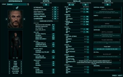
You mean this font?Text font is also terrible, I wanted to destroy it on spot. How do you expect someone to read a lot of dialog with this?

Yeah, when someone disagrees with me, it's because my TRUTH hurt them! After all, it's the only possible explanation.I can say a lot on the topic but generally when people in internet tell about constructuve criticism, objective/subjective, it just means that truth hurts them.Consructive criticism, ever heard of it? Saying it is bad without explaining why or providing alternatives doesn't help.VD, I have o lot of respect to you, you made the Codex along with a couple of others, but believe us, this UI sucks ass.
Do you honestly believe that it's possible to make an interface that every single person would like? That subjective preferences never ever play any role there at all?your job as designer is to figure out why.I see it for the first time and I'm tired after looking at it for 30 seconds.
but why use the word as a shield then?Do you honestly believe that it's possible to make an interface that every single person would like? That subjective preferences never ever play any role there at all?
don't do the sale moves on me salesmanObviously, we'd very much prefer if every single person who liked AoD (including MasPingon) would like everything about Colony Ship as well, so we do pay attention to both the criticism and suggestions

Underrail at minimum groups parts of the system (like base stats, skills and perks) into different tabs afaik. also arguably its stylized look provides it with unique appeal characteristic to overall visual style of the game.Nothing wrong with that interface. No, it isn't pretty, but it does the job and gives you the info you need to know. I like it a lot more than I like Underrail's microscopic pixel art.
That font is not bad, but generally speaking, fixed width fonts are inferior to variable width fonts, so unless you have some need to go monospaced, I would use a variable width font. Further, your lines are running about 100 characters, which is too long for optimum readability. There is some debate about the optimum length on screens, but ~66 CPL is a reasonable number: http://webtypography.net/2.1.2 I wouldn't go much higher than 70. (Fallen Gods is ~60 CPL; PS:T is ~70.) The font is also a bit small, in general. Whenever a dialogue window is up, the player's focus is going to be on that window and the "action" is taking place there, so I think you should consider making the window a bit larger and the font a bit larger. (You'll need the larger window because at 66 CPL and larger font, you wouldn't be able to fit all of the text in a single window, and having a single dialogue node that requires scrolling is IMO a bad idea in almost all instances.) But these are mostly nits. I think the criticism of the dialogue font is mostly misplaced -- it's a readable font and a reasonableYou mean this font?
Merely pointing out that criticism isn't universal. We've been dealing with it for over 10 years now. We show/release something, most people like it, someone says it's shit. Ask FeelTheRads what he thinks of AoD. He'd tell you it's shit. That's his truth and we're fine with it.but why use the word as a shield then?Do you honestly believe that it's possible to make an interface that every single person would like? That subjective preferences never ever play any role there at all?
:why not both:either shit is subjective ie art and people have no say about your vision, or it isn't and they do have a say.
considering at least few people every time ui shows up go into photoshop to take their time and redraw how they would prefer it this is not correct;Re: subjective, etc.
To me, the frenzy of criticism in this thread smacks more than a little of Codexian self-destructiveness and maybe envy, and doesn't seem super helpful. I would think if there were ever a project to exert oneself beyond "this sucks, you're a coward for not facing up to it," it would be this one.
With that in mind, re: UI
Most of monochrome ui I remember, like moderntard skyrim/whatever, seems to use it for small amount of information and blocks, but not for a large list of skills. And then so far your game, judging from pictures, has a lot of dark areas of bluish shadows in them. I already feel kinda tired just from looking at it.Take the monochrome thing. It's not something that can be labelled as objectively good design or objectively bad design.
iirc that's a desk and the menu is portrayed as a holographic UI. That's a nice touch, fits very well with the corporate/techno setting. Nice touches are nice. I don't think anyone is worried about too much info (who here has never looked down at their charsheet, wondering where it all went wrongwhatever the techno-crap is in the background
To me, the frenzy of criticism in this thread smacks more than a little of Codexian self-destructiveness and maybe envy, and doesn't seem super helpful.
Now, no UI is going to be perfect, what we're looking for is the acceptable compromise.
There is nothing wrong with punching holes in the game. It doesn't matter how nasty and aggressive you think your commentaries are. VD heard it before. What I don't like is that you can make a bunch of butthurt posts about how resistant to the feedback they are but you are incapable of providing detailed criticisms. If your view is so scientific, show it with arguments and let the details speak for themselves. Don't waste your time and ours with generic complaints about other issues.
No, indeed. When someone disagrees with you it's because climate or they just don't like it.Yeah, when someone disagrees with me, it's because my TRUTH hurt them! After all, it's the only possible explanation.

If he doesn't know no one should tell him. Devs who believe *composition* and *color palette* are subjective concepts deserve to remain ignorant.Consructive criticism, ever heard of it? Saying it is bad without explaining why or providing alternatives doesn't help.VD, I have o lot of respect to you, you made the Codex along with a couple of others, but believe us, this UI sucks ass.
I am not too hot on font color and background behind font being same tone. it's like if codex font instead of white was bright greyish blue.The dialogue is fine to read, for example