Putting the 'role' back in role-playing games since 2002.
Donate to Codex
Good Old Games
  • Welcome to rpgcodex.net, a site dedicated to discussing computer based role-playing games in a free and open fashion. We're less strict than other forums, but please refer to the rules.

    "This message is awaiting moderator approval": All new users must pass through our moderation queue before they will be able to post normally. Until your account has "passed" your posts will only be visible to yourself (and moderators) until they are approved. Give us a week to get around to approving / deleting / ignoring your mundane opinion on crap before hassling us about it. Once you have passed the moderation period (think of it as a test), you will be able to post normally, just like all the other retards.

Game News Colony Ship Update #41: Closed Combat Beta Begins

Goral

Arcane
Patron
The Real Fanboy
Joined
May 4, 2008
Messages
3,552
Location
Poland
People keep posting suggestions and actual constructive criticism.
Not in this thread, at least until Tigranes and MRY replied. Shadenuat gave no constructive criticism, just criticism. As for my criticism it's here for example: https://rpgcodex.net/forums/index.p...rface-improvements.129596/page-3#post-6321489
https://rpgcodex.net/forums/index.p...rface-improvements.129596/page-4#post-6322250

Vault Dweller Elhoim
Why not release .psd files with interface and other stuff people complain about and let us give you specific suggestions. Doing what AdolfSatan did is too bothersome,,with .psd files it would be easier and someone might do the job for you while you could focus on high priority stuff.
 

AdolfSatan

Arcane
Joined
Dec 27, 2017
Messages
1,889
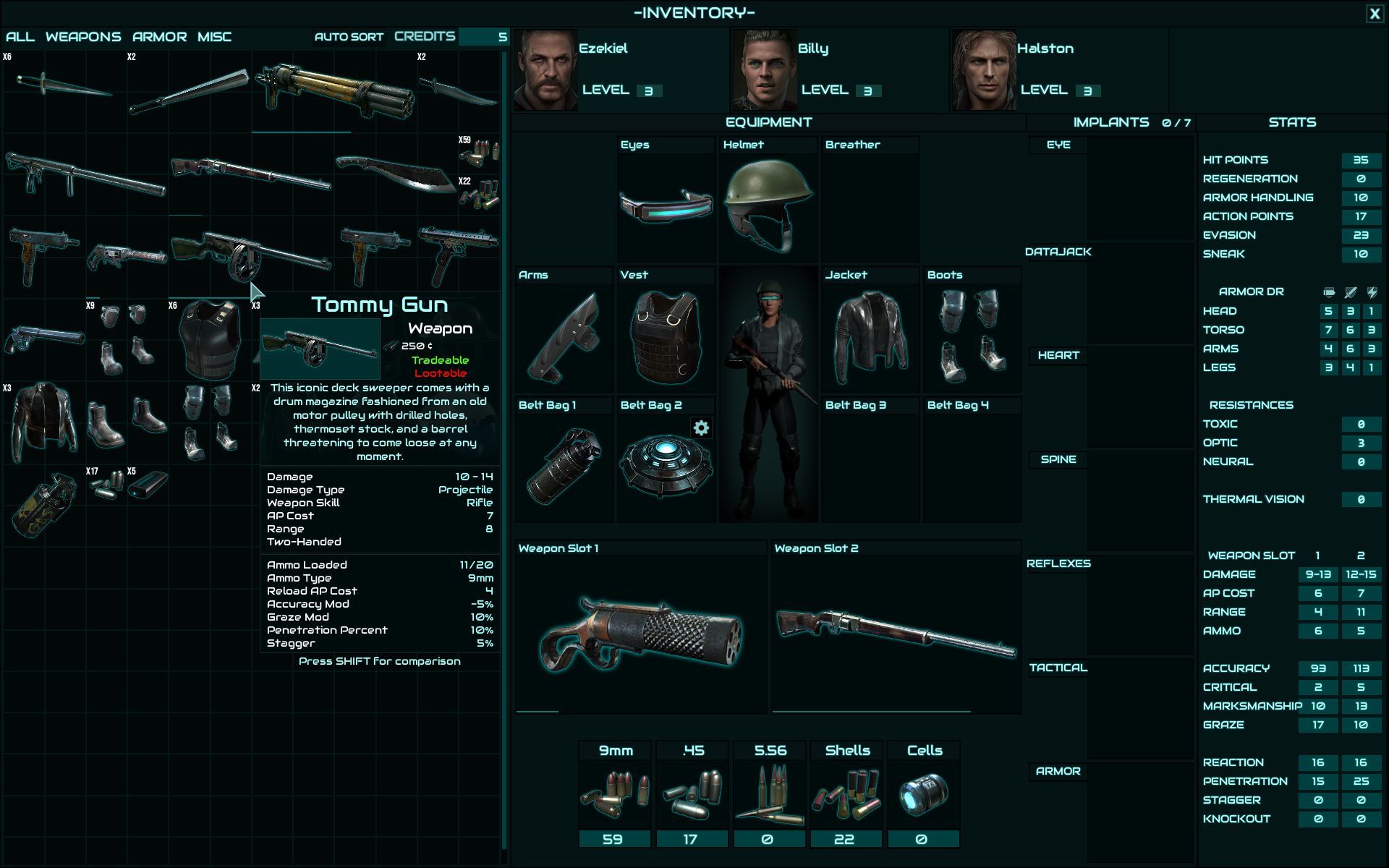
The main issue presently in the char screen I would say is not with the font being monospaced (or ugly) but it being all caps.

The distribution in columns seems well thought and works great, but the palette is going against it.

If I were working on this, I'd stop iterating upon the same structure at once, lest I befall victim of demoitis.
Way I see it, the best thing the designer can do in this moment is switch to a neutral system font, set bg and font colour to b/w and come back later with a set of fresh eyes.

Same applies to other interfaces. The criticism towards the use of glow rings very valid to me; it looks more like a quick fix to circumvent a problem created by a previously poor choice in design than an actual aesthetic flavour. Best way to deal with this is to stop fixing and start over.
 

Daedalos

Arcane
The Real Fanboy
Joined
Apr 18, 2007
Messages
5,566
Location
Denmark
Most of the complaints seems to be about visibility in terms of colour and font and such for the UI, easily fixable stuff in the future.

But I like the idea of outsorcing some help with the UI to other people, if the team is pressed for ressources. Like consider some mock ups or such or inspiration and how-to.
At any rate, it's their decision.
 

Elhoim

Iron Tower Studio
Developer
Joined
Oct 27, 2006
Messages
2,878
Location
San Isidro, Argentina
Not in this thread, at least until Tigranes and MRY replied. Shadenuat gave no constructive criticism, just criticism. As for my criticism it's here for example: https://rpgcodex.net/forums/index.p...rface-improvements.129596/page-3#post-6321489
https://rpgcodex.net/forums/index.p...rface-improvements.129596/page-4#post-6322250

Vault Dweller Elhoim
Why not release .psd files with interface and other stuff people complain about and let us give you specific suggestions. Doing what AdolfSatan did is too bothersome,,with .psd files it would be easier and someone might do the job for you while you could focus on high priority stuff.

There are no PSD files, it's all created in engine. We are working on some tweaks, hopefully we'll be able to show something soon.
 

Grotesque

±¼ ¯\_(ツ)_/¯
Patron
Vatnik
Joined
Apr 16, 2012
Messages
9,008
Divinity: Original Sin Divinity: Original Sin 2
If only all these critics would put all this energy in making a mockup of the charater UI according with their vision so we all can bask in its quality and make fun of it (or not).
This thread would instantly have entertainment value for the next week!

I mean, why Wateland 2 received all that support and not this game?
you motherfuckers...

37965c27c98b13034d82c2d60bce2769e17ffeed.jpg
 
Last edited:

Alpan

Arcane
Patron
Joined
Mar 4, 2018
Messages
1,340
Grab the Codex by the pussy Pathfinder: Wrath
I think the UI is fine, it's only the inventory screen that looks quite crowded visually. I would suggest to get rid of the glowing outlines around every single item and maybe make the darkest teal shade a wee bit darker to improve contrast.
 

Elhoim

Iron Tower Studio
Developer
Joined
Oct 27, 2006
Messages
2,878
Location
San Isidro, Argentina
If only all these critics would put all this energy in making a mockup of the charater UI according with their vision so we all can bask in its quality and make fun of it (or not).

Takes me back to 2006... :D

I think the UI is fine, it's only the inventory screen that looks quite crowded visually. I would suggest to get rid of the glowing outlines around every single item and maybe make the darkest teal shade a wee bit darker to improve contrast.

I currently have tweaked:

- Made the "static" text less bright and without outlines. Basically the text labels.
- Kept the lighter color to the text that changes, which are the numbers.
- I played around with making it a bit more like a screen.

But right now Mazin is doing a real artist's work, so I'll wait for his version before posting anything. We are looking in removing the glow from items and see how it goes.
 

Daedalos

Arcane
The Real Fanboy
Joined
Apr 18, 2007
Messages
5,566
Location
Denmark
If only all these critics would put all this energy in making a mockup of the charater UI according with their vision so we all can bask in its quality and make fun of it (or not).

Takes me back to 2006... :D

I think the UI is fine, it's only the inventory screen that looks quite crowded visually. I would suggest to get rid of the glowing outlines around every single item and maybe make the darkest teal shade a wee bit darker to improve contrast.

I currently have tweaked:

- Made the "static" text less bright and without outlines. Basically the text labels.
- Kept the lighter color to the text that changes, which are the numbers.
- I played around with making it a bit more like a screen.

But right now Mazin is doing a real artist's work, so I'll wait for his version before posting anything. We are looking in removing the glow from items and see how it goes.

Will you be updating the beta build with these new changes so we can see them in effect? :)
 

Vault Dweller

Commissar, Red Star Studio
Developer
Joined
Jan 7, 2003
Messages
28,024
Hi Vault Dweller

Can I make a small suggestion in terms of colour balance and contrast
You can but I can only forward your mockup to Mazin and Oscar. Ultimately, they decide what the interface will look like.

And I'd like to state again that the interface is work in progress which didn't have any art pass yet due to the low priority as our focus was and still is on combat mechanics.
 

Grotesque

±¼ ¯\_(ツ)_/¯
Patron
Vatnik
Joined
Apr 16, 2012
Messages
9,008
Divinity: Original Sin Divinity: Original Sin 2
In this game, the player will still be able to complete it by clicking only on lines of dialogue options?

After finishing Age of Decadence this way, I reached the conclusion that making a game this way is like shooting yourself in the foot as a game developer.
 

Vault Dweller

Commissar, Red Star Studio
Developer
Joined
Jan 7, 2003
Messages
28,024
In this game, the player will still be able to complete it by clicking only on lines of dialogue options?

After finishing Age of Decadence this way, I reached the conclusion that making a game this way is like shooting yourself in the foot as a game developer.
Yes. I see it as essential in the context of different options and paths. I understand its limitations, of course, but since we aren't focusing fully on one path (like Disco developers did) I doubt it would differ greatly from what we did in AoD.
 

As an Amazon Associate, rpgcodex.net earns from qualifying purchases.
Back
Top Bottom