Putting the 'role' back in role-playing games since 2002.
Donate to Codex
Good Old Games
  • Welcome to rpgcodex.net, a site dedicated to discussing computer based role-playing games in a free and open fashion. We're less strict than other forums, but please refer to the rules.

    "This message is awaiting moderator approval": All new users must pass through our moderation queue before they will be able to post normally. Until your account has "passed" your posts will only be visible to yourself (and moderators) until they are approved. Give us a week to get around to approving / deleting / ignoring your mundane opinion on crap before hassling us about it. Once you have passed the moderation period (think of it as a test), you will be able to post normally, just like all the other retards.

Game News Colony Ship Update #39: User Interface Improvements

Joined
Jan 14, 2018
Messages
50,754
Codex Year of the Donut
Why show both weapons at the same time instead of just the weapon actively being used? If the intent is just to see information about it when making a decision, it could just be the text without the image for the not currently used weapon.
The portrait next to the two weapons is mostly just a duplication of information already available in the top left.
Do I need to know how much XP I have/how close I am to the next level while in combat?

Quick edit of what I meant:
image.png
 

Lady_Error

█▓▒░ ░▒▓█
Patron
Joined
Oct 14, 2012
Messages
1,879,250
Most of the extra info (grazing, possible covers, etc, should be toggled on held button, not shown at all the times). I'd also eliminate clarifications like hold alt button for extra info that only need to be seen once. Say it in the manual, do a tutorial, whatever you want, but don't make me read the same tidbit when I'm going for my hundredth kill.

Definitely agree on this.

As to the same info being shown thrice, I don't think that's a problem. The upper left displays your party, including outside of combat. So you cannot mix it with the combat order display on top in the center.
 

Whisper

Arcane
Vatnik
Joined
Feb 29, 2012
Messages
4,357
i don't know how the previous version of the ui looked but if these are supposed to show 'improvements' then my god it must have been distilled eye cancer
It looks abit messy and cluttered Vince, but I like the improvements. It does need to be cleaned up alot and sleekend up
Suggestions are welcome.

Sorry for derailing thread, but did you read Jeff Vogel latest post on game development? I think this will be of interest to you.

Also, i am will happy to help with testing, i usually make strange, unexpected builds. Thank you for supporting them, by the way. I never expected character with Dex 4 (6 action points) work in Dungeon rats.
 

MRY

Wormwood Studios
Developer
Joined
Aug 15, 2012
Messages
5,716
Location
California
i don't know how the previous version of the ui looked but if these are supposed to show 'improvements' then my god it must have been distilled eye cancer
It looks abit messy and cluttered Vince, but I like the improvements. It does need to be cleaned up alot and sleekend up
Suggestions are welcome.
I'm terrible at this stuff, but a few things that jump out to me:

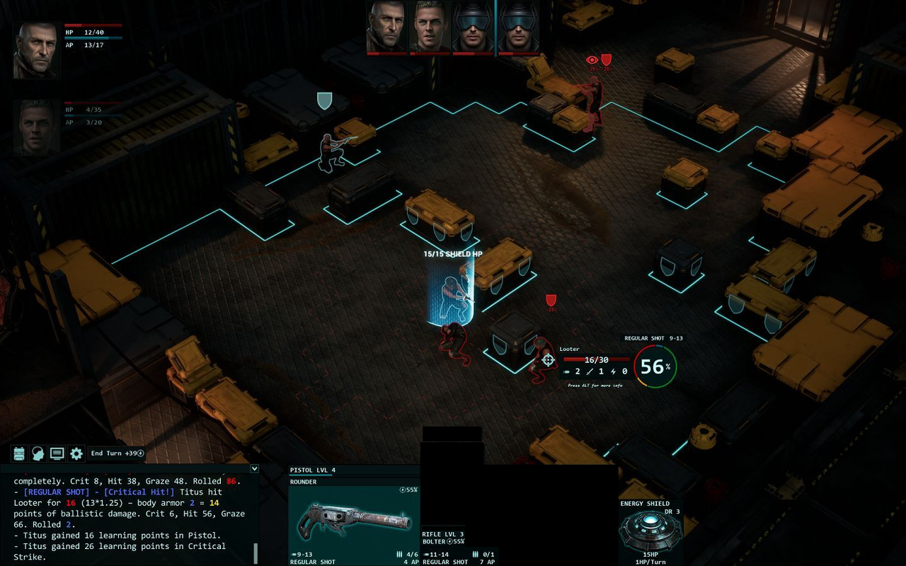
(1) I think the window in the lower-left corner looks wrong to me. The single thing that annoys me the most is the scroll bar because it looks like a Windows preset. I'm not really big on "immersion," but I do think a game should feel like its own fun, contained space, rather than an extension of OS/enterprise software, and the scroll bar interferes with that. Further, I find it distracting that I can't tell where the UI stops at the background begins. The way in which the UI elements seem to "float" over the background rather than having their own weight again feels more like enterprise software (in this case, Photoshop / Paint.NET tool windows). If you compare it to the FO UI, which is clearly an inspiration, FO's is very solid, it looks bolted onto the bottom of the screen. I prefer that approach even if it takes up a bit more real estate.

(2) It's a small matter, but I really strongly dislike the THAC0-style approach to to-hit rolls. This is an old point that someone else made years ago, but it is a problem when every other roll you want to go high, but on this one, you want to go low. IMO, it would be much more satisfying to see: "Graze 34, Hit 44, Crit 94. Rolled 98."

(3) The use of blue color is inconsistent. For "[REGULAR SHOT] - [Critical Hit!]" and "Rolled 2," the blue appears to be signifying that it was a critical hit (that is what blue is on the target wheel, I guess). But then when calculating damage, blue seems to indicate the opponent's defense roll. By contrast, red on the target wheel signifies a hit, but red is the color you use for the damage and THAC0 rolls, even when the THAC0 roll was a critical hit. Moreover, even on the color wheel itself, it's very weird that the colors are in non-spectrum order and, to some extent, don't track our normal color usage. The spectrum runs Blue->Green->Yellow->Red. The wheel, in contrast, runs Green->Yellow->Red->Blue. The result is that it's not clear that Blue is the best, as opposed to worst, result. In fact, it's counter-intuitive. That is amplified by the fact that if you think of the wheel as a spinner dial (or a clock), the results run Best->Worst->Okay->Good. Very weird IMO. Whether you use my count-up or your THAC0 count down, the results should be arranged spatially as if it were a spin -- so in my version, it would go Miss->Graze->Hit->Critical, with the better spin getting you farther along the wheel. In your approach, it would go Critical->Hit->Graze->Miss, with a smaller spin being better. But in neither approach should it be like it is here. The spin always should start at 12 o'clock. Furthermore, most players (I think?) would consider a green result good and a red result bad. But here, a red result is good (though not as good as blue) whereas a green result is bad.

(4) The 56% is a little confusing IMO, especially when there is a 66% chance of at least grazing. You might just drop the percent, since you have the wheel for the same info, and move the damage range into the middle of the wheel.

(5) If you are going to duplicate the damage range in both the tooltip and the UI bar, and if you are going to show the target's armor, why not at least have the tooltip damage range take the armor into account? IMO, you might also want to include the action point cost in the tool-tip when you're going to shoot, as that seems relevant information there.

(6) I'm also not sure the text ordering is right. I think I'd like it more, and find it more logical, if it went: "[REGULAR SHOT] - Titus critically hit Looter! (Rolled 98: Graze 34, Hit 44, Crit 94.) Looter takes 14 points of ballistic damage. (Rolled 13*1.25 - body armor 2 = 14.)"

(7) I would not have any elements extend above the top line, the way the top of Titus's head and status current do. Better to have a clear delineation between UI and field of play. Similarly, it feels off to me that the shield is shorter and that the UI eventually just stops on the far right. I'm a little confused as to what's going on with the double weapons, too -- can you hold a rifle and pistol at the same time?

(8) AP is potentially very relevant but it's very obscure right now.

(9) Not entirely sure what the + energy on ending turn conveys, because I don't see energy being counted anywhere else.

(10) I think it's needlessly confusing that the ammo icon is three bullets, but that doesn't necessarily tell the player how many bullets he has in the gun. I'm sure I'm an idiot, but at first I read that as three bullets in the clip, and then a number of clips. You might just say "4/6 Ammo."

Hope that's helpful.
 
Joined
Jan 14, 2018
Messages
50,754
Codex Year of the Donut
(2) It's a small matter, but I really strongly dislike the THAC0-style approach to to-hit rolls. This is an old point that someone else made years ago, but it is a problem when every other roll you want to go high, but on this one, you want to go low. IMO, it would be much more satisfying to see: "Graze 34, Hit 44, Crit 94. Rolled 98."
It's not THAC0-style, it's just roll-under AFAICT.
The reason it's done at tabletop is because it's clearer(20% → roll 20 or under), generally faster than using roll-over, and results in less target number inflation.
I'm not advocating adapting tabletop rules 1:1 to computer games(I actually prefer the opposite), most rulesets exist out of convenience for play sans some of the more arcane ones(e.g., Rolemaster, which is a perfect example of why rulesets are simplified for the tabletop)
 
Last edited:

MRY

Wormwood Studios
Developer
Joined
Aug 15, 2012
Messages
5,716
Location
California
That makes sense, but I still think it is generally an inferior approach for the reasons I mention. I'm a caveman, and rolling big numbers feeling like a success, not a failure.
 

MRY

Wormwood Studios
Developer
Joined
Aug 15, 2012
Messages
5,716
Location
California
On further reflection, it looks like I'm reading the target wheel wrong. It goes crit -> hit -> graze -> miss. So it's not as illogical as I thought. [INT: Failed]
 

Vault Dweller

Commissar, Red Star Studio
Developer
Joined
Jan 7, 2003
Messages
28,024
Some (but not all) leg armor for your amusement. All these details will be seen on your character. The pointy boots will look great on your character so finally you can role-play Griff from Back to the Future 2!
osYMgqV.png


dvfcSqK.png

An ancient pair of boots once issued by the Ship Authority to every citizen onboard. The Ship Authority is long gone now and so are free boots.

2AJ0ifO.png

Heavy duty boots with rubberized steel toes and carbon fiber kneepads. Made for dirty work, these boots will soften hard blows and turn bullets as easily as pebbles.

U6XKOwv.png

Regular Ship Authority-issued boots with pointed steel toes and reinforced knee guards. Good for kicking things.

mxijJNi.png

These boots were made for welding, but that's probably not what they're going to do. Along with standard metatarsal guard and heat-absorbent padding, this pair comes with shin guards and kneepads salvaged from damaged combat suits.

Ot1XVDz.png

A vital component of the Destroyer S300 armor set, this high-tech leg armor will make you impervious to any low-grade weaponry typical of rebel scum.
 

Kev Inkline

Arcane
Patron
Joined
Nov 17, 2015
Messages
5,097
A Beautifully Desolate Campaign Pillars of Eternity 2: Deadfire Pathfinder: Kingmaker Steve gets a Kidney but I don't even get a tag.
Seems that the guy who modelled for the destroyer s300 armor set likely suffers from supination. I wonder whether achilles tendon injuries are common on the ship?

It could be that hard steel surface with no proper cushioning in the boots, or something.
 

Goral

Arcane
Patron
The Real Fanboy
Joined
May 4, 2008
Messages
3,552
Location
Poland
As Flint said, all labels should start from the top, like in his mockup (bottom picture):
Most labels for bars (hp, ap, xp) are closer to the wrong bar. "HP 37/40" is closer to the AP bar than to the actual health bar. This reduces readability as eye gets confused about what labels what. It will look much cleaner if you move text a few pixels closer to the respective bar. Same with the lvl/hp/ap sandwich at the bottom.
drlatxX.png


I think it is even better to switch labels and bars around, like in my third example. Looks more natural to me to have the bar already labeled when scanning from top to bottom.
 

Vault Dweller

Commissar, Red Star Studio
Developer
Joined
Jan 7, 2003
Messages
28,024
Remember the starfish? I posted this concept art awhile ago:

TU3iOri.png


We hired a second animator a couple of months ago to reduce Ivan's workload, here's his work:

yEDd6qi.gif
 

Lady_Error

█▓▒░ ░▒▓█
Patron
Joined
Oct 14, 2012
Messages
1,879,250
I wouldn't be against a bit of cosmic horror in a side quest. The Old Ones are not confined by space or time.
 

As an Amazon Associate, rpgcodex.net earns from qualifying purchases.
Back
Top Bottom