Putting the 'role' back in role-playing games since 2002.
Donate to Codex
Good Old Games
  • Welcome to rpgcodex.net, a site dedicated to discussing computer based role-playing games in a free and open fashion. We're less strict than other forums, but please refer to the rules.

    "This message is awaiting moderator approval": All new users must pass through our moderation queue before they will be able to post normally. Until your account has "passed" your posts will only be visible to yourself (and moderators) until they are approved. Give us a week to get around to approving / deleting / ignoring your mundane opinion on crap before hassling us about it. Once you have passed the moderation period (think of it as a test), you will be able to post normally, just like all the other retards.

Game News Colony Ship Update #41: Closed Combat Beta Begins

Haba

Harbinger of Decline
Patron
Joined
Dec 24, 2008
Messages
1,871,781
Location
Land of Rape & Honey ❤️
Codex 2012 MCA Divinity: Original Sin Project: Eternity Torment: Tides of Numenera Wasteland 2
:nocountryforshitposters:

Decades worth of scientific study is not subjective.
 

Vault Dweller

Commissar, Red Star Studio
Developer
Joined
Jan 7, 2003
Messages
28,024
:nocountryforshitposters:

Decades worth of scientific study is not subjective.
There's nothing as subjective as "decades worth of scientific study". See the climate change debate. As for the interface, the only study that matters is the overall reception on the Codex. So far it's been positive, so...
 

Shadenuat

Arcane
Joined
Dec 9, 2011
Messages
11,966
Location
Russia
subjecive turns objectvie when more people say that your stuff is shit. it took a while for AoD to get decent charscreen too.
 

FeelTheRads

Arcane
Joined
Apr 18, 2008
Messages
13,716
based on or influenced by personal feelings, tastes, or opinions.

LMAO.
Someone googling "sci-fi font" and dropping the first result in the game is not a matter of opinion.
That centering text like that in the item descriptions shows no taste or design knowledge is not a matter of opinion.
Batching "outer glow" on every item in the game being shit is not a matter of opinion.
Text flying out of text-boxes is not a matter of opinion.

Any designer worth anything would tell you that this is garbage in every respect.
But I guess, who needs designers when you have the fanboys and ass-kissers on the Codex.
 
Joined
Jan 14, 2018
Messages
50,754
Codex Year of the Donut
Vault Dweller
image.png
 

Shadenuat

Arcane
Joined
Dec 9, 2011
Messages
11,966
Location
Russia
subjecive turns objectvie when more people say that your stuff is shit.
Is this what's happening here?
well I personally prefer Fallout 1 ui to Fallout 3.

I am honestly surprised there was no effort to make game ui resemble at least something the game is about, be it a pocket computer, or space ship interface you travel on, or colonist profile/document as they registered on the ship, etc.
like traditional RPGs did it, merging ui and story together.

but this is a lot to ask when I find current ui struggle with as basic a thing as readability. (due to everything being fucking blueh)

and as many others I do find photoshop layer>glow effect on items odd. I actually think it makes the overall ok looking items uglier than their base art.
overall I feel you need to come up with something more aesthetically pleasant for isometric game on final release at least.

it's not that you can't do monotone UI, but then it should't be used for big blocks of text.
 
Last edited:

Haba

Harbinger of Decline
Patron
Joined
Dec 24, 2008
Messages
1,871,781
Location
Land of Rape & Honey ❤️
Codex 2012 MCA Divinity: Original Sin Project: Eternity Torment: Tides of Numenera Wasteland 2
I wouldn't go as far as to call it "shit" but yeah, as someone who looks at spreadsheets and analytical data every day, some of the screens give me an allergic reaction (that is subjective).

The problem with the outer glow on items is that it makes everything blend into the same mass. Since everything is the same at glance, you can't group things naturally. Which makes it tiresome to look at.

Something something principles of gestalt psychology
 

Grotesque

±¼ ¯\_(ツ)_/¯
Patron
Vatnik
Joined
Apr 16, 2012
Messages
9,008
Divinity: Original Sin Divinity: Original Sin 2
Artful Dodger? I see someone reads too much Peter Hamilton. :)

the items 2D drawings look sweet and the portraits are very expressive.

also I like the color palette chosen for the UI
good job very!
 
Last edited:

Drowed

Arcane
Joined
Dec 28, 2011
Messages
1,679
Location
Core City
About the UI, I wouldn't say it's "bad," but it's just... Functional?

If we look at AOD, the screens and the UI in general had substance. It seemed to be "something", a physical object, but it was still functional. It possessed all the information immediately necessary for the player and still presented them in a way that was pleasant to the eyes and that stylistically matched with the ambiance/setting of the game. To compare, we can also talk about the interface in Deus EX (the original). It wasn't anything extremely innovative or amazing, but you can also see the same principles that we saw in the case of AOD there: it presented the necessary information and seemed to be "something" that actually exists somewhere. That people could use. And it followed the cyberpunk theme of the game.

The interface of Colony Ship look like edgeless, borderless quares floating in empty space. Well, it works, so it's not the end of the world. It's not a dealbreaker at all and no one will (or should) stop buying a game just because the UI is dull. But it is sad to see, in any aspect of any product, that a person feels satisfied when presenting the minimum acceptable level for something to serve its function. Yeah, it works. But it would be better if it worked and was visually pleasing, and wasn't like something that seems to have been done in MS Excel, you know?
 

Vault Dweller

Commissar, Red Star Studio
Developer
Joined
Jan 7, 2003
Messages
28,024
About the UI, I wouldn't say it's "bad," but it's just... Functional?
A fair assessment. From the other thread: "Our focus is on the mechanics, content, and in-game art (icons, portraits, props, etc). The current GUI won't win any awards but it's functional. If we get an opportunity to improve it, we will, but it's not high on the priority list."

The interface of Colony Ship look like edgeless, borderless quares floating in empty space. Well, it works, so it's not the end of the world. It's not a dealbreaker at all and no one will (or should) stop buying a game just because the UI is dull. But it is sad to see, in any aspect of any product, that a person feels satisfied when presenting the minimum acceptable level for something to serve its function. Yeah, it works. But it would be better if it worked and was visually pleasing, and wasn't like something that seems to have been done in MS Excel, you know?
The screen has a lot of data, a lot more than Deus Ex and more than AoD had. It *is* a spreadsheet, basically, but I don't see it as a bad thing. I'd take a functional "spreadsheet" that says "this is an RPG" over pretty screen with 5 stats. However, I'm not an artist so it's not my call. Oscar and Mazin (who prettied up AoD interface, did the slides, portraits, and tons of other things) handle it, so I'm going to leave it to them.
 

Haba

Harbinger of Decline
Patron
Joined
Dec 24, 2008
Messages
1,871,781
Location
Land of Rape & Honey ❤️
Codex 2012 MCA Divinity: Original Sin Project: Eternity Torment: Tides of Numenera Wasteland 2
The interface of Colony Ship look like edgeless, borderless quares floating in empty space. Well, it works, so it's not the end of the world. It's not a dealbreaker at all and no one will (or should) stop buying a game just because the UI is dull. But it is sad to see, in any aspect of any product, that a person feels satisfied when presenting the minimum acceptable level for something to serve its function. Yeah, it works. But it would be better if it worked and was visually pleasing, and wasn't like something that seems to have been done in MS Excel, you know?
The screen has a lot of data, a lot more than Deus Ex and more than AoD had. It *is* a spreadsheet, basically, but I don't see it as a bad thing. I'd take a functional "spreadsheet" that says "this is an RPG" over pretty screen with 5 stats.

A functional spreadsheet is one that has groupings and categorization, colour highlights, styling and borders. There is nothing stopping you from doing the same here.
 

Momock

Augur
Joined
Sep 26, 2014
Messages
645
The character screen is absolutly perfect in my opinion. All the info is there, in a single screen and well categorised and gives extensive info without being bloated. The way it is cut in four columns is nice to the eye since it's symetric. I don't know what poeple are bitching about.

The inventory though... eh. The symetry is lost (maybe put the stats in a line at the bottom and let the inventory and equipment take half of the rest?) , the style of the icons don't fit toghether the rest of the UI (the IU is very "computery" while the items are "real"), it's hard to distinguish the grid or the equipment slots from the background because it's too dark (and it would be hard to distinguish the items too if not for the ugly outlines I guess), it needs more colors to see at a glance the type of the items (llike a differents background color for each type).
 

Hobo Elf

Arcane
Joined
Feb 17, 2009
Messages
14,022
Location
Platypus Planet
Looks good to me. Didn't care much for AoD so hopefully this one will be more up my alley if it has some more freedom in the character roaming around the ship areas. Judging by the firearms skills there are no fantastic inspired weaponry (lasers etc.)? Or are they under a different skill?
 

Van-d-all

Erudite
Joined
Jan 18, 2017
Messages
1,557
Location
Standin' pretty. In this dust that was a city.
About the UI, I wouldn't say it's "bad," but it's just... Functional?
A fair assessment. From the other thread: "Our focus is on the mechanics, content, and in-game art (icons, portraits, props, etc). The current GUI won't win any awards but it's functional. If we get an opportunity to improve it, we will, but it's not high on the priority list."

I like it even aesthetically. Reminds me of Syndicate & Syndicate Wars.
 

Elhoim

Iron Tower Studio
Developer
Joined
Oct 27, 2006
Messages
2,878
Location
San Isidro, Argentina
Things we want to work on the interface:

- We haven't nailed a proper "border" like in AoD with the columns.
- Current fonts are a bit inconsistent and don't merge well for each other.
- We want to add a bit more color to it.

Looks good to me. Didn't care much for AoD so hopefully this one will be more up my alley if it has some more freedom in the character roaming around the ship areas. Judging by the firearms skills there are no fantastic inspired weaponry (lasers etc.)? Or are they under a different skill?

Yes, it will have more freedom of exploration than AoD, with areas being more expansive and free-form. We have energy weapons.
 
Last edited:

HeatEXTEND

Prophet
Patron
Joined
Feb 12, 2017
Messages
3,981
Location
Nedderlent
Syndicate
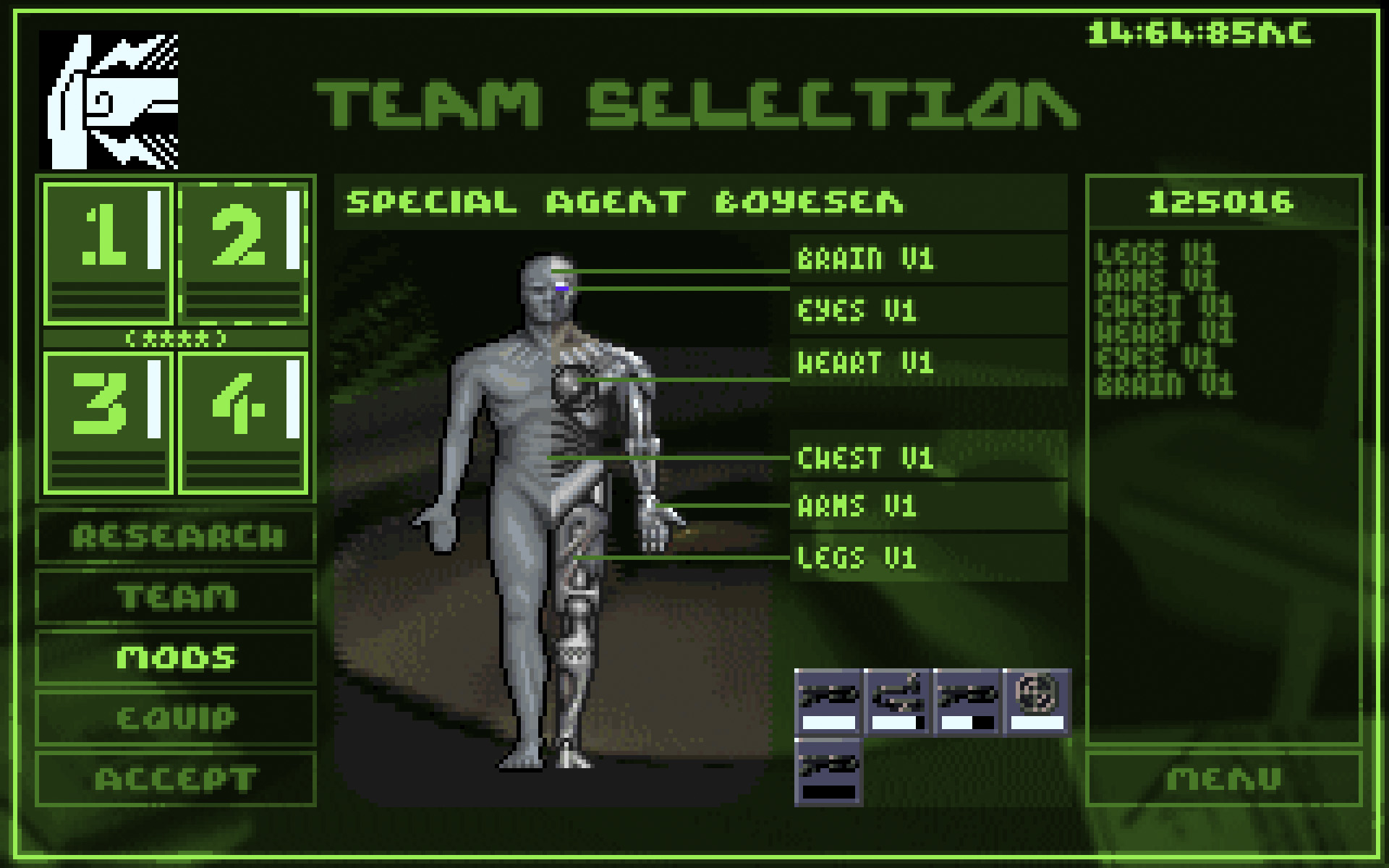
Had a lot more character than these screens iirc. I'm sure most people that liked AoD aren't worried in the slightest about the gameplay itself; Ironically the only bitching left to do is about non cRPG stuff like GFX. So yeah, the menus suck :dealwithit:
 

HeatEXTEND

Prophet
Patron
Joined
Feb 12, 2017
Messages
3,981
Location
Nedderlent
Nostalgia? That screen looks nicely in-character imo. Cyber-y with a touch like the time being displayed top-right giving it a corporate vibe. These tiny little things can do a lot for vibe/flavour.
 
Last edited:

As an Amazon Associate, rpgcodex.net earns from qualifying purchases.
Back
Top Bottom