ProphetSword
Arcane

Try this, then...


This one is a bit better on the saturation level. Still colorful, but more naturalistic.


I'm not an artist, but one thing I've learned from the projects I've worked on -- especially Fallen Gods -- is that the key to really good sprites is to not just move things for the sake of moving, but to focus on the key frames and their logic. Here, I actually think that aside from the axe, you may have failed to move the one part of him that most "wants" to move in that stroke, namely his forward leg. At the same time, the leg you've moved -- his back leg -- seems to move in the wrong direction. Try swinging an overhand stroke while stepping back with your back leg, and I think you'll see it throws you off balance. The back leg is where you'll be driving forward from, perhaps stepping forward with the front leg, but at a minimum shifting weight from the back to the front to contribute to the strength and momentum of the overhand stroke.FYI, I'll be attempting to create some 100X100 fantasy sprites. Not sure if it fits the style you're looking for, but I'll link here when it's done anyway. They'll be open source, so feel free to use them once they're complete, if you like.
Posting animated gif below, but since my animation skills kind of suck at the moment, the rest will only be two frame sprites.
EDIT: Also, this was a test sprite,. so complete ones will be more polished.
Anyway, I might be entirely full of crap, so feel free to disregard all this, but I think it might be useful.
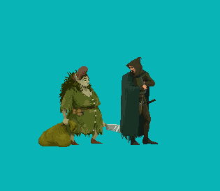
here're the frames from the Sega Golden Axe first miniboss:

in my defense I was experimenting a bit with some of the old SNES JRPG animations, where attacks would only be 2 or 3 frames. So there's a bit sense of "movement", but it's a bit more abstracted