Putting the 'role' back in role-playing games since 2002.
Donate to Codex
Good Old Games
  • Welcome to rpgcodex.net, a site dedicated to discussing computer based role-playing games in a free and open fashion. We're less strict than other forums, but please refer to the rules.

    "This message is awaiting moderator approval": All new users must pass through our moderation queue before they will be able to post normally. Until your account has "passed" your posts will only be visible to yourself (and moderators) until they are approved. Give us a week to get around to approving / deleting / ignoring your mundane opinion on crap before hassling us about it. Once you have passed the moderation period (think of it as a test), you will be able to post normally, just like all the other retards.

This is old and tired, we want a new one.

The current header is...?

  • Perfect!

    Votes: 0 0.0%
  • Good for what it is.

    Votes: 0 0.0%
  • Much better than that shitty bird.

    Votes: 0 0.0%
  • Yeah that shitty bird sucked didn't it?

    Votes: 0 0.0%
  • Thank God that shitty bird is gone. That really sucked. Also it was shitty.

    Votes: 0 0.0%
  • I am very upset about Codex Democracy.

    Votes: 1 100.0%

  • Total voters
    1

Liberal

Barely Literate
Joined
Jan 23, 2009
Messages
6,152
Location
Cornucopia
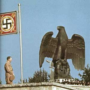
New logo = too big. Also I don't know what the eagle is supposed to be sitting on. Or why it's there in the first place.

Just providing feedback.
 

DarkUnderlord

Professional Throne Sitter
Staff Member
Joined
Jun 18, 2002
Messages
28,357
Yeah, I'm not going to go higher than 120px unless someone wants to try something fancy that brings the rows of buttons up more and combines it all somehow.
 

Shannow

Waster of Time
Joined
Sep 15, 2006
Messages
6,386
Location
Finnegan's Wake
Yeah, the colours are off.
I also preferred the die. Just sayin'.
EDIT:
Basically I like this best. Maybe add (a) row(s) to the buttons? And merge the whole thing into a consistent style.
image1tf.jpg


EDIT2: Oh, and add the clothes.
 

DarkUnderlord

Professional Throne Sitter
Staff Member
Joined
Jun 18, 2002
Messages
28,357
Okay conceptually, how about the larger header in the center with the buttons going around the edge like so:

image17mq.jpg


Replace the white line with buttons.
 

Fens

Ford of the Llies
Joined
Nov 3, 2009
Messages
1,899
Location
pitcairn
make the navigation more important than the site it's supposed to navigate you through ? nah... and please no flash
 

Fens

Ford of the Llies
Joined
Nov 3, 2009
Messages
1,899
Location
pitcairn
birdofhope5.gif


birdofhope6.gif


birdofhope7.gif


bird might be too small to see the props

[edit]added the third one
 

Fucking Quality Poster

Guest
^ Really good.

All of the eagle ones are, actually, pretty good. Excellent work gentlemen!
 
Joined
Jan 28, 2010
Messages
918
Location
:(
Here you go. 120px height, correct size fonts, no "RPG Codex" around the die. It's probably impossible to make it any smaller without making the eagle look like a blob.

Use this one and stop the madness.
 

mondblut

Arcane
Joined
Aug 10, 2005
Messages
22,240
Location
Ingrija
The eagle looks too american/dovelike. With a tophat even, it just screams "teh Fallout irony the bethsoft way". We need a honest to death germanic Iron Eagle, with a d20 for swastika.

The slogan is great. I loved how larpers cringed on the first page, "waaah, don't you dare taking away our 'Role'" :roll: So much for the "but it says so on the banner right here" argument :smug:
 

Hory

Erudite
Joined
Oct 1, 2003
Messages
3,002
Hitler said:
The book burning is great. I loved how liberals cringed on the first day, "waaah, don't you dare taking away our 'Liberty'" :roll: So much for the "but it says so on the book right here" argument :smug:
 

Hory

Erudite
Joined
Oct 1, 2003
Messages
3,002
mondblut said:
Butthurt much? :smug:
No, I have become quite used to the decline.

Anyway, the color of the logo doesn't fit the template, it needs to be bluer or whiter. And on that note, DU should update phpBB and then we could choose from one of the prestigious-looking templates available, to go with the style of the logo. The floppy disk doesn't match with the bird either. Nor with RPGs.
 
Joined
Jan 28, 2010
Messages
918
Location
:(
Fens said:
Droog White Smile said:
Fens said:
isn't that a commercial font family ?
Yes. So what?
just a warning to ppl who might feel inclined to look for downloads ?
OK. Thought it'd be obvious, though.

Anyway, it's one of the fonts used in Arcanum, so it fits just great, I think.
 

As an Amazon Associate, rpgcodex.net earns from qualifying purchases.
Back
Top Bottom