


-
Welcome to rpgcodex.net, a site dedicated to discussing computer based role-playing games in a free and open fashion. We're less strict than other forums, but please refer to the rules.
"This message is awaiting moderator approval": All new users must pass through our moderation queue before they will be able to post normally. Until your account has "passed" your posts will only be visible to yourself (and moderators) until they are approved. Give us a week to get around to approving / deleting / ignoring your mundane opinion on crap before hassling us about it. Once you have passed the moderation period (think of it as a test), you will be able to post normally, just like all the other retards.
You are using an out of date browser. It may not display this or other websites correctly.
You should upgrade or use an alternative browser.
You should upgrade or use an alternative browser.
Game News Age of Decadence June Update
- Thread starter VentilatorOfDoom
- Start date
Kaanyrvhok
Arbiter
- Joined
- May 1, 2008
- Messages
- 1,096
MicoSelva said:This.TalesfromtheCrypt said:This is getting better and better.to the AoD team.
But I really wish we could already play the game and discuss the improvements that will be present in the soon-to-be-released sequel. All this polishing is great and commendable but I highly doubt that it's justified from a business point of view. I don't think any amount of immersion in the gameworld will make AoD achieve mainstream success in current day and age (although I'd really like to be wrong here).
Got to consider Your target audience, Iron Tower, and their expectations. How many more people will buy Your game because of more idle animations for NPCs?FinishRelease the game already!
"Living and Breathing worlds" sell.
Elhoim
Iron Tower Studio

The main idea behind the GUI is that the different parts of it are customizable, so you can take advantage of higher resolution or aspect ratios. You would be able to expand and move many of the panels to your liking. Here is a mockup of the different ways the inventory screen can look depending on your resolution and ratio.


Now, these are just mockups, we are going to improve the style (more post-apoc grittiness is on its way!) and also we are taking into account many of your suggestions (more interesting details, less "floating" interface, etc). Keep them coming!


Now, these are just mockups, we are going to improve the style (more post-apoc grittiness is on its way!) and also we are taking into account many of your suggestions (more interesting details, less "floating" interface, etc). Keep them coming!


Melcar said:I had a nice AoD fund going because I really wanted to buy this (for cereal) but I already spent it on whores. You guys take too long.
You should've kept going with your fund. By the time AoD comes out, you could've used the interest to buy a house.
Seriously though, this is one of the few games I'm looking forward to. With all the retarded childish crap coming out these days, I'm starting to think I need a new hobby.

Don't know how I feel about that frog Elhoim ")
Use IMGUR.
Use IMGUR.
Esquilax
Arcane
- Joined
- Dec 7, 2010
- Messages
- 4,833
I'm going against the grain here, but I rather liked the interface, especially now that you mentioned that it's possible to expand and move panels according to your personal preference. I just don't like having an interface take up a big chunk of the screen like it did in the combat demo and I find this a lot less intrusive. I think folks liked the old interface because it reminded them of Fallout more than anything. If you can relay the same information easily to the player with a minimum amount of clutter, then by all means do that.
However, a few bros are right that the look and feel of the inventory/character screen simply isn't gritty and grimdark enough. Since we are playing a dark, gritty and mature RPG, presumably with lots of gay romance (no gay sex, no sale), we need an appropriately mature interface to handle it. So yeah, a bit more grime would make it look a bit more distinctive and give it a bit more character. As it is, it's certainly functional, which is the most important part, but a bit sterile.
However, a few bros are right that the look and feel of the inventory/character screen simply isn't gritty and grimdark enough. Since we are playing a dark, gritty and mature RPG, presumably with lots of gay romance (no gay sex, no sale), we need an appropriately mature interface to handle it. So yeah, a bit more grime would make it look a bit more distinctive and give it a bit more character. As it is, it's certainly functional, which is the most important part, but a bit sterile.

Just keep rolling those stones, people, it looks better each time 
For this particular case, the time has stopped in my book. When it's done.
For this particular case, the time has stopped in my book. When it's done.
thursdayschild
Educated
- Joined
- Jun 17, 2011
- Messages
- 121
Frog in an ice cube sums up my thoughts on the new interface nicely.
The new interface is fine.
Fuck the drog alts.
Fuck the drog alts.
villain of the story
Arcane
I like the new interface mock-ups, I like the decorative parts in the corners. I've always thought that the previous, "competition winning" interface never worked with the game's colour palette.
Here's an idea: if you made those decorative lines mosaic style with slight irregularities instead of straight uninterrupted lines with perfectly perpendicular geometry, it might look perfect.
Here's an idea: if you made those decorative lines mosaic style with slight irregularities instead of straight uninterrupted lines with perfectly perpendicular geometry, it might look perfect.
obediah
Erudite
- Joined
- Jan 31, 2005
- Messages
- 5,051
torpid said:Looks good, but I thought they were only polishing the game before release. Looks like they keep adding new things, or does this count as polish? Or maybe VD is rewriting everything in a fit of perfectionist rage so Oscar has the time to improve the graphics.
They've been polishing since 2005. Expect AoD to sparkle more than a vampire.
Elhoim
Iron Tower Studio
obediah said:torpid said:Looks good, but I thought they were only polishing the game before release. Looks like they keep adding new things, or does this count as polish? Or maybe VD is rewriting everything in a fit of perfectionist rage so Oscar has the time to improve the graphics.
They've been polishing since 2005. Expect AoD to sparkle more than a vampire.
GarfunkeL
Racism Expert
Well, they changed engines completely once and then redid all the GFX for the game.
Melcar
Arcane
They should do it again.
Elhoim
Iron Tower Studio
That's a good idea...
torpid
Liturgist
How about switching to first-person? It's a single-character game, so an isometric perspective isn't that useful. You can do the switch during VD's next rewrite. See you next year!
sgc_meltdown
Arcane
- Joined
- May 8, 2003
- Messages
- 6,000
looking forward to a magnificent debut at next year's E3
Kaanyrvhok
Arbiter
- Joined
- May 1, 2008
- Messages
- 1,096
sgc_meltdown said:looking forward to a magnificent debut at next year's E3
Dweller... can you do the photoshopers the honor?
Melcar
Arcane
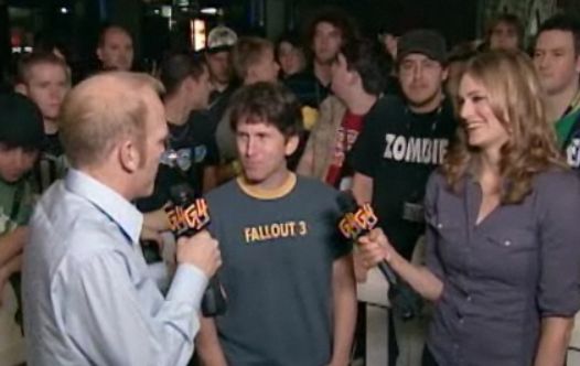
Can´t wait for VD to be interviewed by the G4 monkeys. Will be awesome.
oneself
Arcane

AoD will be released posthumously.
I'm glad that I will outlive AoD design team.
I'm glad that I will outlive AoD design team.
Kaanyrvhok
Arbiter
- Joined
- May 1, 2008
- Messages
- 1,096
Melcar said:Can´t wait for VD to be interviewed by the G4 monkeys. Will be awesome.
Morgan Webb: I read some of your interviews and you have been very critical of the of the triple A Roleplaying ga...
VD: http://www.youtube.com/watch?v=hMtZfW2z9dw
AoD commercial hit.

Achilles
Arcane
- Joined
- Sep 5, 2009
- Messages
- 3,425
Elhoim said:The main idea behind the GUI is that the different parts of it are customizable, so you can take advantage of higher resolution or aspect ratios. You would be able to expand and move many of the panels to your liking. Here is a mockup of the different ways the inventory screen can look depending on your resolution and ratio.
Hey guys, could you maybe use another image host? All I'm seeing is a frozen frog. Thanks!
Elhoim
Iron Tower Studio
Alexandros said:Elhoim said:The main idea behind the GUI is that the different parts of it are customizable, so you can take advantage of higher resolution or aspect ratios. You would be able to expand and move many of the panels to your liking. Here is a mockup of the different ways the inventory screen can look depending on your resolution and ratio.
Hey guys, could you maybe use another image host? All I'm seeing is a frozen frog. Thanks!
Try just clicking on it, despite the frog. They are thumbnails. Or go see them here:
http://www.irontowerstudio.com/forum/in ... l#msg68474


Alexandros said:Hey guys, could you maybe use another image host? All I'm seeing is a frozen frog. Thanks!
Install the Refcontrol plugin. it's hammer on the frogs.

Eh, if I cared, I'd just be disappointed if it's changed again. I'll just wait and accept the final product for what it is.


As an Amazon Associate, rpgcodex.net earns from qualifying purchases.