Putting the 'role' back in role-playing games since 2002.
Donate to Codex
Good Old Games
  • Welcome to rpgcodex.net, a site dedicated to discussing computer based role-playing games in a free and open fashion. We're less strict than other forums, but please refer to the rules.

    "This message is awaiting moderator approval": All new users must pass through our moderation queue before they will be able to post normally. Until your account has "passed" your posts will only be visible to yourself (and moderators) until they are approved. Give us a week to get around to approving / deleting / ignoring your mundane opinion on crap before hassling us about it. Once you have passed the moderation period (think of it as a test), you will be able to post normally, just like all the other retards.

Pillars of Eternity Beta Discussion [GAME RELEASED, GO TO NEW THREAD]

Rake

Arcane
Joined
Oct 11, 2012
Messages
2,969
Bleh. May sound ridicoulous for some, but this is a dealbreaker for me. Soon as the game comes out I'll be trying to do a solid border around the screen classic UI mod. The IWD2 one looked like shit.
Pls do. And come to contact with Bester so he can add it to his IE mod.
:bounce:

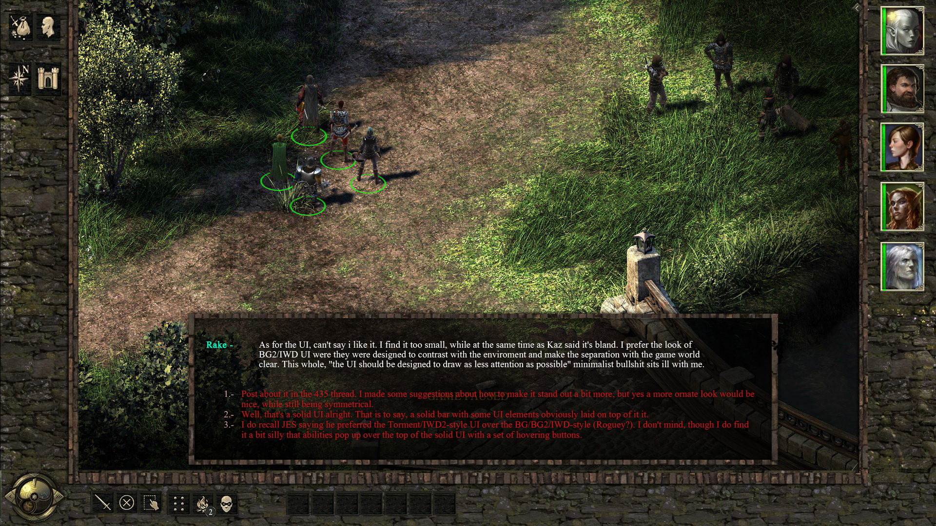
As for the UI, can't say i like it. I find it too small, while at the same time as Kaz said it's bland. I prefer the look of BG2/IWD UI were they were designed to contrast with the enviroment and make the separation with the game world clear.
This whole, "the UI should be designed to draw as less attention as possible" minimalist bullshit sits ill with me.
 

Sensuki

Arcane
Joined
Oct 26, 2012
Messages
9,800
Location
New North Korea
Codex 2014 Serpent in the Staglands Shadorwun: Hong Kong A Beautifully Desolate Campaign
Post about it in the 435 thread. I made some suggestions about how to make it stand out a bit more, but yes a more ornate look would be nice, while still being symmetrical.
 

Athelas

Arcane
Joined
Jun 24, 2013
Messages
4,502
Well, that's a solid UI alright. That is to say, a solid bar with some UI elements obviously laid on top of it it.

Though with the ability to move the combat log to the center, I like the current UI well enough. Ability/spell selection feels quick and snappy, not unlike NWN2's quick cast menu.
 

Surf Solar

cannot into womynz
Joined
Jan 8, 2011
Messages
8,831
This whole, "the UI should be designed to draw as less attention as possible" minimalist bullshit sits ill with me.

:bro:

This. The UI in those games felt like it was "part" of the world. Or like some carefully crafted table you play P&P on. Same as in Fallout. There the UI simply felt like an extension to the gameworld, not an afterthought. It's quite shocking how a company that wants to create spiritual successors to the "feels" of these games doesn't get the simplest things about what made them so magical.
 

Athelas

Arcane
Joined
Jun 24, 2013
Messages
4,502
Uh, Fallout had a bottom bar UI (and a not particularly good UI, at that).

Actually, Black Isle tended to favor the bottom bar UI (Fallout, PST, IWD2 - IWD is the exception but it was obviously using BG1 as a template in a lot of ways); it was Bioware that implemented the 'frame' UI. Looks like you Kickstarted the wrong company for your IE successor. :M
 
Last edited:

Surf Solar

cannot into womynz
Joined
Jan 8, 2011
Messages
8,831
What took them so long to do this anyway? It's not hard.

Jesus christ, just something similar to this that put together in 30 minutes

izlcekm1gad3.png


Ofcourse item placment and size needs to be altered. But what else is so "wrong" about it, can someone enlighten me?
 

Apexeon

Arcane
Joined
Nov 10, 2012
Messages
864
What took them so long to do this anyway? It's not hard.

Jesus christ, just something similar to this that put together in 30 minutes

izlcekm1gad3.png


Ofcourse item placment and size needs to be altered. But what else is so "wrong" about it, can someone enlighten me?

Its called lazy developers who disrespected the game (BG1&2) they milked 4+ million to make.
Made big claims then under delivered.

Still this is not shovelware like wastelands 2.
 

Arkeus

Arcane
Joined
Oct 9, 2012
Messages
1,406
Its called lazy developers who disrespected the game (BG1&2) they milked 4+ million to make.
Made big claims then under delivered.

Still this is not shovelware like wastelands 2.
Mmmh, and If they did that kind of UI, would you say they disrepect PS:T and IWD2?

I guess the only choice is to give people the choice in like 4 different kind of UI, right? -_-
 

Surf Solar

cannot into womynz
Joined
Jan 8, 2011
Messages
8,831
Its called lazy developers who disrespected the game (BG1&2) they milked 4+ million to make.
Made big claims then under delivered.

Still this is not shovelware like wastelands 2.
Mmmh, and If they did that kind of UI, would you say they disrepect PS:T and IWD2?

I guess the only choice is to give people the choice in like 4 different kind of UI, right? -_-

Given the matter how laughably easy and fast this can be created, it is not a far fetched suggestion to put this in. In the end, as usual it comes all down to the modders as Sensuki already showedl
 

veevoir

Klytus, I'm bored
Patron
Joined
Jan 15, 2015
Messages
1,797
Location
Riding the train, high on cocaine
Shadorwun: Hong Kong BattleTech
What took them so long to do this anyway? It's not hard.

Jesus christ, just something similar to this that put together in 30 minutes

izlcekm1gad3.png

Ofcourse item placment and size needs to be altered. But what else is so "wrong" about it, can someone enlighten me?

This is awesome :bro:.

I'm choosing option 1 - Have you tried dumping it somewhere on Obs forums? Maybe, just maybe, Kaz will see the light and improve upon current version.
I would move the left side buttons to the bottom and dump the left bar alltogether. Nostalgia is one thing, reducing game screen for no other purpose than 4 small buttons is another.

But for 30 mins work it is great, you're hired.
 

Apexeon

Arcane
Joined
Nov 10, 2012
Messages
864
Its called lazy developers who disrespected the game (BG1&2) they milked 4+ million to make.
Made big claims then under delivered.

Still this is not shovelware like wastelands 2.
Mmmh, and If they did that kind of UI, would you say they disrepect PS:T and IWD2?

I guess the only choice is to give people the choice in like 4 different kind of UI, right? -_-

Why not add in the options to change your UI to get a IE feel.
Maybe that should of been a stretch goal instead of all the other content bloat.
 

Copper

Savant
Joined
Jan 28, 2014
Messages
469
I'm being mean, and nobody cares, but what the hell is up with the bridges in this game turning to shit as soon as they get halfway to shore? The cobbled area should extend past the bridge into the bank, not stop 1 foot away and look like it was attacked by a French mob. :negative:
 

Apexeon

Arcane
Joined
Nov 10, 2012
Messages
864
I'm being mean, and nobody cares, but what the hell is up with the bridges in this game turning to shit as soon as they get halfway to shore? The cobbled area should extend past the bridge into the bank, not stop 1 foot away and look like it was attacked by a French mob. :negative:

Its called Adra or some BS. Once the bridge touches the shore they use pee from magical adra moo cows to harden up the banks so it doesn't turn to mud. Also the adra cow pee makes stones float in the air.

Or maybe the designers and 3 producers can't spot dumb mistakes before they hit the render scene button.
I call this below "polished stupidity".

Pillars-of-Eternity-630x354.jpg
 

Roguey

Codex Staff
Staff Member
Sawyerite
Joined
May 29, 2010
Messages
35,811
Putting everything on the bottom is more functional, deal with it sideliners.

Dexterity affects action speed now.

Well, that took a while.
 

Copper

Savant
Joined
Jan 28, 2014
Messages
469
I'm being mean, and nobody cares, but what the hell is up with the bridges in this game turning to shit as soon as they get halfway to shore? The cobbled area should extend past the bridge into the bank, not stop 1 foot away and look like it was attacked by a French mob. :negative:

Its called Adra or some BS. Once the bridge touches the shore they use pee from magical adra moo cows to harden up the banks so it doesn't turn to mud. Also the adra cow pee makes stones float in the air.

Or maybe the designers and 3 producers can't spot dumb mistakes before they hit the render scene button.
I call this below "polished stupidity".

Pillars-of-Eternity-630x354.jpg

Adra's fine, although I question the point of aiming for 'impossible fantasy architecture that's so understated it just looks like a lazy mistake'. There's no way to cut it - that's pretty dumb, as sympathetic as I am to 'understated fantasy visuals' - you'd need to be tapping one of the top 24 or so concept artists in the field to pull that off well.

The issue with the bridge, etc., is that the thought process was something like: 'Let's put down some stuff in a different style to show the history of the settlement, bridges are good strategic resources, so that can be one of the old structures - but it should be obvious it doesn't fit with the rest of the settlement, so let's have a clear break between a cobbled bridge and the dirt road - in fact, let's show that there were stones there, but now most of them are missing and all broken up.'

So you end up with stones that would crack a wagon wheel right in the middle of the road, an area of earth that would obviously end up full of mud and potholes during snow melt or winter rains, etc. - it's just conceptually lazy, with bugger all thought into how people would use the space as a living environment.
 

Hormalakh

Magister
Joined
Nov 27, 2012
Messages
1,503
yaeh the solid ui is horrible. Sorry Kaz, but you either seem to have given this 0 time or its a C priority or something.

I'm starting to hate the "mods will fix it" concept. If mods are supposed to fix everything, then what's the point of giving money to devs?

I'll be happy with a L-shaped UI. I hope it's possible. Seems like I'll have to make my own....
 

Athelas

Arcane
Joined
Jun 24, 2013
Messages
4,502
Well, you did pay to beta-test the game for them, improving the game through mods on your own time and dime is the logical next step.
 

Sensuki

Arcane
Joined
Oct 26, 2012
Messages
9,800
Location
New North Korea
Codex 2014 Serpent in the Staglands Shadorwun: Hong Kong A Beautifully Desolate Campaign
I think the purpose of an 'unfinished' Solid UI is to gather feedback. So if you have some - go over to the Obs boards and post it.

Kaz admitted that it looks way too plain (and it does), but what other functionality were you expecting ?
 

Zed

Codex Staff
Patron
Staff Member
Joined
Oct 21, 2002
Messages
17,068
Codex USB, 2014
Played some beta today.

Glad to see they've finally implemented a solid UI . Too bad the layout still is shit (put the fucking text window in the middle) and that the solid UI does nothing but limit the viewport – no decorations or anything like that what-so-ever. I'll still play with solid UI on because I don't like my game interfaces to look like Adobe Photoshop, but this could have been done better. I know this because I could have done it better myself.

Some other stuff I can't wrap my head around:
(For the 1000nd time: ) Why use icons for area transitions? Really should only be a small annoyance, but it's everywhere in the game.
Why is the cursor - especially the movement cursor - so god damn small?
Why can't I stealth guys individually?
Why is there no "all" tab for the stash? (why is there even a stash lol)
Why are all the modal windows so fucking small? And icons so small?
Why does it take 3 seconds before a body becomes lootable? And why the fugly MMORPG loot glow?
Why can't I use TAB+mouseover to make name tags/tooltips on enemies appear in combat?
Why does the text box only say "Journal updated?" Turning off the quest pop-ups (of course), I don't know what's been updated.

In short: why such poor UX choices (everything so small and so many intrusive elements) and why break the conventions set by IE when IE does it better?

More complaints!:
Backgrounds are still too sharp and contrasted; combat is still too chaotic and pause-demanding; character development is a meta-gamey mess (I thought they wanted to avoid that?) – especially the attributes; music and sound is truly unimpressive; classes and races are completely void of identity and godlikes look fucking stupid as hell; character models lack variance but I guess everybody including villagers go to the gym regularly; I guess someone killed all the children in the game already because I don't see any; spell effects are just glowing blobs or glowy whatever – no chunky "fuck you"-spells, not even fizzling or sparkly spells (even fireball is just a glowy mess).

Most talents and character advancement options seem to only modify the extremely boring stats this game have like "interrupt" and "accuracy" of which you have no idea what a "good increase" is (will +5 make a difference? +10?). The game requires constant pausing, but not for sweet spells and fun stuff, only to modify stats i.e. in-combat buffing (or debuffing if applied to enemies). Boring as all-fuck.

Shit shit shit shit. SHIT! Shit. SHiiiiiiTIIITTiTIt.

I'll play the retail but it's probably gonna be shit too.
 

Athelas

Arcane
Joined
Jun 24, 2013
Messages
4,502
The irony of people complaining that character development is too meta-gamey and complicated. :D
 

Infinitron

I post news
Staff Member
Joined
Jan 28, 2011
Messages
97,463
Codex Year of the Donut Serpent in the Staglands Dead State Divinity: Original Sin Project: Eternity Torment: Tides of Numenera Wasteland 2 Shadorwun: Hong Kong Divinity: Original Sin 2 A Beautifully Desolate Campaign Pillars of Eternity 2: Deadfire Pathfinder: Kingmaker Pathfinder: Wrath I'm very into cock and ball torture I helped put crap in Monomyth
It's just gamey, not meta-gamey.
 
Last edited:

As an Amazon Associate, rpgcodex.net earns from qualifying purchases.
Back
Top Bottom