Putting the 'role' back in role-playing games since 2002.
Donate to Codex
Good Old Games
  • Welcome to rpgcodex.net, a site dedicated to discussing computer based role-playing games in a free and open fashion. We're less strict than other forums, but please refer to the rules.

    "This message is awaiting moderator approval": All new users must pass through our moderation queue before they will be able to post normally. Until your account has "passed" your posts will only be visible to yourself (and moderators) until they are approved. Give us a week to get around to approving / deleting / ignoring your mundane opinion on crap before hassling us about it. Once you have passed the moderation period (think of it as a test), you will be able to post normally, just like all the other retards.

Innovation in RPG genre

Should RPG designers innovate in their games?


  • Total voters
    50

Kliwer

Savant
Joined
Oct 19, 2018
Messages
216
what about wrist computer that looks like wrist computer?

Yes. It looks cool. Such inventions are too rarely used today.

I am also reminded of Ultima 9 with its "minimalist" interface; each interface element (bag, map) was sort of an "in-game" object, which I liked very much.

961c0d993612667ba186359b2d5498b84c06504d.jpg
 

lukaszek

the determinator
Patron
Joined
Jan 15, 2015
Messages
12,670
Yes. It looks cool.
I disagree. Aesthetics aside line must be drawn between aesthetics and bloating screen, wasting screen from usability point of view. Not sure where to draw it but bethesda clearly crossed it
 

Gastrick

Cipher
Joined
Aug 1, 2020
Messages
1,709
Interesting article and commentary from UI masters, https://socket3.wordpress.com/2018/02/03/designing-windows-95s-user-interface/
https://twitter.com/tuomassalo/status/978717292023500805
It lays out what the non-aesthetic side of UI design is aiming at.
The main technical reason that interfaces are going to continue to be flat and bland in RPGs compared to the old days is that they are now high resolution textures mapped on 3D polygons that need to scale.


They are no longer fixed size pixel art like the old interfaces. There are pros and cons with both. The old interfaces with pixel art can't scale up easily to different monitor resolutions without really breaking the pixel aspect ratio. This is why all new games interfaces will basically behave like flat vector art that can scale up/down easier. You could potentially do a modern game interface with pixel art and map it on textures, but it would be a total pain in the ass and you couldn't freely scale between monitor resolutions without breaking the aspect ratios of the pixels. You can't really display a fraction of a pixel clearly when it comes to pixel art and you can't just anti-alias the hell out if it without getting a fuzzy look. This is why pixel art interfaces look so nice and crispy on the old games that we love.

You are always giving up something when you adopt the "new" way of things. This is just one of those areas for RPGs.
For movies, they only have three resolutions that they release in, 720p, 1080p and 4k. If you can watch a 1080p digital movie on many different computers then a 1080p pixel game should work as well. It might just need minor black bars like films.
 

fantadomat

Arcane
Edgy Vatnik Wumao
Joined
Jun 2, 2017
Messages
37,163
Location
Bulgaria
Have really shit inventory system,a bag within a bag within a bag lol. It is retarded. I have nylon bag that i keep other nylon bags in,by this logic i should be able to put nearly every item in me house in that bag lol.
 

gurugeorge

Arcane
Patron
Joined
Aug 3, 2019
Messages
7,496
Location
London, UK
Strap Yourselves In
YOu will note that F3/FNV pipboy screen waste acreage at 40% or more. Look cool is one thing, look wasteful is another.

And after looking at it 100 times the cool just get... colder.

What does that mean "wasteful?" - what better use could be made of the screen room in an interface, so long as everything needed that's functional is present and correct, what the hell is the problem with having the rest of the screen space devoted to aesthetics and immersion? That's putting a mere abstraction about efficient use over something that enhances the game's psychological impact, which seems daft to me.

However, if by that you mean, for example, having a useful button too tiny and fiddly to be actually usable because you've used so much space for mere aesthetics, then on that I will agree, but the pipboy has never seemed to me to have that problem (whereas the Arcanum interface did, a bit - for example, with the miniscule +/- buttons for the attributes).
 

JarlFrank

I like Thief THIS much
Patron
Joined
Jan 4, 2007
Messages
33,134
Location
KA.DINGIR.RA.KI
Steve gets a Kidney but I don't even get a tag.
The main technical reason that interfaces are going to continue to be flat and bland in RPGs compared to the old days is that they are now high resolution textures mapped on 3D polygons that need to scale.

They are no longer fixed size pixel art like the old interfaces. There are pros and cons with both. The old interfaces with pixel art can't scale up easily to different monitor resolutions without really breaking the pixel aspect ratio. This is why all new games interfaces will basically behave like flat vector art that can scale up/down easier. You could potentially do a modern game interface with pixel art and map it on textures, but it would be a total pain in the ass and you couldn't freely scale between monitor resolutions without breaking the aspect ratios of the pixels. You can't really display a fraction of a pixel clearly when it comes to pixel art and you can't just anti-alias the hell out if it without getting a fuzzy look. This is why pixel art interfaces look so nice and crispy on the old games that we love.

You are always giving up something when you adopt the "new" way of things. This is just one of those areas for RPGs.
Where ?
o0xO7T3.png


A good pixel art is good pixel art lol. It could be done,but modern devs lack the skillz and are too lazy to do it.

Yeah this interface is really easy to scale to different aspect ratios, as this screenshot perfectly illustrates. The background is a leathery-looking texture in red and brown with golden borders. That can be stretched to any resolution since it's a tiling texture. It wasn't made for a widescreen resolution, but look at how easily it is to scale: just stretch the window horizontally a bit and arrange the resources at the left side. You end up with some empty pieces of red-leather-texture border, but that's fine. It doesn't look distorted at all.

This is proof that you can do beautiful stylized interfaces even when you design for various resolutions.

EDIT:

And even if you don't wanna do stylized borders around your play window, let's look at your average modern interface. Let's take Solasta as an example, a D&D RPG that should evoke a similar feel to the BG games but its interface is incredibly minimal and utilitarian.

ss_d018c913eefa98f96328fe8da83f595e3e684f38.1920x1080.jpg


What do we see here?
A turn order at the top. A character and skills selection at the bottom. A compass at the bottom right and an event window at the top right. Each of these interface elements stands on its own, they're not connected with a border or anything. Theoretically you can freely reposition them at other places of the screen without issue.

This would be incredibly easy to beautify just by adding decoration to each individual element. Just make it look less bland, less like a sterile OS interface. Add some frills around the borders of each individual element. Give it a wooden or metallic or marble texture rather than flat color. It's not rocket science.
 
Last edited:

Jackpot

Learned
Joined
Dec 15, 2019
Messages
224
Talking genuinely though, the biggest problem I have with old interfaces is that they overuse the colors brown and grey.
Look at most of the screenshots posted here: brown, grey, brown with grey, brown with dark brown.
I get that it props up the fantasy aesthetic, but I get so fucking tired of looking at brown and grey in these games, especially when most of the environments are overwhelmingly brown or grey as well.
 
Joined
Jan 14, 2018
Messages
50,754
Codex Year of the Donut
I have a feeling that some people don't actually care if the UI is functional at all(the entire point of a UI) but want to jack off to the art.
 

lukaszek

the determinator
Patron
Joined
Jan 15, 2015
Messages
12,670

Jackpot

Learned
Joined
Dec 15, 2019
Messages
224
It's brown and grey because you are staring at diaries, backpacks etc.

I understand logically why the interfaces are brown and grey, but that doesn't mean that I don't still get sick of the colors.
I dunno, can't I just get a wizard to turn my backpack green, or my diary blue?
 

JarlFrank

I like Thief THIS much
Patron
Joined
Jan 4, 2007
Messages
33,134
Location
KA.DINGIR.RA.KI
Steve gets a Kidney but I don't even get a tag.
solastafancy.png


5 minutes in photoshop makes this. Yeah, it looks shit - but you get the idea.

A good graphic designer could make something really beautiful and atmospheric. But what we get is sterile interface elements that look like they belong to a mobile phone's operating system.
 

Mark Richard

Arcane
Joined
Mar 14, 2016
Messages
1,192
Bland. Boring. Soulless. Interchangable. Nothing in these interfaces says "middle ages!" or "fantasy!" or "post-apocalypse!"
In the past I've called it the social media aesthetic. These flavourless focus-tested interfaces could've been built by a software algorithm or an intern who's overly proud of their doctorate in web design. Modern interfaces provide information without texture, almost as if they're viewed in current development circles as a necessary evil rather than an additional opportunity to reinforce the game's setting.

And to address those lambasting the old and favouring the new - there is a middle ground between dealing with a clunky mess and having your brain think its just logged onto Facebook.
 

gurugeorge

Arcane
Patron
Joined
Aug 3, 2019
Messages
7,496
Location
London, UK
Strap Yourselves In
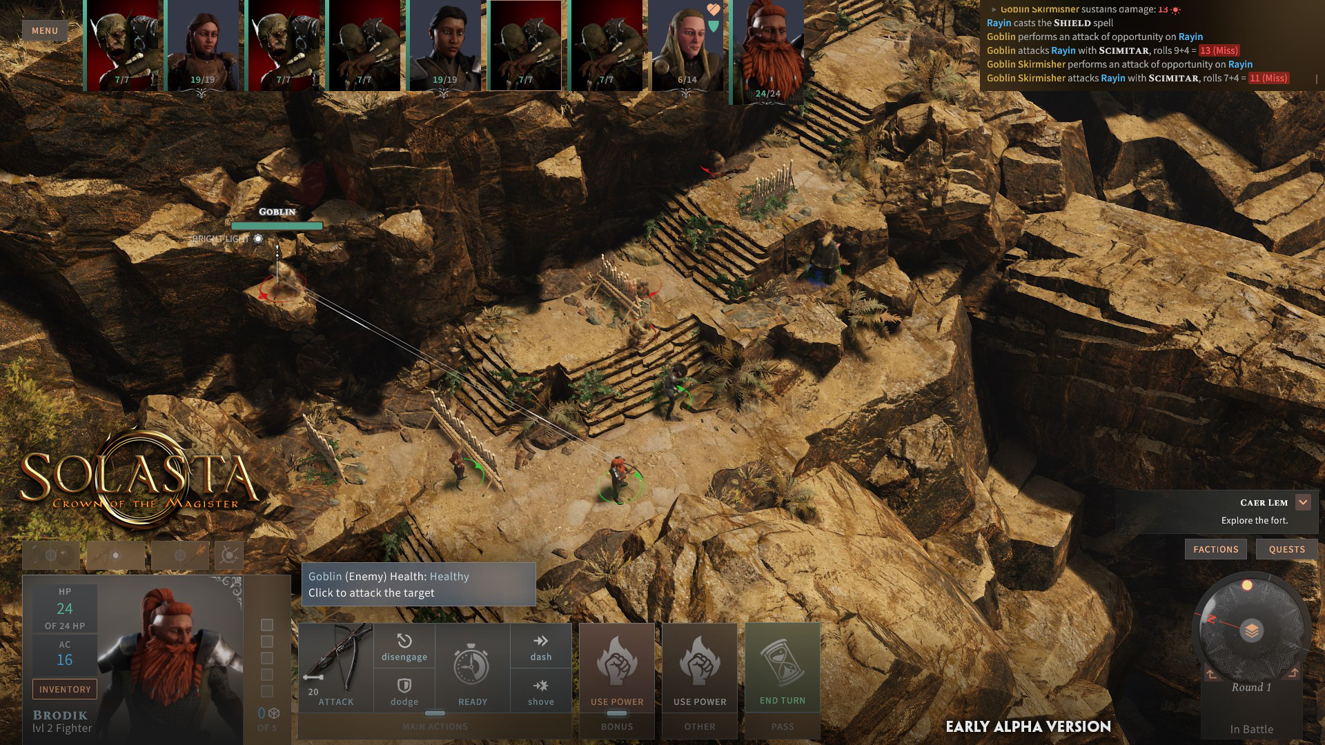
Solasta looks like Windows 10 lmao.

Yeah that's it. I think that's what us interface complainers are really talking about at the end of the day. Imagine any game with just an OS interface - you'd have all the functionality you need, but how dull would it feel emotionally? Very dull - because your association with the OS interface is more with utilitarian stuff, for the most part, whereas the game is supposed to entrance you and take you into another world. It just can't do that job with an interface that's too much like a boring OS interface.

Solasta is an excellent example to illustrate the point, as it's in the middle ground.

It's clear that a lot of thought has gone into it in terms of functionality, and it really is very functional in that sense (which helps make the gameplay flow really slick and trancey); but aesthetically, while I wouldn't go so far as to say that its at the "just a bland OS interface" extreme, it does lack that extra bit of je ne sais quoi aesthetically.

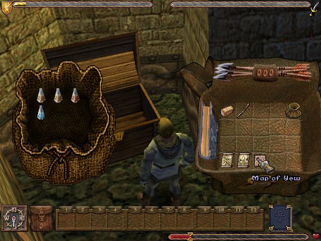
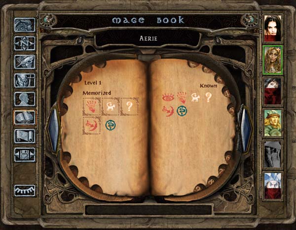
Funnily enough, you can tell that a little bit of effort has been made, in terms of the tiny bit of florid knotwork in the top right corner of the character portrait. Plus also the item icons are beautifully done and of just the right character (they remind me a lot of Warframe icons in terms of "solid but painterly" feel - though with WF ofc the theme is s-f). So I think the devs are aware of the problem.

But with just a little bit more effort at prettification, as JarlFrank has pointed out, it could be stellar and a classic.

(I suspect the Solasta devs want to leave that sort of thing to modders though - which goes to my first point: if nothing else is moddable about a game, the UI at the very least should be.)
 

V_K

Arcane
Joined
Nov 3, 2013
Messages
7,714
Location
at a Nowhere near you
5 minutes in photoshop makes this.
It has already been mentioned in this thread though - the original UI is clearly in vector, so it scales very easily. Even the character portrait is a static render of a 3D model, so it's not rasterized. Adding textured borders would increase the workload dramatically - either figuring out how to do them in vector too (which would probably affect performance), or making a shitload of static images for every resolution possible. It's not a 5 minutes job.
 

gurugeorge

Arcane
Patron
Joined
Aug 3, 2019
Messages
7,496
Location
London, UK
Strap Yourselves In
You know what I miss the most?

Good old interface design.


I have always liked interface elements, which refer in style to function. For example, spell books that look like ... books.

BG2-FindFamiliar-big.jpg


111479-might-and-magic-vi-the-mandate-of-heaven-windows-screenshot.jpg
What game is the second screenshot from and why is there a ginger Natalie Portman on the right?

Might and Magic VI. And who knows why developers thought it was cool to base character portraits on photographs at one time? It's a weird aberration that didn't last very long.
 

Butter

Arcane
Patron
Joined
Oct 1, 2018
Messages
7,657
The Pillars of Eternity portraits were based on photographs and look great. The MM3-5 portraits were just cartoons and they look great. MM post-Xeen was just NWC fucking up repeatedly.
 

gurugeorge

Arcane
Patron
Joined
Aug 3, 2019
Messages
7,496
Location
London, UK
Strap Yourselves In
The Pillars of Eternity portraits were based on photographs and look great. The MM3-5 portraits were just cartoons and they look great. MM post-Xeen was just NWC fucking up repeatedly.

Well sure, it's fine if an artist uses a photograph for reference and makes the portrait look realistic, but those abominations from the 90s, they seem to be just photos touched up a bit. Yeesh.

The thing is all the characters in M&M VI look really dodgy - it's like they grabbed the wino who hangs around at the corner of the street, took him into the studio and gave him a fiver so they could take his picture, etc., etc. :)
 

As an Amazon Associate, rpgcodex.net earns from qualifying purchases.
Back
Top Bottom