


-
Welcome to rpgcodex.net, a site dedicated to discussing computer based role-playing games in a free and open fashion. We're less strict than other forums, but please refer to the rules.
"This message is awaiting moderator approval": All new users must pass through our moderation queue before they will be able to post normally. Until your account has "passed" your posts will only be visible to yourself (and moderators) until they are approved. Give us a week to get around to approving / deleting / ignoring your mundane opinion on crap before hassling us about it. Once you have passed the moderation period (think of it as a test), you will be able to post normally, just like all the other retards.
You are using an out of date browser. It may not display this or other websites correctly.
You should upgrade or use an alternative browser.
You should upgrade or use an alternative browser.
Atlus Shin Megami Tensei V - It's been hurting my OCD.
- Thread starter Abu Antar
- Start date
Assisted Living Godzilla
Prophet
- Joined
- Nov 23, 2017
- Messages
- 4,115
Whether they reused the UI or not is irrelvant because both UIs are abominations. Take up >40% of the fucking screen space for no reason. Why can't both party members and commands just be on the bottom of the screen? Why try to reinvent the wheel? Or if you're gonna try to copy something, at least copy Persona 5's battle UI concept since that was pretty good.
I don't really see any problem with it. They're basically using the screen space like a 4:3 tv with the placement of your character and enemies on the screen, with where the black bars would be having your party information and your combat options. For the most part I like this framing they're using; it's a very clean, uncluttered, simple to read look. The only time it looks like it really crosses over into the space the characters are in (like that image in the tweet) is when you're choosing a skill or selecting what to say when talking to an enemy, otherwise that stuff is tighter to the left side of the screen or gone.
It does make me wonder if you can play it with the touchscreen in handheld mode.

- Joined
- Mar 28, 2014
- Messages
- 4,198


I also think the UI is fine. It used to take literally half the screen in the SNES and DS/3DS era (the entire bottom screen). It's not an action game/FPS where you need to see as much of the game area as possible to be able to play the game properly. The only relevant information that isn't in the UI is what enemies you're facing and they are all perfectly visible.
Nifft Batuff
Prophet
- Joined
- Nov 14, 2018
- Messages
- 3,202
Don't mind me, but this looks like decline even when compared to Persona 3-5 standards. I think I will rather play another run on Nocturne (PS2 version) and SMTIV+A, and also the English translated SMT1-2 on the SNES.
What kind of rationalization is this? "Screens are bigger now so I don't mind if they waste half the screenspace on clutter so I have exactly the same uncluttered screenspace as I did 20 years ago". What the fuck is wrong with you?Whether they reused the UI or not is irrelvant because both UIs are abominations. Take up >40% of the fucking screen space for no reason. Why can't both party members and commands just be on the bottom of the screen? Why try to reinvent the wheel? Or if you're gonna try to copy something, at least copy Persona 5's battle UI concept since that was pretty good.
I don't really see any problem with it. They're basically using the screen space like a 4:3 tv with the placement of your character and enemies on the screen, with where the black bars would be having your party information and your combat options. For the most part I like this framing they're using; it's a very clean, uncluttered, simple to read look. The only time it looks like it really crosses over into the space the characters are in (like that image in the tweet) is when you're choosing a skill or selecting what to say when talking to an enemy, otherwise that stuff is tighter to the left side of the screen or gone.
It does make me wonder if you can play it with the touchscreen in handheld mode.
oddech_wymarlych_swiatow
Arcane
- Joined
- Apr 5, 2013
- Messages
- 2,434
Don't mind me, but this looks like decline even when compared to Persona 3-5 standards. .
For now we can compaint only on minor things like UI, framedrops (Yuzu/Ryujinx will solve that problem) etc. but I'm sure it has potential to reach TOP5 ov Megaten, trust Atlus.
Nifft Batuff
Prophet
- Joined
- Nov 14, 2018
- Messages
- 3,202
Maybe. I am just a bit depressed. It will pass.Don't mind me, but this looks like decline even when compared to Persona 3-5 standards. .
For now we can compaint only on minor things like UI, framedrops (Yuzu/Ryujinx will solve that problem) etc. but I'm sure it has potential to reach TOP5 ov Megaten, trust Atlus.
- Joined
- Mar 28, 2014
- Messages
- 4,198
Surprised nobody posted it.
Atlus released Jack Frost highlight video
https://www.gematsu.com/2021/06/shin-megami-tensei-v-daily-demon-vol-001-jack-frost-video
Important stuff at 0:30 seconds, Jack uses his unique skill, which summons a bunch of Jacks made of ice and drops them on the enemy demon.
Atlus released Jack Frost highlight video
https://www.gematsu.com/2021/06/shin-megami-tensei-v-daily-demon-vol-001-jack-frost-video
Important stuff at 0:30 seconds, Jack uses his unique skill, which summons a bunch of Jacks made of ice and drops them on the enemy demon.
Assisted Living Godzilla
Prophet
- Joined
- Nov 23, 2017
- Messages
- 4,115
What kind of rationalization is this? "Screens are bigger now so I don't mind if they waste half the screenspace on clutter so I have exactly the same uncluttered screenspace as I did 20 years ago". What the fuck is wrong with you?Whether they reused the UI or not is irrelvant because both UIs are abominations. Take up >40% of the fucking screen space for no reason. Why can't both party members and commands just be on the bottom of the screen? Why try to reinvent the wheel? Or if you're gonna try to copy something, at least copy Persona 5's battle UI concept since that was pretty good.
I don't really see any problem with it. They're basically using the screen space like a 4:3 tv with the placement of your character and enemies on the screen, with where the black bars would be having your party information and your combat options. For the most part I like this framing they're using; it's a very clean, uncluttered, simple to read look. The only time it looks like it really crosses over into the space the characters are in (like that image in the tweet) is when you're choosing a skill or selecting what to say when talking to an enemy, otherwise that stuff is tighter to the left side of the screen or gone.
It does make me wonder if you can play it with the touchscreen in handheld mode.
It's not cluttered. Your character and the enemies on screen are all clearly visible and framed in the center of the screen...which is the majority of the screen. Info like attacks and party lineup are on the sides. You look at SMT3 (where the text information is on the bottom of the screen) and half of your character is covered up by the stuff this game is putting in the side of the screen, the information isn't as easy to read at a glance, and the framing leaves lots of empty space on the sides sometimes.
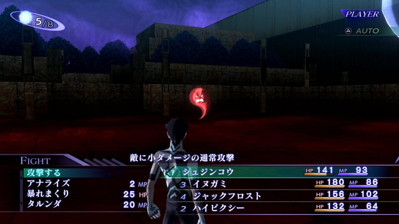

Now the stuff on the side of the screen probably doesn't need to be as big, the party lineup could line up with that MAGATSUHI meter above it, but what they're doing with the framing of it is good.
Last edited:
Dishonoredbr
Liturgist
- Joined
- Jun 13, 2019
- Messages
- 2,109
A Change to Pass turn system , instead giving you half a turn then taking that 1/2 if you pass again , in SMTV you gain 1/2 turn on every press turn icon.
Yeah you're right there's nothing wrong here.What kind of rationalization is this? "Screens are bigger now so I don't mind if they waste half the screenspace on clutter so I have exactly the same uncluttered screenspace as I did 20 years ago". What the fuck is wrong with you?Whether they reused the UI or not is irrelvant because both UIs are abominations. Take up >40% of the fucking screen space for no reason. Why can't both party members and commands just be on the bottom of the screen? Why try to reinvent the wheel? Or if you're gonna try to copy something, at least copy Persona 5's battle UI concept since that was pretty good.
I don't really see any problem with it. They're basically using the screen space like a 4:3 tv with the placement of your character and enemies on the screen, with where the black bars would be having your party information and your combat options. For the most part I like this framing they're using; it's a very clean, uncluttered, simple to read look. The only time it looks like it really crosses over into the space the characters are in (like that image in the tweet) is when you're choosing a skill or selecting what to say when talking to an enemy, otherwise that stuff is tighter to the left side of the screen or gone.
It does make me wonder if you can play it with the touchscreen in handheld mode.
It's not cluttered. Your character and the enemies on screen are all clearly visible and framed in the center of the screen...which is the majority of the screen. Info like attacks and party lineup are on the sides. You look at SMT3 (where the text information is on the bottom of the screen) and half of your character is covered up by the stuff this game is putting in the side of the screen, the information isn't as easy to read at a glance, and the framing leaves lots of empty space on the sides sometimes.
Now the stuff on the side of the screen probably doesn't need to be as big, the party lineup could line up with that MAGATSUHI meter above it, but what they're doing is the framing of it is good.

Nifft Batuff
Prophet
- Joined
- Nov 14, 2018
- Messages
- 3,202
The UI for Nocturne was developed for 4/3 screens on the PS2, where it makes sense, and then forcibly stretched for wide screens in the remake. For wide screens it makes more sense the disposition of the UI elements of smtv, if used correctly.
Assisted Living Godzilla
Prophet
- Joined
- Nov 23, 2017
- Messages
- 4,115
Yeah you're right there's nothing wrong here.What kind of rationalization is this? "Screens are bigger now so I don't mind if they waste half the screenspace on clutter so I have exactly the same uncluttered screenspace as I did 20 years ago". What the fuck is wrong with you?Whether they reused the UI or not is irrelvant because both UIs are abominations. Take up >40% of the fucking screen space for no reason. Why can't both party members and commands just be on the bottom of the screen? Why try to reinvent the wheel? Or if you're gonna try to copy something, at least copy Persona 5's battle UI concept since that was pretty good.
I don't really see any problem with it. They're basically using the screen space like a 4:3 tv with the placement of your character and enemies on the screen, with where the black bars would be having your party information and your combat options. For the most part I like this framing they're using; it's a very clean, uncluttered, simple to read look. The only time it looks like it really crosses over into the space the characters are in (like that image in the tweet) is when you're choosing a skill or selecting what to say when talking to an enemy, otherwise that stuff is tighter to the left side of the screen or gone.
It does make me wonder if you can play it with the touchscreen in handheld mode.
It's not cluttered. Your character and the enemies on screen are all clearly visible and framed in the center of the screen...which is the majority of the screen. Info like attacks and party lineup are on the sides. You look at SMT3 (where the text information is on the bottom of the screen) and half of your character is covered up by the stuff this game is putting in the side of the screen, the information isn't as easy to read at a glance, and the framing leaves lots of empty space on the sides sometimes.
Now the stuff on the side of the screen probably doesn't need to be as big, the party lineup could line up with that MAGATSUHI meter above it, but what they're doing is the framing of it is good.
I know you think you're making your point, but you're only making mine. You cut the player character completely out of the picture other than his head, and there's a ton of unused space around the enemy. On the other hand, in this game, you can clearly see your character, and you can see the enemies.
Last edited:
There's more uncluttered screen space in Nocturne than there is in SMTV, that was the point of the image. The UI elements occupy symetrical spaces and are well organized, something not seen in SMTV. You can see the entire enemy lineup no matter what in Nocturne, which is not true for SMTV, where enemies are hidden behind the UI. The party being partially obscured by the UI is not relevant because the UI itself covers this by listing every party member, and the combat camera shows them anyway. SMTV also loses out here, with the camera stepping on the UI's role for no reason while not providing a proper unobscured view of enemies.Yeah you're right there's nothing wrong here.What kind of rationalization is this? "Screens are bigger now so I don't mind if they waste half the screenspace on clutter so I have exactly the same uncluttered screenspace as I did 20 years ago". What the fuck is wrong with you?Whether they reused the UI or not is irrelvant because both UIs are abominations. Take up >40% of the fucking screen space for no reason. Why can't both party members and commands just be on the bottom of the screen? Why try to reinvent the wheel? Or if you're gonna try to copy something, at least copy Persona 5's battle UI concept since that was pretty good.
I don't really see any problem with it. They're basically using the screen space like a 4:3 tv with the placement of your character and enemies on the screen, with where the black bars would be having your party information and your combat options. For the most part I like this framing they're using; it's a very clean, uncluttered, simple to read look. The only time it looks like it really crosses over into the space the characters are in (like that image in the tweet) is when you're choosing a skill or selecting what to say when talking to an enemy, otherwise that stuff is tighter to the left side of the screen or gone.
It does make me wonder if you can play it with the touchscreen in handheld mode.
It's not cluttered. Your character and the enemies on screen are all clearly visible and framed in the center of the screen...which is the majority of the screen. Info like attacks and party lineup are on the sides. You look at SMT3 (where the text information is on the bottom of the screen) and half of your character is covered up by the stuff this game is putting in the side of the screen, the information isn't as easy to read at a glance, and the framing leaves lots of empty space on the sides sometimes.
Now the stuff on the side of the screen probably doesn't need to be as big, the party lineup could line up with that MAGATSUHI meter above it, but what they're doing is the framing of it is good.
I know you think you're making your point, but you're only making mine. You cut the player character completely out of the picture other than his head, and there's a tons of unused space around the enemy. On the other hand, in this game, you can clearly see your character, and you can see the enemies.
I'm not talking about "unused space" anywhere. Idk where you came up with this. Unused spaces in UIs is generally a good thing, it lets the actual game breathe.
Last edited:
Please name me all the games that have the main UI elements on the Y axis of left and right side of the screen and leave top & bottom center X axis unused, since it "makes more sense for wide screens". Not only is your post retarded, it has nothing to do with the discussion. You're doing mental gymnastics to justify bad UI design.The UI for Nocturne was developed for 4/3 screens on the PS2, where it makes sense, and then forcibly stretched for wide screens in the remake. For wide screens it makes more sense the disposition of the UI elements of smtv, if used correctly.
Assisted Living Godzilla
Prophet
- Joined
- Nov 23, 2017
- Messages
- 4,115
There's more uncluttered screen space in Nocturne than there is in SMTV, that was the point of the image. The UI elements occupy symetrical spaces and are well organized, something not seen in SMTV. You can see the entire enemy lineup no matter what in Nocturne, which is not true for SMTV, where enemies are hidden behind the UI.Yeah you're right there's nothing wrong here.What kind of rationalization is this? "Screens are bigger now so I don't mind if they waste half the screenspace on clutter so I have exactly the same uncluttered screenspace as I did 20 years ago". What the fuck is wrong with you?
It's not cluttered. Your character and the enemies on screen are all clearly visible and framed in the center of the screen...which is the majority of the screen. Info like attacks and party lineup are on the sides. You look at SMT3 (where the text information is on the bottom of the screen) and half of your character is covered up by the stuff this game is putting in the side of the screen, the information isn't as easy to read at a glance, and the framing leaves lots of empty space on the sides sometimes.
Now the stuff on the side of the screen probably doesn't need to be as big, the party lineup could line up with that MAGATSUHI meter above it, but what they're doing is the framing of it is good.
I know you think you're making your point, but you're only making mine. You cut the player character completely out of the picture other than his head, and there's a tons of unused space around the enemy. On the other hand, in this game, you can clearly see your character, and you can see the enemies.
I'm not talking about "unused space" anywhere. Idk where you came up with this. Unused spaces in UIs is generally a good thing, it lets the actual game breathe.
Your point is fucking stupid. There isn't more uncluttered screen space in Nocturne because the player character is almost completely obscured by the HUD on the bottom of the screen...that would be clutter. Nocturne also has enemies much smaller in the frame, with unused wasted space all round them. This game uses the angled camera angle Nocturne does when you're attacking. You only really need that 4:3 space for this shot, the game keeps that view unobstructed, and creates a frame within a frame with far more clear and easy to read UI elements on the side of the screen. Persona 5 also uses a similar kind of camera angle during combat, but your character is much smaller in the frame during combat in that game; this has the camera pushed in like when you're in a Hold Up.
You are talking about unused space. If you're talking about how the game is using screen space, how it does and doesn't use that space are the same conversation. What you seem to want is more unused space, not uncluttered, given how the UI covers your character in Nocturne.
The enemies aren't hidden behind the UI this game; not only can you see all of them, when you're picking which enemy to attack the UI elements on the left side of the screen aren't there.
"Let's the game breathe" is just completely meaningless jargon. Maybe, they don't want it to breathe when you're in the turned based battles. Maybe they want to make it claustrophobic.
Last edited:
e-mailio estevez
Arcane
- Joined
- Dec 19, 2012
- Messages
- 1,643
The UI doesn't necessarily bother me... although I would say that Persona 5's combat UI blows it out of the water in slickness and oddly enough, minimalism when it comes to screen real estate.
I do like the portrait art for the demons and MC being featured in the battle screen, however. I dunno, it looks fine to me.
I do like the portrait art for the demons and MC being featured in the battle screen, however. I dunno, it looks fine to me.
Nifft Batuff
Prophet
- Joined
- Nov 14, 2018
- Messages
- 3,202
Persona 3,4, Tokyo FE, just to name similar turn based jrpg by Atlus. There are many other jrpg in which the status bar and command windows are put laterally. An example in mary skelter:Please name me all the games that have the main UI elements on the Y axis of left and right side of the screen and leave top & bottom center X axis unused, since it "makes more sense for wide screens". Not only is your post retarded, it has nothing to do with the discussion. You're doing mental gymnastics to justify bad UI design.The UI for Nocturne was developed for 4/3 screens on the PS2, where it makes sense, and then forcibly stretched for wide screens in the remake. For wide screens it makes more sense the disposition of the UI elements of smtv, if used correctly.
A simlar concept has been used by Disco Elysium to improve readability (the text is show on a lateral column, instead of the slim and large central text windows commonly used in isonometric rpgs. There are tons of studies in text readability that says that this is an improvement, but tnis is for another story).
That said. I still prefer tne Nocturne minimalistic syle (no icons, only text, dark background). I would have preferred the Nocturne style with the smtv arrangement.
Derringer
Prophet
- Joined
- Jan 28, 2020
- Messages
- 1,934
Minimalism is appealing if it's out of the way and adjustable instead of oversized for the hell of it. A lot of older RPGs either had cramped screens or dense single information screens, they just winged it after a while by adding transparencies to newer releases.
SMTV looks like Nocturne sentai edition though, except Doi's designs don't intentionally look piss-ugly anymore which is good.
SMTV looks like Nocturne sentai edition though, except Doi's designs don't intentionally look piss-ugly anymore which is good.
Last edited:
- Joined
- Mar 15, 2008
- Messages
- 5,511

"Let's the game breathe" is just completely meaningless jargon. Maybe, they don't want it to breathe when you're in the turned based battles. Maybe they want to make it claustrophobic.
Any feeling of claustrophobia should come from level/art design though, not from the UI.

Assisted Living Godzilla
Prophet
- Joined
- Nov 23, 2017
- Messages
- 4,115
"Let's the game breathe" is just completely meaningless jargon. Maybe, they don't want it to breathe when you're in the turned based battles. Maybe they want to make it claustrophobic.
Any feeling of claustrophobia should come from level/art design though, not from the UI.
This does not look like that.
Persona 3,4, Tokyo FE, just to name similar turn based jrpg by Atlus. There are many other jrpg in which the status bar and command windows are put laterally. An example in mary skelter:Please name me all the games that have the main UI elements on the Y axis of left and right side of the screen and leave top & bottom center X axis unused, since it "makes more sense for wide screens". Not only is your post retarded, it has nothing to do with the discussion. You're doing mental gymnastics to justify bad UI design.The UI for Nocturne was developed for 4/3 screens on the PS2, where it makes sense, and then forcibly stretched for wide screens in the remake. For wide screens it makes more sense the disposition of the UI elements of smtv, if used correctly.
A simlar concept has been used by Disco Elysium to improve readability (the text is show on a lateral column, instead of the slim and large central text windows commonly used in isonometric rpgs. There are tons of studies in text readability that says that this is an improvement, but tnis is for another story).
That said. I still prefer tne Nocturne minimalistic syle (no icons, only text, dark background). I would have preferred the Nocturne style with the smtv arrangement.
Yeah, I almost brought up Disco Elysium because it's basically doing the exact same thing (although differently) of creating a 4:3 frame within the 16:9 space with how it's putting text off to the left hand side of the screen for ease of readability.
Last edited:
Maxie
Guest
i play on text to speech anyway


A Change to Pass turn system , instead giving you half a turn then taking that 1/2 if you pass again , in SMTV you gain 1/2 turn on every press turn icon.
Let us talk about the important things, not that meaningless crusade against the UI.
I am not exactly sure I like this. Yes this will cut quite a bit of frustration from the system, but passing consuming half turns had meaning aswell. It forced you to use the abilities from certain demons when their turn comes up after a crit. You wanted to keep at least one damage move on a healer/buffer type demon, otherwise when their turn comes up flashing after a crit you would waste a turn by skipping. Now you can savely skip with utility type characters to let your damage dealer demons deal more damage. Also fighting last stand type battles becomes a lot stronger. If some of your main team demons die and you summon garbage from your stock to fill the rows during a tight bossfight the new pass rules make that a lot stronger.
I would have to play it to make up my opinion, I am a bit wary over the change tho.
Glad you abandoned your stupid idea of "widescreen moved developers to vertical UIs!". The first game Atlus made for widescreens went the exact opposite directionPersona 3,4, Tokyo FE, just to name similar turn based jrpg by Atlus. There are many other jrpg in which the status bar and command windows are put laterally. An example in mary skelter:Please name me all the games that have the main UI elements on the Y axis of left and right side of the screen and leave top & bottom center X axis unused, since it "makes more sense for wide screens". Not only is your post retarded, it has nothing to do with the discussion. You're doing mental gymnastics to justify bad UI design.The UI for Nocturne was developed for 4/3 screens on the PS2, where it makes sense, and then forcibly stretched for wide screens in the remake. For wide screens it makes more sense the disposition of the UI elements of smtv, if used correctly.
A simlar concept has been used by Disco Elysium to improve readability (the text is show on a lateral column, instead of the slim and large central text windows commonly used in isonometric rpgs. There are tons of studies in text readability that says that this is an improvement, but tnis is for another story).
That said. I still prefer tne Nocturne minimalistic syle (no icons, only text, dark background). I would have preferred the Nocturne style with the smtv arrangement.

Tokyo FE was universally panned for, among other things, its messy UI, so it's not a very good example. Guess when it's SMT the fanboys will defend anything though.
There's more uncluttered screen space in Nocturne than there is in SMTV, that was the point of the image. The UI elements occupy symetrical spaces and are well organized, something not seen in SMTV. You can see the entire enemy lineup no matter what in Nocturne, which is not true for SMTV, where enemies are hidden behind the UI.Yeah you're right there's nothing wrong here.What kind of rationalization is this? "Screens are bigger now so I don't mind if they waste half the screenspace on clutter so I have exactly the same uncluttered screenspace as I did 20 years ago". What the fuck is wrong with you?
It's not cluttered. Your character and the enemies on screen are all clearly visible and framed in the center of the screen...which is the majority of the screen. Info like attacks and party lineup are on the sides. You look at SMT3 (where the text information is on the bottom of the screen) and half of your character is covered up by the stuff this game is putting in the side of the screen, the information isn't as easy to read at a glance, and the framing leaves lots of empty space on the sides sometimes.
Now the stuff on the side of the screen probably doesn't need to be as big, the party lineup could line up with that MAGATSUHI meter above it, but what they're doing is the framing of it is good.
I know you think you're making your point, but you're only making mine. You cut the player character completely out of the picture other than his head, and there's a tons of unused space around the enemy. On the other hand, in this game, you can clearly see your character, and you can see the enemies.
I'm not talking about "unused space" anywhere. Idk where you came up with this. Unused spaces in UIs is generally a good thing, it lets the actual game breathe.
Your point is fucking stupid. There isn't more uncluttered screen space in Nocturne because the player character is almost completely obscured by the HUD on the bottom of the screen...that would be clutter. Nocturne also has enemies much smaller in the frame, with unused wasted space all round them. This game uses the angled camera angle Nocturne does when you're attacking. You only really need that 4:3 space for this shot, the game keeps that view unobstructed, and creates a frame within a frame with far more clear and easy to read UI elements on the side of the screen. Persona 5 also uses a similar kind of camera angle during combat, but your character is much smaller in the frame during combat in that game; this has the camera pushed in like when you're in a Hold Up.
You are talking about unused space. If you're talking about how the game is using screen space, how it does and doesn't use that space are the same conversation. What you seem to want is more unused space, not uncluttered, given how the UI covers your character in Nocturne.
The enemies aren't hidden behind the UI this game; not only can you see all of them, when you're picking which enemy to attack the UI elements on the left side of the screen aren't there.
"Let's the game breathe" is just completely meaningless jargon. Maybe, they don't want it to breathe when you're in the turned based battles. Maybe they want to make it claustrophobic.

Nifft Batuff
Prophet
- Joined
- Nov 14, 2018
- Messages
- 3,202
I wonder if it is possible to turn off the hair animation, to save the Switch battery life.


As an Amazon Associate, rpgcodex.net earns from qualifying purchases.