
Modron
Arcane
- Joined
- May 5, 2012
- Messages
- 10,036
Sorry the true ok button is reserved for DarkUnderlord use only.Please add the OK button instead of this dumb forg


Sorry the true ok button is reserved for DarkUnderlord use only.Please add the OK button instead of this dumb forg
okSorry the true ok button is reserved for DarkUnderlord use only.Please add the OK button instead of this dumb forg


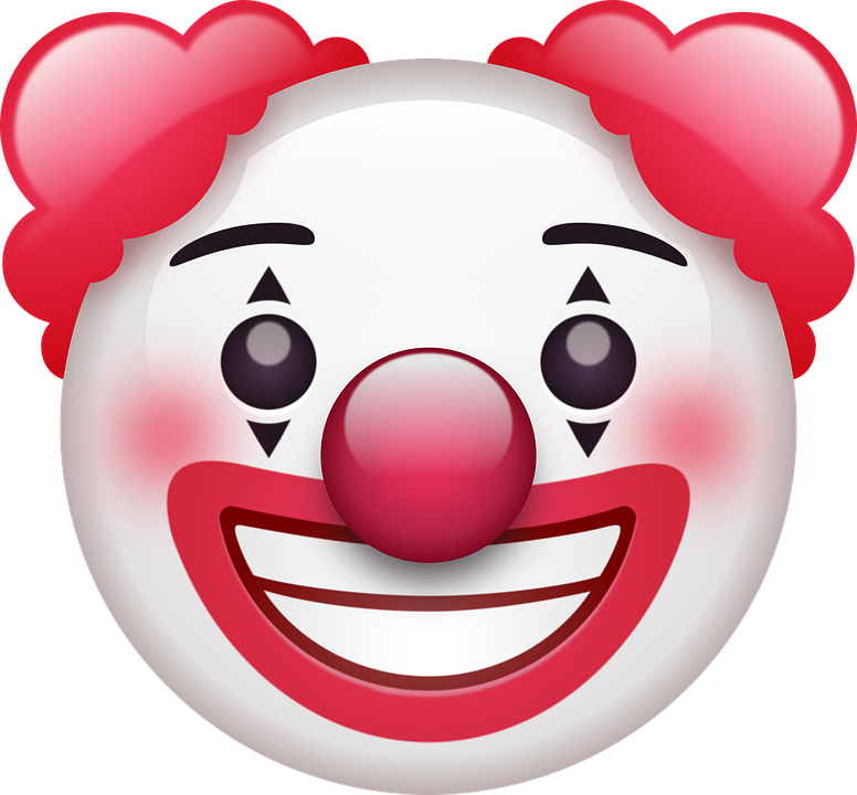
Beautiful, only one suggestion to make it more inline with the purpose of the "Honk Honk!" button;I find the ''honk'' atrocious to look at so I'm working on an alternative. Anything pepe-related needs to disappear from the surface of planet Earth (and the solar system). Rpg Codex deserves better.
Static concepts:
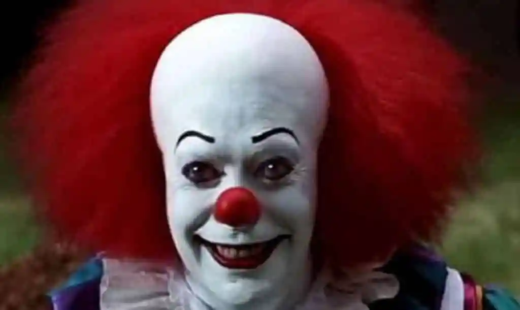
Mostly based on the clown in IT.
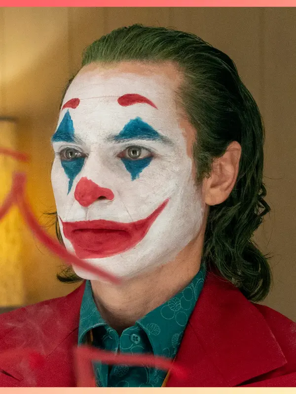
Joker-ify him. White makeup coupled with the colored facial marking would be more readable and more striking as a button; big red nose, grin and eye marks. Keep the colored shadows in his hair, though. That's a good improvement.


Better. Lose the eyebrows so the only thing against the forehead is the upper-blue triangle, and trade the eye-whites for wholly white skin. The Pennywise-hair has a better silhouette.Joker-ify him. White makeup coupled with the colored facial marking would be more readable and more striking as a button; big red nose, grin and eye marks. Keep the colored shadows in his hair, though. That's a good improvement.
You mean like this? Or this too detailed still?
...and this is with the original hair like you mentioned:
Better. Lose the eyebrows so the only thing against the forehead is the upper-blue triangle, and trade the eye-whites for wholly white skin. The Pennywise-hair has a better silhouette.


This one is my favorite. One suggestion for editing; the blue triangles. Currently he looks like a four-eyed monster. Which is an effective visual, but the clownyness could be better served by altering his eyes and makeup. Like so;E. Yet another set of eyes
For the eyebrows, make them arched. His expressions here comes across as smug and bemused, arched-eyebrows would make him out as more unhinged and serve the button purpose better. Forgive me, but I am going to use an emoji to illustrate what I mean:A. No eyebrows
B. eyebrows

One I want sometimes when people bitch about shallow things about games.
graphics whore x 1

I *think* I get what you meant. I've included one version with eyebrows just to test things out but made it less noticeable.
A. No eyebrows
B. eyebrows
C. Different eyes and mouth shape
D. Another set of eyes and mouth shape
E. Yet another set of eyes
F. Eyes more like Pennywise and yet a different mouth
G. Different mouth again
H. Ears showing and yet another mouth
Could you point out which one is closer to what you meant? Do you think I should mix certain elements from one with another (the mouth for example)?
This is the reference I'm using:
Think I'm getting closer to 200 buttons.

He won't stop. He think's he's somehow special. He's been at it for a month now. On olddex this retard would have half a dozen tags and would be prosperised by now.
And the attention whoring again.
Make a good button, and it might get implemented (or not). It took a long time for some of Zombra's suggestions to get implemented, and tbh most of his are way better than anything you've shown so far.


C would be good as it is. I can't stress enough how cuteis with those almost mitten-hands.

Whatever you prefer is whatever we don't.I prefer the more realistic versions, personally.


Good one, "eyes bleed" will be definitely useful
Ol' Willy said:Good one, "eyes bleed" will be definitely usefulSemiurge said:


KrunoI’d rather use the likeliness of someone who could be related to “bleeding eyes”. No one really comes to mind, however. It’s not really something which could be related to a person in particular.
It would also have a very similar meaning to “what am I reading”.


For readability. If I keep the color version, the contrast between “fake” and the background would blend together make it hard to read the “fake” word.Why does it change color to grey?
If we had all these buttons moving around and flashing it would probably give me a seizure and I'm not even epileptic


There are no pictures of Kruno in the members gallery.
Anyhow, I've had an idea. By removing some hair from the top of the clown's hair and make him balder, it would allow me more space for the face. Besides, Pennywise is bald on top. I've also cranked the skin color to be whiter. The variation between each one of this set are minors but noticeable (smile size, with or without eyebrows, partly or fully bald, etc...):
1.2.3.4.5.6.7.8.
I wouldn't know how to improve upon the 8, unless you guys have suggestions.
And a new version of eyes-bleeding:
New version of It was Aliens in order to make it more concise:


