Putting the 'role' back in role-playing games since 2002.
Donate to Codex
Good Old Games
  • Welcome to rpgcodex.net, a site dedicated to discussing computer based role-playing games in a free and open fashion. We're less strict than other forums, but please refer to the rules.

    "This message is awaiting moderator approval": All new users must pass through our moderation queue before they will be able to post normally. Until your account has "passed" your posts will only be visible to yourself (and moderators) until they are approved. Give us a week to get around to approving / deleting / ignoring your mundane opinion on crap before hassling us about it. Once you have passed the moderation period (think of it as a test), you will be able to post normally, just like all the other retards.

Game News The New World Update #23: State of the Game - First Screenshots

Infinitron

I post news
Patron
Staff Member
Joined
Jan 28, 2011
Messages
99,616
Codex Year of the Donut Serpent in the Staglands Dead State Divinity: Original Sin Project: Eternity Torment: Tides of Numenera Wasteland 2 Shadorwun: Hong Kong Divinity: Original Sin 2 A Beautifully Desolate Campaign Pillars of Eternity 2: Deadfire Pathfinder: Kingmaker Pathfinder: Wrath I'm very into cock and ball torture I helped put crap in Monomyth
Tags: Colony Ship: A Post-Earth Role Playing Game; Iron Tower Studio; Nick Skolozdra; Vince D. Weller

Vault Dweller has published 2018's first development update for The New World. It's an important update, summarizing the previous year's work and announcing this year's plans - namely, the release of a combat demo. And yes, it includes our very first look at the actual game, in the form of two screenshots from the location known as the Pit. Behold:
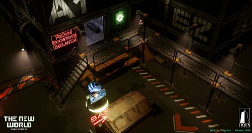
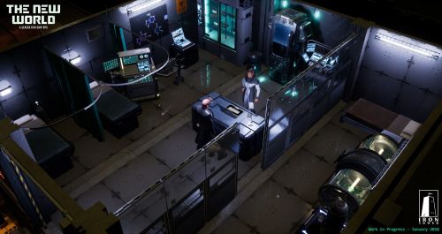

2017 was a busy year: we did a lot of programming and animation work, produced a lot of art assets, defined locations (quests, places of interest, key characters), factions (leaders, relationships, goals), expanded the Pit’s quests, finalized the systems, and did a lot of work on the first two locations, so we started 2018 in a pretty good shape.

Our main goal for this year is to release a combat demo. It’s a major milestone as it’s practically a game in itself. We do that, it means we have the engine (fully customized for what we need), all systems except stealth, all art assets and animation, interface, and TONS of small things that take a lot of time. It’s a massive amount of work and it took us 5,5 years to reach this point with AoD. If we do it in 2 years this time around, it will mean that we’re right on schedule for 2020 release and give us 2 years to work on quests and locations.

What’s done:

- Map grid. In CSG, the tiles are aligned according to the surface angle and look better by not sticking into the ground;
- Non-combat and combat pathfinding. Two separate systems now, which allows smooth movement when exploring locations and good old tactical tile-to-tile movement in combat. Your combat path is also displayed with a nice spline, so no more uncertainty of "where exactly will my character move when I click here" kind;
- Map checking system that spawns warnings if certain map objects are not configured properly - this should decrease the amount of level-design bugs;
- Hierarchical item classes and visual item editor;
- Chargen;
- The flexible structure of character classes that allows adding new creature types with a different appearance, item slots and behavior easily. Implementing new creature type was a big task in AoD/Torque and required writing a lot of code from scratch every time;
- Party system. Better-looking party following, comparing to DR;
- Animation system based on a proper state machine this time. Animations blended with ragdoll, which should help to avoid situations like dead/knockdown characters sticking into the wall;
- Inventory system and screen. Inventory space is now grid-based;
- Character screen;
- Dialogue system, screen, and visual node-based dialogue editor;
- Cover system which provides defense bonuses based on cover type and angle of enemy's fire;
- Combat exit areas - special tiles, Fallout-style, that allow player to flee from combat and execute attached scripts;
- Overhead icons, more informative than in previous games, since they now can display progress bars, numbers, and other useful context-based information;
- Discrete hitbox/collision system. We got rid of the chaotic line of fire and attack results that were animation-based. In AoD/DR the cursor could report you that you are able to hit a target, but then, when you click, your enemy would turn around or scratch his butt, and your arrow could fly past him despite all the odds;
- RPG Camera, replicated from AoD, also includes optional orthographic projection mode;
- Doors (prototype, not final)
- Basic destructible environment;
- Building system (floors visibility, interior/exterior objects)
- Basic combat system (weapons, attack modes, THC calculation, hitting, missing, simple RNG) and combat flow (start, end, combat queue, detecting enemies, advancing turns). No status effects yet.
- Global and local quest variables and game states;
According to Iron Tower programmer Nick Skolozdra, it'll probably take around six additional months to complete the remaining gameplay features required for the combat demo. In the nearer future, expect an update presenting the game's armor system.
 
Joined
Jul 11, 2010
Messages
3,213
Location
Vostroya
Not exactly what I'd call a gritty environment inhabited by whole generations of people slowly but surely succumbing into violence over who's actually in charge of the ship, it needs this thick patina of worn out shittiness one can observe in pics of poor Russian neighbourhoods
Or Polish ones.
warsaw-soviet-apartment-hdr.jpg
 

Eyestabber

Arcane
Patron
Joined
Jan 15, 2015
Messages
4,733
Location
HUEland
PC RPG Website of the Year, 2015
Cool. Combat demo is what originally got me interested in AoD.

Just make sure all those juicy death animations are included in the demo. Lack of gibs was, by far, Underrail's biggest issue, IMO.
 

Vault Dweller

Commissar, Red Star Studio
Developer
Joined
Jan 7, 2003
Messages
28,044
Hey Vault Dweller, until a year or so ago you were talking about a "4-location demo" in 2018, eg: http://www.irontowerstudio.com/forum/index.php/topic,7387.msg149641.html#msg149641

Is that the same thing as the combat demo?
No, that's the full demo. I don't have the estimated release date for it yet. Most likely it will be ready by the end of 2018 as we'll be working on these 4 locations throughout the year (Oscar and I are working on the quests and maps now, while Nick, Eugene, and Ivan are working on the mechanics and animations, Mazin is working on the armor sets and GUI, Joao is pumping out the assets; so it's all happening at the same time), but we'll start with the combat demo to focus on the combat mechanics first. In the unlikely event that everyone absolutely loves the combat system, the full demo will be released a couple of months later. Otherwise, when we're done tweaking the combat mechanics.

Now on the subject of the screens and what they show:

1) These are very early screens showing the state of the game (we have controllable characters, equippable items, various assets - the healing machine, the hydroponics thing, etc), the overall direction (closer to cyberpunk rather than pure space western like Firefly), and the engine. Essentially, we're at a stage where we put together the assets but we aren't doing the 'atmospheric' pass yet as it's done when everything else is in place. However, since there's so much bitching a lot of commotion, we'll do that pass for the interior shot and show you what a semi-finished place would look like.

2) Things like piles of dirt and discarded crap will be done last as they require various 'dirt models', which have the lowest priority at the moment and won't be done until last 2019.

3) It does look different from the concepts because the concepts show the 'big picture' while these screens are close ups; having said that if we do it based on concept #2 everyone will say it looks empty. Anyway, considering point #1 the best way to compare the Pit to the concept art is when the full demo is released.

4) Yes, the ship is old and crumbling but if every area looks like that beautiful Polish building above, it will get visually boring fast. The Pit is a relatively young and still growing town, about 10 years old. The containers provide access to brand new things intended for the future colony. In comparison, the Habitat is more than two hundred years old, damaged during the mutiny and the ongoing war between the factions. The mutant city and the 'monastery' will look different as well.
 

VentilatorOfDoom

Administrator
Staff Member
Joined
Apr 4, 2009
Messages
8,603
Location
Deutschland
Not exactly what I'd call a gritty environment inhabited by whole generations of people slowly but surely succumbing into violence over who's actually in charge of the ship, it needs this thick patina of worn out shittiness one can observe in pics of poor Russian neighbourhoods
Or Polish ones.
warsaw-soviet-apartment-hdr.jpg
wtf those textures look like shit, also what's up with the sky?? worse than witcher 3
 

Van-d-all

Erudite
Joined
Jan 18, 2017
Messages
1,580
Location
Standin' pretty. In this dust that was a city.
Given that AoD was one of the best RPGs I played in years I have really high hopes for the new game. But... The name is awfully generic and unlike AoD it will make it difficult to find anything relevant about the game on the interwebs, making it even less known. As others have already stated, the screens look way too new for a derelict ship, and it's not about the clutter like garbage piles, but about textures and color palette. It sure didn't make Fallout games look boring, and it's even something Boyarsky was talking about in an interview posted recently. That said, I think the graphic quality looks very nice, but it will require some serious fluff explanation as to why it still looks cyberpunk after 200 years and not like a cannibalistic hellhole from the Habitat comic.
 

Vault Dweller

Commissar, Red Star Studio
Developer
Joined
Jan 7, 2003
Messages
28,044
It's not.

b_102357.jpg

^ used sci fi book cover from the 70's style

What do people think of when they hear "The New World", absent a video game?

  • a time when people were migrating in their millions across the Atlantic to the strife and uncertainty of an unknown destination
  • people fleeing an awful life of toil for a new almost entirely unknown life, which unbeknownst to them would also be full of toil
  • people of all different religions, origins and castes jammed together on the voyage; even rich and poor, otherwise always segregated, shared the same boat
  • European pioneers, the migration West, the Mayflower, colonization, it's a package of all the sub-themes

What will people see when they're playing the game?

  • The passengers of the Ship are headed to a New World
  • The Ship itself is a New World, away from Earth for so many generations it might as well be a myth
  • The player is like one of those hapless migrants of the five hundred year migration to North America, surrounded by conflicting factions, different religions, philosophies and ideals
  • The player is headed for the absolutely unknown in a chaotic, dangerous environment where he must live by violence or his wits

Other benefit: the name doesn't sound like any current computer games, or suggest other types of computer games. Like The Age of Decadence it really stands alone. So while at first glance it seems bland, in very few words it completely identifies the practical details of the game *and* the philosophical underpinnings of the game. It's not perfect, but I think it's the best we've come up with and likely the best we ever will come up.
 

Infinitron

I post news
Patron
Staff Member
Joined
Jan 28, 2011
Messages
99,616
Codex Year of the Donut Serpent in the Staglands Dead State Divinity: Original Sin Project: Eternity Torment: Tides of Numenera Wasteland 2 Shadorwun: Hong Kong Divinity: Original Sin 2 A Beautifully Desolate Campaign Pillars of Eternity 2: Deadfire Pathfinder: Kingmaker Pathfinder: Wrath I'm very into cock and ball torture I helped put crap in Monomyth
You totally could have called it "Starfarer", though. That's a great name and also sounds like an old science fiction book.
 

Van-d-all

Erudite
Joined
Jan 18, 2017
Messages
1,580
Location
Standin' pretty. In this dust that was a city.
Quite frankly you are over complicating it with meta stuff like it was a name of your teen garage band, while in fact it's a product name that simply needs to stand out from the flood of other games when, for instance, you are trying to find it on Steam, watach a video on yt, or simply remember the title of that one game your friend told you about. Just google the phrase and see what happens. Unless you wish to spend money on positioning, shit either pops up on the first page or might as well not exist at all.
 

Vault Dweller

Commissar, Red Star Studio
Developer
Joined
Jan 7, 2003
Messages
28,044
Before AoD's combat demo was released searching for 'age of decadence' would only give you political and trip advisor stuff (despite the interviews, screens, etc), so these things change quickly when the content is there.
 

Diggfinger

Arcane
Joined
Jan 6, 2014
Messages
1,240
Location
Belgium
Agree with previous comments that it's 'shinier' than I thought...but that can surely be tweaked still.

Good luck and Gods Speed for the combat demo!
 

Van-d-all

Erudite
Joined
Jan 18, 2017
Messages
1,580
Location
Standin' pretty. In this dust that was a city.
Before AoD's combat demo was released searching for 'age of decadence' would only give you political and trip advisor stuff (despite the interviews, screens, etc), so these things change quickly when the content is there.

That's because combat demo was probably the most meaningful thing associated with somewhat unique phrase AoD. On the other hand, with all due respect, but if you think the new demo is going to become a competition for an oscar nominated flick, then you're "fabulously optimistic".
 

Vault Dweller

Commissar, Red Star Studio
Developer
Joined
Jan 7, 2003
Messages
28,044
Before AoD's combat demo was released searching for 'age of decadence' would only give you political and trip advisor stuff (despite the interviews, screens, etc), so these things change quickly when the content is there.

That's because combat demo was probably the most meaningful thing associated with somewhat unique phrase AoD. On the other hand, with all due respect, but if you think the new demo is going to become a competition for an oscar nominated flick, then you're "fabulously optimistic".
First, it's an rpg not some household brand (you've heard the name, don't know what it is and going to google it to find out). Second, when it comes to exposure, the only exposure that matters today is Steam exposure. The rest is white noise. Our 'customer base' was and always will be sites like the Codex (i.e. specific communities we can engage directly rather than some abstract players who must google the name first).
 

Zanzoken

Arcane
Joined
Dec 16, 2014
Messages
4,063
Taken into account that this thing is not even playable yet, it looks good. Much more refined than AoD but still reminiscent of it.

I am confident it will only get better as you continue to develop the art style and apply polish.
 

Jaedar

Arcane
Patron
Joined
Aug 5, 2009
Messages
10,139
Project: Eternity Shadorwun: Hong Kong Divinity: Original Sin 2 Pathfinder: Kingmaker
Environments look good, can't wait to zoom past them in lightspeed after I turn up movement speed to 8x.
 

MRY

Wormwood Studios
Developer
Joined
Aug 15, 2012
Messages
5,719
Location
California
the overall direction (closer to cyberpunk rather than pure space western like Firefly)
I think the screenshots look very nice, a solid progression from AOD. But I am curious about the logic behind a cyberpunk aesthetic. I can see commercial (i.e., gamers buy cyberpunk and it's enjoying a masscult resurgence) and practical (i.e., it's might be easier for the artists to do chrome and neon) reasons for it, but it seems an odd fit for what I understand of the setting.

Cyberpunk and TNW both deal with "uprooted man" but the uprooting is different. Cyberpunk is tied to a particular set of themes, and while I'm no expert on the genre, those seem to be (1) corporate power separating us from our political institutions; (2) advertising power separating us from our cultural heritage; and (3) urbanization and pollution separating us from our natural environment.

As I understood it, TNW is about a Catholic (still think it should be Mormon) generations ship that starts out on an expressly religious colonial mission. The crew has definitely been uprooted from political institutions and I suppose potentially from some parts of their cultural heritage (depending on what kind of censorship took place when the ship launched) and obviously from the natural environment, but the uprooting forces are different. I guess I supposed that a degenerate religious mission would look different from a corporate dystopia -- even if TNW is also dystopian, it seems a different kind of dystopia, where you're not as likely to have neon lights (how do they even make the neon lights?) and heavy trench coats (there's no rain, right?). I'm not sure what would be in their place, but it just seems like there is some risk that the visual language of cyberpunk will distort the uniqueness of TNW's setting and themes.

Anyway, probably a misplaced concern about the very early art of a WIP game. :)
 

Infinitron

I post news
Patron
Staff Member
Joined
Jan 28, 2011
Messages
99,616
Codex Year of the Donut Serpent in the Staglands Dead State Divinity: Original Sin Project: Eternity Torment: Tides of Numenera Wasteland 2 Shadorwun: Hong Kong Divinity: Original Sin 2 A Beautifully Desolate Campaign Pillars of Eternity 2: Deadfire Pathfinder: Kingmaker Pathfinder: Wrath I'm very into cock and ball torture I helped put crap in Monomyth
4) Yes, the ship is old and crumbling but if every area looks like that beautiful Polish building above, it will get visually boring fast. The Pit is a relatively young and still growing town, about 10 years old. The containers provide access to brand new things intended for the future colony. In comparison, the Habitat is more than two hundred years old, damaged during the mutiny and the ongoing war between the factions. The mutant city and the 'monastery' will look different as well.

This is interesting, since from your descriptions so far it's always sounded the Pit is some cobbled together redneck shithole while "The Habitat" sounds some like some spick n' span Star Trek-esque living quarters.
 

Vault Dweller

Commissar, Red Star Studio
Developer
Joined
Jan 7, 2003
Messages
28,044
4) Yes, the ship is old and crumbling but if every area looks like that beautiful Polish building above, it will get visually boring fast. The Pit is a relatively young and still growing town, about 10 years old. The containers provide access to brand new things intended for the future colony. In comparison, the Habitat is more than two hundred years old, damaged during the mutiny and the ongoing war between the factions. The mutant city and the 'monastery' will look different as well.

This is interesting, since from your descriptions so far it's always sounded the Pit is some cobbled together redneck shithole while "The Habitat" sounds some like some spick n' span Star Trek-esque living quarters.
122804.jpg

The Habitat's living quarters. capsule hotel style. The Pit is a lawless shithole but it has plenty of space and containers to live in.
 

Vault Dweller

Commissar, Red Star Studio
Developer
Joined
Jan 7, 2003
Messages
28,044
the overall direction (closer to cyberpunk rather than pure space western like Firefly)
I think the screenshots look very nice, a solid progression from AOD. But I am curious about the logic behind a cyberpunk aesthetic. I can see commercial (i.e., gamers buy cyberpunk and it's enjoying a masscult resurgence) and practical (i.e., it's might be easier for the artists to do chrome and neon) reasons for it, but it seems an odd fit for what I understand of the setting.

Cyberpunk and TNW both deal with "uprooted man" but the uprooting is different. Cyberpunk is tied to a particular set of themes, and while I'm no expert on the genre, those seem to be (1) corporate power separating us from our political institutions; (2) advertising power separating us from our cultural heritage; and (3) urbanization and pollution separating us from our natural environment.

As I understood it, TNW is about a Catholic (still think it should be Mormon) generations ship that starts out on an expressly religious colonial mission. The crew has definitely been uprooted from political institutions and I suppose potentially from some parts of their cultural heritage (depending on what kind of censorship took place when the ship launched) and obviously from the natural environment, but the uprooting forces are different. I guess I supposed that a degenerate religious mission would look different from a corporate dystopia -- even if TNW is also dystopian, it seems a different kind of dystopia, where you're not as likely to have neon lights (how do they even make the neon lights?) and heavy trench coats (there's no rain, right?). I'm not sure what would be in their place, but it just seems like there is some risk that the visual language of cyberpunk will distort the uniqueness of TNW's setting and themes.

Anyway, probably a misplaced concern about the very early art of a WIP game. :)
An excellent assessment. For the record, I said closer to cyberpunk not cyberpunk.
 

As an Amazon Associate, rpgcodex.net earns from qualifying purchases.
Back
Top Bottom