

- Joined
- Apr 24, 2015
- Messages
- 19,269


I'm amazed the guy even remember about Lionheart.Honestly that's not such a bad list, contains some genuinely good RPGs with genuinely good cities.
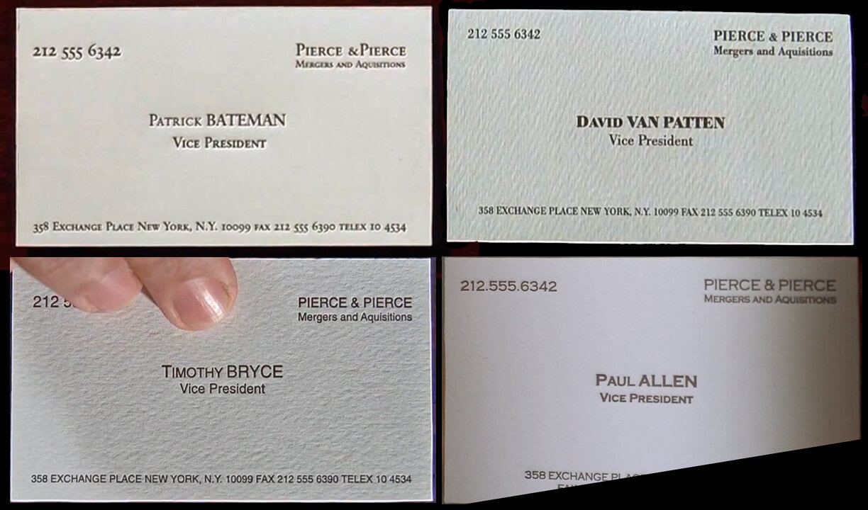
Patrick Bateman's business card was probably Fallout Tactics.
bos from ps2Patrick Bateman's business card was probably Fallout Tactics.

The point of the scene is that they are all the same and they're psychopaths fighting over tiny differences, so should just be Skyrim, Skyrim SE and Skyrim Anniversary.
Unless you're arguing that all modern Fallout games play exactly the same. If that's the case, well played.
idk, Bateman was the only one who broke a sweat and started to tremble.The point of the scene is that they are all the same and they're psychopaths fighting over tiny differences
Van Buren tech demo.bos from ps2Patrick Bateman's business card was probably Fallout Tactics.
It was Fallout 76, if you know the ending you knowVan Buren tech demo.bos from ps2Patrick Bateman's business card was probably Fallout Tactics.
I hate how most of numbers are placed in his card, it's like the guy couldn't keep the card in place while printing it.believe it would be the superior card if it had that coloring
The point of the scene is that they are all the same and they're psychopaths fighting over tiny differences, so should just be Skyrim, Skyrim SE and Skyrim Anniversary.
Unless you're arguing that all modern Fallout games play exactly the same. If that's the case, well played.
Not a fan of the textured ones, but I have to agree that Allen's is the best simply because of the off-white color. Although I do appreciate the embossing on Bateman's card and believe it would be the superior card if it had that coloring.
Bateman's also has very nice typography, I especially like the telephone number. But it may be too nice.

I hate how most of numbers are placed in his card, it's like the guy couldn't keep the card in place while printing it.
I fucking hate that. The different sizes feels to me like nails scratching on a chalkboard

Well, they're placed correctly, it's just that they're not lining figures. They're called text figures and are designed to look somewhat like lower-case letters. But it is an odd choice to use them in a small caps only design.I hate how most of numbers are placed in his card, it's like the guy couldn't keep the card in place while printing it.
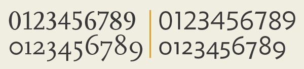
If the lower two chains of numbers were people I'd have to resist the urge to commit a hate crime.Well, they're placed correctly, it's just that they're not lining figures. They're called text figures and are designed to look somewhat like lower-case letters. But it is an odd choice to use them in a small caps only design.I hate how most of numbers are placed in his card, it's like the guy couldn't keep the card in place while printing it.


