Putting the 'role' back in role-playing games since 2002.
Donate to Codex
Good Old Games
  • Welcome to rpgcodex.net, a site dedicated to discussing computer based role-playing games in a free and open fashion. We're less strict than other forums, but please refer to the rules.

    "This message is awaiting moderator approval": All new users must pass through our moderation queue before they will be able to post normally. Until your account has "passed" your posts will only be visible to yourself (and moderators) until they are approved. Give us a week to get around to approving / deleting / ignoring your mundane opinion on crap before hassling us about it. Once you have passed the moderation period (think of it as a test), you will be able to post normally, just like all the other retards.

Disciples: Liberation - "a new beginning" for the series

vazha

Arcane
Joined
Aug 24, 2013
Messages
2,069
Anybody who played first two Disciples and prefers the look of this to those needs to be shot through the head.
 

cyborgboy95

News Cyborg
Joined
Aug 24, 2019
Messages
3,065
Given how the developer introduce many changes to Disciples Liberation's gameplay and artstyle in an obvious effort to copy King's Bounty, wouldn't it be ironic if this King's Bounty's copycat end up being more well received/getting higher review score than the legitimate successor of the King's Bounty series itself? (King's Bounty 2)
:philosoraptor:
 

Lacrymas

Arcane
Joined
Sep 23, 2015
Messages
18,732
Pathfinder: Wrath
Given how the developer introduce many changes to Disciples Liberation's gameplay and artstyle in an obvious effort to copy King's Bounty, wouldn't it be ironic if this King's Bounty's copycat end up being more well received/getting higher review score than the legitimate successor of the King's Bounty series itself? (King's Bounty 2)
This has a lot of precedent in the art world. Chopin is (in)famous for copying the style of John Field in his nocturnes, but Chopin's ended up far better. It got to the point that at first people were saying Chopin sounds like John Field, but after a while told John Field he sounds like Chopin. It's the same story with HoMM and King's Bounty. HoMM actually copied the original King's Bounty, but now people consider the new King's Bounties to be a copy of HoMM.
 

Parsifarka

Arcane
Joined
Dec 31, 2014
Messages
1,022
Location
Potato field
HoMM actually copied the original King's Bounty, but now people consider the new King's Bounties to be a copy of HoMM.
Both KB and HoMM were designed by chad pro racer Jon van Caneghem, so the latter is not a copy at all but a natural development of his own concept as he gallantly satisfied the desire of his wife who favoured strategy games over RPGs.
 

cvv

Arcane
Patron
Joined
Mar 30, 2013
Messages
18,955
Location
Kingdom of Bohemia
Enjoy the Revolution! Another revolution around the sun that is.
Jesus fucking christ that moderntard art style again. It's not as ghastly and amateurish like King's Bounty II, this time around it's "just" mobile-like.

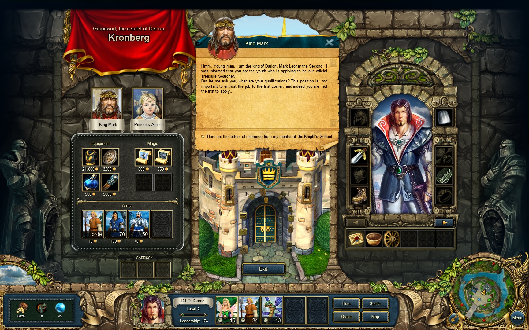
I've posted this comparison in the KB2 thread, this is the charming old King's Bounty:

screen_170422_008.jpg


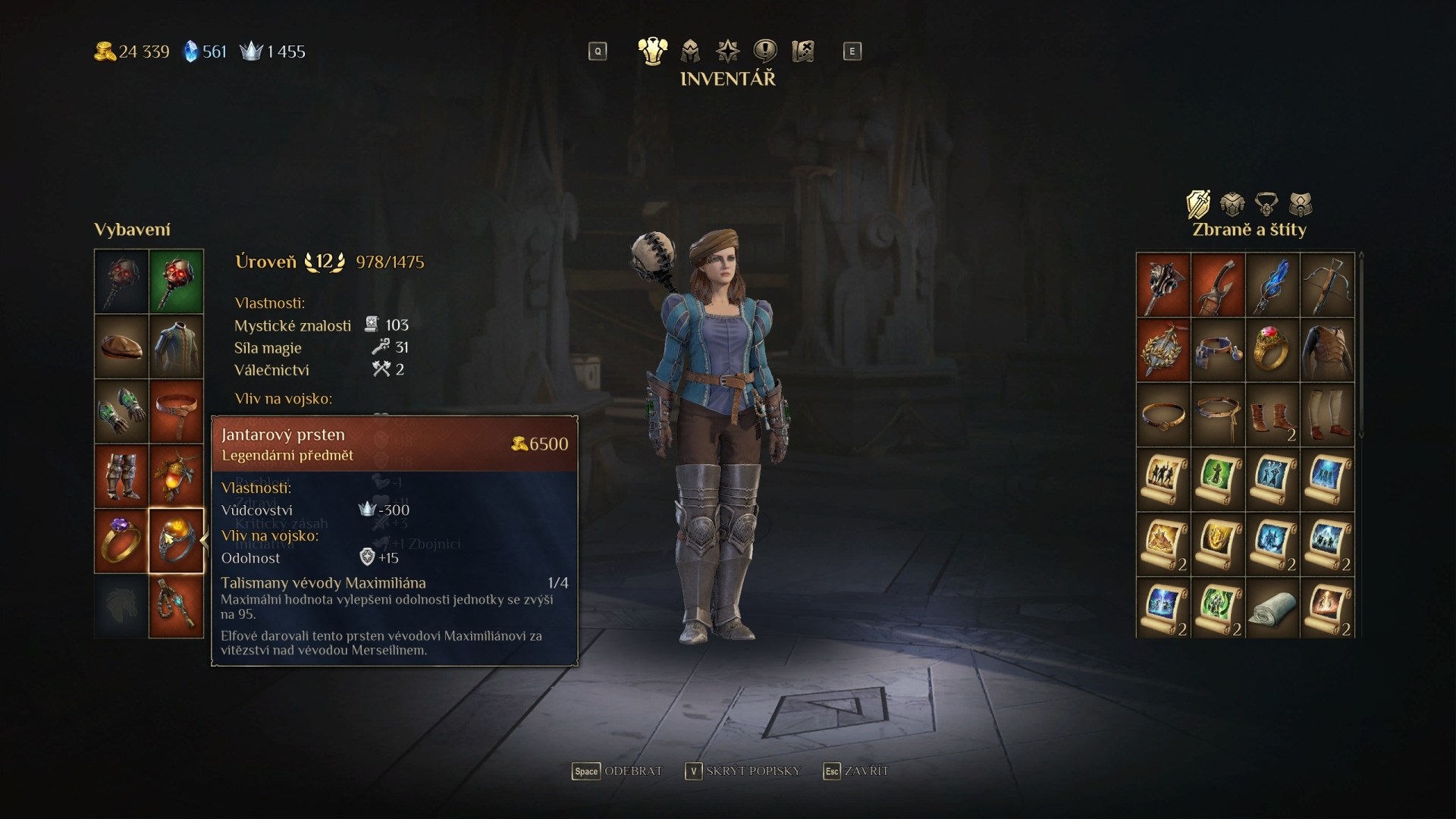
This is the new one:

kings-bounty-2-recenze-artefakt.jpg


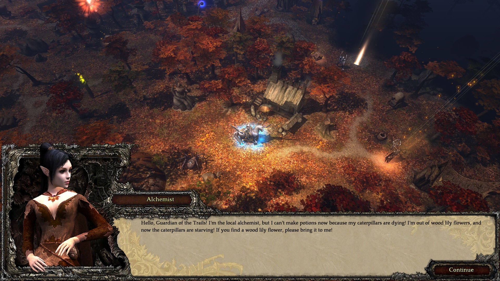
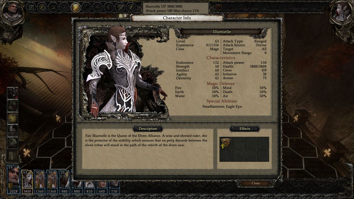
Now this is Disciples 3, notice the gorgeous UI and the golden ornaments in the dialogue window below:

379000-disciples-3-dojmy-z-dema-1920x1080.jpg


502767-disciples-iii-renaissance-windows-screenshot-the-guardian.jpg


Now this is the new Disciples:

disciples-liberation-kalypso-lanzamiento2-1024x576.jpg


I don't know if the ugly moderntard art is the result of shit taste or just simple incompetence and inability of millennials to produce the gorgeous, high-quality art of their forefathers.
 

Archibald

Arcane
Joined
Aug 26, 2010
Messages
7,869
I think lots of that has to do with being more efficient. Less stuff you put on the screen less you have to think about how it will work under different screen sizes and things like that.
 

Lacrymas

Arcane
Joined
Sep 23, 2015
Messages
18,732
Pathfinder: Wrath
I watched a little bit of that let's play and it still doesn't look awful. The talent trees are pretty huge, it seems there are like 70+ spells and a lot of units to choose from, it's hard to fuck up a TB game unless you make it too deterministic and reliant on cooldowns, so I'm very, very cautiously optimistic. The Disciples universe is pretty vast, so it might be fun to explore it in an RPG style as opposed to the normal TBS way. That dude was painful to watch, though. I always find most let's plays very agonizing, so it's not a big surprise, but using your invisibility before attacking in a survival battle (or in general really. Even if it gives some kind of damage bonuses, I'd still want to see what the enemy does next without having to worry they'll bunch up on my rogue) and not noticing the huge SURVIVE FOR 3 ROUNDS text in the middle of the screen is more painful than I can bear.
 

cvv

Arcane
Patron
Joined
Mar 30, 2013
Messages
18,955
Location
Kingdom of Bohemia
Enjoy the Revolution! Another revolution around the sun that is.
cvv while I agree that the user interface of Disciples 3 looks very good, it's not the most accessible one.
I played an Undead run just recently, no problems with the usability of the UI. The action buttons on the top of the combat screen could be a bit clearer and the town screen menus could use one more look but those are tiny issues.

I'd rather have a gorgeous, dark-fantasy themed UI that's 90% there in terms of ergonomics than a perfectly clean and functional mobile-like UI with zero aesthetic value.
 

Peachcurl

Arcane
Joined
Jan 3, 2020
Messages
10,673
Location
(╯°□°)╯︵ ┻━┻
I played an Undead run just recently, no problems with the usability of the UI. The action buttons on the top of the combat screen could be a bit clearer and the town screen menus could use one more look but those are tiny issues.

I'd rather have a gorgeous, dark-fantasy themed UI that's 90% there in terms of ergonomics than a perfectly clean and functional mobile-like UI with zero aesthetic value.

If those are the only two options, I agree.

One problem with the UI is that some things are needlessly spread out on different pages (character and army details). Also, while beautiful the troop portraits sometimes are not easily recognizable. Especially for the human troops. And since the UI indicators that show the active troop on the field are rather light, this can make it a bit hard to see which troop you are moving.
 

cvv

Arcane
Patron
Joined
Mar 30, 2013
Messages
18,955
Location
Kingdom of Bohemia
Enjoy the Revolution! Another revolution around the sun that is.
I played an Undead run just recently, no problems with the usability of the UI. The action buttons on the top of the combat screen could be a bit clearer and the town screen menus could use one more look but those are tiny issues.

I'd rather have a gorgeous, dark-fantasy themed UI that's 90% there in terms of ergonomics than a perfectly clean and functional mobile-like UI with zero aesthetic value.

If those are the only two options, I agree.

One problem with the UI is that some things are needlessly spread out on different pages (character and army details). Also, while beautiful the troop portraits sometimes are not easily recognizable. Especially for the human troops. And since the UI indicators that show the active troop on the field are rather light, this can make it a bit hard to see which troop you are moving.

All that is true, I suppose. I have 200 hours in D3 so I'm used to it by now but yeah, usability-wise the UI could be improved.

That said it's not like your choice is either a beautiful UI or an ergonomic one. Can't we have both? Modern-day devs apparently think "NO!"
 

markec

Twitterbot
Patron
Joined
Jan 15, 2010
Messages
50,983
Location
Croatia
Codex 2012 Strap Yourselves In Codex Year of the Donut Codex+ Now Streaming! Dead State Project: Eternity Codex USB, 2014 Shadorwun: Hong Kong Divinity: Original Sin 2 Steve gets a Kidney but I don't even get a tag. Pathfinder: Wrath
We need to give props to devs for taking a brave and original choice of making the main character looking like a tranny with a danger hair.

They should have broken more glass ceilings by having him in wheelchair.
 

cyborgboy95

News Cyborg
Joined
Aug 24, 2019
Messages
3,065
https://store.steampowered.com/news/app/1287840/view/2897493794923422536

Discover the dark fantasy world of Disciples: Liberation in our free demo & developer livestream ⚔️

We are taking a quick leave from our home base in Nevendaar to take part in the Steam Next Fest where you can celebrate and explore hundreds of upcoming games – including #DisciplesLiberation! From October 1 - 7, we will let you discover the
dark fantasy world in a demo and in our very own livestream together with the developer.
Save the date!


Disciples: Liberation is currently available for pre-purchase at a 10% discount. Wishlist and follow now to become a disciple and liberate the war-torn lands of Nevendaar!

Play the demo now and discover two starting regions of the game offering up to 8 hours of play time!
 

Shadenuat

Arcane
Joined
Dec 9, 2011
Messages
11,977
Location
Russia
let's turn all different versions of a formula into same HoMM ripoff with hexes skill trees and generic grafix.
 

Parsifarka

Arcane
Joined
Dec 31, 2014
Messages
1,022
Location
Potato field
I played for about half an hour and uninstalled it.
It really isn't worth the effort of dissecting it, so I'll just drop some thoughts:

- There's an excessive amount of really poor dialogue in the spirit of contemporary cringe heroic fantasy (personal insecurities, "subversive" clichés, characters living a powerfantasy/misunderstood "badassness", untimely flirting, try-hard jokes and puns, etc.) very alienated from the style of Disciples.

- Not only the material is bad, but the presentation is in the form of multitude of short sentences and requires to specifically click on the arrow icon to move to the next, which is very annoying.

- Fortunately loredumps seem to be contained within optional conversation choices, but the game made the impression that going through them might be required to unlock more relevant choices at other times, but I can't confirm it.

- Most dialogue has voice acting, which isn't very convincing. Most, because dialogues within the home town have no voice for no other reason than a short budget I guess.

- However, the intro cinematic is fine and it screams "Disciples", so perhaps the overarching story is decent when abstracted from the cringe of the main character you are forced to stick with.

- The UI is unwieldy with minuscule icons in-game yet humongous within the menus, an inelegant amount of submenus and a horrendous equipment screen.

- I levelled up but the menus are so ugly, and particularly that of the skill trees that I didn't make the effort to check what could I spend points in.

- The movement in the adventure map feels wrong due to the way the camera slides and the cursor not giving proper feedback when clicking on the terrain.

- The combat is sloooooooooow, painfully so. Those who complained about Disciples 3 on this account will have a seizure here. Also, I have not seen any obstacle in those maps, making the engagements very repetitive.

- Characters talk during combat. It is unnecessary, it gives no valuable info and it is replacing a proper soundtrack making fights really stale in terms of aesthetics.

- Combat has some interesting innovations:
+ Every unit has at least two possible actions (its standard attack which might induce altered states and a skill which might or might not be directly offensive).
+ There's a flanking mechanic that increases the damage received by the flanked unit which also sees its ability to move reduced while flanked.
+ Any unit can be set in a backrow -it is not as in Disciples 1&2, for these units cannot be attacked at all (they are within view but outside of the fighting field) and their only input is to provide a passive ability to the combatants.
+ Fights can have special objectives, like surviving a number of rounds.
+ Also, spells are cast during combat à la HoMM.
These innovations are interesting and could deliver an engaging experience were not for the following point.

- Every time a unit in combat finishes its turn it recovers a significant amount of health, this has two dreaded consequences: first, that fights go on for even longer, and second and most important, that as far as I can tell not focusing all your troops in a single unit is always suboptimal. This last issue is common to most engagements in Disciples 1 & 2 but here it makes one wonder why add free movement as it seems to do nothing but slow down the game.

- You have one town in a sort of parallel dimension disjointed from the adventure map, and there you can recruit any single basic unit of the four factions (i.e. elf sorcerer, human warrior, zombie, demonic possessed, just one from each army instead of the wot triad). There's an overwhelming amount of text and sign warnings in the town screen with terrible visual design telling you what you can and cannot do, indicating that as the game progresses the alignment choices will determine which high tiers become available and likewise with spells.

- Visually I like it enough except for the blocky aspect of the city, the outright hideousness of the main characters and the units being too small as to properly appreciate the quality of the models during fights. And of course the UI design doesn't help. Disciples 3 did a much better job at showing off in 3D.
Then, after thirty something minutes I encountered a bug that made my horse automatically run backwards causing it to crash into objects whenever I wasn't ordering a move and decided I just didn't care enough as to load a saved game since it's just painfully mediocre and I knew sooner or later the long and redundant fights would defeat my patience.
So there's that, see you when the reviewing shitfest starts.
 
Last edited:

As an Amazon Associate, rpgcodex.net earns from qualifying purchases.
Back
Top Bottom