All good points, but I meant the stylization art-wise.The "relatable, attractive everyman" always alienates me. Please give the protagonist glaring faults, darkness, and things that make me not necessarily relate to him but want to learn more.There have been heavy discussions here at the studio on whether the protagonist should be this super stylized creep or maybe closer to a more relatable everyman that could maybeee even be viewed as sort of attractive. We´re rolling dice with our fingers firmly crossed and lips bitten and bleeding.
"Super stylized" may be too far, of course; ultra cartoony will make me not take him seriously, and I want to take him seriously. The best characters have strong tendencies but aren't always predictable. E.g.: a story about a guy who always fucks up his job can be OK, but what about a guy who is great at his job every day but then one day he fucks up bad? Maybe a guy can't deal with his aggressive boss but deals with his aggressive wife just fine. And so forth. All-or-nothing characters are weak writing next to those with variation and texture. Don't "stylize" him so much he becomes 2D.
But definitely don't make him so bland and "relatable" that I don't fucking care any more.
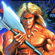
Think of a graph where the cartoony Warcraft is on one end, some quasi-realistic WWII story-shooter on the other and Dishonored somewhere in the middle. There are certain expressive shapes that help tell a story, but it can go overboard. Finding that balance is tough and involves personal tastes and what is common in other similar medias. We’ve gone though a bunch of iterations and ended up with *drumroll* with this:

(