

Yeah this isn't the best optimized game. It's UE4 post-processed down to Quake 1 graphics. There's also no free saving and combat feels clunky. Need to play more later to make up my mind.


-
Welcome to rpgcodex.net, a site dedicated to discussing computer based role-playing games in a free and open fashion. We're less strict than other forums, but please refer to the rules.
"This message is awaiting moderator approval": All new users must pass through our moderation queue before they will be able to post normally. Until your account has "passed" your posts will only be visible to yourself (and moderators) until they are approved. Give us a week to get around to approving / deleting / ignoring your mundane opinion on crap before hassling us about it. Once you have passed the moderation period (think of it as a test), you will be able to post normally, just like all the other retards.
You are using an out of date browser. It may not display this or other websites correctly.
You should upgrade or use an alternative browser.
You should upgrade or use an alternative browser.
GRAVEN - dark fantasy first person action puzzler from 3D Realms
- Thread starter geno
- Start date
LESS T_T
Arcane
- Joined
- Oct 5, 2012
- Messages
- 13,582

FWIW: https://steamcommunity.com/app/1371690/discussions/0/2994295183848080760/#c2994295183848193677
The version of the engine (UE4.24) unfortunately, has a known performance issue, which is fixed in the subsequent engine version.
We have a version switch scheduled in our development schedule, however, it was too big of a risk to upgrade the engine version, this close to the demo launch.
Therefore, performance is not as great as it will be in subsequent updates - Keep in mind that this has nothing to do with the actual game content. We witnessed low framerates, even with every visual and most code aspects of the game turned off. After weeks of research, we learned that this specific engine version, has some known issues in terms of how it utilizes CPU and GPU allocations.
This is a none-issue for the full release, so we hope you all will be able to still have some fun with the demo")
Multi-headed Cow
Arcane
Beat the demo. Graphics are really nice, performance is spotty as mentioned, combat's pretty bad. The spells seemingly do no damage to enemies and are only used for utility and statuses (Set fire to wood to break it, lightning water to stun enemies, etc) while your weapons are your only source of damage, but the enemy AI and attack patterns are really fucking bad. Combat's terrible when you only have the staff, but once you get the shotgun and the flail you can have a bit more fun (Especially since the gibbing is satisfying) but it also gets really easy at that point since you absolutely shit on all the enemies. The "First person puzzling" or whatever is a complete non-entity too. Boils down to "See pressure plate, pick up crate" and "See lock, pick up key". Few minor secrets in the demo mission but they weren't all that exciting either. The knight-dude-boss-dude-bro you fight early on shows up again with a friend near the end and you destroy him with your better weaponry, IIRC he takes about two shotgun alt-fires to take down.
Demo was a piss-poor example of good gameplay so hopefully it's just a proof of concept and they make a better game to go along with the graphics, because the game really does look pretty nice for an early demo.
Demo was a piss-poor example of good gameplay so hopefully it's just a proof of concept and they make a better game to go along with the graphics, because the game really does look pretty nice for an early demo.
ColCol
Arcane
- Joined
- Jul 12, 2012
- Messages
- 1,731
Played demo, games seems like it can't quite make up its mind about what it wants to be. I can see hexen, dark messiah, some of its large arenas make me think of current shooters . Yet, it does not really take a clear direction nor does it combines these influences in a memorable way.
Curratum
Guest
Game has some serious performance issues for something that looks like it should run without problems on a 10 year old PC.
I have FPS drops without anything getting even close to maxed in usage.
https://steamcommunity.com/app/1371690/discussions/0/2994295183848080760/#c2994295183848193677
Hopefully. I am getting 50 fps on an RX 570 and this is simply not ok. Hopefully they do deliver on this promise on launch.
Beat the demo. Graphics are really nice, performance is spotty as mentioned, combat's pretty bad. The spells seemingly do no damage to enemies and are only used for utility and statuses (Set fire to wood to break it, lightning water to stun enemies, etc) while your weapons are your only source of damage, but the enemy AI and attack patterns are really fucking bad. Combat's terrible when you only have the staff, but once you get the shotgun and the flail you can have a bit more fun (Especially since the gibbing is satisfying) but it also gets really easy at that point since you absolutely shit on all the enemies. The "First person puzzling" or whatever is a complete non-entity too. Boils down to "See pressure plate, pick up crate" and "See lock, pick up key". Few minor secrets in the demo mission but they weren't all that exciting either. The knight-dude-boss-dude-bro you fight early on shows up again with a friend near the end and you destroy him with your better weaponry, IIRC he takes about two shotgun alt-fires to take down.
Demo was a piss-poor example of good gameplay so hopefully it's just a proof of concept and they make a better game to go along with the graphics, because the game really does look pretty nice for an early demo.
Pretty much my conclusion too.
For anyone who hoped this would be like Hexen or Dark Messiah --> Nope. Feels more like Daikatana, only more uninspired. But the potential to get it right is still there...
Hobo Elf
Arcane
Played the demo up until when you get the Lightning spell, then I quit out of boredom. This was my most anticipated game, but now I don't care for it anymore. It's not even a case of tweaking the game to fix the problems; it's the very foundation of it that's bad. The spells are meh as they drain your mana super fast and only act as utility (fire for blowing up barrels, lightning to stun so you can club enemies to death), there's nothing special about the melee combat which is probably going to be the main method of how you fight in the game, level design is poor, there's a stupid stamina bar for running and holding your breath and this shouldn't even exist within the game, zombies and fish are your introduction enemies. Too much blah and the only way to fix the game is if it was just entirely different from the ground up. Preferably without forced and pointless boat trips that serve no purpose.
Latelistener
Arcane
- Joined
- May 25, 2016
- Messages
- 2,587
Yeah, it's kind of disappointing after its initial announcement. I managed to complete the demo but only through a sheer will and it wasn't even worth it.
Even if we forget about combat, there is nothing even interesting going on in the demo in terms of quests, story or exploration.
That reminds me of Gloomwood, which is another recent game cut from the same cloth, but feels much better.
Even if we forget about combat, there is nothing even interesting going on in the demo in terms of quests, story or exploration.
That reminds me of Gloomwood, which is another recent game cut from the same cloth, but feels much better.
Dexter
Arcane
- Joined
- Mar 31, 2011
- Messages
- 15,655
Liked the art style and the Intro was impressive but the combat seems a bit broken. Can take down 4-5 zombies in a horde, bosses or any of the enemies by just circlestrafing around them while hitting them with the staff and they won't be able to hit you bad. Once you learn that you barely even need any HP pots anymore.
Boleskine
Arcane
- Joined
- Sep 12, 2013
- Messages
- 4,045
https://steamcommunity.com/games/1371690/announcements/detail/2928994181868083310
GRAVEN Dev Blog #3 - The GRAVEN Look
Hello guys, this is Bebeto, art director for GRAVEN.
Let me take you through the process of creating the visual identity for GRAVEN. For this, I’ll stick mostly with the environments that were seen in the demo.
Overall Look
From the start, the intention was making a spiritual successor to Hexen and Heretic, games that most of us loved and played endlessly (or until it was time to go to school in the morning!). Back in the day, I remember playing Hexen with a couple of friends taking turns, and how we would be amazed by the atmosphere, how sometimes it was fantastic, other times scary as hell. That was something to aim for; to convey the sense (and scale) of a fantastic, brutal, and cruel world within the stylistic boundaries of our retro aesthetics.
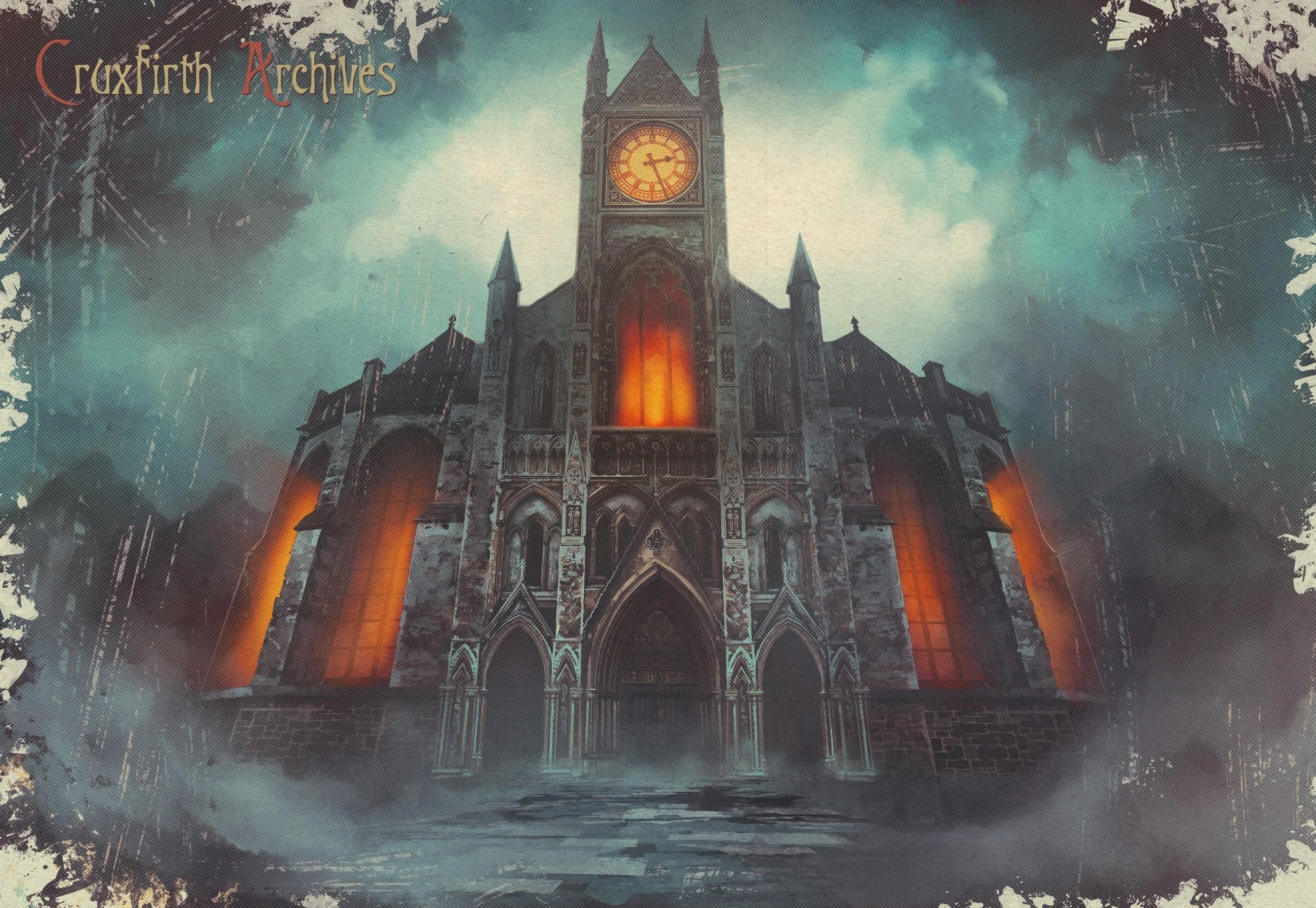
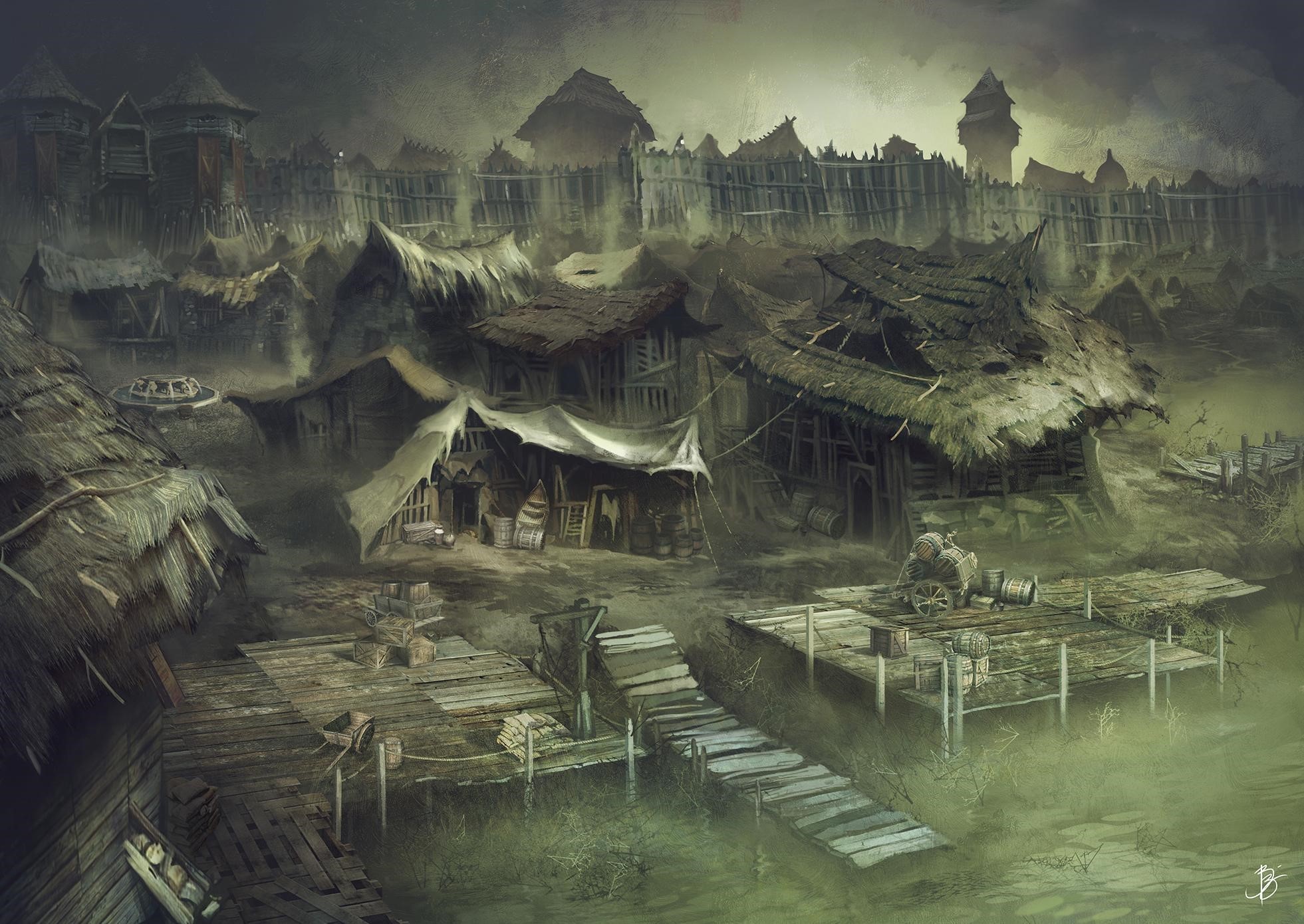
The first thing I've settled for was the greenish/brownish color scheme for Cruxfirth, our first location. I felt it enforced the idea of a plague/infection, while also making a statement that this is not going to be the kind of happy colorful fantasy, no sir! As in maps of Old: Hic Sunt Leones (Here be Dragons - figuratively!!).
The grim tone of a place once thriving and now completely decadent was suggested by my early concepts but was brought to life in full by the team, who took the original concept and made it breathe with life, as can be seen in the game’s intro.
Architecture and technology
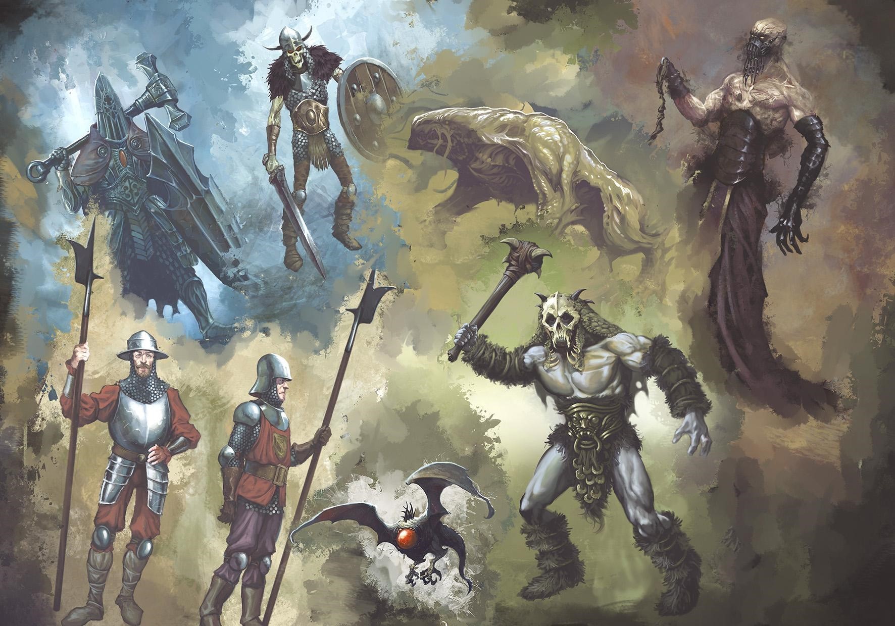
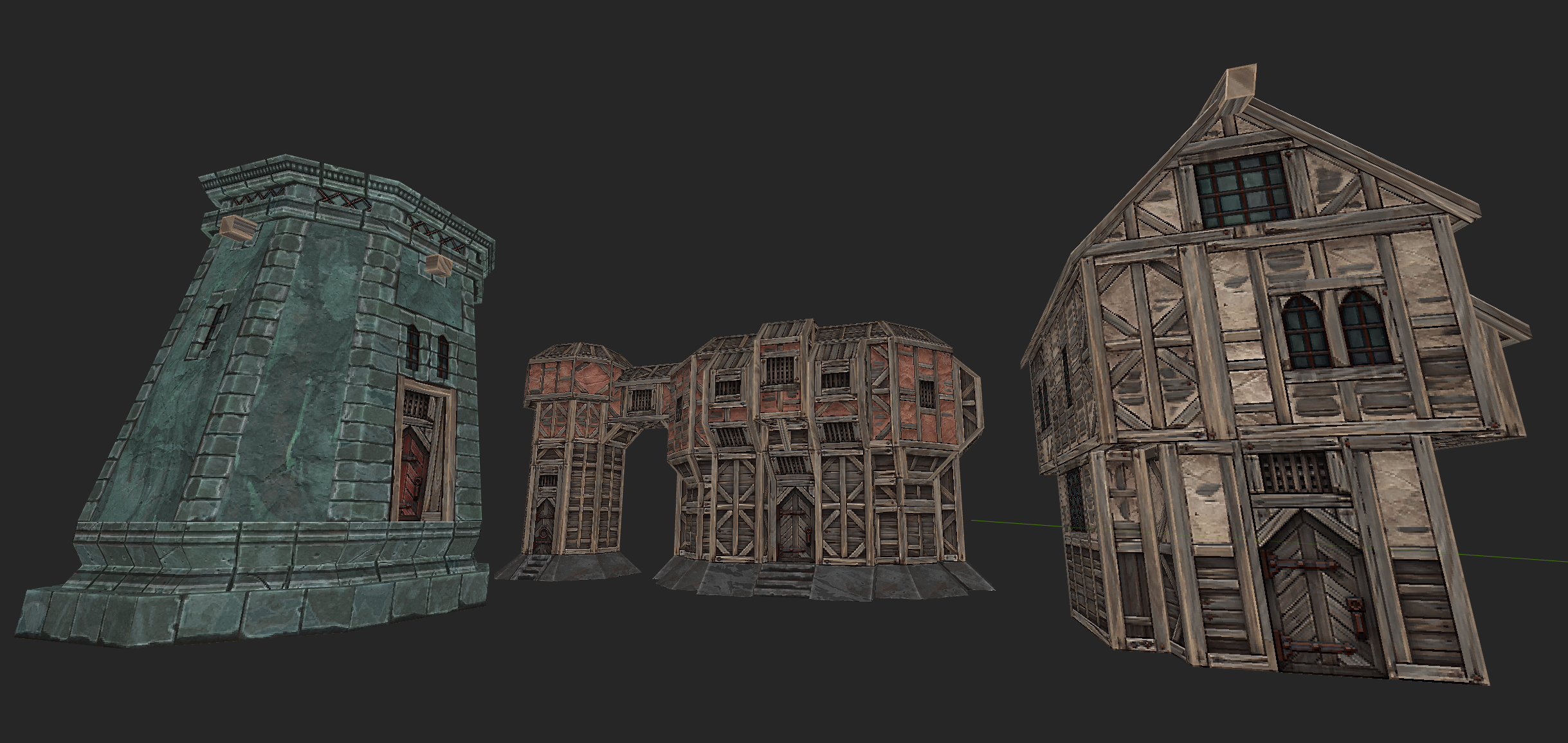
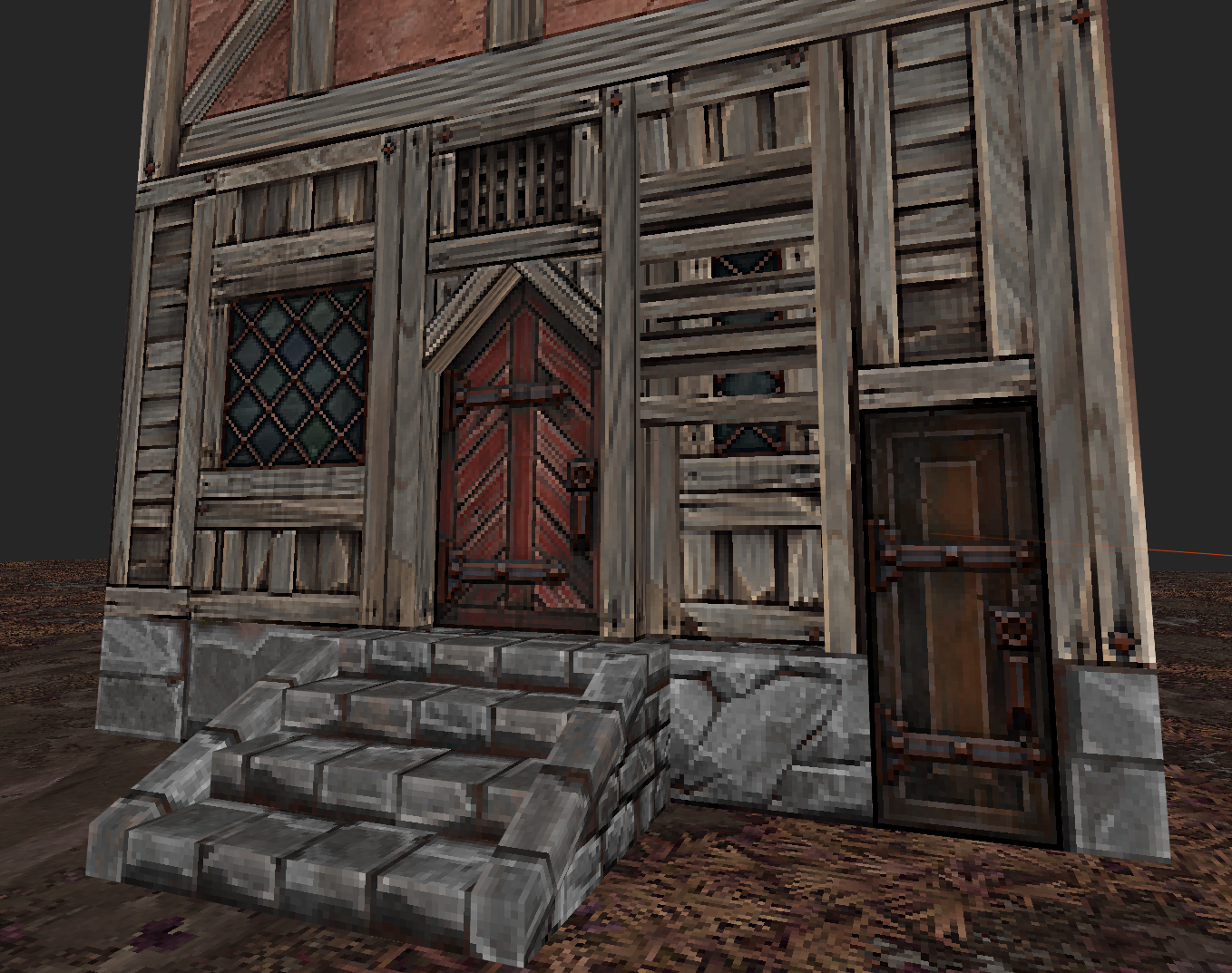
Since it's a fantasy setting, we could take some liberties with the environments and technology. In the world of GRAVEN, you might face armored warriors, fur-clad barbarians, wizards and weird creatures. Depending on where you are, gothic architecture coexists with medieval castles, swords and maces with fantastic ranged weapons (mostly designed by the bad-ass Arturo Padua). And MAGIC. This allowed us to achieve a lot of variety in terms of environments.
Characters
Sad to say, but in the world of GRAVEN, regular folks are not the healthiest looking fellas. Life is tough and, you know, lots of bad magic goin’ on. So our hero had to be more of an average physically fit person, than a bodybuilding killing machine. Somewhere along the way he started to resemble Chris Holden, our Lead Level Designer.
Some suggestions by the amazing Chuck Jones, and our hero was ready to be kicked out into the desert.
Enemies
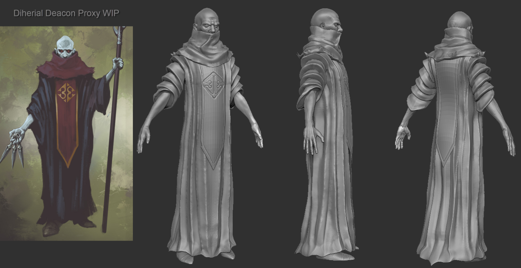
Given the retro feel of the game, I felt it fitting to look for old school fantasy references and make ’em MORE BAD ASS. I'm talking 80’s Conan, the D&D tv show, Masters of the Universe, Frank Frazetta etc. That's how a character such as the Dihedral Cleric came to be.
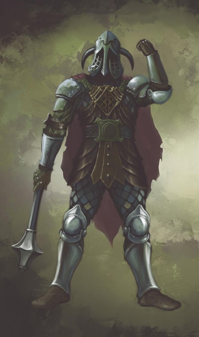
As with the environments, I was able to mix different styles both realistic and fantastic. Real World weirdness also played a part, as in the Mire Reaver Sword.
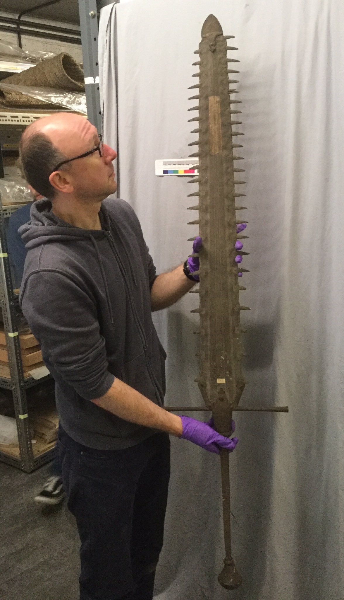
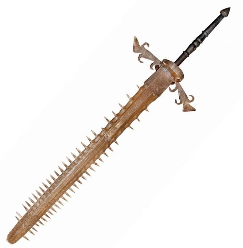
(Yes, sawfish swords seem to have been a thing!)
Overall, my aim was to find balance between something fresh looking but also something you might recognize in the back of your head.
So that's it for the moment. I hope you have enjoyed this small glimpse at the thought process going on behind the art direction of GRAVEN. At the stage we’re at, we’re still coming up with a lot of cool stuff, so hopefully, in time we’ll meet again in the not so safe but fantastic world of GRAVEN.
Happy Holidays to all of you! And in case you haven’t done already, don’t forget to add GRAVEN to your Steam Wishlist!
- Joined
- Jan 28, 2011
- Messages
- 97,437


- Joined
- Jan 28, 2011
- Messages
- 97,437
https://store.steampowered.com/news/app/1371690/view/3043838585279387426
GRAVEN Dev Blog #4 - Making Procedural Pixel Textures for GRAVEN
In this dev. blog, Ben "Makkon" Hale takes us through the process of making procedural pixel art for GRAVEN
My name is Ben Hale, and I’m a texture artist on GRAVEN. I currently work full time at ILMxLab making Star Wars VR games, and have had the pleasure to work on GRAVEN during my spare time and weekends.
This is not a tutorial, but a bit of a peek into my workflow.
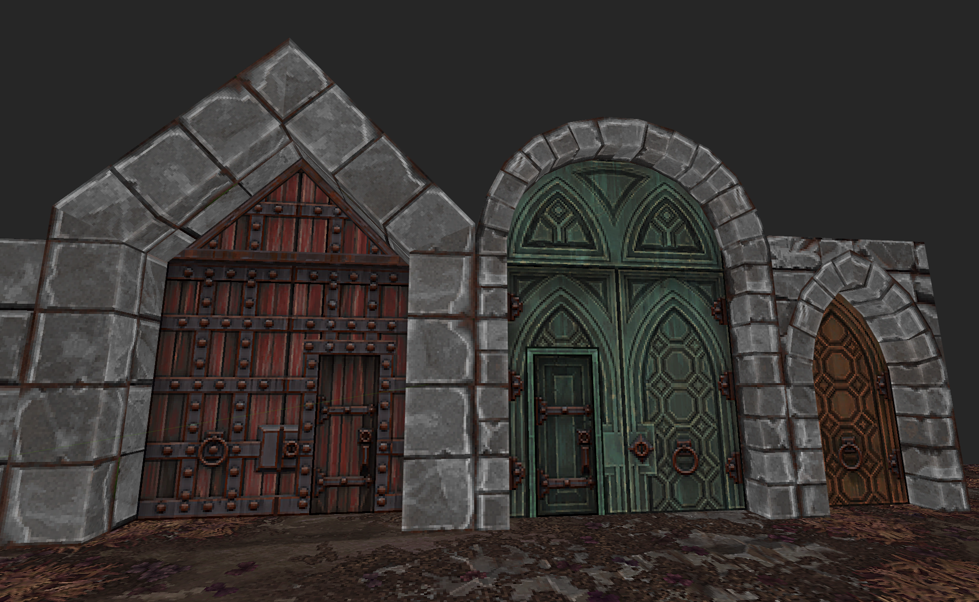
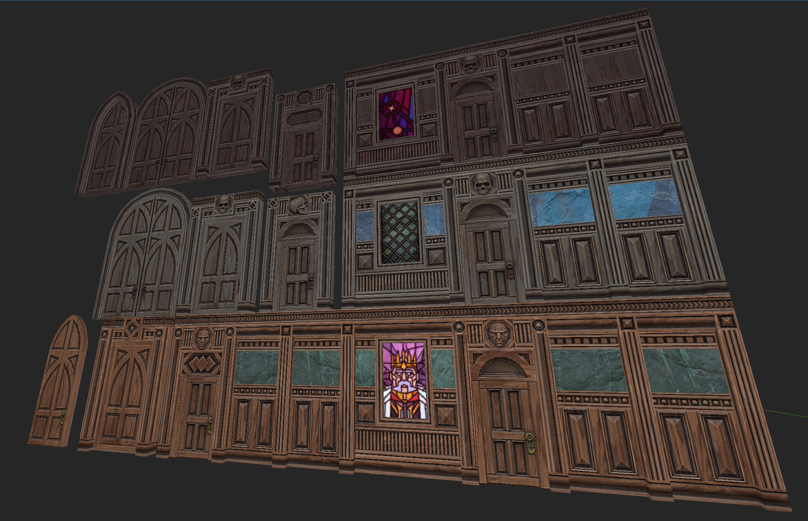
I make every texture in GRAVEN inside of Substance Designer, a powerful node-based tool specifically designed for generating tiling textures. Even though Substance is intended for current-gen PBR materials, it’s surprisingly useful for chunky pixel art or retro diffuse textures.
You might think “wouldn’t painting in photoshop be easier?” Sure, it’d be easier if I only needed to do something exactly once. Thus far I’ve made about 500 textures for GRAVEN in only a few months, and that time can add up remarkably fast even with batch scripts or a solid painting pipeline.
You only have to do something once in Substance, and with some parameterization you can turn that one something into a tool to create many more. I’ve made several tools for GRAVEN that enable me to work modularly, and create textures in minutes rather than hours or days. Though making these tools in the first place was a time commitment, in the long run I’ve saved several months of labor.
I start a lot of graphs with a simple pattern like this:
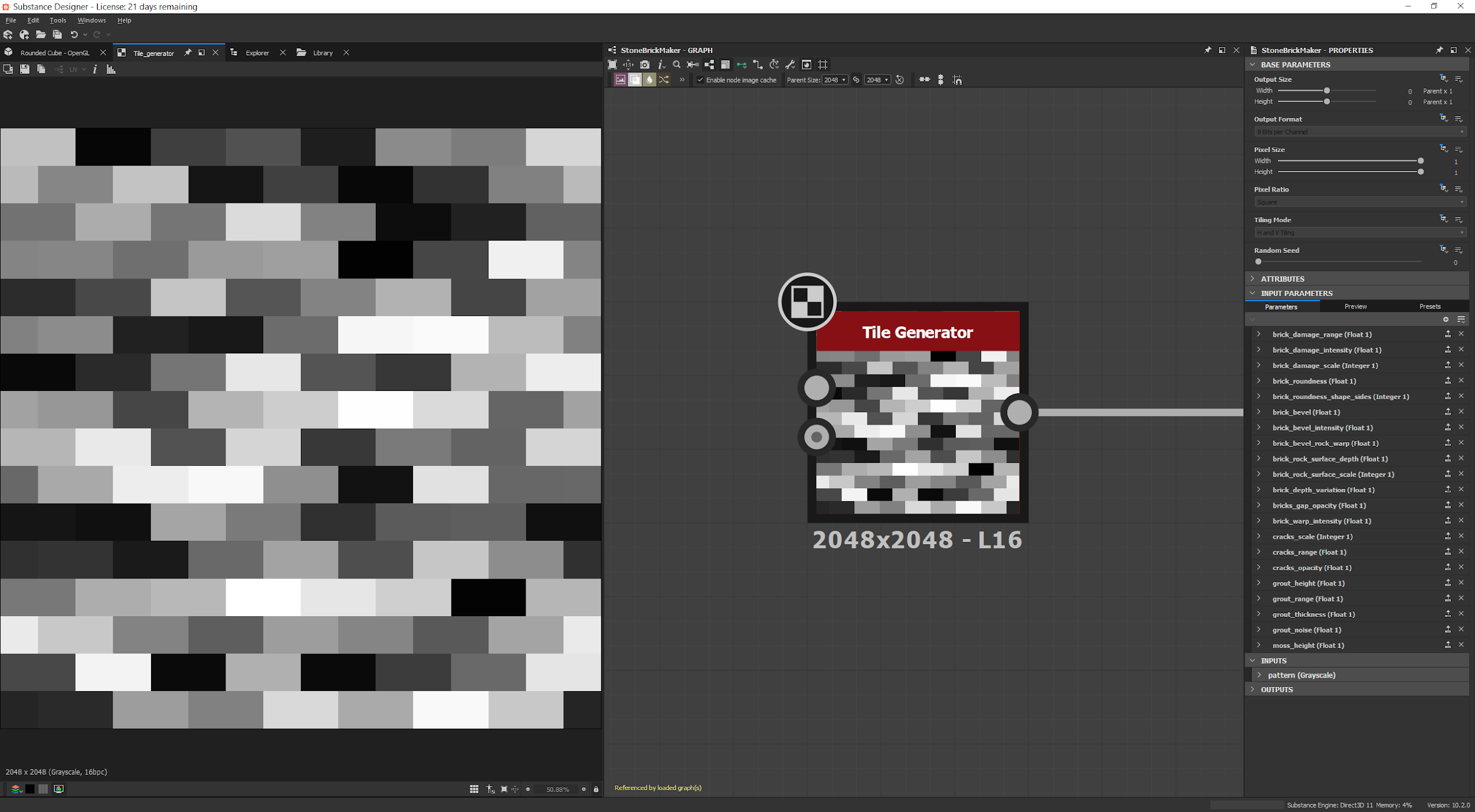
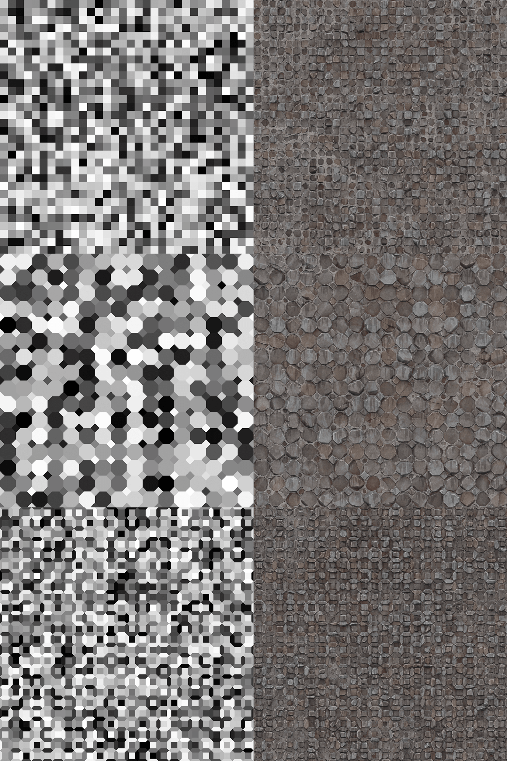
From here, I can derive a lot of information, such as edges, which I can generate individual islands from, which I can turn into random gradients….
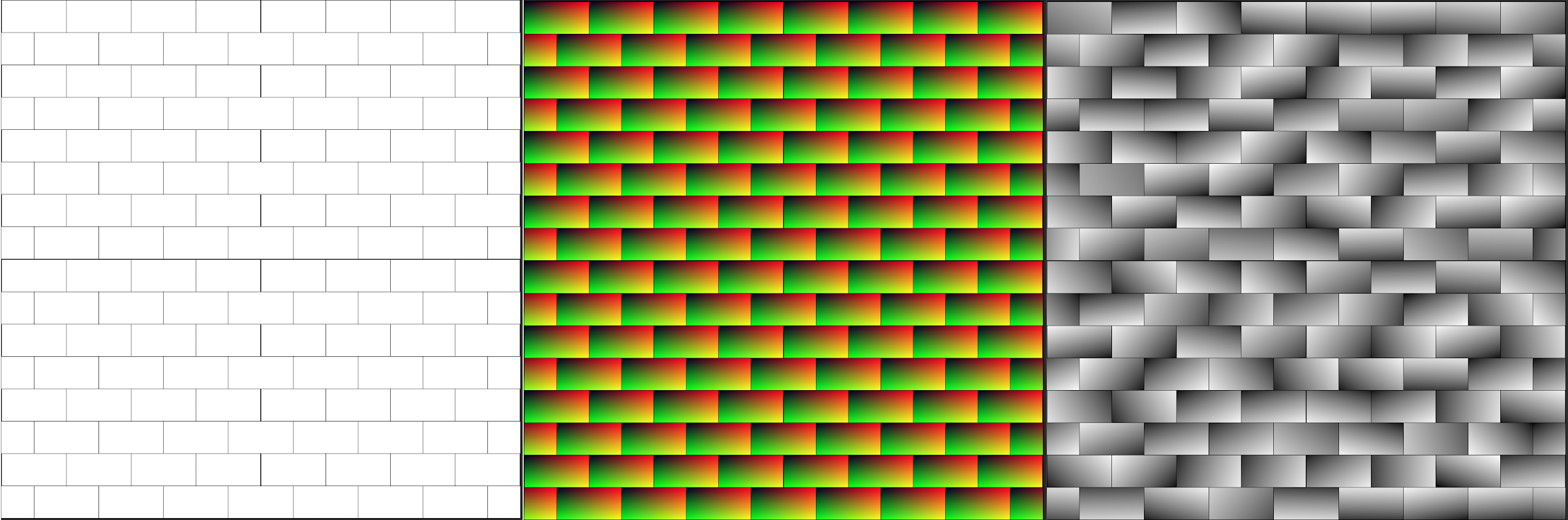
And after layering enough random gradients at different angles and intensities, I can get some lovely large rocky shapes, blend some additional rocky height into it, chop off the tops with some levels…
We’re getting something resembling a brick wall.
Here’s a gif of the whole thing through:
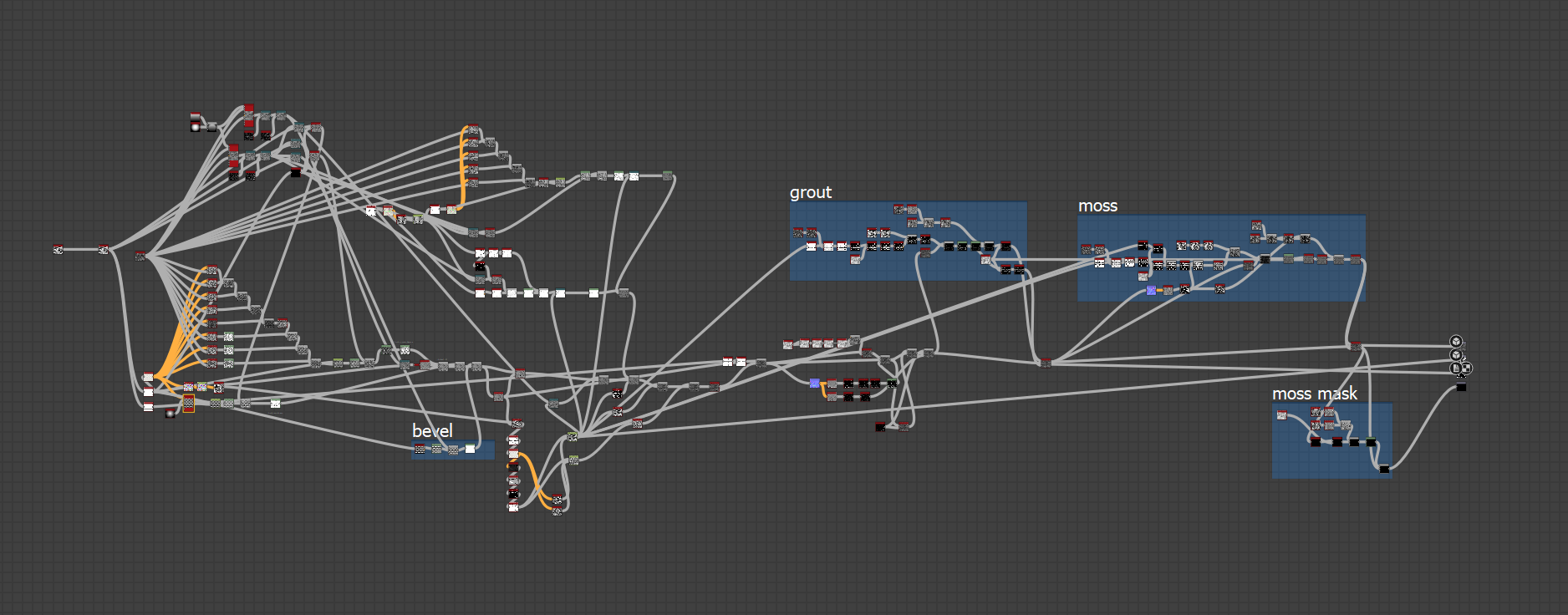
And here’s what that graph looks like, mmmm mmm spaghetti!
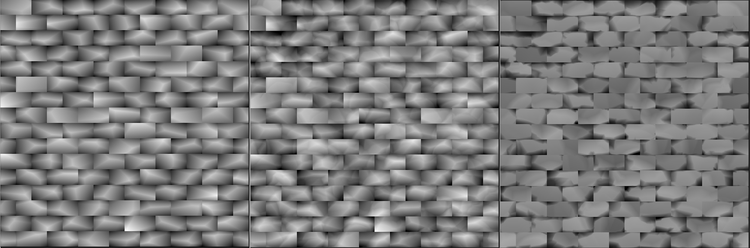
It’s worth mentioning that I don’t work blind with just the grayscale height trying to imagine the output, I have a 3d preview while I work.
You’ll notice that I have some OUTPUTs in there, those will come in handy for the next phase: color!
For the sake of brevity, here’s what the color part of the graph looks like:
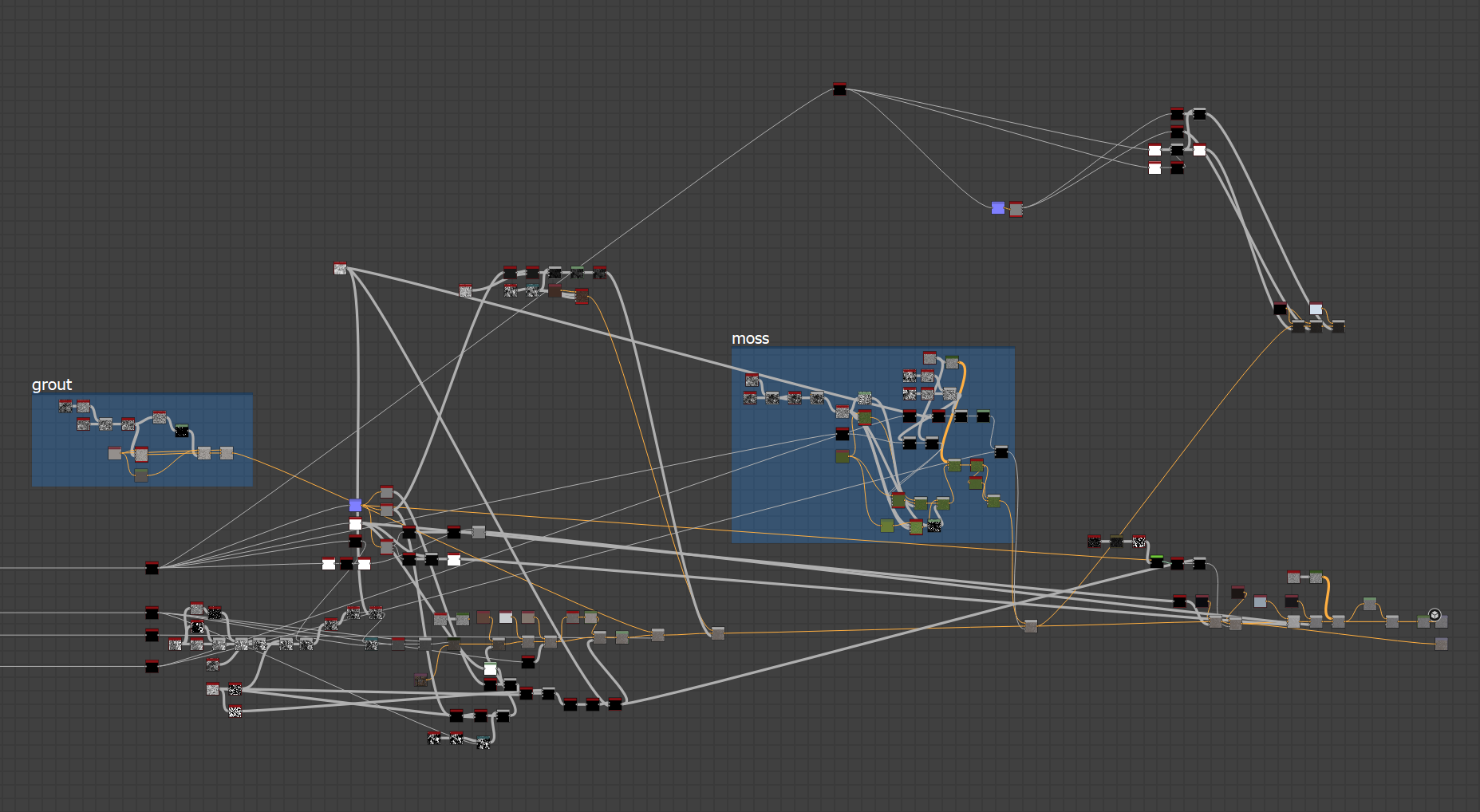
To explain, I’m taking the height I made earlier, and some of the masks and other outputs I made, and using that information to create gradients, drips, color variation, grunge, edge wear, and dirt. Here’s a gif of what that looks like:
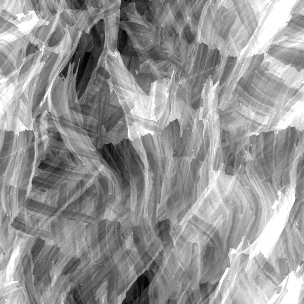
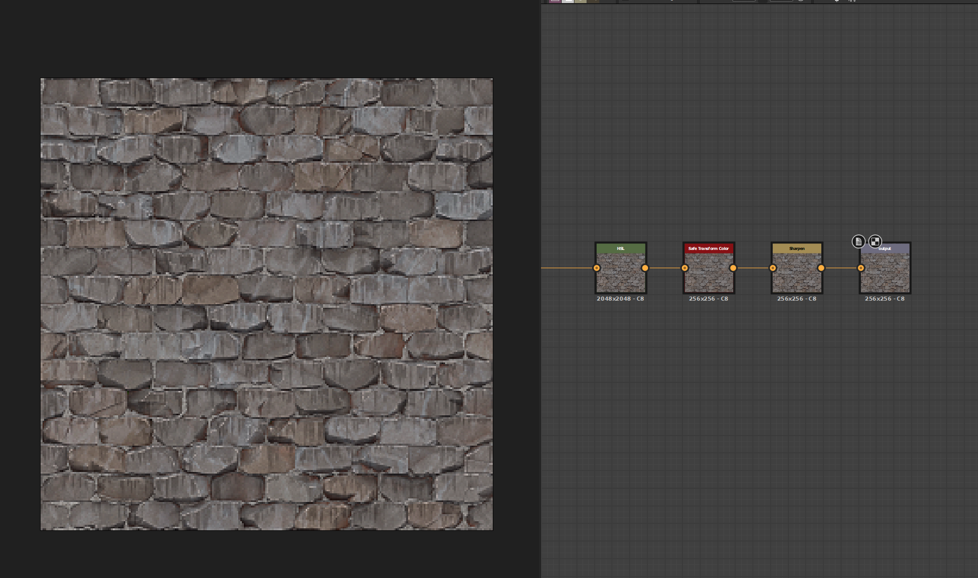
At this point, things diverge from a current-gen PBR workflow: I bake in the lighting. Using the green channel of a normal map I generate from the height, I can mask out the tops and bottoms of the bricks using 2 histogram select nodes. I then use those as masks to blend in a top light color, and a bottom shadow color, with a bit of ambient occlusion on top.
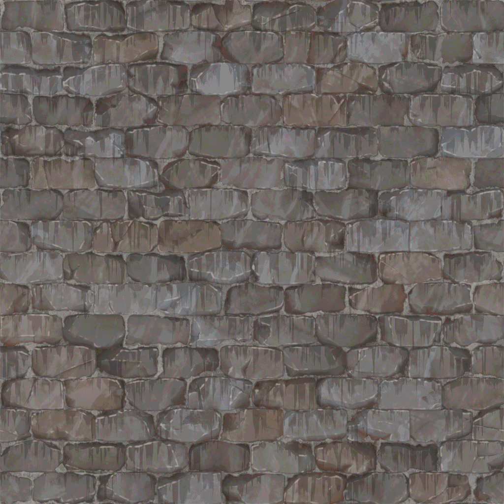
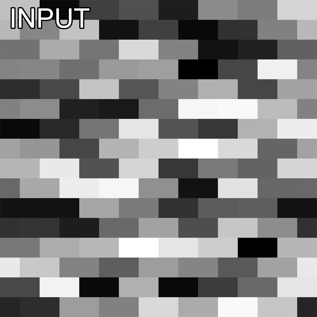
And to scale it down to retro size? This is possibly the laziest part of the whole thing, but the results can’t be argued with. I just down-sample it to 512 or 256, give it a light sharpen filter, a pat on the back, and send it on it’s way.
Okay, so you might be thinking “Ben, this is the most dull and arduous way to make a brick wall texture I’ve ever seen, why don’t you just paint it in photoshop like a normal person?”
Ahh you see, here’s where the magic starts. Remember that first pattern we started with? What if we just swapped to a different one?
Instant results, new texture, minimal effort. Remember, I only had to do the work once.
I can do more. I’ve separated the height and color into separate graphs with inputs and outputs, look how clean that is now!
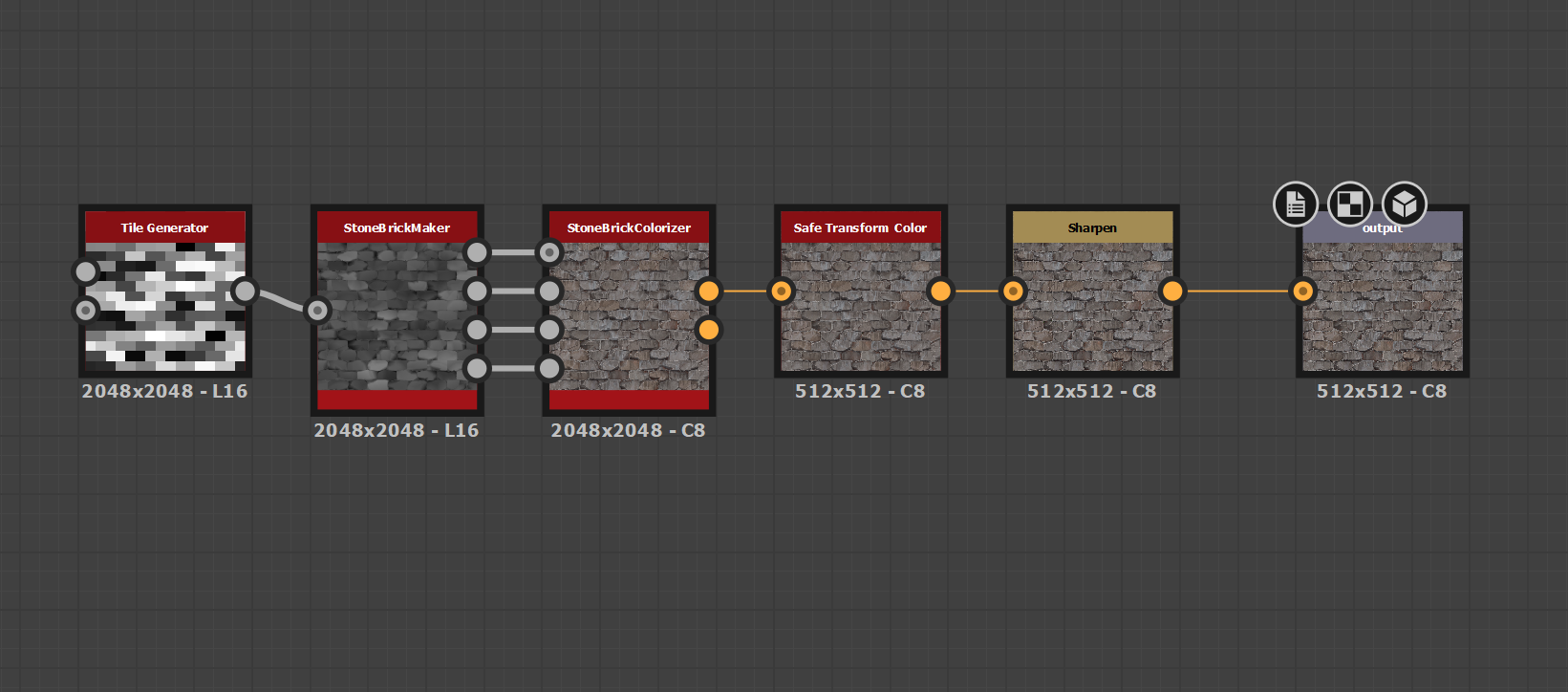
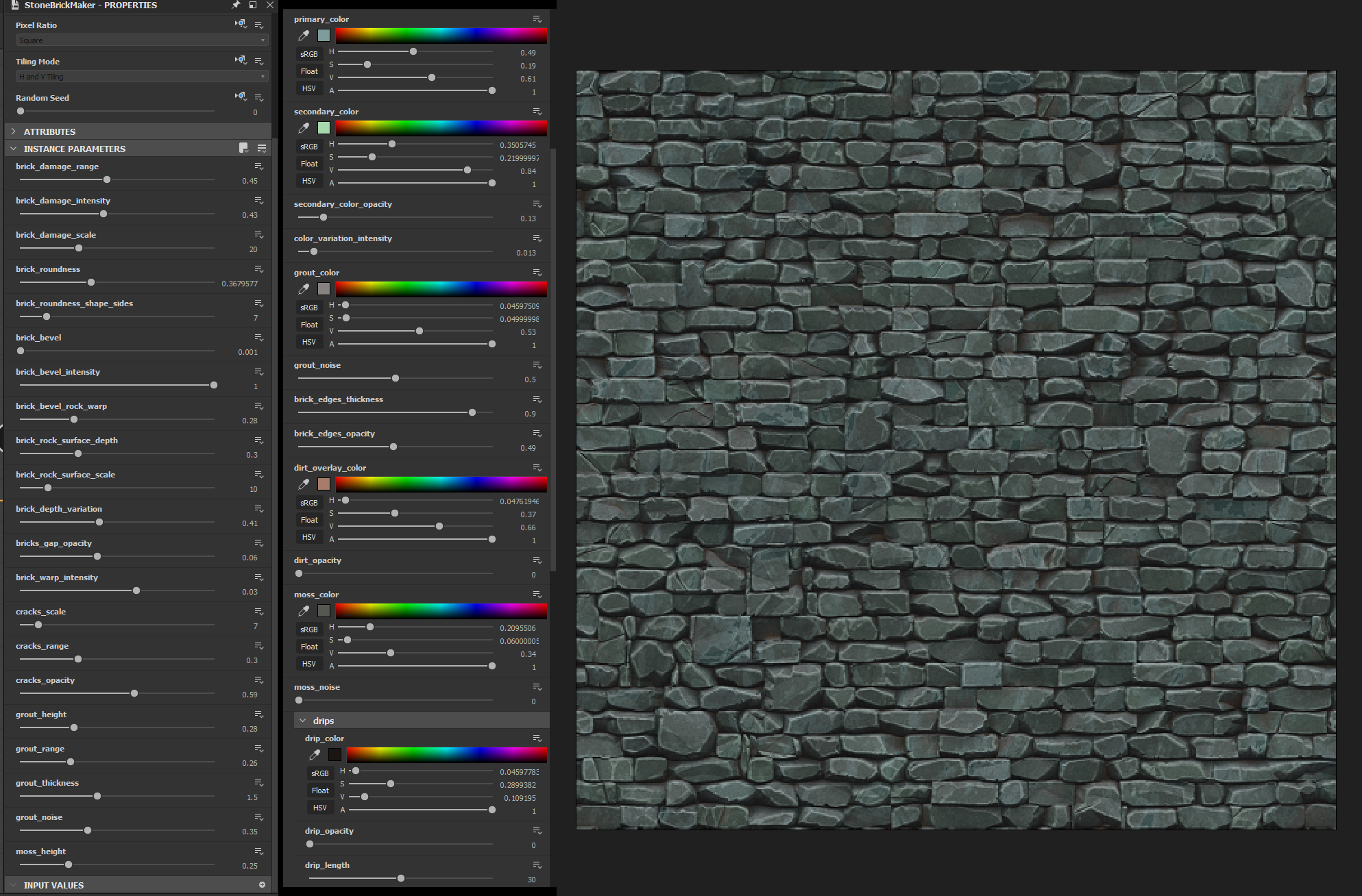
And I’ve parameterized several functions in these graphs to allow me to edit things like brick damage, grout height, brick color, drip length, lighting intensity ect. From 2 graphs, I can make infinite brick textures of all kinds.
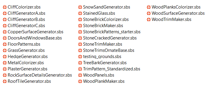
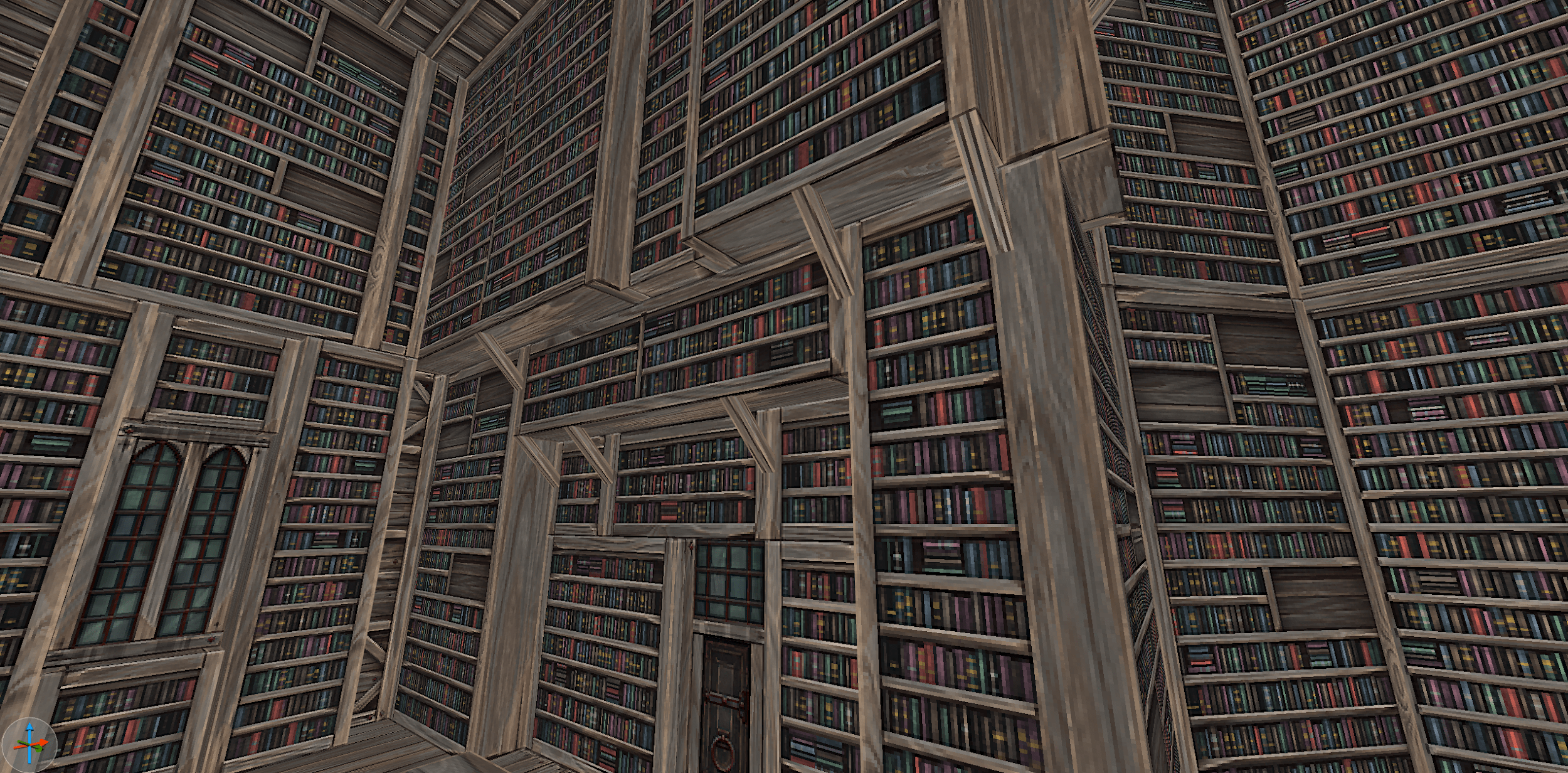
As I’ve worked on Graven, I’ve created many tools like these two. I find myself using them interchangeably to do surprising things, such as making a bookshelf!
Substance Designer has transformed the way I work forever, it’s enabled me to be more productive and inventive than I ever have been in my career. I highly recommend the software to anyone looking to improve their texturing, or to start for the first time!
Thanks for reading!
Written by Ben Hale.
https://store.steampowered.com/news/app/1371690/view/3041589956027454061
GRAVEN Dev Blog #5 - Characters Like it's 1998
Chuck Jones delves into the nitty-gritty of making characters come to life in GRAVEN.
Very few times do you get a chance to go back and re-do something. I have that opportunity working with 3D Realms and the GRAVEN team. Boomer shooters!
Yep, those long-time-ago-games are still hanging in there! My mission from Fred was to build these characters like I used to build them! After Duke and Half Life, I stayed in the industry still creating characters. I’ve learned a lot! The tools we used back then are gone, replaced with so much more advanced tools it presents a new challenge.
Well, we come back to the part of redoing something you did a long time ago… But this time, I can use my knowledge and modern tools! Can’t tell you how many times I’ve looked at my old models and wished I could rebuild with what I know today.
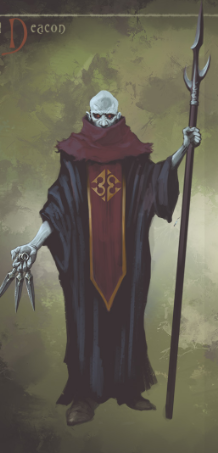
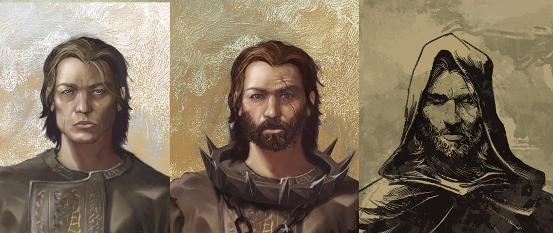
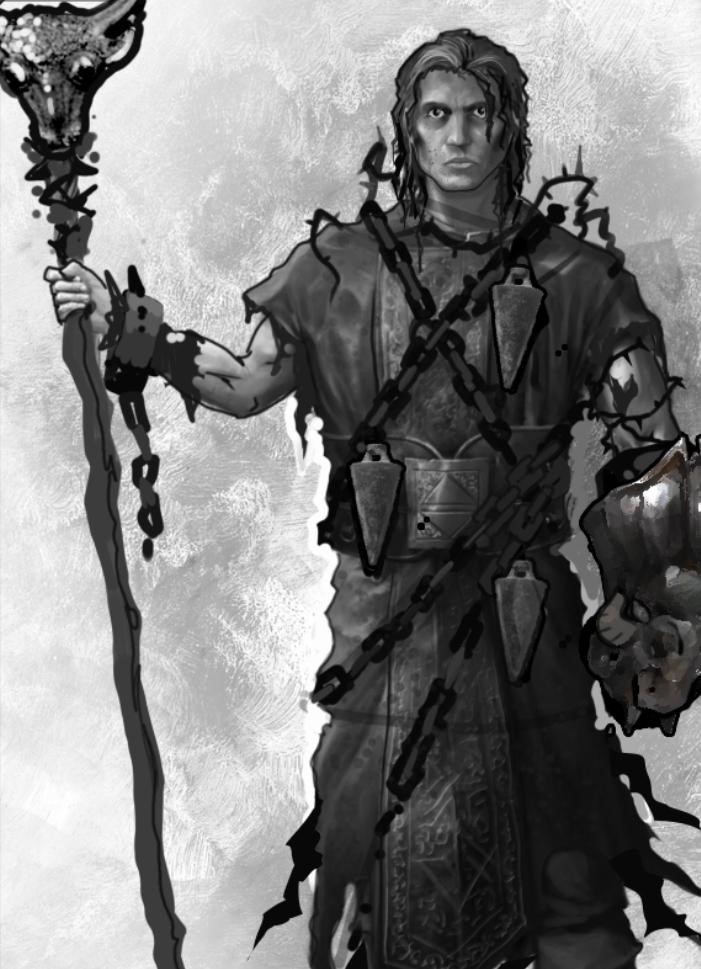
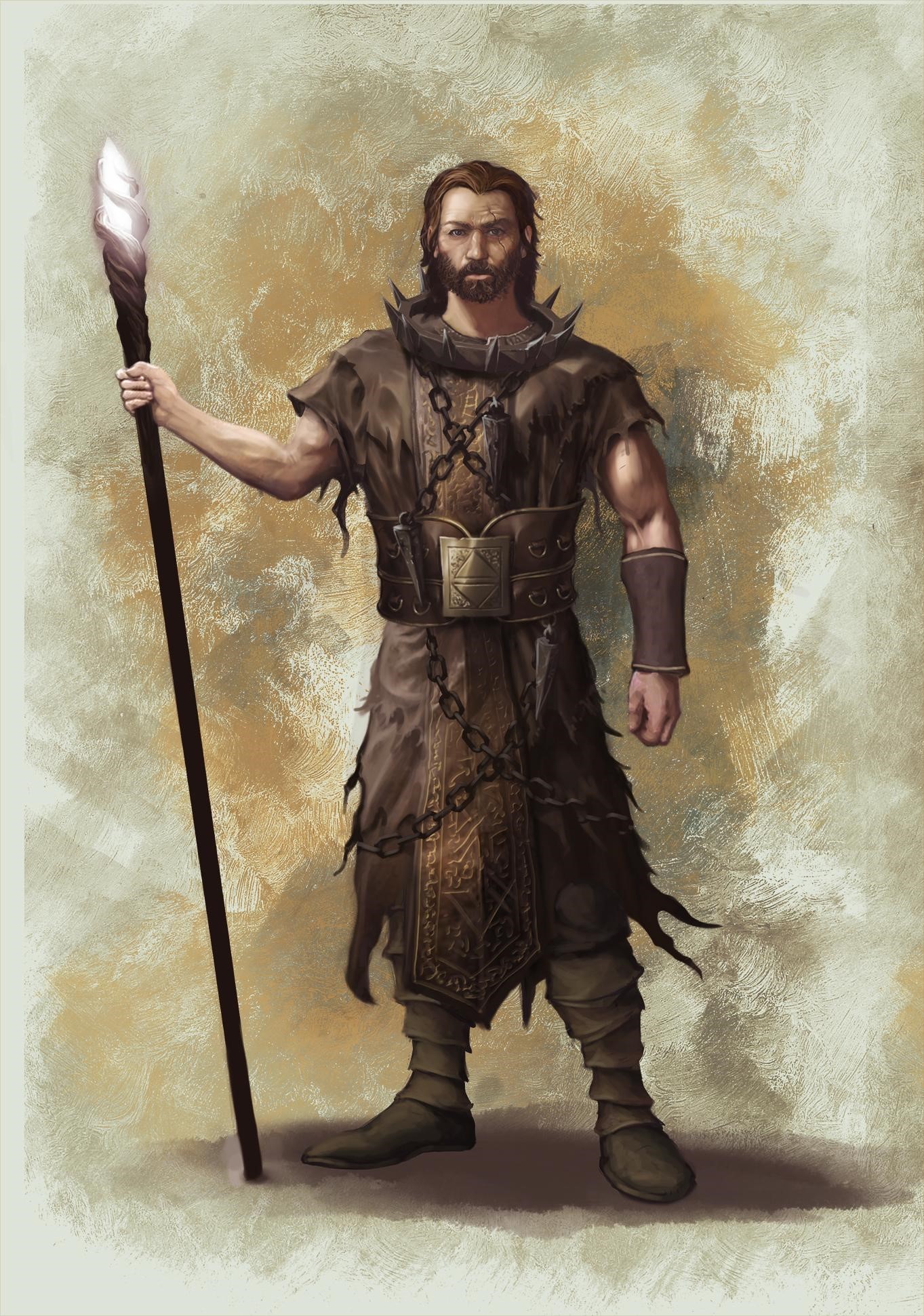
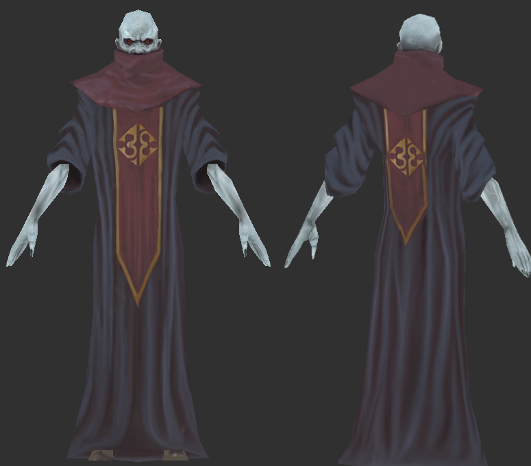
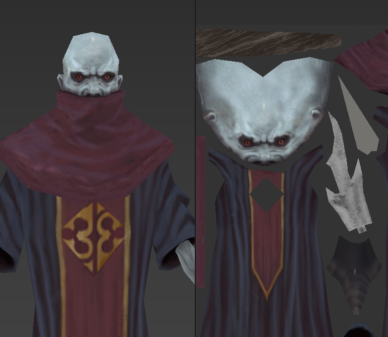
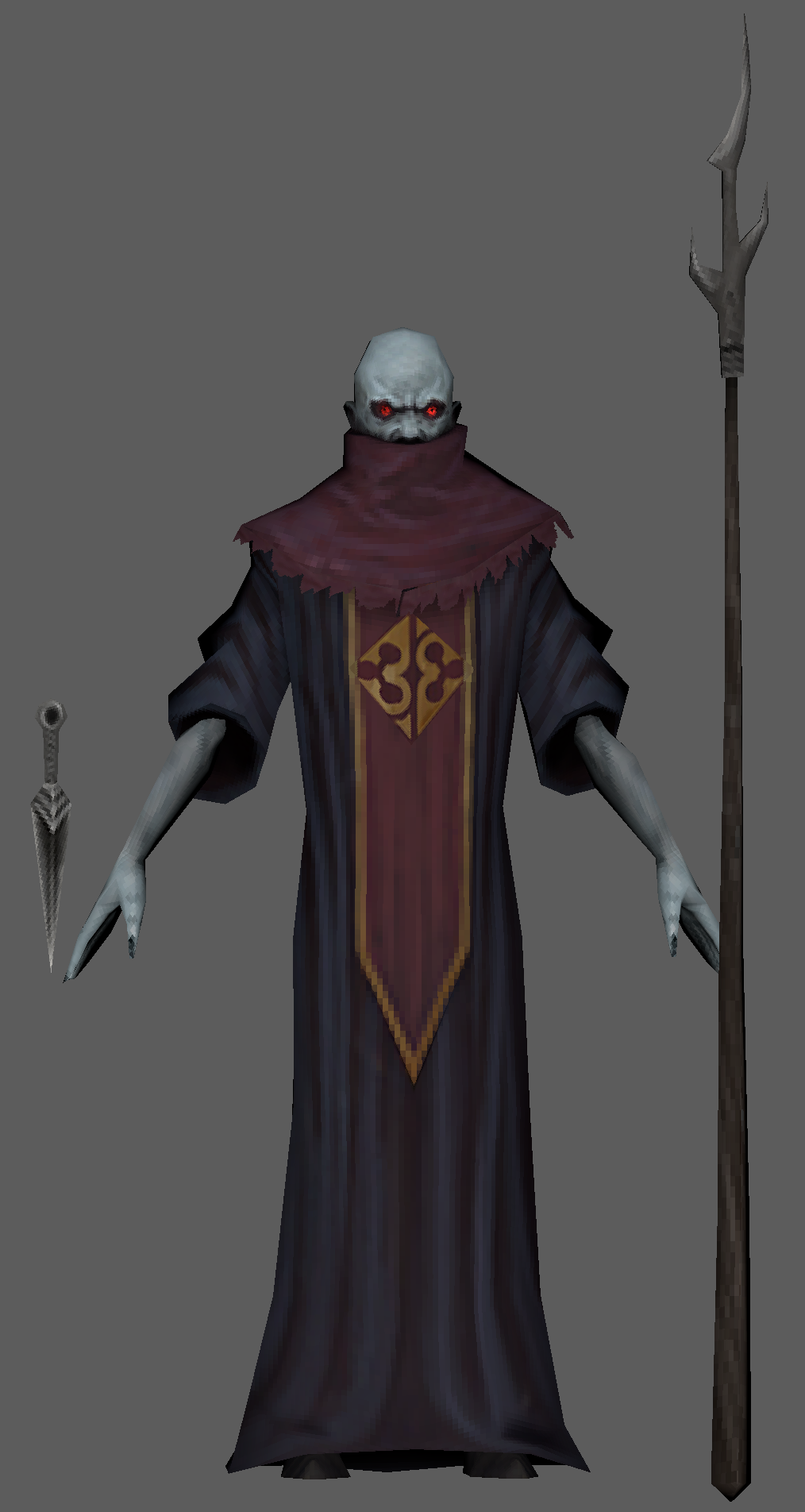
We’ll use GRAVEN’s Deacon as an example. Awesome character design by Bebeto Daroz, our art director. Look at the detail in him! His silhouette has so many folds and depth, how can we represent that with a low poly look?
For me, I always start with Zbrush! I know, it’s for hi res stuff, but I use it to build and plan the character ahead of time. WIth all the folds and details. I feel this will save me time and allow me to get the silhouette and overall shapes right before I commit to polygons.
So now I’ve made my proxy model in Zbrush, what’s next? Resurface!
We will take this mesh we just quickly comped in Zbrush and take it into our 3D software (I use Maya, use what makes you happy) Once I’m in, I use “Make Surface Live” tool, this allows me to put points on the model and draw out the quad. I do this over the entire model. It’s helpful because I’m using the hi res as a guide. True, I could have done this in Maya just in poly’s, but for me, it just works faster and it also allows me to capture some special texture maps to use later on in texturing.
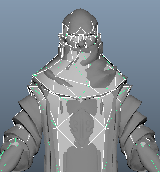
Here’s our Deacon model on top of it’s resurface proxy. I think it’s super important to get as many details into the model as possible, but you have to balance your poly budget! On the model here, I used the polys to build some of the folds on the arms, these work well in the silhouette!
UV’s are the next step. WIth the pixels being so visible in the final textures, I try to keep my texel density (pixel grid) in a linear direction. If you place a UV section diagonal, it may be very visible up against a section with a different direction.
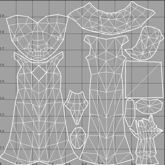
See the large square on the right? This was for his logo. Had I made it in the same ratio as the rest of the texture there would not be enough detail to see it. I cut this one out, making sure the edge matched with the design and made it separate with more resolution.
Really helps with its visibility.
Now back to Zbrush, this time to polypaint! This is a tool in ZBrush that allows you to paint directly on the model and over seams.
We have great concepts from Bebeto, so I project as much of it as I can onto the model. I want to capture the colors and even the paint strokes of his concept designs.
With most concepts, you only have one angle. Here’s where the brute force comes in and the need to hand paint the rest while in polypaint. It will also be necessary to reproduce things you see in the texture so it will all be cohesive!
The folds in the back must blend with the ones in front as well as any brush strokes or color.
Once I have the entire model polypainted, it’s time to capture the texture and export it. Since we’ve done our UV’s and imported the same mesh into Zbrush, all of our UV’s are there as well as our texture.
I will do one final step now that I have my diffuse map. That’s exporting the model into Substance Painter.
I import my game mesh into Substance painter and the new polypaint diffuse map too.
In Substance, I can adjust any colors. Add more details to create the opacity maps.
I will also use my Zbrush proxy mesh to rip more textures. AO and cavity maps can help add to the look.
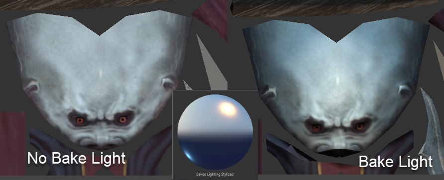
One other thing I’ve been doing in Substance is adding a Baked Lighting Stylized node.This will add lighting to the whole character. I will adjust down to 50% sometimes not to overwhelm the texture. It just adds a nice overall even light that really grounds the texture.
I can light the model from all angles and even add color lighting. All this will be non destructive, meaning I can go back and tweak when I want to. I save the hand painting part for last.
So now we reach the final model ready for the game with 256x 256 textures just like in the boomer days!
So many new tools I would have never dreamed of available today. Things change so quickly.
It’s been fun revisiting models built in the spirit of the old ones. I hope they bring as much entertainment as the other games I’ve had the pleasure working on.
Thanks for reading!
Written by Chuck Jones.
https://store.steampowered.com/news/app/1371690/view/3008941395577716115
GRAVEN Dev. Blog #6 - Rhythms of Despair
Greetings everyone! In this dev blog, music composer Nikola Nikita Jeremić goes into detail about the music for GRAVEN.
If I had to describe the music of Graven in a single word, I’d probably go for “tragic”. The main theme that plays in the menu is the first thing the players will hear when they start the game, and our idea was to start bold in order to capture their attention.
After talking about the game with Fred and the development team, I realized that this game is not going to be your standard fantasy RPG with the “good guy” hero. Our priest is the fallen hero. A bad good guy if you can call it that way, so the music had to portray that. He committed a sin and for that sin he was excommunicated from his order.
It is his life tragedy that we wanted to portray in music of the entire game, and the main theme was the starting point of building this ominous musical tragedy for Graven. The entire score is mostly orchestral, with additions of medieval instruments and some sound designed music atmospheres. On top of that, we opted for male choir, church bells and church organ to add a sense of “holiness”, since our “hero” is a priest after all. But we didn’t stop there. In order to present both religious fanaticism and heresy in a single character, we had to make a clash of “holy” instruments and “pagan heretic” instruments. At certain points you can hear a blend of church bells and organs accompanying solo instruments like zither and gypsy style violin. The character of those two solo instruments perfectly represents the other side of our priest as a heretic and a wandering outcast.
How to represent tragedy in music? The most common path is by composing in minor scale. Natural minor scale doesn’t fit here. It sounds sad and that’s all fine, but we needed tragedy, sadness and seriousness in this story, because we are not creating a sad love story. We’re creating a story about a man who used to be a representation of everything that’s holy and good, a protector of faith who went in the wrong direction after his daughter was killed, and he was out for blood. Harmonic D minor is the scale that tells that story, and that was our path.
The first demos I sent to Fred and the team were just some short audio clips of the overall musical atmosphere for the game, and from those first demos we knew we had a thematic material on our hands.
Soon afterwards we had our first version of the main theme which started pretty calm and then it was building up into a more dramatic sounding performance, but then we talked about how this is the first piece the players will hear as soon as they enter the main menu, and we wanted to make them get pumped about the game.
We re-arranged the main theme so it starts boldly and builds up into a big tragic orchestral piece which has its ups and downs, so the middle section of the final main theme was actually the start of the first version we initially had. With this approach, we had a perfect blend of both calm and dramatic parts of the piece, and we were able to create a never-ending loop for the main menu.
This melody that plays in the main theme is foundation of the game’s soundtrack, and we are using the melody as a motif in some of the other tracks as well.
When you create a usable main theme, you have a strong foundation for the rest of the soundtrack, because you have already created the template you will use for other tracks as well, and it very important if you want to have consistency further on.
This soundtrack is a labor of love, dedication and creative ideas of the entire development team, and every member has as much credit for this soundtrack as I do, even though I am credited as the composer. We really hope the players will enjoy listening to the soundtrack as much as they will enjoy playing the game.
Written by Nikola Nikita Jeremić - find him at www.nikolanikitajeremic.com
Boleskine
Arcane
- Joined
- Sep 12, 2013
- Messages
- 4,045
https://steamcommunity.com/games/1371690/announcements/detail/3059609427960938281
GRAVEN Dev. Blog #7: Level Design Documentation and Philosophies in GRAVEN
In this dev blog, lead level designer Chris Holden describes the documentation process when creating levels in GRAVEN.
It starts with a write-up of the core goals of the level. For example, "The Brine Muskeg" (Swamps) the player objective is to locate the sinking lighthouse and ignite it to lure the infected away from the gates to the next level.
GRAVEN uses an open world like hub system, designers need to know what level connections to include and where to put them. Missions are broken into mandatory and optional mission types. As above the mandatory mission of the Muskeg is to activate the lighthouse. From there, we list what weapons, items, enemies, etc. the designer needs to use. Most all of this is written by leads and/or everyone in collaborative meetings very early in the games development. Much of this is open to change, within reason, as the project develops.
At this point, the level is assigned to a single, core Level Designer. They continue the documentation process by creating a moodboard. This is collecting reference images that capture the atmosphere, colors, shapes, and so on of what they would like to see in the level. A concept artist then uses that reference to create key illustrations for the level.
The next big part of documentation for the level designer is creating a detailed plan for all the above information. This can include a top-down map, drawings, flow charts, write-ups of locations, encounters, puzzles and so on. This is mostly for the designer and it's up to them to document what they need to convey their ideas to the team. This is a more personalized part of the process as each designer handles their documentation differently.
With all documentation approved, the level designer now builds the level blockout. This is simple geometry to convey shapes, level layout, spaces, etc. This should be a fully playable version of the level from start to finish without any time spent detailing. The importance of this step is to ensure how the layout and gameplay should work, and address any issues before heavy detailing and reworking.
In Dev Blog #2, I detailed the process of creating level blockouts; read it here.
After the detailing is complete, the rest of the team dog-piles the level to add set dressing, lighting, vfx, scripting, audio and lore. Most of these have their own sub-level in Unreal so all individuals can be working on the level at the same time. Levels then go through rigorous internal playtesting and polishing.
Design Philosophies
Loops
In a literal sense a circle O shape, the infinity loop ∞ or figure-eight (8). These shapes keep the player in a flow that makes navigation feel smoothly meaningful. Like a roller coaster or race track, there's twists and turns that always come back to the station or hub. Skyrim's dungeons/caves often make great use of this by the end dumping the player back at the entrance. This avoids backtracking and gives the convenience of moving on quickly.
A basic loop is a column in a room. An object the player can run around that also provides cover an empty arena might not.
In this figure-eight example, the player can see, but not reach, a key. They must navigate around the loop to grab it and can drop back down to the entrance.
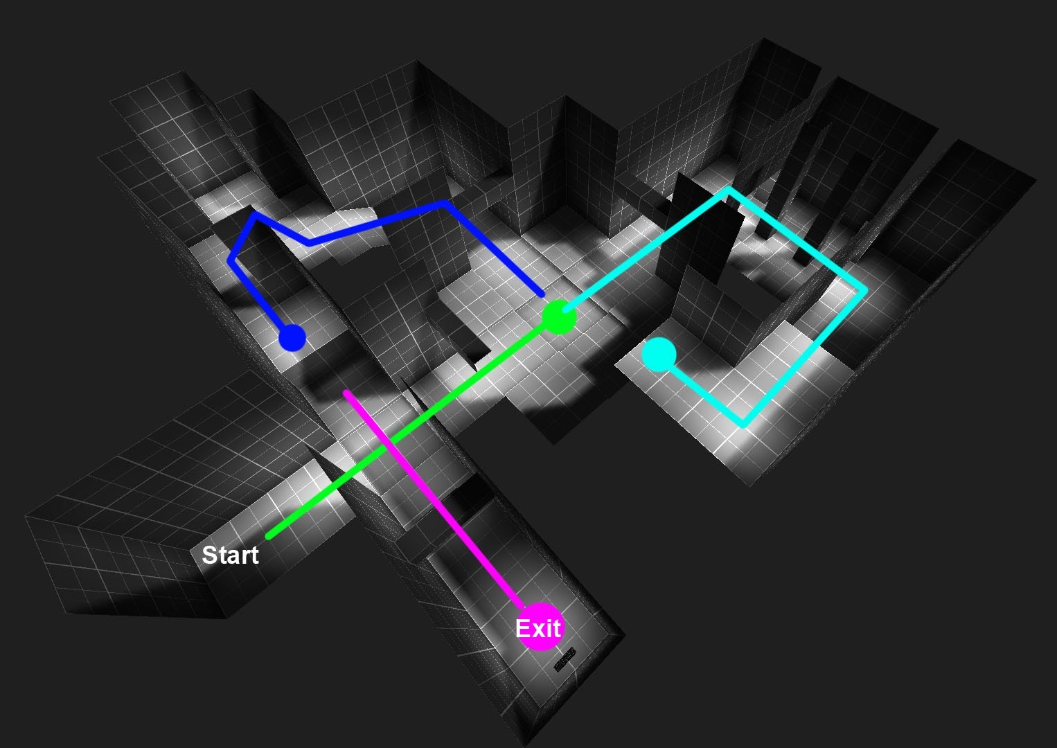
The first area comes to a 4-way hall where the player can see a key item on an unreachable platform on the left (blue dot) and a locked exit on the right (purple dot).
The only option is the green path to an arena fight. This continues on to a loop around to a key item (aqua dot) which grants access to the blue path loop and finally the exit.
The figure-8 layout is a straightforward way to achieve two loops. The raised areas could also include a raising platform that activates after the goal is reached to create a nice shortcut for backtracking.
Meaningful Backtracking
An infiltration where the protagonist reaches a goal and must escape. In Indiana Jones and the Temple of Doom, he has to avoid all the traps to get to the golden idol. Upon taking it, the temple begins to collapse and he's in a race against time with massive stone doors lowering and the iconic giant rolling boulder before being chased off by locals. The timed escape is a classic, nerve-wracking experience used in many video games. Super Metroid begins with one where Samus enters a dead space station to retrieve a metroid only to be thwarted by Ridley and must evacuate the station before it self destructs. The player learns the environment in a low stress situation then backtracks under high stress.
An example might be stealth into a powerful weapon and fight out. It can be more casual by going in to receive a navigation upgrade like double-jump the backtracking with many new exploration options.
Verticality
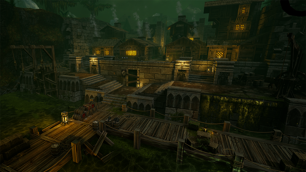
Landmarks can guide the player and give them reason to look up. For those that have played the GRAVEN demo you know about the Sunken Lighthouse and the Clocktower visible from the hub and swamp, both of which the player can walk to in the full release. In particular the clocktower is visible from almost all areas and can provide a sense of direction.
Vantage points allow the player to overlook an area, access dangers and plan out where to travel next. When designing the underground area of the first hub, verticality was one of my main goals and it started by laying out three tiers of playable space. The player enters this area from above. This gives the player multiple advantages in that they can see most of the area and can get the drop on the Infected. This goes both ways as in the underground as the transition to the other side is at the lowest level putting the player at the most disadvantage.
Visibility and Occlusion in verticality can provide cover and assist in performance. This also applies to loops mentioned above. The player or enemies gets the edge here. In the first areas of the hub, all of the buildings have optional explorable areas between them. And thanks to UE4's mesh bounds, most things behind them are occluded.
Encounters (covered a bit above): if the enemy is above the player and has a ranged attack this can be incredibly oppressive to the player. If you've ever played Quake, you know the destructive power of a couple Ogres lobbing grenades down or in DOOM when a designer places Revenant on a tall platform. Basically a turret spamming explosives. In the opposite situation, enemies placed in a basin below the player are fish in a barrel.
Epilogue
When it comes to Level Design I could go on all day. If you’re interested in it, Quake and DOOM communities are a great starting place. UE4, Far Cry, Source, Mario Maker for 2d. Another great resource is the LevelDesign hashtag on Twitter. Find what you want to make, study and the best advice I can give is make maps.
Last edited by a moderator:
Curratum
Guest
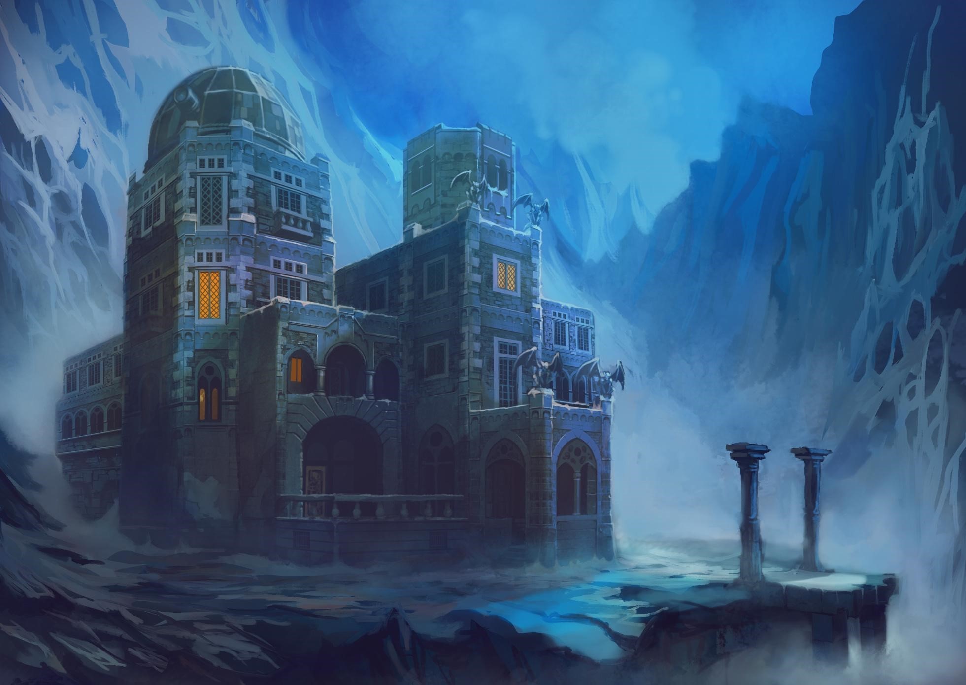
Increasingly more generic art direction, ahoy! That last shot looks like it's taken out of a game running stock Unity assets or something like Ziggurat.
https://steamcdn-a.akamaihd.net/ste...998563e34c819acd6fc51bea388ac30.1920x1080.jpg
https://steamcdn-a.akamaihd.net/ste...998563e34c819acd6fc51bea388ac30.1920x1080.jpg
- Joined
- Mar 25, 2012
- Messages
- 2,224


Looks like they forgot to disable texture filtering :-P
I for one find the art direction really boring.
Dark pseudo-medieval atmosphere. How fuckin original.
But watching the game play video I have an even worse feeling. The map really has a strong Hexen smell with lots of walls, cliffs, close-quarter combat. But these were due at the time to technical limitations. The real charm of these old shooters dwells in overcoming these limitations and proposing despite of them clever level design, precise and gratifying fight, never-seen worlds.
Here ? Seems to me all development energy is going in polishing an old-school ambiance, with no real effort in understanding what makes old-school shooters good games even today.
The more I watch the more I cringe. Breaking crates to loot coins or pink vials. The lightning effect that hasn't change since Quake. A static, empty world with few sad-looking fillers PNJs who would look out of place in any game. An overall art direction I could sum up as "Hexen II but developed by 2005 Blizzard". I hope the game will be better than it looks now 'cause in our day and age we could use better shooters, and for now it looks like shit.
- Joined
- Mar 25, 2012
- Messages
- 2,224
Hexen 2 has great level design that no "Hexen inspired" game so far has got (they are too afraid people will get lost and rate the game negatively on Steam i guess), the only technical limitation at the time was the hull count for collision detection because they had monsters of various sizes which is why each "hub" is broken in several smaller maps.
But walls, cliffs and especially close quarter combat is a design decision that is independent from technical limitations: being able to make larger maps does not invalidate that sort of level design. And FWIW already at the time the game was released games could do larger maps if they wanted (just not using the Quake engine).
But walls, cliffs and especially close quarter combat is a design decision that is independent from technical limitations: being able to make larger maps does not invalidate that sort of level design. And FWIW already at the time the game was released games could do larger maps if they wanted (just not using the Quake engine).
soulburner
Cipher
- Joined
- Sep 21, 2013
- Messages
- 810
I find it fascinating that the "old school" kind of 3D map design became impossible to reproduce in modern times. Whenever anyone touches the subject of a retro first person game, it mostly sucks. Ion Fury and Dusk were close to capturing this 1990s feel, but there was still something that was "off" about them. Wrath, based on what I saw on videos, feels soulless. Graven doesn't look interesting at all to me, no matter how much I like the general idea of what this game is trying to be. Some map designers who still make maps and mods for the original Doom and Quake seem to get it, but whenever a commercial retro title is announced, in most cases it sucks.
Curratum
Guest
I find it fascinating that the "old school" kind of 3D map design became impossible to reproduce in modern times. Whenever anyone touches the subject of a retro first person game, it mostly sucks. Ion Fury and Dusk were close to capturing this 1990s feel, but there was still something that was "off" about them. Wrath, based on what I saw on videos, feels soulless. Graven doesn't look interesting at all to me, no matter how much I like the general idea of what this game is trying to be. Some map designers who still make maps and mods for the original Doom and Quake seem to get it, but whenever a commercial retro title is announced, in most cases it sucks.
You should see WRATH Aeon of Ruin's levels!
- Joined
- Mar 25, 2012
- Messages
- 2,224
You should see WRATH Aeon of Ruin's levels!
What is the issue with them? I haven't played the game (waiting for a final version to be made) but from the screenshots i see they look great. The only issue i can think based on what i read is that they're too big (which is something that sadly plagues a lot of custom maps for Quake too, bigger is not always better people) and there isn't any sort of map to help with that.
Curratum
Guest
You should see WRATH Aeon of Ruin's levels!
What is the issue with them? I haven't played the game (waiting for a final version to be made) but from the screenshots i see they look great. The only issue i can think based on what i read is that they're too big (which is something that sadly plagues a lot of custom maps for Quake too, bigger is not always better people) and there isn't any sort of map to help with that.
It's not even the size for me. Most of the designs are pretty bland and uninspired. There are a few cool spots here and there, but there are way too many wide open spaces that lend themselves to slaughter maps more than the sort of game that Wrath is.
I haven't played the level they added in the last content update because I didn't want to spoil too much of the full game, but in general, it's very hard to believe that the same devs worked on Arcane Dimensions, because AD is miles ahead of Wrath in terms of level design.
- Joined
- Mar 25, 2012
- Messages
- 2,224
Thanks for explaining. Though TBH i do not like AD that much but that is again because the maps tend to become too big for their own good... when it comes to Quake maps i prefer the more retro-styled id-like maps - my favorite release in recent years has been the new unofficial episode by J.F. Gustafsson (Dimensions of the past).
Curratum
Guest
Thanks for explaining. Though TBH i do not like AD that much but that is again because the maps tend to become too big for their own good... when it comes to Quake maps i prefer the more retro-styled id-like maps - my favorite release in recent years has been the new unofficial episode by J.F. Gustafsson (Dimensions of the past).
Fair's fair. I adore the bigger maps, I love getting a bit lost and finding my way again.
- Joined
- Jan 28, 2011
- Messages
- 97,437


As an Amazon Associate, rpgcodex.net earns from qualifying purchases.