rusty_shackleford
Arcane
- Joined
- Jan 14, 2018
- Messages
- 50,754

it's pretty closeI doubt it, it's no push button and you get automatically what you want,


it's pretty closeI doubt it, it's no push button and you get automatically what you want,


Some of the UI is undergoing some modifications. I'll swing back around to it.
In fact, here's where I need opinions; because I am working on changing some things around and improving graphics across the board. Just don't know if I'm going in the right direction.
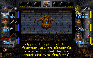
For example, the main layout of the game. Initially I wanted it to resemble the Gold-Box games, and it had this familiar layout that resembles those games very closely:
But, I've been revamping it to have a centered viewport, character portraits, a different layout, etc. Honestly don't know if this would be considered better or worse...
Thoughts?
Just to put an end to the debate, I went ahead and rolled it back to the non-portrait version of the game. It's more in line with the kind of game I'm trying to build anyway. Sometimes I lose sight of that, so I need to remind myself what the goal is.
Thanks for the feedback.