Putting the 'role' back in role-playing games since 2002.
Donate to Codex
Good Old Games
  • Welcome to rpgcodex.net, a site dedicated to discussing computer based role-playing games in a free and open fashion. We're less strict than other forums, but please refer to the rules.

    "This message is awaiting moderator approval": All new users must pass through our moderation queue before they will be able to post normally. Until your account has "passed" your posts will only be visible to yourself (and moderators) until they are approved. Give us a week to get around to approving / deleting / ignoring your mundane opinion on crap before hassling us about it. Once you have passed the moderation period (think of it as a test), you will be able to post normally, just like all the other retards.

Obsidian's Pillars of Eternity [BETA RELEASED, GO TO THE NEW THREAD]

Grunker

RPG Codex Ghost
Patron
Joined
Oct 19, 2009
Messages
27,765
Location
Copenhagen
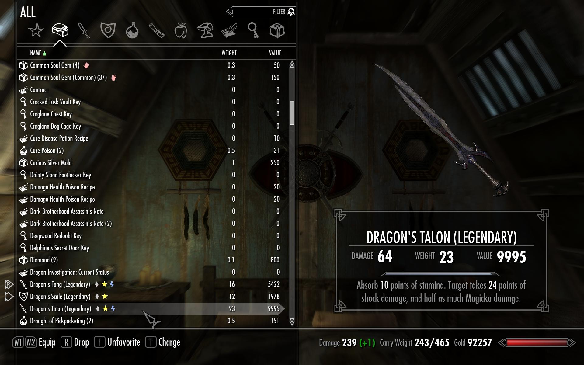
But remember, Sykrim has shitloads of stuff and you only have one inventory to manage... the moment you move to various party menbers & inventories - like in W2 - the instant recognition of icons is pretty much a necessity, or you'll be scrolling through 6 inventories like a retard trying to find that one thing you need.
ibbglmKRTKGTFc.jpg
I find those icons pretty easily recongnisable.

I made this point earlier as well. Lists have the additional inherent weakness that in party games you need a shared inventory if you use list inventory, for the exact reasons you mentioned, and shared inventory sucks.
Uh, no. There's nothing preventing you from making separate inventories. I hope you noticed that you can switch between vendor and pc inventories in Skyrim.

I said inherent weaknesses, not "IT'S PHYSICALLY IMPOSSIBLE." You don't see the problems with having six different SkyUI inventories to go through? Not at all?

Also, you seem to have missed the point pretty bad. SkyUI's icons are general category icons, not specific icons for each individual item like the IE games. Full plate is one icon, full plate +1 another, specific full plates yet another.
 

Liston

Augur
Joined
Mar 28, 2013
Messages
200
Duuuuuude, did you even read my posts? Most people cannot get fast overviews with a glance when they deal with a blurry list. I use icons in the folders where it is possible because it has more usability.

Really? In file managers where you are going to see a large amount of the same icons? I guess we browse different directories.
 

Grunker

RPG Codex Ghost
Patron
Joined
Oct 19, 2009
Messages
27,765
Location
Copenhagen
Uses the term "e-sport" unironically.
:nocountryforshitposters:

It's shorter than typing out 'games that, through one of the world's most bizarre cultural quirks, South Koreans watch in obscenely large numbers'.

Not only South Koreans. E-sports is a massive industry in terms of turnover in the west as well, especially in north america and northern europe. It's also growing nearly exponentially.
 

felipepepe

Codex's Heretic
Patron
Joined
Feb 2, 2007
Messages
17,312
Location
Terra da Garoa
I find those icons pretty easily recongnisable.
Dã, they are sorted tabs, with very few itens. Unless you open and sort every single inventory every time, browsing a character's inventory is something like this:

d83bfyrfbx.jpg

Managing 6 inventories like this is a pain. In grid inventories you can even use the grid positions to physically set them apart, placing all the sell-able junk on the lower part and stuff like that.
 

FeelTheRads

Arcane
Joined
Apr 18, 2008
Messages
13,716
Windows Explorer vs RPG inventories. Only on the Codex.

Does not work. You typically have folders with the same type of files so then icons don't really do much. If you do however have folders with different types of files then icons would make it much easier to identify between music, video, pictures and so on.
The same, or even more so in RPGs where you not only have different types of items, you also have special items.

You don't see the problems with having six different SkyUI inventories to go through? Not at all?

Tabs within tabs. The apex of design.
 

Lancehead

Liturgist
Joined
Dec 6, 2012
Messages
1,550
I said inherent weaknesses, not "IT'S PHYSICALLY IMPOSSIBLE." You don't see the problems with having six different SkyUI inventories to go through? Not at all?
I can see problems if navigating such inventories is heavily mouse dependent. The SkyUI screen posted above by Xeon should work pretty well with moderate keyboard use.

Also, you seem to have missed the point pretty bad. SkyUI's icons are general category icons, not specific icons for each individual item like the IE games. Full plate is one icon, full plate +1 another, specific full plates yet another.
It seems I have.

I find those icons pretty easily recongnisable.
Dã, they are sorted tabs, with very few itens. Unless you open and sort every single inventory every time, browsing a character's inventory is something like this:

d83bfyrfbx.jpg
I don't understand your point here; why do you have to sort anything except:

Managing 6 inventories like this is a pain. In grid inventories you can even use the grid positions to physically set them apart, placing all the sell-able junk on the lower part and stuff like that.
?

And regarding this, I've said earlier that SkyUI lacks custom categories which I consider a flaw. It also lacks drag and drop, but it wasn't necessary in a single character game, especially without custom categories.
 

hiver

Guest
tab by value and type takes care of all possible assortment problems in an icon-item inventory, grid based, limited or unlimited.
functionality and usability actually top any possible list shit.

plus as ive said, item-icon based inventory directly strengthens several important features of the game, look and feel being the least of it.


- i keep my folders set to thumbnail view, as the files themselves too.
makes it much easier to find what the fuck you are looking for, then going through the list.
 

FeelTheRads

Arcane
Joined
Apr 18, 2008
Messages
13,716
The SkyUI screen posted above by Xeon should work pretty well with moderate keyboard use.

So, from being easy to use with a mouse we get to being easy to use with a mouse+keyboard. And this is increase in usability?
 

Lancehead

Liturgist
Joined
Dec 6, 2012
Messages
1,550
Custom categories =/= physically splitting items up and managing them all manually.
Not functionally. A separate category is the physical split and you can have drag and drop.

The SkyUI screen posted above by Xeon should work pretty well with moderate keyboard use.

So, from being easy to use with a mouse we get to being easy to use with a mouse+keyboard. And this is increase in usability?
Pretty much in every software I used, including games, use of keyboard shortcuts improved workflow. But I've said as much as a sort of disclaimer a few pages ago. If someone were to say "I like to use mouse for pretty much everything, therefore I want a UI for that purpose", then sure, I'm not going argue that.
 
Last edited:

FeelTheRads

Arcane
Joined
Apr 18, 2008
Messages
13,716
Pretty much in every software I used, including games, use of keyboard shortcuts improved workflow.

That's not the point.
Interface already easy to use with the mouse -> gets faster to use with keyboard shortcuts
Interface that NEEDS keyboard shortcuts to be usable

See the difference?

And, like I said some time ago, RPGs are a gentleman's game and a gentleman plays his games with a cigarette and a glass of liquor in his hand. No hand for keyboard. :martini:
 

tuluse

Arcane
Joined
Jul 20, 2008
Messages
11,400
Serpent in the Staglands Divinity: Original Sin Project: Eternity Torment: Tides of Numenera Shadorwun: Hong Kong
The inventory should be stored in a sql database and the game should include an interactive query interface. Anything less is popamole. :rpgcodex:
 

Lhynn

Arcane
Joined
Aug 28, 2013
Messages
9,963
Jesus christ, this has turned into being jrpg inventory style vs wrpg inventory style and no one seems to have noticed.

What works is having a limited space inventory were you can see what you have at any given time, icons (unique icon for each item with different properties) or no icons (names of the items should be descriptive enough). you have X number of those (were X is the number of the party members) and make the interaction between them extremely easy and fast. No lazy shit like auto comparison, that tends to make items stat based instead of giving each and every object its own characteristics, but yes to a log where you can "paste" items of your choosing to have fast access to the info even across multiple party members.
 

Lancehead

Liturgist
Joined
Dec 6, 2012
Messages
1,550
Pretty much in every software I used, including games, use of keyboard shortcuts improved workflow.

That's not the point.
Interface already easy to use with the mouse -> gets faster to use with keyboard shortcuts
Interface that NEEDS keyboard shortcuts to be usable

See the difference?
But I wasn't comparing grids against lists there.

Edit: Also, you haven't quite got the first scenario correct. It gets faster by replacing mouse with keyboard. Which means that if you have a certain number of actions you can perform with either mouse or keyboard then using keyboard instead of mouse (not mouse + keyboard) expedites the process.
 
Last edited:

hiver

Guest
And, like I said some time ago, RPGs are a gentleman's game and a gentleman plays his games with a cigarette JOINT and a glass of liquor in his hand. No hand for keyboard. :martini:

-fixed-

please dont spread cancerogenous lethal substances propaganda, tnx. lets keep things healthy. for the kids.
 

felipepepe

Codex's Heretic
Patron
Joined
Feb 2, 2007
Messages
17,312
Location
Terra da Garoa
I don't understand your point here
Let me try to be as didactic as I can. Bellow are 8 inventories, 4 of them are from Arcanum (Grid/Tetris style), 4 from SkyUI (List style). Each of these groups has similar amount of items, but only one shield each.

Now open the spoiler tab and see in which group is easier to find it.

qZNI8Jm.jpg
Get my point?
 
Last edited:

FeelTheRads

Arcane
Joined
Apr 18, 2008
Messages
13,716
But how can you tell it's a shield if it doesn't say "shield"? Such small, indistinguishable icons!
 

Lancehead

Liturgist
Joined
Dec 6, 2012
Messages
1,550
I don't understand your point here
Let me try to be as didactic as I can. Bellow are 8 inventories, with similar amount of shit inside. 4 of them are from Arcanum (Grid/Tetris style), 4 from SkyUI (List style). In all those inventories, there is only one shield.

Now open the spoiler tab and see where it is easier to find it.

qZNI8Jm.jpg
Get my point?
Making a new post to answer more elaborately.

Grid: Since you don't know where the shield is you start checking inventories one by one. You may find it with the first party member in which case it pretty quick, or you may find with the last party member in which case it'd take a bit of time.

List: You press a key to activate search, start typing 'shield' and you'll have your result. And before you ask, you should be able to search all inventories much like how you can search subfolders.
 

Grunker

RPG Codex Ghost
Patron
Joined
Oct 19, 2009
Messages
27,765
Location
Copenhagen
Ultrafunctionalists in this case are like the ultraformalists of video gaming in general who claim mechanics are the SOLE thing that matters. The logical conclusion of both arguments is that every game should be black text on white background. No, bloody Excel is not the pinnacle of inventory screens for fucks sake.

Any stance taken to the extreme ends up in retarded territory like this. I don't believe we could find anyone anywhere else who would argue that Windows Explorer is seriously a design paragon for video game inventories, fortunately...
 

felipepepe

Codex's Heretic
Patron
Joined
Feb 2, 2007
Messages
17,312
Location
Terra da Garoa
Making a new post to answer more elaborately.

Grid: Since you don't know where the shield is you start checking inventories one by one. You may find it with the first party member in which case it pretty quick, or you may find with the last party member in which case it'd take a bit of time.

List: You press a key to activate search, start typing 'shield' and you'll have your result. And before you ask, you should be able to search all inventories much like how you can search subfolders.
So it's better to have a shitty UI and implement a search system to make it functional than to have a good UI that may require simply opening each party inventory?

Not to mention that opening the search window, typing what you want, finding the item and who owns it and then opening his inventory is much more complex and time wasting than just opening all inventories....
 

As an Amazon Associate, rpgcodex.net earns from qualifying purchases.
Back
Top Bottom