


This was already posted 4 minutes ago. How is it possible it hasn't been added as an emoticon yet? How long do we have to wait?! Infinitron


-
Welcome to rpgcodex.net, a site dedicated to discussing computer based role-playing games in a free and open fashion. We're less strict than other forums, but please refer to the rules.
"This message is awaiting moderator approval": All new users must pass through our moderation queue before they will be able to post normally. Until your account has "passed" your posts will only be visible to yourself (and moderators) until they are approved. Give us a week to get around to approving / deleting / ignoring your mundane opinion on crap before hassling us about it. Once you have passed the moderation period (think of it as a test), you will be able to post normally, just like all the other retards.
You are using an out of date browser. It may not display this or other websites correctly.
You should upgrade or use an alternative browser.
You should upgrade or use an alternative browser.
Return To Monkey Island - MI2 sequel from Ron Gilbert
- Thread starter Wirdschowerdn
- Start date

rusty_shackleford
Arcane
- Joined
- Jan 14, 2018
- Messages
- 50,754

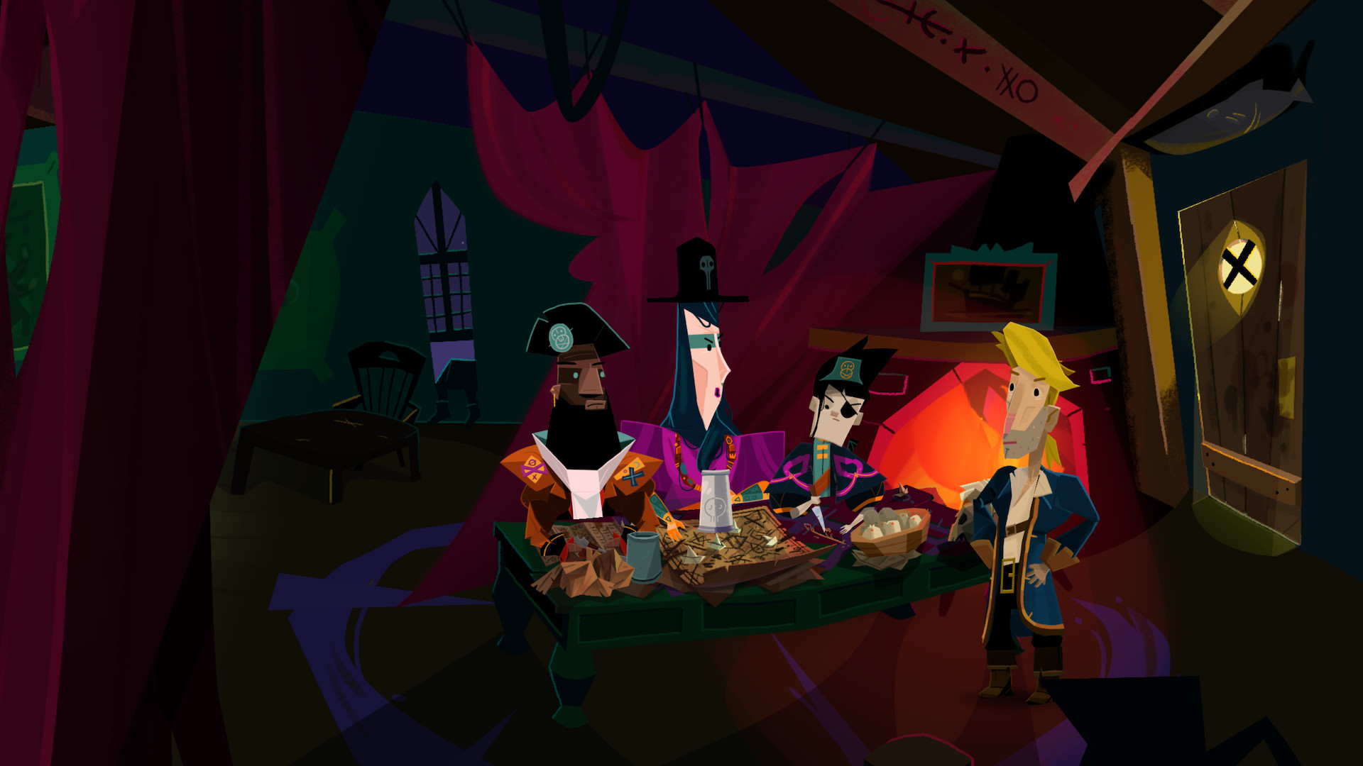
It's almost guaranteed made using something like thisThere's something about modern art and animation that has always bothered me. It's as if it looks too clean or polished.
The first thing that comes to mind is The Simpsons. I haven't watched it since the early 2000s but when I see a commercial or ad the modern animation seems like a huge downgrade. The 90s episodes had softer colors and edges. Modern animation is too sharp or detailed. I can't quite put my finger on it but it's like there's too much stark contrast. It's jarring and I honestly find it unpleasant to look at the second image. Every color is so bold in a way that my eyes don't know how to focus. Maybe I'm just getting older.


I don't know if this is related to the issues others have with ReMI's art, but I get a similar feeling as with The Simpsons example. The ReMI art is too clean and polished. On one hand the art style looks objectively well-done and unique in its own way, but on the other hand there's something that feels "off". The foreground blends into the background, like @Strig and @Jenkem noted.

uncalled forAnd my post began with the word "people", not "you"!
Alex
Arcane
I proudly identify as a Retro-Fascist.
Yeah, I don't understand why people assume that being a retro-fascist is supposed to be a bad thing.
Morpheus Kitami
Liturgist
- Joined
- May 14, 2020
- Messages
- 2,521
Personally, I prefer the term "traditional animation" because technically "hand-drawn" and "computer-drawn" are rather illogical. The latter is still being drawn by hand, simply using different tools. But other than that you're absolutely right. The artists knew their medium well and actually took into account how the animation would look on a standard TV. Line work was adjusted and so were the colors, if you look at the original animation cells the palette is always quite stark and it was precisely because they knew that it's going to get muted during the development, making copies/generation loss and finally on a standard broadcast. I believe that current digital artists either use the old color tables from pre-digital era or just don't care how it looks on a modern screen. And modern TVs, for some bloody reason, have often this oversaturated look to begin with. On top of that artists usually are pretty enamoured with digital line work as they get a consistent, clean result with every stroke of the pen. That's exactly what every course trains you to do, it's just that with any tactile material you get texture and the pen in your hand will never make two lines which are exactly the same. Many creators hate that prefering this consistent sterile look. Generally, I believe that limitations breed creativity and slight imperfections give character. Not to mention that any grain or texture on a flat color is just free detail. Even if you skillfully clean traditional animation to somewhat match the current standards it still looks way better with its painterly backgrounds and evidently inked lines. I'll just again fall back on City Hunter as an example.It's (at least) two things.There's something about modern art and animation that has always bothered me. It's as if it looks too clean or polished.
The first thing that comes to mind is The Simpsons. I haven't watched it since the early 2000s but when I see a commercial or ad the modern animation seems like a huge downgrade. The 90s episodes had softer colors and edges. Modern animation is too sharp or detailed. I can't quite put my finger on it but it's like there's too much stark contrast. It's jarring and I honestly find it unpleasant to look at the second image. Every color is so bold in a way that my eyes don't know how to focus. Maybe I'm just getting older.
I don't know if this is related to the issues others have with ReMI's art, but I get a similar feeling as with The Simpsons example. The ReMI art is too clean and polished. On one hand the art style looks objectively well-done and unique in its own way, but on the other hand there's something that feels "off". The foreground blends into the background, like Strig and Jenkem noted.
First, it's hand-drawn animation vs computer-drawn, AI-assisted CGI.
Second, the former was intended to be shown on standard definition televisions, while the latter was intended for HD flatscreens. The lines need to be thicker on the former and the colors different on the latter, for the end result to 'look' right.
Funnily enough the silver and bronze age comic books suffer from similar ails. When they're not being completely recolored they get "restorations" with absolutely garish colors. They probably match the original tables but there's a slight problem. New editions are printed on a white paper, often glossy, and the originals were printed on cheap yellowish pulp which chugs the inks like Russkij udarnik chugs vodka on his day off. It's all about mastering the medium, nowadays they think that if it's done digitally it'll look good on anything, no need to think about it too much. We could even circle back to vidya by discussing how pixelart looks now and how it's "supposed to look" with CRT monitors or shaders, but there already is a topic for that, I believe.
People also tend to use an animation style these days that I believe started with Flash, where they're not drawing a new frame of animation, but rather repositioning the limbs of a character much like construction paper, a marionette or a 3D model. While cost-cutting measures were a thing before this (see every TV cartoon of the '60s and '70s) this particular style feels cheaper than those. You can often tell what uses this animation style because limbs tend not to look properly connected. If someone is drawing each new frame of animation, it tends to look better than the cheaper version.
Which doesn't apply to The Simpsons, I think they still have hand-drawn animation, they just have a lot less of it. Can't find it now, but I remember some video comparing shopping scenes between the early years of the show and a more recent one and the more recent one had a lot less going on.
ADULF HITLOR FAN KLUB
Arcane
More drama.


Morpheus Kitami
Liturgist
- Joined
- May 14, 2020
- Messages
- 2,521
Gee, its almost like there are consequences for treating part of your audience like a pile of human garbage. I've seen people do this bullshit a lot in recent years, and the only time it ever works if they're "fuck you" popular. I don't think that's something Gilbert can afford to bet on.More drama.
Boleskine
Arcane
- Joined
- Sep 12, 2013
- Messages
- 4,045
That would be a good title for the site in browser tabs.
"rpgcodex > Home of Retro-Fascists"


THE CHARACTERS LOOK HORRIBLE. the background is meh, but I am indifferent.
now I remember why I hate the character art so much, they look like even worse looking funko pops
now I remember why I hate the character art so much, they look like even worse looking funko pops
Alex
Arcane
You mean avant-garde antifa.Come on, accusing him of being an abhorent human is too much. Shame Armato just didn't say grognard, skip all this BS.
Then again....those comments could have been a false flag from retro-Antifa.
Strig
Learned
Personally, I prefer the term "traditional animation" because technically "hand-drawn" and "computer-drawn" are rather illogical. The latter is still being drawn by hand, simply using different tools. But other than that you're absolutely right. The artists knew their medium well and actually took into account how the animation would look on a standard TV. Line work was adjusted and so were the colors, if you look at the original animation cells the palette is always quite stark and it was precisely because they knew that it's going to get muted during the development, making copies/generation loss and finally on a standard broadcast. I believe that current digital artists either use the old color tables from pre-digital era or just don't care how it looks on a modern screen. And modern TVs, for some bloody reason, have often this oversaturated look to begin with. On top of that artists usually are pretty enamoured with digital line work as they get a consistent, clean result with every stroke of the pen. That's exactly what every course trains you to do, it's just that with any tactile material you get texture and the pen in your hand will never make two lines which are exactly the same. Many creators hate that prefering this consistent sterile look. Generally, I believe that limitations breed creativity and slight imperfections give character. Not to mention that any grain or texture on a flat color is just free detail. Even if you skillfully clean traditional animation to somewhat match the current standards it still looks way better with its painterly backgrounds and evidently inked lines. I'll just again fall back on City Hunter as an example.It's (at least) two things.There's something about modern art and animation that has always bothered me. It's as if it looks too clean or polished.
The first thing that comes to mind is The Simpsons. I haven't watched it since the early 2000s but when I see a commercial or ad the modern animation seems like a huge downgrade. The 90s episodes had softer colors and edges. Modern animation is too sharp or detailed. I can't quite put my finger on it but it's like there's too much stark contrast. It's jarring and I honestly find it unpleasant to look at the second image. Every color is so bold in a way that my eyes don't know how to focus. Maybe I'm just getting older.
I don't know if this is related to the issues others have with ReMI's art, but I get a similar feeling as with The Simpsons example. The ReMI art is too clean and polished. On one hand the art style looks objectively well-done and unique in its own way, but on the other hand there's something that feels "off". The foreground blends into the background, like Strig and Jenkem noted.
First, it's hand-drawn animation vs computer-drawn, AI-assisted CGI.
Second, the former was intended to be shown on standard definition televisions, while the latter was intended for HD flatscreens. The lines need to be thicker on the former and the colors different on the latter, for the end result to 'look' right.
Funnily enough the silver and bronze age comic books suffer from similar ails. When they're not being completely recolored they get "restorations" with absolutely garish colors. They probably match the original tables but there's a slight problem. New editions are printed on a white paper, often glossy, and the originals were printed on cheap yellowish pulp which chugs the inks like Russkij udarnik chugs vodka on his day off. It's all about mastering the medium, nowadays they think that if it's done digitally it'll look good on anything, no need to think about it too much. We could even circle back to vidya by discussing how pixelart looks now and how it's "supposed to look" with CRT monitors or shaders, but there already is a topic for that, I believe.
People also tend to use an animation style these days that I believe started with Flash, where they're not drawing a new frame of animation, but rather repositioning the limbs of a character much like construction paper, a marionette or a 3D model. While cost-cutting measures were a thing before this (see every TV cartoon of the '60s and '70s) this particular style feels cheaper than those. You can often tell what uses this animation style because limbs tend not to look properly connected. If someone is drawing each new frame of animation, it tends to look better than the cheaper version.
Which doesn't apply to The Simpsons, I think they still have hand-drawn animation, they just have a lot less of it. Can't find it now, but I remember some video comparing shopping scenes between the early years of the show and a more recent one and the more recent one had a lot less going on.
Yeah, it's called puppet animation or puppet rigging. In the context of adventure games Daedalic significantly increased the use of this technique in their games over the years, if you're interested in this type of "art style evolution". The Whispered World was very traditional in its execution. The Deponia series made extensive use of puppet rigs but, quite surprisingly, mostly in cutscenes. Chains of Satinav was very much "rigged from the start" which, to be fair, allowed for a pretty fancy art direction for the characters. Even if the effect was a bit lifeless. I agree it often looks extremely cheap, brings to mind Flash animations and absolute TV trash aimed at preschool children like Peppa Pig. I like what they did with that technique in the later seasons of Archer though.
Comments on Gilbert's blog are full of sycophants. From what they write they'd eat up whatever he'd serve them, so he could've easily made something palatable to almost everyone and chose not to. Also, they're not sending their best:

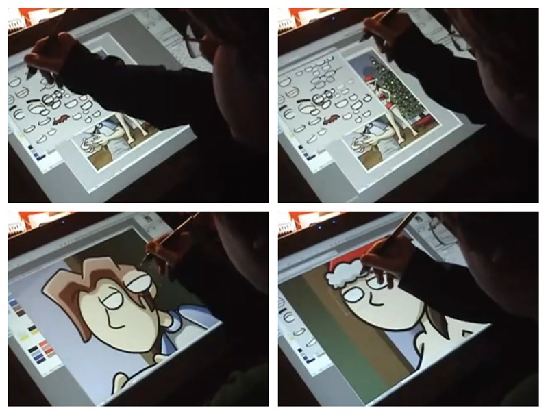
The last 30 years changed almost everything about the animation and made it easier/more accessible than ever before. The scale of these changes, I believe, was unprecedented. Literally warehouses of equipment and storage space can be swapped for a laptop if you're hard pressed. Just look at THIS monstrosity used for something that in the end looks so simple. And these people try to authoritatively speak about what looks good or cheap, or whatever really.
As for Gilbert and his ilk, I'm beginning to suspect they're all dyslexic. The brief probably said they need an appealing art style and what we got is an appalling art style. Can't be a coincidence. Same with Hollywood casting and producers not getting the gingers they asked for.
Last edited:
rusty_shackleford
Arcane
- Joined
- Jan 14, 2018
- Messages
- 50,754
Devs love echo chambers, it's why they like discord so much.
Boleskine
Arcane
- Joined
- Sep 12, 2013
- Messages
- 4,045
Recall that Dave Gilbert spent years on the Codex enjoying interactions with fans and supporters. Then Unavowed came out and the reception here was quite mixed compared to near unanimous praise in the press and on social media. Gilbert suddenly had the epiphany that the Codex was too toxic for him.
It's one thing to complain that a forum is "dedicated to saying how much he sucks" (paraphrasing) but another to gloss over the fact that he didn't mind the crass, edgy forum culture as long as he received mostly positive feedback. (((Gilbert))) after all...
It's one thing to complain that a forum is "dedicated to saying how much he sucks" (paraphrasing) but another to gloss over the fact that he didn't mind the crass, edgy forum culture as long as he received mostly positive feedback. (((Gilbert))) after all...
Last edited:


The new art style reminds me of South Park, but with round shapes exchanged by polygons.
A visually similar game for me is Guacamelee.
 esbanja referências numa fiesta metroidvânica - Nintendo Blast")
I wouldn't want a pixelized VGA style game at all. My ideal would be a painted art style that woud emulate a painting of steve purcell or someone that has that artstyle, that would remind us of the original cover arts.
I always thought MI 1 and 2 had a "realistic" approach to graphics, because it looked like indiana jones crusade and atlantis adventures, with well proportioned design. They had comedy and the cartoon tropes were more prominent in monkey 2, for example when guybrush drinks alcohol beverege his mouth opens as if he was "the Mask", or when he sees lechuck is alive, his hair literally leaves his head showing his bald head. That's why I hated his COMI version because they went full cartoon, instead of something more like the dig or even full throttle. They could use a realistic cartoon aproach like broken sword. But that kind of worked because it was something in the vibe of day of the tentacle.
But COMI started this trend of embracing a cartoon style, I'm okay with RoMI going full modern cartoon and break free of conventions and expectations.
What I think it's unfair is saying the new style is a mess or confusing. They're colorful and full of angles, but they're simple and easy to read. And you instantly recognize old locations and characters. I think what bothers most people is because it looks like art for kids.
As I said before, I'm mostly worried about the story/puzzles. If the game fails, it will probably be because it fails in that aspect.
Well, it will actually fail anyway, because its an adventure game.
A visually similar game for me is Guacamelee.
I wouldn't want a pixelized VGA style game at all. My ideal would be a painted art style that woud emulate a painting of steve purcell or someone that has that artstyle, that would remind us of the original cover arts.
I always thought MI 1 and 2 had a "realistic" approach to graphics, because it looked like indiana jones crusade and atlantis adventures, with well proportioned design. They had comedy and the cartoon tropes were more prominent in monkey 2, for example when guybrush drinks alcohol beverege his mouth opens as if he was "the Mask", or when he sees lechuck is alive, his hair literally leaves his head showing his bald head. That's why I hated his COMI version because they went full cartoon, instead of something more like the dig or even full throttle. They could use a realistic cartoon aproach like broken sword. But that kind of worked because it was something in the vibe of day of the tentacle.
But COMI started this trend of embracing a cartoon style, I'm okay with RoMI going full modern cartoon and break free of conventions and expectations.
What I think it's unfair is saying the new style is a mess or confusing. They're colorful and full of angles, but they're simple and easy to read. And you instantly recognize old locations and characters. I think what bothers most people is because it looks like art for kids.
As I said before, I'm mostly worried about the story/puzzles. If the game fails, it will probably be because it fails in that aspect.
Well, it will actually fail anyway, because its an adventure game.
- Joined
- Dec 14, 2009
- Messages
- 3,895
What the actual FUCK.
Even the ugly Special Edition had a better artstlye than this.
The decline, illustrated in 3 pictures:
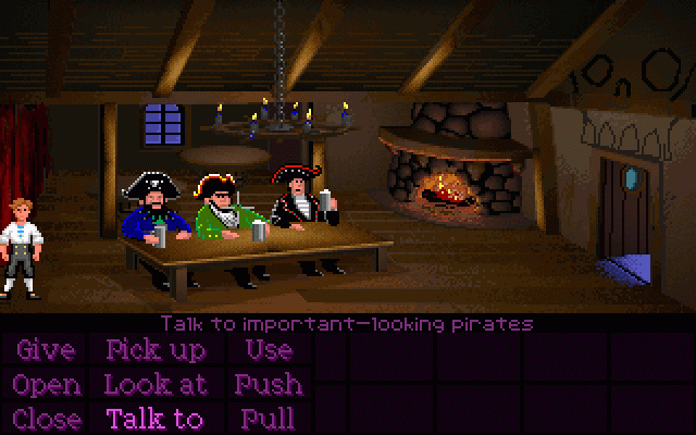
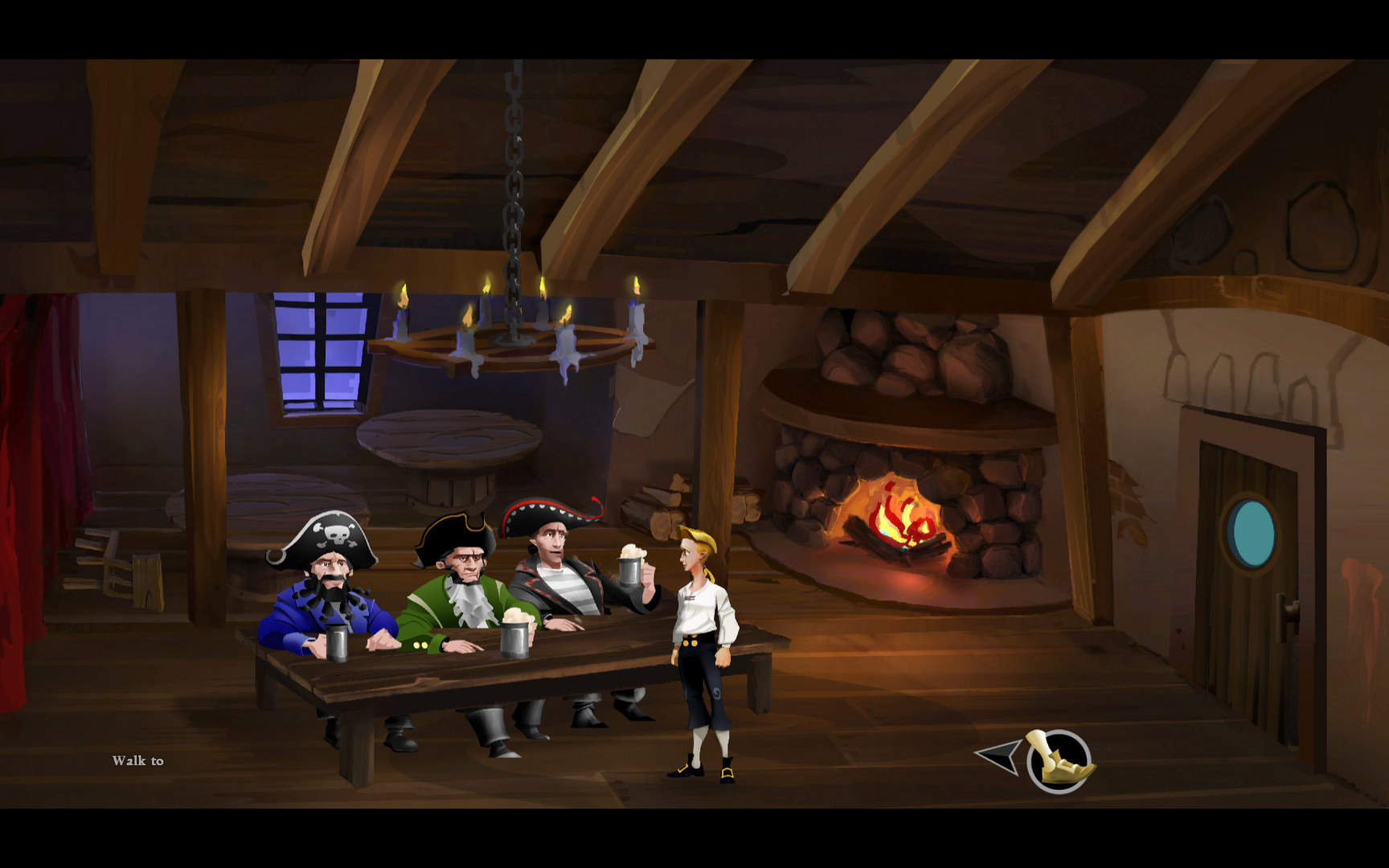
Do I even need to point out that the three pirates went from "white-white-white" to : "jogger-woman-asian"?
kaysayva
Literate
- Joined
- Jun 30, 2022
- Messages
- 8
it even gets worse when they bring up the stupid argument is that "MI never had a standard artstyle bla bla bla..." does this mean it shouldn't even learn from the past mistakes, and keep on making mistakes?
they bring up COMI as an example, and it is a stupid comparison, because COMI is a real 2d, hand animated game, despite the comic cartoonish style, it is still a REAL authentic 2D game...
which is unfair to compare with a sloppy cheesy 2.5d flash, spine, powerpoint auto generated animation style... this mixing is horrible, i dunno whats wrong with people's minds
Falksi
Arcane
The game looks like pure eye-AIDS. The embodiment of everything wrong about modern game-art in one game. It literally hurts to look at it, and the whole thing moves as if it's got a disability.
Gilbert's a fucking right vagina for not having the balls to listen to criticism. What's worse is that so many loved modern adventure games, such as Darkside Detective and Technobabylon, provide a guide for what people still love about the games.
Gilbert's just dumb as fuck for choosing an art-style which is designed specifically for people not really interested in MI or adventure games in general.
If he wants to surround himself with a handful of people who'll put a wall between him and the success that thousands of MI fans would bring this game if they got what they wanted, then fair play he's every right to be that stupid.
Last edited:
i don't dislike cartoony art style (broken age for example. not quite a good game, but the art is excellent) the same with firm fandango, deponia, etc. it's just this particular style is just plain ugly.


Hate the art style and my enthusiasm for the game has plummeted. With adventure games the visuals are an integral part of the game play. I imagine Gilbert can't take the criticism because he waited too long to "showcase" the art. They had already made so much of it for the game that financially they can't go back and fix it. He now has to be overly defensive because the team's choices can't be changed now.
Sizzle
Arcane
- Joined
- Feb 17, 2012
- Messages
- 2,471
Hate the art style and my enthusiasm for the game has plummeted. With adventure games the visuals are an integral part of the game play. I imagine Gilbert can't take the criticism because he waited too long to "showcase" the art. They had already made so much of it for the game that financially they can't go back and fix it. He now has to be overly defensive because the team's choices can't be changed now.
I think it's more along the lines that he - personally - likes the art style and is pissed off that (most) other people don't. He expected everyone to fawn over this abomination.
So, in typical butthurt developer fashion, he has to try and rationalize along those weak-ass lines of "Well, we worked really hard on it. Like, super hard! So don't go bringing everybody down, you retro-fascists!"
The fault cannot be with them (cause they're awesome!), so it must lie in with the players (not fans, since true fans automatically love all things MI).
Last edited:
negator2vc
Scholar
Actually it's worst than that. He enjoy provoking people (he actually posted this on his blog, both when he was talking about his current game and when he was talking about the weird ending of Thimbleweed Park).Hate the art style and my enthusiasm for the game has plummeted. With adventure games the visuals are an integral part of the game play. I imagine Gilbert can't take the criticism because he waited too long to "showcase" the art. They had already made so much of it for the game that financially they can't go back and fix it. He now has to be overly defensive because the team's choices can't be changed now.
I think it's more along the lines that he - personally - likes the art style and is pissed off that (most) other people don't. He expected everyone to fawn over this abomination.
So, in typical butthurt developer fashion, he has to try and rationalize along those weak-ass lines of "Well, we worked really hard on it. Like, super hard! So don't go bringing everybody down, you retro-fascists!"
The fault cannot be with them (cause they're awesome!), so it must lie in with the players (not fans, since true fans automatically love all things MI).
That's the main problem of the whole situation. All this was ON PURPOSE! He choose this crap art style in order to provoke the fans!
Who does that? Especially in a niche genre
And again his blog is down!!!!! Seriously, can he just close the comments on his blog instead of shutting down the whole thing!!!


As an Amazon Associate, rpgcodex.net earns from qualifying purchases.