Looking forward to this Charles. Loved the first game (though still working my way through it with my Codex party).
-
Welcome to rpgcodex.net, a site dedicated to discussing computer based role-playing games in a free and open fashion. We're less strict than other forums, but please refer to the rules.
"This message is awaiting moderator approval": All new users must pass through our moderation queue before they will be able to post normally. Until your account has "passed" your posts will only be visible to yourself (and moderators) until they are approved. Give us a week to get around to approving / deleting / ignoring your mundane opinion on crap before hassling us about it. Once you have passed the moderation period (think of it as a test), you will be able to post normally, just like all the other retards.
You are using an out of date browser. It may not display this or other websites correctly.
You should upgrade or use an alternative browser.
You should upgrade or use an alternative browser.
Underworld Sequel
- Thread starter Charles-cgr
- Start date
Charles-cgr
OlderBytes

- Joined
- Mar 13, 2010
- Messages
- 984

 Curious to see your take on the last 6 levels. :D
heh I made it to the uh... "Fire" level, then I re-started my codex party. So sure. I'll share some thought's. I still enjoy the original game. It is a good kick ass solid blobber old school game (and good combat, man I SO miss that). Just looking forward to the new over-world and all the new nasty creatures we will encounter. And the new classes sound very interesting.
Something else I'm considering:
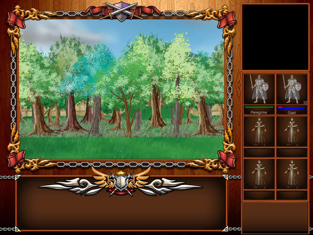
The box at the bottom would be for game texts only and stay empty otherwise. This kind of bothers me a bit - actually it could tell something like a level of danger, a description of the area, party status or morale, etc). The bottom right box would carry the icons for all game options. That 32 next to Gael would be for spell components when applicable. I could actually fit several different values from top to bottom.
Late to the party but I quite like that mockup.
Charles-cgr
OlderBytes

- Joined
- Mar 13, 2010
- Messages
- 984

Charles-cgr
OlderBytes

- Joined
- Mar 13, 2010
- Messages
- 984

Further progress on the GUI as well as a bit of a revelation on the openworldedness (grammatical exactedness not guaranteed) 
http://www.olderbytes.com/sovereign-gui-progress-and-more.html
Also, there's a poll! Weigh in on the upcoming Xeen killer's design decision-making
http://www.olderbytes.com/sovereign-gui-progress-and-more.html
Also, there's a poll! Weigh in on the upcoming Xeen killer's design decision-making
Mortmal
Arcane
- Joined
- Jun 15, 2009
- Messages
- 9,182
Actually the new UI choice doesnt sound a bad idea, it remembers me a bit of the interface of drakkhen , however in drakkhen the paperdolll were reflecting wich items your characters were using, i dont know if its the case there.Id say i prefer the last one , but all 3 are good to be honest.
Excommunicator
Arcane
- Joined
- Oct 19, 2010
- Messages
- 3,524
Don't like the "modern" one. Don't pretend to be something you're not. You have an oldschool game with "practical" visuals and a non-animated world, there's absolute no reason to try to modernise or minimise the interface.
The one with the octopus is good. I still think you should tone down the red saturation though
The one with the octopus is good. I still think you should tone down the red saturation though
Charles-cgr
OlderBytes

- Joined
- Mar 13, 2010
- Messages
- 984

zeitgeist I'm not sure what you mean by emblem... At the bottom right or the logo at the top right?
Maybe we aren't on the same page - I just realized there isn't a copy of the new GUI here (only in the page I linked to a couple posts up)
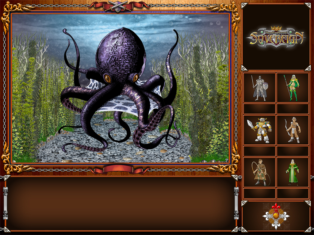
Excommunicator I'll look into the saturation. This choice between old and new is a tough one. I see what you mean but the reviewer on CanardPC was quite unpleasant about the GUI... Still this one addresses some of the concerns raised at least. And my personal preference changes every other day
Maybe we aren't on the same page - I just realized there isn't a copy of the new GUI here (only in the page I linked to a couple posts up)

Excommunicator I'll look into the saturation. This choice between old and new is a tough one. I see what you mean but the reviewer on CanardPC was quite unpleasant about the GUI... Still this one addresses some of the concerns raised at least. And my personal preference changes every other day
Charles-cgr
OlderBytes

- Joined
- Mar 13, 2010
- Messages
- 984

Missed that one, sorry! I was talking about the version with the huge one above the text box in this post.
That's what I figured. My fault, lazy update on my part
laclongquan
Arcane
Why dont you push the 6 character buttons upward and keep the automap at the bottom. Drop the last big button altogether, more space for automap.
Charles-cgr
OlderBytes

- Joined
- Mar 13, 2010
- Messages
- 984

Why dont you push the 6 character buttons upward and keep the automap at the bottom. Drop the last big button altogether, more space for automap.
That would be more vertical space for the automap. It would need as much horizontal space to really be useful and that block at the bottom right is meant for buttons like search, map...
I'm also thinking about buttons in the bottom center though. Perhaps I'll split them according to function (party vs environment) or duplicate them for easier mouse access...
Charles-cgr
OlderBytes

- Joined
- Mar 13, 2010
- Messages
- 984

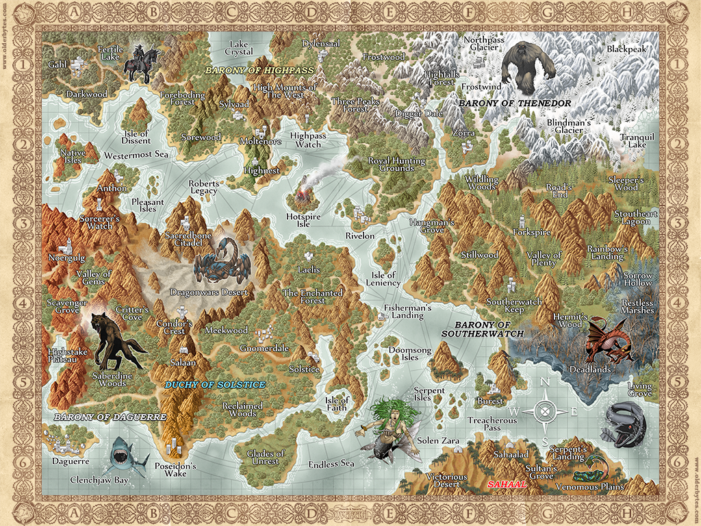
The world map
There's a dev blog post with a few more details. http://www.olderbytes.com/sovereign-world-map.html
I plan to write about the character creation and development next.
Map looks nice!
If I'm not mistaken it's made with the Campaign Cartographer from ProFantasy, yes? Been using it myself for Pen and Paper purposes but I can't get mine to look so good
If I'm not mistaken it's made with the Campaign Cartographer from ProFantasy, yes? Been using it myself for Pen and Paper purposes but I can't get mine to look so good
Charles-cgr
OlderBytes

- Joined
- Mar 13, 2010
- Messages
- 984

The map really is looking great. Reminds me of the old Might and Magic games. Good stuff Charles!
Charles-cgr
OlderBytes

- Joined
- Mar 13, 2010
- Messages
- 984

The map really is looking great. Reminds me of the old Might and Magic games. Good stuff Charles!
Thanks Ebenezer,
The artist will be duly congratulated (again)
Wow, I see you're not holding back with the number of locations. Are you going for a less linear approach with more optional content?
Charles-cgr
OlderBytes

- Joined
- Mar 13, 2010
- Messages
- 984

Wow, I see you're not holding back with the number of locations. Are you going for a less linear approach with more optional content?
Hey Underworld isn't THAT linear
But yes, Sovereign is set out to be a lot less so. Although absence of level scaling tends to set a path I'll do my best to leave lots of options. Dungeons, caverns and the like, for instance, can be accessible to a low level party but impossible to complete until a certain amount of strength is built up.
Some places however will be punishing from the offstart so exploring will always be a possibility at the player's risk. But with the ability to save anywhere, why not go see that dark knight or that red dragon with a lvl 1 party? It'll be quick and painless
Can't wait to hear about character development. M&M tribute or not, that's one area I'd like to see improved over the previous game.
Charles-cgr
OlderBytes

- Joined
- Mar 13, 2010
- Messages
- 984

Can't wait to hear about character development. M&M tribute or not, that's one area I'd like to see improved over the previous game.
The character creation post has been delayed a bit (lots of little things to settle like cross-requirements, descriptions...) but I uploaded a new GUI with... portraits! And a new town environment. It's a lot more popamole.
The character update will be up in a week or two now.
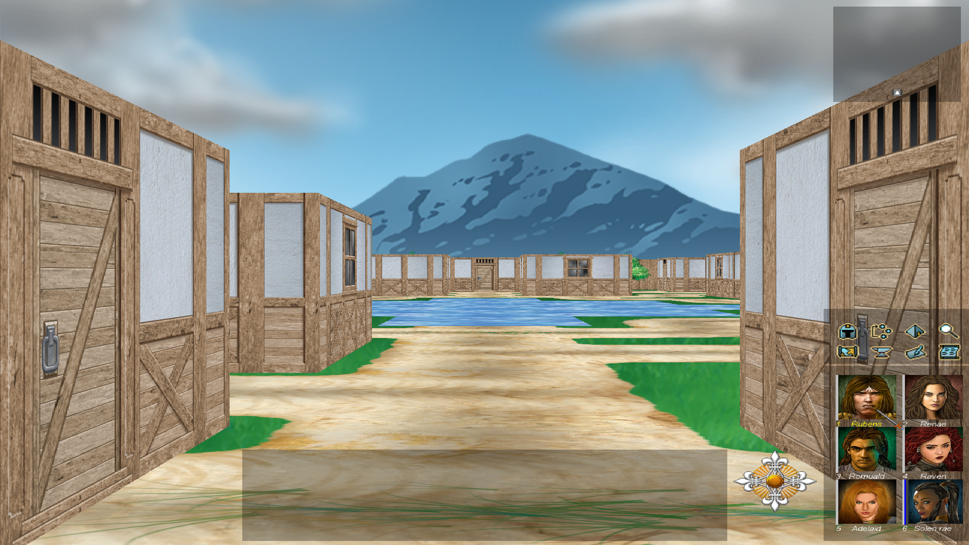
For those that like to comment on the dev blog (always appreciated) the entry is here.
I like that GUI. 

Can't wait to hear about character development. M&M tribute or not, that's one area I'd like to see improved over the previous game.
The character creation post has been delayed a bit (lots of little things to settle like cross-requirements, descriptions...) but I uploaded a new GUI with... portraits! And a new town environment. It's a lot more popamole.
The character update will be up in a week or two now.
Ain't no thang bro.
The GUI is... small. I like the portraits and the art a lot. In fact I think it looks so good you won't hear even the Codex bitch about it.
Blog said:- Sovereign will be much more intuitive and mouse-friendly than Underworld was. Even if the GUI continues to evolve, this will be a priority.
But will it be possible to play without a mouse? I actually preferred using the keyboard in the first game.


![The Year of Incline [2014] Codex 2014](/forums/smiles/campaign_tags/campaign_incline2014.png)


![Have Many Potato [2013] Codex 2013](/forums/smiles/campaign_tags/campaign_potato2013.png)


