Burning Bridges
Enviado de meu SM-G3502T usando Tapatalk
Great, consoletards will will  this.
this.
P.S. at least it has inventory
 this.
this.P.S. at least it has inventory
 this.
this.
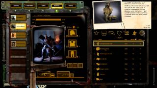
originally we were thinking grid, but as we continued through development we found that is was going to be a little bit limiting for us
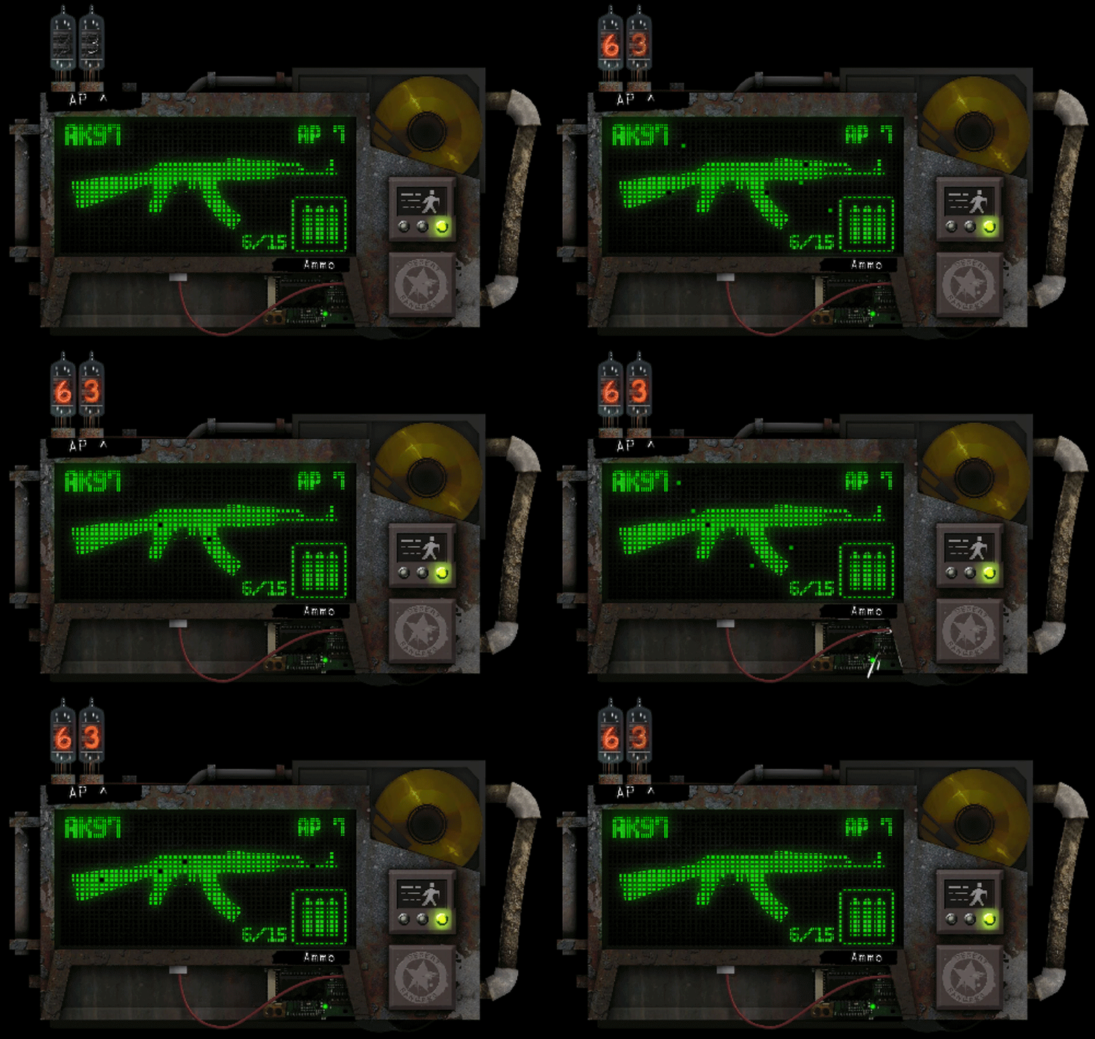
I found the electricity running through all the screen a bit distracting, apart from that it looks fine.
 , but what the fuck is going on with that paper clip item description? and those electrical effects? They clash with the overall aesthetic of the UI and just look out of place.
I like the weapon descriptions.
The office memo bit is a terrible design decline though. It does not mesh well with the rest.I like the weapon descriptions.
when was the last time we had those? incline!
The office memo bit is a terrible design decline though. It does not mesh well with the rest.I like the weapon descriptions.
when was the last time we had those? incline!
Maybe, but as long as it is amusing, conducts the info easily, and not painfull on the eyes, I don't really care..The office memo bit is a terrible design decline though. It does not mesh well with the rest.I like the weapon descriptions.
when was the last time we had those? incline!
To me it is. Pain. Pain.and not painfull on the eyes
graphics whore!To me it is. Pain. Pain.and not painfull on the eyes


Watched at work with no sound, i just skipped around to look at the various inventory elements. So now yellow is the default color for all the icons?


