MapMan
Arcane
- Joined
- Aug 7, 2009
- Messages
- 2,330
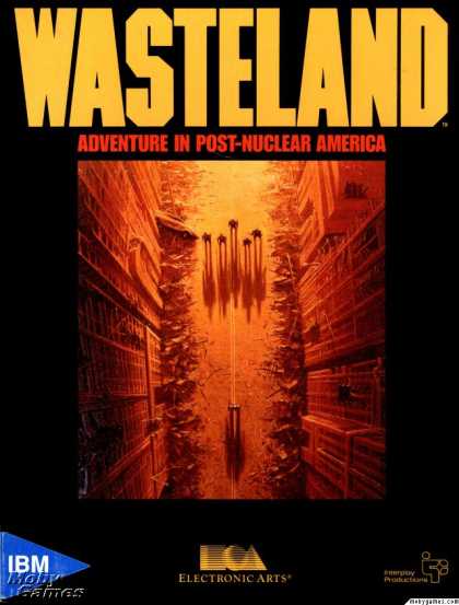
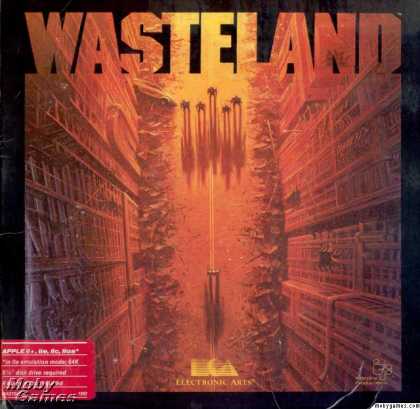
Agreed but both are still shit. The original (minimalistic Wasteland 2 over new artwork) was the best imho. Had really great feel to it. This? Looks amateurish as hell (something a 15yo with photoshop does after few tutorials). So yeah, they should stick to this:The whiteish 2 just stands out too much IMHO and doesn't seem to fit.


![Glory to Codexia! [2012] Codex 2012](/forums/smiles/campaign_tags/campaign_slushfund2012.png)


![Have Many Potato [2013] Codex 2013](/forums/smiles/campaign_tags/campaign_potato2013.png)
![The Year of Incline [2014] Codex 2014](/forums/smiles/campaign_tags/campaign_incline2014.png)


