Putting the 'role' back in role-playing games since 2002.
Donate to Codex
Good Old Games
  • Welcome to rpgcodex.net, a site dedicated to discussing computer based role-playing games in a free and open fashion. We're less strict than other forums, but please refer to the rules.

    "This message is awaiting moderator approval": All new users must pass through our moderation queue before they will be able to post normally. Until your account has "passed" your posts will only be visible to yourself (and moderators) until they are approved. Give us a week to get around to approving / deleting / ignoring your mundane opinion on crap before hassling us about it. Once you have passed the moderation period (think of it as a test), you will be able to post normally, just like all the other retards.

Vapourware Fourth Project

Lance Treiber

Educated
Joined
Feb 23, 2019
Messages
65
I started three projects in the last year and I dropped them all, two are documented here on the Codex. Failure is a very real thing. Every failed project leaves an aftertaste that says "you'll never release one, you'll always fail". But you have to face the music anyway. So here's my current new project. I really believe it's my best one yet.


You should intuit what this is just by looking at it. If not, please tell me.

It's:
a UI-based mobile MMORPG based mostly on text.

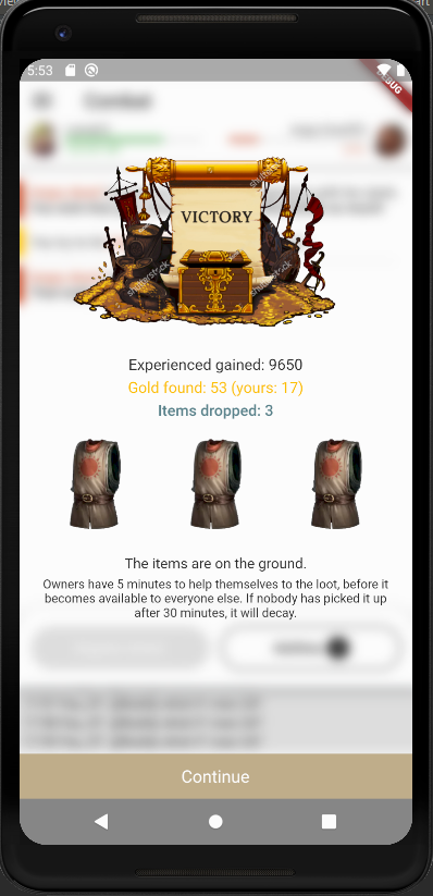
You can see the room where you are, its description, where you can go from here, you've got loot on the ground, mobs you can inspect/attack, players you can interact with. It's like a 2D/3D MMO, but in form of menus with text.

Tell me if you got all that just by looking at the screen?

Let me know if seeing this makes you want to have a different UI layout?

I'll show the combat screen next, but I'd appreciate some feedback in the meantime.

This may not look like much, but this is the result of 23 days of work. I never coded mobile apps before.
 

vlzvl

Arcane
Developer
Joined
Aug 7, 2017
Messages
195
Location
Athens
Tell me if you got all that just by looking at the screen?

Not really.
Try to increase the immersion factor, make the players believe they're clicking to an RPG game, not something such a scheduler.
Add more graphics. Tavern & places should had some symbol of what they are.
Consider adding less items on screen, but more information and/or actions to do on them.
Give some space to players, guide them to few choices first.
Do not blowup the screen with MMO kind of crap information, but don't leave it that empty either.
Right now it seems quite simple & not very playable, or at least immersive, but considering its your first Android take, seems a good start.
If you like what you play, then you're on the right path.
 

Lance Treiber

Educated
Joined
Feb 23, 2019
Messages
65
Try to increase the immersion factor, make the players believe they're clicking to an RPG game, not something such a scheduler.
Add more graphics. Tavern & places should had some symbol of what they are..

First of all, I appreciate the feedback. When companies write it, they're just "being polite", but I actually do need it. It makes me think about the design. And having thought about the points you raised, I'm going to disagree with them, but I'm glad that you raised them.

So, to explain...

People who love graphics will prefer a pure 2d/3d game. This is not one, and it's not trying to be one. The charm is supposed to be in the text. The text can create worlds more beautiful than any graphics, this is particularly appreciated by people who played old text based quests, RPGs, MUDS, etc. I hope to be able to bring this idea to the new generation of players, who don't even suspect it.

It then follows that the UI design has to be minimalistic, yes kind of like a business app. That's the point, that it mustn't distract from the game. It must be as "transparent" to the user as possible. There must be nothing eye catching on the screen other than the text and the very intuitive UI structure. It's supposed to act as a replacement for a 2d/3d world representation and text-based commands in MUDs. I don't want to end up creating a 2d game, I'm going in the opposite direction. No visual junk, I want to plug the user into the information as much as possible.

So adding symbols such as a "tavern symbol" that you suggested only makes sense if it's to accommodate the game design. If the game design requires the player to quickly identify a tavern, then an icon is required. Otherwise, it's not required.

I don't know what kind of player you are. It would be interesting to know. Maybe you played text based games yourself and enjoyed them, but lean more towards graphics? That would explain your preferences.
 

vlzvl

Arcane
Developer
Joined
Aug 7, 2017
Messages
195
Location
Athens
First of all, I appreciate the feedback. When companies write it, they're just "being polite", but I actually do need it. It makes me think about the design. And having thought about the points you raised, I'm going to disagree with them, but I'm glad that you raised them.

This is just my personal feedback about what i saw.
I have no love for graphics or any kind of preference and i don't really know what's going on Android apps these days in the RPG department.
If there's charm in the text, then i am not really the guy that you need feedback from.
I am not an expert in minimalist UI, unless we're talking about a website. For an RPG, i expect immersion and this was my first catch on the feedback.
I might be wrong, obviously.
However, if your idea was to replace graphics with text, then go ahead. I didn't knew that & might work best this way, i don't know.
I am a player that comes from the old era of RPGs, an age of fine pixel art, huge silly buttons & fast action. I am not a player that plays or likes text-based RPGs.
I don't have an opinion on minimalistic UI themes and such. I still believe RPGs is about immersion & cRPGs came to fill that gap with majestic graphics and epic music.
So, i don't think i am the average player out there & you should take my personal feedback with a grain of salt.
I lean towards immersion.
 
Last edited:

Lance Treiber

Educated
Joined
Feb 23, 2019
Messages
65
Quick look at the combat screen:


CircleMUD used to have these boring messages for damage, but CircleMud was released back in 1993.
- "You try to slash target, but miss."
- "You tickle target as you slash him."
- "You barely slash target."
- "You slash target."
- "You slash target hard."
- "You slash target very hard."
- "You slash target extremely hard."
- "You massacre target to small fragments with your slash."
- "You OBLITERATE target with your deadly slash!!"

Meanwhile, Dwarf Fortress offers more flavor:
- "The marksman bites the goblin lasher in the upper lip and the injured part is ripped into loose shreds!"
- "The marksman vomits!"
- "The marksman kicks the goblin lacker in the upper body with her left foor, bruising the muscle, jamming the ribs through the lungs and tearing the lungs!"

Visceral stuff.

The former is easier to read in a big fight with many participants. The latter offers an interesting read. I'd like to find some middle ground solution, so I'll try to research current year Muds.
Also, perhaps the amount of flavor should really depend on the number of combatants.
 

Lance Treiber

Educated
Joined
Feb 23, 2019
Messages
65
Post-combat screen:

Shutterstock logo on the art, because I haven't bought the art yet in case I find something better.

f72f5af69996d69cf80e979e695be62f.png
 

Lance Treiber

Educated
Joined
Feb 23, 2019
Messages
65
Day 67 of the project.

Players connect to server, see each other, see the mobs, the loot, the room. They can walk between rooms, other players will see them leave and come back.

2e02e9a221451393d0d8717b30354710.png


4ef82946d783141915d30b18712da705.png


Now time for a functional combat.
 

As an Amazon Associate, rpgcodex.net earns from qualifying purchases.
Back
Top Bottom