Putting the 'role' back in role-playing games since 2002.
Donate to Codex
Good Old Games
  • Welcome to rpgcodex.net, a site dedicated to discussing computer based role-playing games in a free and open fashion. We're less strict than other forums, but please refer to the rules.

    "This message is awaiting moderator approval": All new users must pass through our moderation queue before they will be able to post normally. Until your account has "passed" your posts will only be visible to yourself (and moderators) until they are approved. Give us a week to get around to approving / deleting / ignoring your mundane opinion on crap before hassling us about it. Once you have passed the moderation period (think of it as a test), you will be able to post normally, just like all the other retards.

Game News Swords and Sorcery: Underworld Definitive Edition Revealed

Infinitron

I post news
Patron
Staff Member
Joined
Jan 28, 2011
Messages
99,595
Codex Year of the Donut Serpent in the Staglands Dead State Divinity: Original Sin Project: Eternity Torment: Tides of Numenera Wasteland 2 Shadorwun: Hong Kong Divinity: Original Sin 2 A Beautifully Desolate Campaign Pillars of Eternity 2: Deadfire Pathfinder: Kingmaker Pathfinder: Wrath I'm very into cock and ball torture I helped put crap in Monomyth
Tags: OlderBytes; Swords and Sorcery: Underworld

First there was 2010's Swords and Sorcery: Underworld. Then there was 2012's Swords and Sorcery: Underworld Gold. The latest incarnation of Codexer Charles Clerc's Might & Magic-inspired blobber will be called Swords and Sorcery: Underworld Definitive Edition, and will use the new engine he developed for its upcoming sequel, Swords and Sorcery: Sovereign. Charles' plan to update the game again was first announced way back in May 2014, but its official name and first gameplay footage are revealed for the first time today:


You can read the linked post for a detailed list of the major changes introduced in this version. Hopefully the long-awaited release of the game on Steam, where it was Greenlit back in December 2014, is not far off.
 

commie

The Last Marxist
Patron
Joined
May 12, 2010
Messages
1,865,260
Location
Where one can weep in peace
Divinity: Original Sin Project: Eternity Divinity: Original Sin 2
My body is ready....It has come a long way from Silver Surfer and coke can placeholder clip art enemies....through the goodness that was the 'Gold' edition....and now this!

Can't wait for another 3 years when Charles remakes it in full 3d on UE4!

What's amazing is that in the time Cleve solved 11 microissues and put up a new splash screen, Charles managed to recreate his game 3 times!
 
Last edited:

Charles-cgr

OlderBytes
Developer
Joined
Mar 13, 2010
Messages
984
Project: Eternity
My body is ready....It's come a long way from Silver Surfer and coke can placeholder clip art enemies....through the goodness that was the 'Gold' edition....and now this!

Can't wait for another 3 years when Charles remakes it in full 3d on UE4!

What's amazing is that in the time Cleve solved 11 microissues and put up a new splash screen, Charles managed to recreate his game 3 times!


There were never full cans of coke in any version. I'm not that crazy.
 

commie

The Last Marxist
Patron
Joined
May 12, 2010
Messages
1,865,260
Location
Where one can weep in peace
Divinity: Original Sin Project: Eternity Divinity: Original Sin 2
There were never full cans of coke in any version. I'm not that crazy.

Shh....a bit of hyperbole never hurts...especially when it deals with this game..;) Still, a coke can enemy sounds great. You should have an obscure 1 hex dungeon that you can only teleport to with a menagerie of creeps based on images from your first effort as a kind of secret/easter egg in the tradition of the old MM's.
 

TigerKnee

Arcane
Joined
Feb 24, 2012
Messages
1,920
Maybe I'll actually work up the money to buy the game this time when the George Lucas Super Special Remastered Edition is out.
 

Aenra

Guest
Charles-cgr
Assuming you'd be interested in commentary from a non-buyer:

- lack of animations (per se) is not a deal breaker, especially when Indie and RPG. Lack of animations when sticking to the stereotypical UI+viusal representation can be. Or is to me. Would have been far better if rather than having a cheap-looking special effect running with no visual indication whether it hit or missed (let alone any visual change to the mob) you chose to go for say, a stylistic representation. A 2D image scroller or page-resembling interface where a sequence of static images displays the outcome of your actions. Think of it as a distorted Realms of Arkania. You walk and explore in the current implementation, but switch when in combat. Even cheaper to do (no effects at all), and definitely better a visual outcome. The way it currently is..just looks bad, sorry.

- we used to have UIs as cluttered as yours and then some. But then again, that was back in the 80s, when it was technical limitations and technical limitations alone that precluded a larger rendered space. Fast forward it all thirty odd years latter, all i can say is: cluttered. Yes yes, a 'stylistic' choice, an 'artistic' direction of the deepest implications..but still cluttered. And if a "choice"? Why not go for something that does resemble the 80s? What i see is ingame info up there, portraits below, enemies again elsewhere, and so on..and in between the gaps created by said UI elements, a tiny part of screen near the edges that serves for nothing at all. Other than to emphasize, you guessed it, how cluttered (read: unorganised and unneeded) it all is.

- how many more Indies whith a "white coloured" (/shivers) spellbook? Look at the video you made, and tell me if another two? three? hours of work on that spellbook look would not have resulted in something a looot better. Something more in line with the rest of your UI elements. Yes, details, and this one is just that. However, and it might just be me, but when it shows, everywhere and all the time, that you are Indie..well you are. We get it. No need to scream it while you're at it. Petty as some concepts may appear, they do matter. Cumulative effect.

I have not played it, so obviously could not comment on anything else. Best of luck
 

Durwyn

Prophet
Joined
Oct 29, 2006
Messages
1,132
Location
Erewhon
Never enough quality TB blobbers, however...

- UI is horrible. Cluttered, obtrusive and ugly. Why not making smaller viewport and arranging the UI into frames?

- If you're sure about bigger viewport, why not show all the enemies one one screen. I urge you to look how the combat screen looks in Lords of Xulima. I'm sure that despite the difference in combat screen transition, you could take some inspiration from it.
 

Charles-cgr

OlderBytes
Developer
Joined
Mar 13, 2010
Messages
984
Project: Eternity
Never enough quality TB blobbers, however...

- UI is horrible. Cluttered, obtrusive and ugly. Why not making smaller viewport and arranging the UI into frames?

- If you're sure about bigger viewport, why not show all the enemies one one screen. I urge you to look how the combat screen looks in Lords of Xulima. I'm sure that despite the difference in combat screen transition, you could take some inspiration from it.

cbt_scrn_220815.png


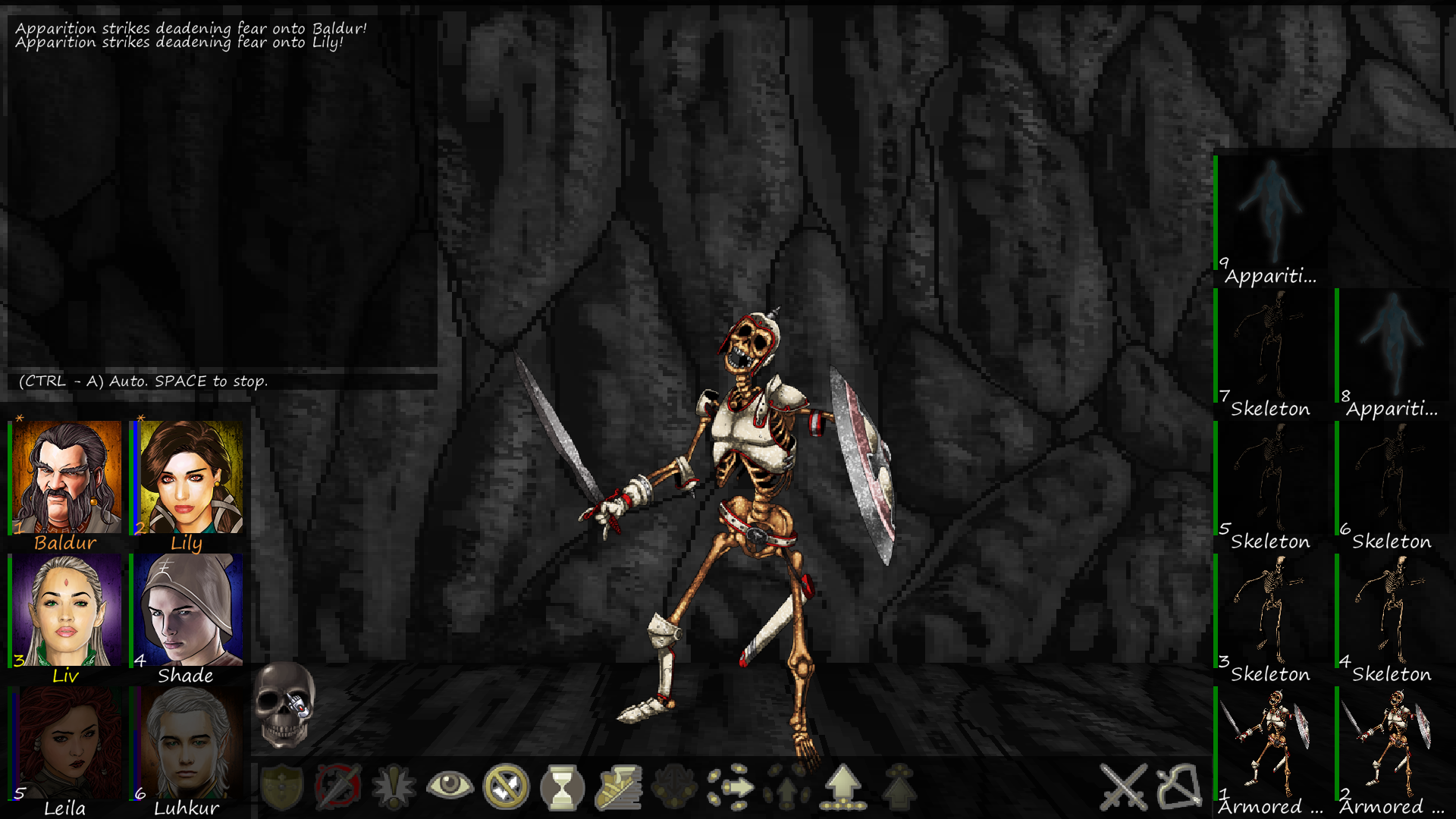
Mimicking the Lords of Xulima UI would break the whole idea. The combat centers on who is in melee and who isn't (grayed out). The same goes for characters and mobs so lining the latter up accross the screen wouldn't work. And lining up characters in two rows with the ones in front in melee and the ones in back out of melee also seriously cripples it: no more use for the join/leave melee, press forward, disengage or Move to the Front commands. These are the reasons the characters and mobs are lined up the way they are.

That said you're right, the clutteredness could be improved so I rearranged the combat log (that's the "ingame info" on the top left) and the skull (clicking on that starts auto-combat, for easily disposed fights).

Everything on the screen has a reason to be there.

Aenra I don't see much value in replacing the combat log with a sequence of cards. That would clutter the UI. And I don't see why paper can't be whiteish just because I'm indie.
 

Charles-cgr

OlderBytes
Developer
Joined
Mar 13, 2010
Messages
984
Project: Eternity
What that skull for?

It starts automatic combat. All characters fight or shoot the first mob in line until it plays out or the player clicks on the skull again to stop it (CTRL-A and SPACE are the shortcuts). It speeds up easy fights... or party death :)
 

Charles-cgr

OlderBytes
Developer
Joined
Mar 13, 2010
Messages
984
Project: Eternity
I was excited when I got the update email, but this is even better than I thought. Nice work.

Thanks :)

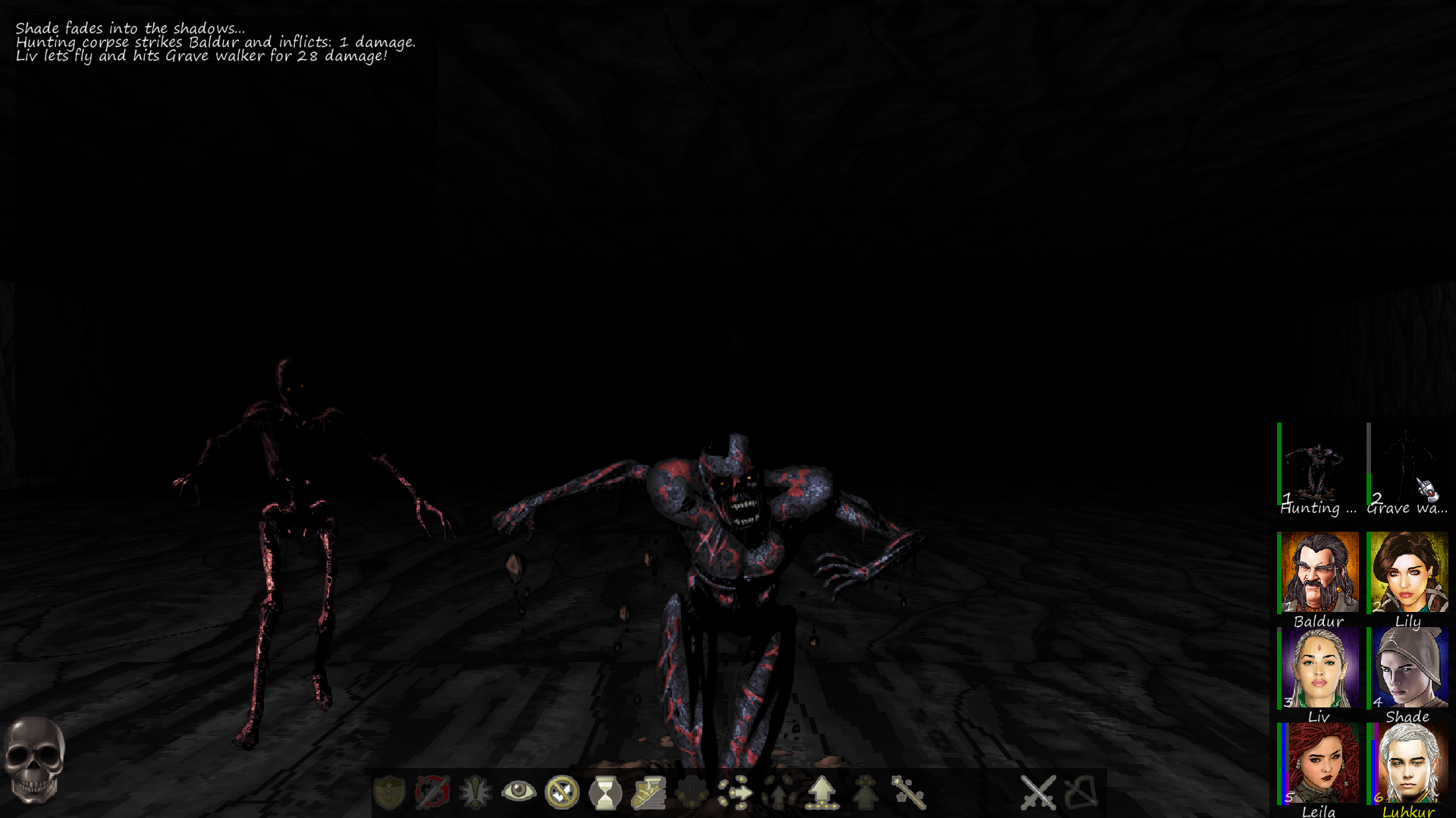
Another small update on the combat layout:

As suggested by Mortmal (on another thread) it helps further illustrate the opposition between the party and the enemy. Also less clutter.

cbt_270815.png
 

As an Amazon Associate, rpgcodex.net earns from qualifying purchases.
Back
Top Bottom