Putting the 'role' back in role-playing games since 2002.
Donate to Codex
Good Old Games
  • Welcome to rpgcodex.net, a site dedicated to discussing computer based role-playing games in a free and open fashion. We're less strict than other forums, but please refer to the rules.

    "This message is awaiting moderator approval": All new users must pass through our moderation queue before they will be able to post normally. Until your account has "passed" your posts will only be visible to yourself (and moderators) until they are approved. Give us a week to get around to approving / deleting / ignoring your mundane opinion on crap before hassling us about it. Once you have passed the moderation period (think of it as a test), you will be able to post normally, just like all the other retards.

Preview Underworld Ascendant Update #34: Vertical Slice Screenshots

Infinitron

I post news
Patron
Staff Member
Joined
Jan 28, 2011
Messages
99,589
Codex Year of the Donut Serpent in the Staglands Dead State Divinity: Original Sin Project: Eternity Torment: Tides of Numenera Wasteland 2 Shadorwun: Hong Kong Divinity: Original Sin 2 A Beautifully Desolate Campaign Pillars of Eternity 2: Deadfire Pathfinder: Kingmaker Pathfinder: Wrath I'm very into cock and ball torture I helped put crap in Monomyth
Tags: Joe Fielder; OtherSide Entertainment; Underworld Ascendant

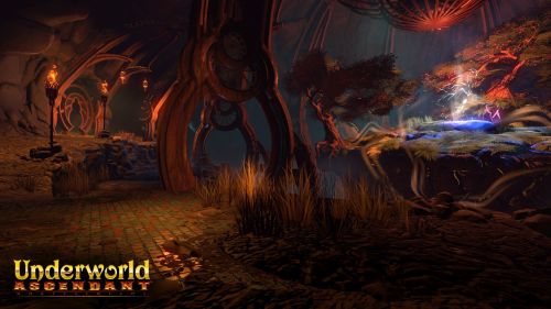
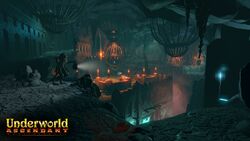
This month's Underworld Ascendant development update unveils three new screenshots from the game's upcoming vertical slice release, which is now apparently in its final polishing phase of development. It increasingly looks like the vertical slice will revolve around The Challenge of Ishtass, an open-ended quest to retrieve a Silver Sapling for the Lizardmen of the Abyss. Here are the screenshots:


Last month's update had more details about the development of the Lizardmen, who have clearly gone from being a last-minute stretch goal to a major focus of the game, or at least its opening chapter. There's still no official ETA on the vertical slice, but last week on the OtherSide forums Chris Siegel said they were aiming for the beginning of April. Let's hope they make that date...and that the wait will have been worth it.
 

Cudgel

Learned
Patron
Joined
Feb 15, 2017
Messages
275
Location
Inside
Despite the inherent decline (though I blame that more on Betheseda's approach to them then the style of game itself) ; I do love a good first-person RPG when it has granular systems/worlds. Theme parks are just booring.


Think I want to play some Arx Fatalis now...
 

karnak

Arcane
Patron
Joined
Jun 14, 2014
Messages
920
Location
Negative Zone
Grab the Codex by the pussy Strap Yourselves In I helped put crap in Monomyth
Those colors hurt my eyes. Is it supposed to be some sort of cute RPG?

790808430_1560906.gif
 

Aenra

Guest
Of all the things they'done or are doing, you two had to cherry-pick graphics, right? That is, before going to some other thread where you can be as edgy and "old school" as everyone else here.. right? Here's a /retarded for you. Well-earned.
We need a 'Reddit generation' button.

But to help the discussion go along? I see that mentioned a lot and you both have a point.
Myself, i find it just fine. Looks like an 'older' game, something i'd have played once, you know? It being their intent of course :)

Anyway, it's a modern engine. You will always have your Nvidia/Ati ctpl to juice up the AF to 394575623x and make things look a bit crispier.
Also, here's a /retarded for talking graphics on RPGs.
 
Self-Ejected

Excidium II

Self-Ejected
Joined
Jun 21, 2015
Messages
1,866,227
Location
Third World
Myself, i find it just fine. Looks like an 'older' game, something i'd have played once, you know? It being their intent of course :)
Doens't look like any older game I've ever played. Old games look crispy not like play-doh.
 

Aenra

Guest
Are you being daft?
O.K., skip that.. of course it doesn't look like any 'particular' game you've played before. I meant that it's supposed to evoke that feeling if you will; and to me, it does.
Now because you're slow, no, this doesn't mean you need to agree. But it -is- retarded when your sole point of criticism is based on looks.

(and between you and me, if someone started counting how many one-liners [the epitomy of qualitative posting] you've made commenting on graphics and graphics alone, in how many games, you'd probably get a well-earned tag by the end of it)

edit: yes, it still bothers me when folks here bitch about the same things retards do in Reddit, but call themselves anything but. Retarded that is.
 
Self-Ejected

Excidium II

Self-Ejected
Joined
Jun 21, 2015
Messages
1,866,227
Location
Third World
What the fuck are people supposed to talk about from looking at screenshots. Do your cretin eyes spot game mechanics hiding behind that clay tree?
 
Joined
Sep 7, 2013
Messages
6,310
PC RPG Website of the Year, 2015 Codex 2016 - The Age of Grimoire Serpent in the Staglands Bubbles In Memoria A Beautifully Desolate Campaign Pillars of Eternity 2: Deadfire
There is a large niche of people who prefer grainy textures, but most gamers (even old school RPGers) find colorful graphics more appealing.
 

Andhaira

Arcane
Joined
Nov 25, 2007
Messages
1,869,093
It's not the it looks colorful, although for a game based on being underground it is that a bit too much IMO, but that it looks glossy. I mean, look at the floor/ground; does that look like the ground inside an underground cavern to you? Why does it shine like that?

Graphics alone are not the be all in an rpg ofcourse, but bad graphics can detract from an experience. Noe to mention in a aFirst Person RPG graphics are kind of important; people seem to forget too easily that when they were released Ultima Underworlds, Lands of Lore, even the earlier Might and Magics etc were the pinnacle in graphics for their time.

Also its 2017.
 

Mustawd

Guest
I mean, look at the floor/ground; does that look like the ground inside an underground cavern to you? Why does it shine like that?

There's only one patch of glossiness on the floor in the three screenshots. I didn't even notice it until you mentioned it.

The screens look good IMO. They're not eye candy but the art direction is interesting and something different than your typical drab dungeon.

Gameplay is what really matters of course. Let's see how that goes.
 

Aenra

Guest
While subjective this one, so yes you're all entitled expected to disagree with me, i think what's funny here is how far your collective brains have been washed; and you're not even aware of it.

I may not be the voice of the average person, but even so, i think we can all agree that when first "God Rays" made an appearance into video games, we were all rather.. appalled? So phony, so pronounced, so fake. And a proper eye-sore.
Likewise with occlusion; what can be barely be discerned in real life (and that is assuming you are in a location where the sun allows it), was 'translated' into this bloated post effect that did nothing but detract or distort.
I could move on with depth of field.
Or bloom. Black 's favorite effect. I hear it's why he keeps replaying Oblivion so often ^^
Or the fact that despite all the progress made in the tech field, one man's grass is another's. Stylistically, aesthetically speaking. Who makes it with the more polygons, fuck all i care.

I'd assume we would all agree on the above?

And yet here you are, stating "it's shit", "it's gay", "it's 2017".
So while again, to each their own? And i did mention that you all DO have a point? I personally find this refreshing and welcome.

It evokes something, it harkens to something.. older and most of all, different. That's a plus in my book. Now i will argue that for example the clay effect is a bit overdone, but as is mentioned, they've still a ways to go with post fx, lighting, etc.
So for now, for now, rather than being an edgelord and prophesizing what the final outcome will look like? I focus on just the direction. It being what is already evident.

And the direction is pleasing. Pleasing, because it's made for people like me. NOT for people who post, think and act like Redditors.

If i had to bitch about this game, i'd bitch about a main dev's mentioning fluff stores, i'd bitch about the delays, i'd bitch about their showcasing 'physics' as something novel, i'd bitch about the obvious lack of a design document; even now.
Luckily for most dev teams, most customers ain't me. Which is why most of you fuckers deserve the shallow eye candy they sell you nowadays. Fair's fair.
 
Last edited by a moderator:

Ash

Arcane
Joined
Oct 16, 2015
Messages
7,055
Visually it's looking good. I'd prefer more grit but that's simply not the style they're going for. Gameplay is the prime concern as well as the overarching experience, and I suspect it won't meet true greatness there, primarily because no game does these days barring some rare exceptions. We just have to wait and see, as they're keeping gameplay stuff under wraps lately.
 

Darkzone

Arcane
Joined
Sep 4, 2013
Messages
2,323
I don't like the art, like i still don't like the art of WoW. But perhpas i'm wrong about it and in the end, this will have a nice retro feel to it. I like more the style that they have shown in the KS.
 

duanth123

Arcane
Joined
Mar 22, 2008
Messages
822
Location
This island earth
While subjective this one, so yes you're all entitled expected to disagree with me, i think what's funny here is how far your collective brains have been washed; and you're not even aware of it.

I may not be the voice of the average person, but even so, i think we can all agree that when first "God Rays" made an appearance into video games, we were all rather.. appalled? So phony, so pronounced, so fake. And a proper eye-sore.
Likewise with occlusion; what can be barely be discerned in real life (and that is assuming you are in a location where the sun allows it), was 'translated' into this bloated post effect that did nothing but detract or distort.
I could move on with depth of field.
Or bloom. Black 's favorite effect. I hear it's why he keeps replaying Oblivion so often ^^
Or the fact that despite all the progress made in the tech field, one man's grass is another's. Stylistically, aesthetically speaking. Who makes it with the more polygons, fuck all i care.

I'd assume we would all agree on the above?

And yet here you are, stating "it's shit", "it's gay", "it's 2017".
So while again, to each their own? And i did mention that you all DO have a point? I personally find this refreshing and welcome.

It evokes something, it harkens to something.. older and most of all, different. That's a plus in my book. Now i will argue that for example the clay effect is a bit overdone, but as is mentioned, they've still a ways to go with post fx, lighting, etc.
So for now, for now, rather than being an edgelord and prophesizing what the final outcome will look like? I focus on just the direction. It being what is already evident.

And the direction is pleasing. Pleasing, because it's made for people like me. NOT for people who post, think and act like Redditors.

If i had to bitch about this game, i'd bitch about a main dev's mentioning fluff stores, i'd bitch about the delays, i'd bitch about their showcasing 'physics' as something novel, i'd bitch about the obvious lack of a design document; even now.
Luckily for most dev teams, most customers ain't me. Which is why most of you fuckers deserve the shallow eye candy they sell you nowadays. Fair's fair.

The game has an ugly aesthetic. I don't care that such ugliness was or was not a product of the most advanced tech. If an aesthetic is off-putting enough, it can become a distraction to the other strengths of a game. You're setting up a straw man
 

Aenra

Guest
duanth123 then i would advise you to look 'strawman argument' up somewhere; you seem to be confused in regard to its meaning.

As to ugly? If by ugly you mean "i get it, just don't like it", you are more than welcome to think so, as i mentioned myself, could sure be even better (clay effect).
Now, since you appear to have reading comprehension issues. My focus was on those people incapable of understanding that there isn't just one way of graphically depicting things and/or that after all these years of the same old new Nvidia way of showing things, our very standards have dropped/become more mainstream than we might have thought (see comments such as "it's 2017" for further validation of the above).

Is that very complicated for you?
 

duanth123

Arcane
Joined
Mar 22, 2008
Messages
822
Location
This island earth
Only when you strain it through your intellectual bowels.

I've followed the development of this game pretty closely, including the detractors' (Excidium II) comments. A consistent theme has been how ugly the claymation-esque style looks. Not that x, y, z graphical effects have/have not been included. Your straw man is a non-existent Codexer claiming the graphical effects are bad by some quantitative measure. I'm saying it looks fucking ugly from an artistic perspective.

Although at this point I also realize that your shtick is to insult the intelligence of your interlocutor. So perhaps there's simply no convincing you as a pre-determined idiot never will.
 

Aenra

Guest
duanth123 And yet here you are replying regardless.. paradoxical isn't it? What with your being assured i'm beyond "convincing"? Now why would one do that, go into such trouble? ^^
If we take it a bit further, you wanna have a look at that word? Convincing? Are you projecting a bit perhaps? If i was about "convincing", i sure wouldn't have stated, twice, that you too have a point, i sure wouldn't have stated that 'i see your point'. Would i now..

Play with your marbles, engage in conversation as well if you will, but careful with overreaching; or whom with.

Now back to topic, if your aesthetic sensibilities got you butthurt simply because someone else disagrees/does not share them, your fault.
If your attempting to switch a man's statement into something other than what he clearly expressed results in their personally addressing you, again your fault.

Now try some more eloquence, see if you can convince yourself it's all my fault yet again :)
 

As an Amazon Associate, rpgcodex.net earns from qualifying purchases.
Back
Top Bottom