Putting the 'role' back in role-playing games since 2002.
Donate to Codex
Good Old Games
  • Welcome to rpgcodex.net, a site dedicated to discussing computer based role-playing games in a free and open fashion. We're less strict than other forums, but please refer to the rules.

    "This message is awaiting moderator approval": All new users must pass through our moderation queue before they will be able to post normally. Until your account has "passed" your posts will only be visible to yourself (and moderators) until they are approved. Give us a week to get around to approving / deleting / ignoring your mundane opinion on crap before hassling us about it. Once you have passed the moderation period (think of it as a test), you will be able to post normally, just like all the other retards.

Game News Paper Sorcerer: First-person turn-based RPG

Zed

Codex Staff
Patron
Staff Member
Joined
Oct 21, 2002
Messages
17,068
Codex USB, 2014
Tags: Kickstarter; Paper Sorcerer; UltraRunawayGames

I suppose we would normally try to bring Kickstarter projects to your attention before they close, but I guess this one flew over our heads. Fortunately, it's successfully funded!

So what it is Paper Sorcerer?

Paper Sorcerer is a first-person turn-based RPG with adventure game elements inspired by Wizardry, Dungeons and Dragons, and Shadowgate.
  • Play as a renegade sorcerer as he struggles to escape the book prison and regain his powers.
  • Escape a magical prison filled with heroes hunting you down at every turn.
  • Strategy over grinding battles, with a charge based spell system.
  • Create a party of summons to join you as allies in battle.
  • Discover open-ended puzzles and solve them with a combinations of spells, items, and your wits.
  • Hand-drawn high-resolution sprites inspired by the work of late eighteenth and early nineteenth century illustrators like Aubrey Beardsley and William Bradley.

There's a gameplay video on youtube, showcasing the unique art style and combat:


You can read more about it at the Kickstarter page. It looks like UltraRunawayGames are aiming to have the game out pretty soon, so keep an eye out.

Thanks, ghostdog!
 
Joined
May 18, 2009
Messages
513
I backed this and I'm pretty sure it has actually been mentioned on the Codex, in Kz3r0's thread at least. I didn't initially think the creator could reach his goal with the super-low tiers ($3 for the full game), but I'm glad he did, it's kind of surreal even for an indie game designer in 2012 to take extra time to explain in which ways exactly is his concept different from The Return of Werdna.
 

ghostdog

Arcane
Patron
Joined
Dec 31, 2007
Messages
11,158
I really like the art direction in this one and Wizardry + Shadowgate sounds very good. It seems he didn't advertised it enough though, he could easily reach higher goals, especially with that gameplay video.
 

sgc_meltdown

Arcane
Joined
May 8, 2003
Messages
6,000
loving the shaders here, really good shit
I kinda hope they have an option to adjust the color of the paper though

and the summon stat/status bars are too wide

http://www.kickstarter.com/projects/2088045881/paper-sorcerer/posts
Bonus Summons Voting

A. Succubus - demon woman, focus on charm attacks and debuffs
B. Iron Golem - giant magical construct, focus on physical attacks
C. Rakshasa - fierce tiger man, focus on illusions and status attacks
D. Ice Queen - haughty ice spirit, focus on ice elemental attacks
E. Basilisk - gargantuan snake, focus on physical damage and stone status attacks
F. Gargoyle - demon made of stone, focus on physical damage
G. Lamia - snake woman, focus on life draining skills
H. Dryad - corrupted tree spirit, focus on healing
I. Black Cat - ghostly demon cat
J. Hellhound - 3 headed demon dog, focus on physical and fire attacks
One of our wonderful backers went out of her way to aggregate the data from the bonus summon vote, giving me a bunch more time to work on the game! Of course the thing you're most excited about is the result, so let's get on with it:
Vote Result!

1.) Succubus: 93
2.) Dryad: 76
3.) Lamia: 60
4.) Rakshasa: 52
5.) Black Cat: 51
6.) Hellhound: 46
7.) Iron Golem: 44
8.) Basilisk: 32
9.) Ice Queen: 26
10.) Gargoyle: 21

So the final result for the identity of the two bonus summons is the Succubus and the Dryad! Looks like everybody really likes the girls!

sigh

they better be hot
 

Roguey

Codex Staff
Staff Member
Sawyerite
Joined
May 29, 2010
Messages
36,707
First, battle mechanics: There are no to-hit rolls [all attacks always hit, except for special abilities that give a chance to dodge], instead all characters have a defense bar, which reduces incoming damage by a static number, for example, if you have a defense of 6, it'll subtract 6 from every attack that hits you, and your defense meter will go down one.
I can't envision this being fun in a turn based game. Pretty art, but not for me.
 
Self-Ejected

Davaris

Self-Ejected
Developer
Joined
Mar 7, 2005
Messages
6,547
Location
Idiocracy
I've liked this style for a long time, but until now I couldn't see how to make it work in a 3D engine. From that video, it looks like you'd have to custom paint the textures, so they would work with the shader.
 

Grunker

RPG Codex Ghost
Patron
Joined
Oct 19, 2009
Messages
27,761
Location
Copenhagen
First, battle mechanics: There are no to-hit rolls [all attacks always hit, except for special abilities that give a chance to dodge], instead all characters have a defense bar, which reduces incoming damage by a static number, for example, if you have a defense of 6, it'll subtract 6 from every attack that hits you, and your defense meter will go down one.
I can't envision this being fun in a turn based game.

why not?
 

Surf Solar

cannot into womynz
Joined
Jan 8, 2011
Messages
8,837
Really loved how the "outside" of the Prison looked. Very creepy/otherworld-ish, something seldom to be seem nowadays. Throwing a cautious eye on this game.
 

Roguey

Codex Staff
Staff Member
Sawyerite
Joined
May 29, 2010
Messages
36,707
First, battle mechanics: There are no to-hit rolls [all attacks always hit, except for special abilities that give a chance to dodge], instead all characters have a defense bar, which reduces incoming damage by a static number, for example, if you have a defense of 6, it'll subtract 6 from every attack that hits you, and your defense meter will go down one.
I can't envision this being fun in a turn based game.

why not?
Sounds like battles will be all about outhealing damage and your damage per turn versus their damage per turn. Like certain HP-heavy JRPGs.
 

Grunker

RPG Codex Ghost
Patron
Joined
Oct 19, 2009
Messages
27,761
Location
Copenhagen
First, battle mechanics: There are no to-hit rolls [all attacks always hit, except for special abilities that give a chance to dodge], instead all characters have a defense bar, which reduces incoming damage by a static number, for example, if you have a defense of 6, it'll subtract 6 from every attack that hits you, and your defense meter will go down one.
I can't envision this being fun in a turn based game.

why not?
Sounds like battles will be all about outhealing damage and your damage per turn versus their damage per turn. Like certain HP-heavy JRPGs.

Ah, OK. Yeah, I hate that kind of stuff with a passion, so I get ya.
 

shihonage

DEVELOPER
Patron
Joined
Jan 10, 2008
Messages
7,182
Location
United States Of Azebarjan
Bubbles In Memoria
Remember when games weren't trying to be art?

There's gotta be a better way to overcome dearth of graphics, than making the game into an eye-searing annoyance.
 

Surf Solar

cannot into womynz
Joined
Jan 8, 2011
Messages
8,837
What is wrong with giving a game a unique look and feel? After all those games classified as RPG lately ( or hell, almost all genres apply to this) that all copy from each other and look the fucking same someone does some new ideas and suddenly it gets dismisses as "just some art game" ? o_O
 

shihonage

DEVELOPER
Patron
Joined
Jan 10, 2008
Messages
7,182
Location
United States Of Azebarjan
Bubbles In Memoria
This kind of graphics may look fine during short-term exposure (i.e. a Youtube video), but when you have to stare at that high-contrast, high-brightness disaster for hours, it will get annoying fast.

Doing something differently does not inherently guarantee superior quality of the end product. You can do simple graphics and "try something different" while remaining aesthetically acceptable (see VVVVVV and Thomas Was Alone). I'm not particularly fond of these games, as they jump on the whole retro artsy platformer bandwagon, but their art styles do not stab you in the eyes.


Ion Prothon II

Liturgist
Joined
Jan 10, 2012
Messages
1,011
Location
Ołobok Zdrój
Shaders and other wonders of graphical hardware used just to get a 3D looking like a badly drawn, monochromatic picture. And a side- scrolling platform game with jumping rectangles.
2012 is gonna be a great year for the indie gaming.

I hate the look of this game at the first sight. 'Unique art style' and 'simple, effective style' my ass. Hipster bullshit. How do you imagine playing more than 1 hour without getting a migraine? It's not only the high contrast issue, it's also about the eye fatigue to spot anything there, like those half- invisible elevator switches. Wouldn't be surprised if the future players installed mod after mod just to be able to see anything.

  • Hand-drawn high-resolution sprites inspired by the work of late eighteenth and early nineteenth century illustrators like Aubrey Beardsley and William Bradley.
Not enough money for a decent graphics? Choose the most cheap and limiting method, then claim it's so classy and artfaggy. Double win if it's a crowd- funded thing, not a game done in garage for one's own money. Hell yeah.
I'm almost happy he will never get a penny from me.

Besides, today the combat and the idea of summoning allies seems to belong more to the world of jRPGs than anything else. A poor man's SMT?
 

sgc_meltdown

Arcane
Joined
May 8, 2003
Messages
6,000
that is a fair point about the high contrast fatigue

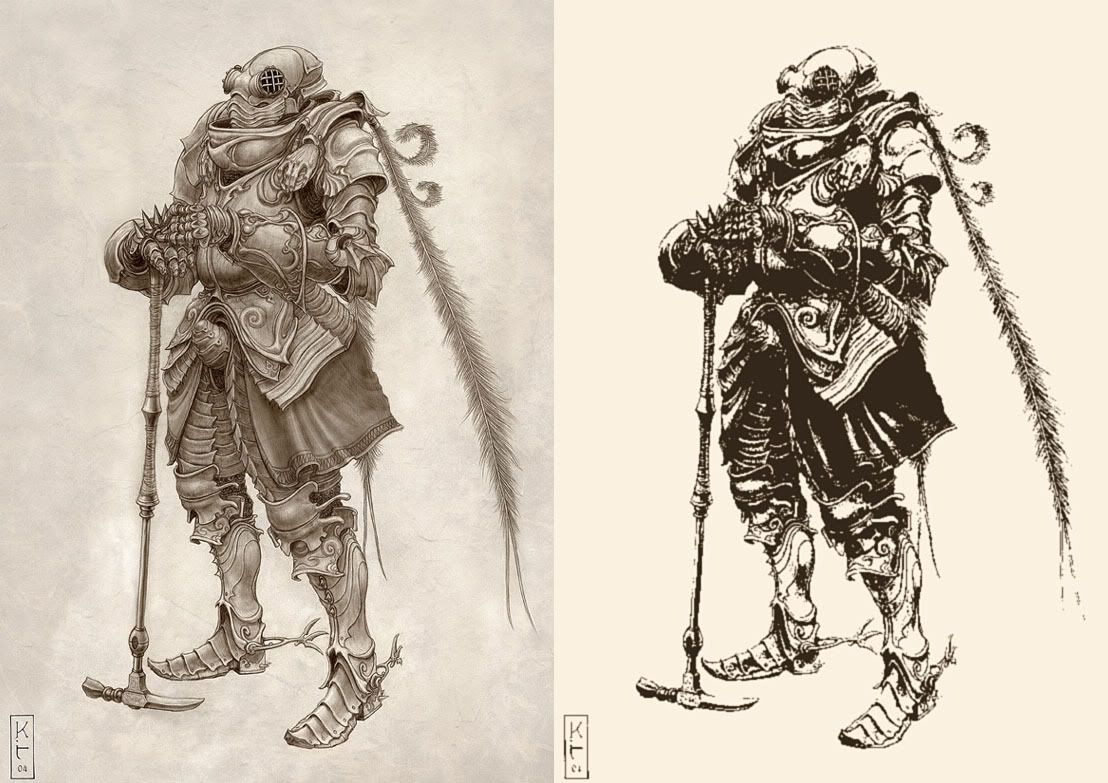
it might come as a result of needing to cut out so much of the normal shading to get something that doesn't look like they sepia toned a game with sparse models and textures, i.e. by obliterating midtones entirely

the original style of this drawing here (not related to the game) for example would be superior but I think they've gone with the presentation of the second (which I've butchered from the first for effect) to be more dramatic and possibly save on detailed drawing
06cafaf7.jpg
 

Baron

Arcane
Joined
Jul 10, 2010
Messages
2,887
Game looks pretty good. Even with high contrast it's so striking and will probably do well on kickstarter. Elevators don't work for me (my Amish fear of buttons perhaps). Would rather a rickety sounding pully system if I'm weilding broadswords. If I'm packing lasers... then ya, elevators. But voice activated ones. That's where I see elevators heading.

In the future.

edit- And holy shit, that Kenshi trailer at the end of YouTube looks fucking great.
 
Self-Ejected

Davaris

Self-Ejected
Developer
Joined
Mar 7, 2005
Messages
6,547
Location
Idiocracy
This kind of graphics may look fine during short-term exposure (i.e. a Youtube video), but when you have to stare at that high-contrast, high-brightness disaster for hours, it will get annoying fast.

IMO he shouldn't have the entire screen look like that. I think it would work, if it was mixed with a somewhat normal looking interface, so you are looking from the real world, into the comic book world.


(see VVVVVV and Thomas Was Alone). I'm not particularly fond of these games, as they jump on the whole retro artsy platformer bandwagon, but their art styles do not stab you in the eyes.

They are good to get you thinking in new directions. I certainly wouldn't look to AAA, for anything that surprises me.
 

Albers

Educated
Joined
Jan 2, 2011
Messages
172
Reminds me a bit of the Codex-approved Dark Spire:
the-dark-spire-20090416040558354.jpg


Guess that makes me an art fag. Pass the clove cigarettes.
 

As an Amazon Associate, rpgcodex.net earns from qualifying purchases.
Back
Top Bottom