Lilura
RPG Codex Dragon Lady
- Joined
- Feb 13, 2013
- Messages
- 5,274
This series of posts has reached Part III, treating the UIs of Pool of Radiance: Ruins of Myth Drannor & The Temple of Elemental Evil.
Excerpt 1:
Excerpt 2:
It sounds crazy, but I'm looking forward to treating the Aurora and Electron UIs in the next post; the latter, a true monster.
Got any criticisms? Fire away.
Excerpt 1:

Part II capped off my treatment of the Infinity Engine UI; holding its five examples in a favorable light with regard to aesthetics, functionality and ease-of-use. In this post I will treat two oddballs of the genre that were never popular and remain largely unknown to the mainstream: Pool of Radiance: Ruins of Myth Drannor & The Temple of Elemental Evil. Both of these RPGs are turn-based and implement the D&D 3.x ruleset, with the former being the first to implement D&D 3.0 and the latter being the first to implement D&D 3.5. Both were also critically-panned on release for several reasons, not the least of which was for their notorious bugs.
While RoMD is mostly remembered in a negative light (if not entirely ignored and forgotten [1]), ToEE has achieved cult status among the "hardcore" crowd and respect has steadily grown for it [2]; in fact, I have long regarded ToEE as THE MODEL for D&D RPGs, combining a top-notch implementation of the ruleset with genuine tactical combat that makes the Infinity, Aurora & Electron combat systems seem like a caricature in comparison. Moreover, its dialogue system is able to handle the role-playing aspect with consummate ease (that Troika failed to make meaningful use of it in their campaign is beside the point). RoMD is also not without virtue and is part of D&D RPG history, whether we like it or not. Yes, the game gets heaps of hate but it's not the purpose of this document to criticize its dungeon design and combat encounters; the UI, as you will see, is quite ok.
[1] The fact that GoG have not offered RoMD for sale is a major reason.
[2] Admittedly, this has a lot to do with the dedicated modding scene and its availability on GoG; however, this game would never have been lost to the mists of time because its combat system is the bee's knees.
Excerpt 2:
User Interface Evolution - Part III: The Odd Ones Out.Note the blue character abilities hypertext link. The entire D&D rulebook is accessible from any hypertext link - and that is simply awesome. Who needs a manual, SRD or wiki? It's in the game. And the best part is: the combat log is also hypertexted so that the player has full access to the rulebook DURING COMBAT.

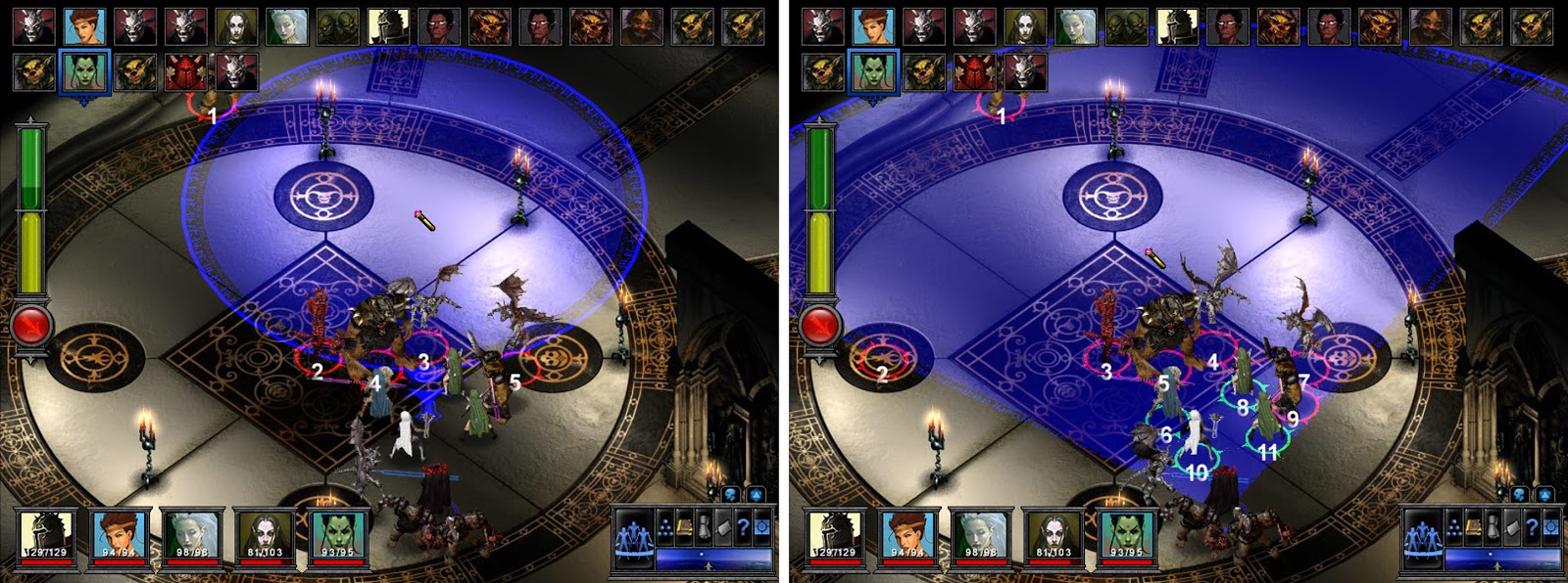
The visual aid for AoE placement is another highlight, a feature sorely lacking in other RPGs in my treatment range. Here you can see the circular targeting aid for Fireball and the cone-shaped one for Cone of Cold.

It sounds crazy, but I'm looking forward to treating the Aurora and Electron UIs in the next post; the latter, a true monster.
Got any criticisms? Fire away.
Last edited:


