Bloodlines 2 Dev Diary #5: FEEDback - UX Design in Bloodlines 2
Bloodlines 2 Dev Diary #5: FEEDback - UX Design in Bloodlines 2
Development Info - posted by Infinitron on Sun 8 September 2019, 23:53:40
Tags: Hardsuit Labs; Paradox Interactive; Rachel Leiker; Vampire: The Masquerade - Bloodlines 2Surprisingly there were no special Vampire: The Masquerade - Bloodlines 2 reveals at PAX West last week, despite the obvious move of taking advantage of a Seattle-based event for a game set in Seattle. Cara Ellison gave two vampire-related talks there, but they weren't broadcast and we found few details about them on social media. On the bright side, since last week Hardsuit have been doing weekly faction reveals on Wednesdays, similar to the clan reveals they did back in May. The factions they've revealed so far are the Pioneers led by Lou Grand (who may or may not be the same person as historical Seattle madame Lou Graham) and the Camarilla led by Alec Cross, both characters who we saw in the game's announcement trailer. Unlike the clan reveals these are just pure lore updates with no livestream announcements, fancy trailers or gameplay details, so they're not that newsworthy on their own, so consider this a roundup. The reason for this newspost is Bloodlines 2's latest dev diary, once again written by lead UI/UX designer Rachel Leiker, and this time it's actually about the UI.
Show the World of Darkness
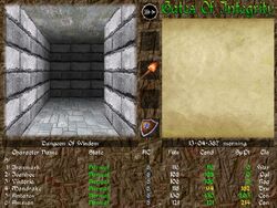
The setting of the game dictates a certain aesthetic – modern day Noir, old versus new, tradition versus progress. We reflect this direction by presenting the player with a not-so pristine interface throughout the game.
Visual inspiration for the UI has been heavily influenced by Neo-noir and modern styles of media. The basic DNA of the style are high contrast, dramatic use of color, and high texture density to reflect the multi-layered quality of the world. With this in mind, we also needed to be careful not to obscure necessary information in style. The function of the thing is always more important than the form of the thing.
We established some basic scales for iconography and texture treatments - Modern, not Sci-fi; Scruffy, not grungy.
Be a Vampire
A HUD and menus are not typically something one would expect to deal with as a vampire, so we cultivated and curated every interaction to support that fantasy. Color scheme, interactions with the world, and character management have all been designed with this in mind.
To a Vampire, blood is everything. It sustains, it empowers, it demands. In the UI we use the color red very sparingly and only when it pertains to blood - Blood gain, blood loss, using blood, and specific feedback regarding health status. This is to help emphasize to the player that their very precious resource is changing, and they need to act accordingly.
Hierarchy
A game with complex systems needs sophisticated feedback. Hierarchies allow us to give the player the right information at the right time without overwhelming or underserving their needs. Every piece of feedback is given a priority against all other forms of feedback, which allows us to easily arrange their placement on screen and their visuals to help the player understand what is most important at any given time.
In the HUD, related items are grouped together – Navigation, Blood-related systems like Health, Hunger, and Disciplines, Combat, and others all have a specific place based on the attention they demand of the player. The more efficiently we can get the necessary information to the player, the more time they can spend immersed in the world and less time engaged with the interface. Notifications also follow this rule – things that demand less of the player’s time are small and appear in a certain location, while Very Important™ notifications such as Quest Completed dominate screen space and player attention.
Consistency
Players can expect the UI to function the same way no matter how they are using it. From Character Creation to Quests to navigation, the player performs an action and the expected result occurs. The goal here is to make managing your character less of a chore and something you enjoy doing. By making it easier for the player to engage with and understand the menus during gameplay, we ensure that they spend less time thinking about the UI and more time enjoying the game. We achieve this by having a consistent menu layout through all pages, consistent input and button locations, and having precise, easily discernible visual feedback if player interaction is required or not.
Accessibility
This appears at the bottom of this list because it is really the foundation for all our work. Hardsuit Labs as a studio is invested in making games that can be enjoyed by as many people as possible. Wherever, whenever possible, the game UI and UX supports accessible features. For example, color is never the primary source of feedback. We use contrast, texture, iconography, FX, text, and layout to provide the primary feedback and use color as secondary enhancement. This helps players with color vision deficiencies without having to have a separate color-blind mode. We are able to test this by including testers with color vision deficiencies in our QA process to give us feedback. Inclusion is part of the accessibility process as well, we have been very conscious about creating iconography that is non-gender specific and considerate of cultural sensitivities. The icons are designed to not rely on gendered tropes (such as pouty lips for seduction or a man’s dress shirt to represent wardrobe), and we use straightforward ideas for icons that can be interpreted no matter the native language or culture.
I’ll be able to talk more about the accessibility options when we get closer to the game’s release, we have many options that we are implementing in the game to make it an enjoyable experience for all of our players. Designing for accessibility is not only great for the players who need them, but it enhances the experience for all players across the board.
UX is so much more than just meters in the HUD and upgrading your skill tree. It really tries to maximize the enjoyment of the player by removing obstacles and solving problems with good design. When you play Bloodlines 2, our goal is to make sure you get the most out of your time with the game and are able to fully immerse yourself in your story. The various UI elements and UX design are all there to give you what you need without getting in the way, putting the proper amount of Feed into your Feedback*.
Next time there should be two or three more factions and hopefully a more substantive dev diary.The setting of the game dictates a certain aesthetic – modern day Noir, old versus new, tradition versus progress. We reflect this direction by presenting the player with a not-so pristine interface throughout the game.
Visual inspiration for the UI has been heavily influenced by Neo-noir and modern styles of media. The basic DNA of the style are high contrast, dramatic use of color, and high texture density to reflect the multi-layered quality of the world. With this in mind, we also needed to be careful not to obscure necessary information in style. The function of the thing is always more important than the form of the thing.
We established some basic scales for iconography and texture treatments - Modern, not Sci-fi; Scruffy, not grungy.
Be a Vampire
A HUD and menus are not typically something one would expect to deal with as a vampire, so we cultivated and curated every interaction to support that fantasy. Color scheme, interactions with the world, and character management have all been designed with this in mind.
To a Vampire, blood is everything. It sustains, it empowers, it demands. In the UI we use the color red very sparingly and only when it pertains to blood - Blood gain, blood loss, using blood, and specific feedback regarding health status. This is to help emphasize to the player that their very precious resource is changing, and they need to act accordingly.
Hierarchy
A game with complex systems needs sophisticated feedback. Hierarchies allow us to give the player the right information at the right time without overwhelming or underserving their needs. Every piece of feedback is given a priority against all other forms of feedback, which allows us to easily arrange their placement on screen and their visuals to help the player understand what is most important at any given time.
In the HUD, related items are grouped together – Navigation, Blood-related systems like Health, Hunger, and Disciplines, Combat, and others all have a specific place based on the attention they demand of the player. The more efficiently we can get the necessary information to the player, the more time they can spend immersed in the world and less time engaged with the interface. Notifications also follow this rule – things that demand less of the player’s time are small and appear in a certain location, while Very Important™ notifications such as Quest Completed dominate screen space and player attention.
Consistency
Players can expect the UI to function the same way no matter how they are using it. From Character Creation to Quests to navigation, the player performs an action and the expected result occurs. The goal here is to make managing your character less of a chore and something you enjoy doing. By making it easier for the player to engage with and understand the menus during gameplay, we ensure that they spend less time thinking about the UI and more time enjoying the game. We achieve this by having a consistent menu layout through all pages, consistent input and button locations, and having precise, easily discernible visual feedback if player interaction is required or not.
Accessibility
This appears at the bottom of this list because it is really the foundation for all our work. Hardsuit Labs as a studio is invested in making games that can be enjoyed by as many people as possible. Wherever, whenever possible, the game UI and UX supports accessible features. For example, color is never the primary source of feedback. We use contrast, texture, iconography, FX, text, and layout to provide the primary feedback and use color as secondary enhancement. This helps players with color vision deficiencies without having to have a separate color-blind mode. We are able to test this by including testers with color vision deficiencies in our QA process to give us feedback. Inclusion is part of the accessibility process as well, we have been very conscious about creating iconography that is non-gender specific and considerate of cultural sensitivities. The icons are designed to not rely on gendered tropes (such as pouty lips for seduction or a man’s dress shirt to represent wardrobe), and we use straightforward ideas for icons that can be interpreted no matter the native language or culture.
I’ll be able to talk more about the accessibility options when we get closer to the game’s release, we have many options that we are implementing in the game to make it an enjoyable experience for all of our players. Designing for accessibility is not only great for the players who need them, but it enhances the experience for all players across the board.
UX is so much more than just meters in the HUD and upgrading your skill tree. It really tries to maximize the enjoyment of the player by removing obstacles and solving problems with good design. When you play Bloodlines 2, our goal is to make sure you get the most out of your time with the game and are able to fully immerse yourself in your story. The various UI elements and UX design are all there to give you what you need without getting in the way, putting the proper amount of Feed into your Feedback*.
There are 23 comments on Bloodlines 2 Dev Diary #5: FEEDback - UX Design in Bloodlines 2