- Joined
- Jan 28, 2011
- Messages
- 99,593


Tags: Almost Human Games; Legend of Grimrock 2
In the latest post on Almost Human's Legend of Grimrock 2 development blog, we get a first look at the game's new and improved GUI.
In the latest post on Almost Human's Legend of Grimrock 2 development blog, we get a first look at the game's new and improved GUI.
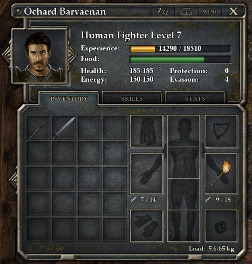
From the past experience with graphical user interfaces (GUI) we know that creating a gui that not only looks great but is also effortless and intuitive to use is hard work. For LoG1 we did many, many iterations before settling down with the final design (by scanning older blog posts you can see various incarnations that evolve to the final version). We are pretty happy with the original gui but as always there is still room for improvement. So, we spent a week with Juho furiously working on the gui and this is what we got:

The changes are not just eye-candy, some of them make the gui more usable. For example, you can now cycle through the characters by clicking on the arrows on the left and right side of the portrait. Also, the main statistics, experience, food, health, energy, protection and evasion are always visible on the upper half of the character sheet. With a quick glance you can now see whose character sheet is open regardless which tab is active.
On the visual side, the little drips of brown and green here and there remind of the new outdoor environments. A little feature that we wanted to do for Grimrock 1, but didn’t have enough time, is race and gender specific inventory panel backgrounds. Naturally now that we have moddable races (did I mention this feature already?), mods can define new background images for new races.
Like before the stats tab shows the remaining statistics, such as ability scores and resistances. We improved the layout a bit and grouped left and right hand statistics in their own boxes. As a new feature the percentile chance of scoring critical hits is now displayed in the stats tab.
(For the technically inclined, the gui elements in Grimrock 1 were manually packed in a texture atlas and the coordinates and sizes of every element were painstakingly entered in the code. For the new gui, I coded a simple texture packer that spews out a big texture atlas containing all the bits and pieces and a Lua file with the coordinates. The texture atlas has currently 192 pieces, so needless to say, making new iterations is now a lot less painful than with the old gui system!)
LoG2 will have many new harmful and beneficial conditions that your characters can have. The conditions used to be seen only in the stats tab, but the tab was getting a bit crowded, so the conditions are now indicated on the portrait. This is a very natural place for them, so I don’t know why we didn’t realize this earlier. Anyway, if you have any harmful condition the portrait rectangle turns red and by hovering on the portrait with the mouse you get a detailed list of all active conditions and their effects on the character.
Perhaps even more important than the character sheet is the attacking interface on the lower right corner of the screen (see below). We have also redesigned the attack frames so that the rune panel fits on the screen without hiding the little portrait and health and energy bars. It’s a lot cleaner now, especially with multiple mages. As a side effect the attack buttons are now a little bigger making it easier to hit them in the heat of battle.
Observant readers may have noticed that I haven’t mentioned the Skills tab of the character sheet yet. I actually skipped that on purpose, because the skill system has went through a major redesign and I reserve the subject for another blog post! Ha!
Looks good. I remember being kind of annoyed by how the same information moved around between tabs in the first game.
The changes are not just eye-candy, some of them make the gui more usable. For example, you can now cycle through the characters by clicking on the arrows on the left and right side of the portrait. Also, the main statistics, experience, food, health, energy, protection and evasion are always visible on the upper half of the character sheet. With a quick glance you can now see whose character sheet is open regardless which tab is active.
On the visual side, the little drips of brown and green here and there remind of the new outdoor environments. A little feature that we wanted to do for Grimrock 1, but didn’t have enough time, is race and gender specific inventory panel backgrounds. Naturally now that we have moddable races (did I mention this feature already?), mods can define new background images for new races.
Like before the stats tab shows the remaining statistics, such as ability scores and resistances. We improved the layout a bit and grouped left and right hand statistics in their own boxes. As a new feature the percentile chance of scoring critical hits is now displayed in the stats tab.
(For the technically inclined, the gui elements in Grimrock 1 were manually packed in a texture atlas and the coordinates and sizes of every element were painstakingly entered in the code. For the new gui, I coded a simple texture packer that spews out a big texture atlas containing all the bits and pieces and a Lua file with the coordinates. The texture atlas has currently 192 pieces, so needless to say, making new iterations is now a lot less painful than with the old gui system!)
LoG2 will have many new harmful and beneficial conditions that your characters can have. The conditions used to be seen only in the stats tab, but the tab was getting a bit crowded, so the conditions are now indicated on the portrait. This is a very natural place for them, so I don’t know why we didn’t realize this earlier. Anyway, if you have any harmful condition the portrait rectangle turns red and by hovering on the portrait with the mouse you get a detailed list of all active conditions and their effects on the character.
Perhaps even more important than the character sheet is the attacking interface on the lower right corner of the screen (see below). We have also redesigned the attack frames so that the rune panel fits on the screen without hiding the little portrait and health and energy bars. It’s a lot cleaner now, especially with multiple mages. As a side effect the attack buttons are now a little bigger making it easier to hit them in the heat of battle.
Observant readers may have noticed that I haven’t mentioned the Skills tab of the character sheet yet. I actually skipped that on purpose, because the skill system has went through a major redesign and I reserve the subject for another blog post! Ha!


![Glory to Codexia! [2012] Codex 2012](/forums/smiles/campaign_tags/campaign_slushfund2012.png)


![Have Many Potato [2013] Codex 2013](/forums/smiles/campaign_tags/campaign_potato2013.png)
![The Year of Incline [2014] Codex 2014](/forums/smiles/campaign_tags/campaign_incline2014.png)


