- Joined
- Jan 28, 2011
- Messages
- 100,077


Tags: Lee Dotson; Seven Dragon Saga; Tactical Simulations Interactive
In the month after the Seven Dragon Saga Kickstarter campaign was cancelled, its official development blog continued to received lore and narrative-related updates of a fairly humdrum nature. Today though, after a period of radio silence, there's something a bit more interesting:
In the month after the Seven Dragon Saga Kickstarter campaign was cancelled, its official development blog continued to received lore and narrative-related updates of a fairly humdrum nature. Today though, after a period of radio silence, there's something a bit more interesting:
Hi there – So things have been pretty quiet here news wise and that’s largely my fault. I joined up with the TSI about a month and a half ago to take over the art direction on Seven Dragon Saga. Since then I’ve read several hundred pages of community comments on the previous iteration of the games visuals along with digesting the exhaustive documentation for the games world and gameplay mechanics so I can feed all of that into our new look which is what we’re ready to talk more about today.
But before we get into that I should give a little background on myself. I’m Lee Dotson, I’ve been making art for games for about 18 years now covering almost every genre of game out there including games like Anachronox, Star Trek Online, and Diablo 3 but classic RPG’s are what make me want to create games in the first place so 7DS’s open ended storylines and rich X-Com like tactical gameplay makes this a total dream project for me.
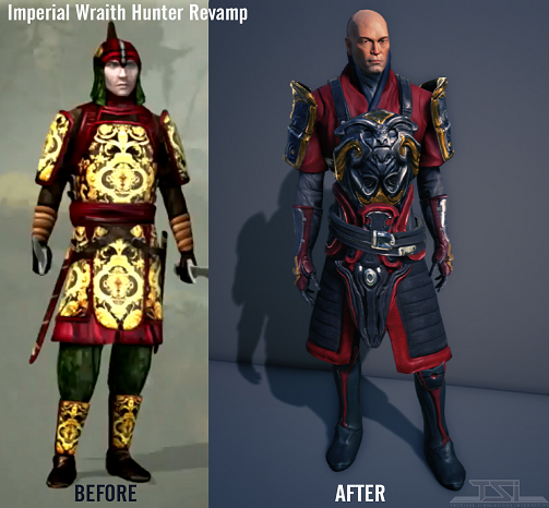
Enough about me, here we have a small example of where we’ve been and where we’re going with the style and look of 7DS. The goal here is to push for a look that merges the sense of fantastic realism found in classic fantasy paintings by the likes of Brom or Easely with the rich colors and clear designs from classic dungeon crawlers like Eye of the Beholder so there’s a feast for the eyes when zooming in on characters while keeping everything legible from far away. For me this is particularly key because while it’s important to have a clear view of the game on a tactical level I love being able to immerse myself in a game’s world and see changes in my character.
There’s also a ton of work that here that’s not really immediately obvious, an engine change, armor that’s designed in a modular format for player customization, animations for the cover system and a lot more but we’ll have to save that for future updates.
In the meantime let us know what you think about this first tiny glimpse into the new direction. We’re super excited about how things are coming together and we hope you are too. I know a lot of people have a thoughts on 3d vs. classic pixel art, isometric vs. classic first person views that we’re happy to discuss our thoughts on over in the forums, facebook, twitter or wherever it is that you like talking.
So not only is the game's development continuing, but they're hiring new people. These guys are pretty determined. A new art style is good, and reading community feedback is very good. And I wonder what that engine change is, just Unity 5 or something more ambitious? Still, if Seven Dragon Saga wants to make a successful comeback, this stuff is just the beginning.But before we get into that I should give a little background on myself. I’m Lee Dotson, I’ve been making art for games for about 18 years now covering almost every genre of game out there including games like Anachronox, Star Trek Online, and Diablo 3 but classic RPG’s are what make me want to create games in the first place so 7DS’s open ended storylines and rich X-Com like tactical gameplay makes this a total dream project for me.
Enough about me, here we have a small example of where we’ve been and where we’re going with the style and look of 7DS. The goal here is to push for a look that merges the sense of fantastic realism found in classic fantasy paintings by the likes of Brom or Easely with the rich colors and clear designs from classic dungeon crawlers like Eye of the Beholder so there’s a feast for the eyes when zooming in on characters while keeping everything legible from far away. For me this is particularly key because while it’s important to have a clear view of the game on a tactical level I love being able to immerse myself in a game’s world and see changes in my character.
There’s also a ton of work that here that’s not really immediately obvious, an engine change, armor that’s designed in a modular format for player customization, animations for the cover system and a lot more but we’ll have to save that for future updates.
In the meantime let us know what you think about this first tiny glimpse into the new direction. We’re super excited about how things are coming together and we hope you are too. I know a lot of people have a thoughts on 3d vs. classic pixel art, isometric vs. classic first person views that we’re happy to discuss our thoughts on over in the forums, facebook, twitter or wherever it is that you like talking.


![Glory to Codexia! [2012] Codex 2012](/forums/smiles/campaign_tags/campaign_slushfund2012.png)
![Have Many Potato [2013] Codex 2013](/forums/smiles/campaign_tags/campaign_potato2013.png)
![The Year of Incline [2014] Codex 2014](/forums/smiles/campaign_tags/campaign_incline2014.png)


