Putting the 'role' back in role-playing games since 2002.
Donate to Codex
Good Old Games
  • Welcome to rpgcodex.net, a site dedicated to discussing computer based role-playing games in a free and open fashion. We're less strict than other forums, but please refer to the rules.

    "This message is awaiting moderator approval": All new users must pass through our moderation queue before they will be able to post normally. Until your account has "passed" your posts will only be visible to yourself (and moderators) until they are approved. Give us a week to get around to approving / deleting / ignoring your mundane opinion on crap before hassling us about it. Once you have passed the moderation period (think of it as a test), you will be able to post normally, just like all the other retards.

Game News Colony Ship Update #35: Combat Demo Update #2 - More New Screenshots

Ismaul

Thought Criminal #3333
Patron
Joined
Apr 18, 2005
Messages
1,871,810
Location
On Patroll
Codex 2014 PC RPG Website of the Year, 2015 Codex 2016 - The Age of Grimoire Make the Codex Great Again! Grab the Codex by the pussy Insert Title Here RPG Wokedex Strap Yourselves In Codex Year of the Donut Divinity: Original Sin Project: Eternity Torment: Tides of Numenera Shadorwun: Hong Kong Divinity: Original Sin 2 BattleTech A Beautifully Desolate Campaign My team has the sexiest and deadliest waifus you can recruit.
Here's an example of what I meant with the tooltip. Note that I'm not an artist, and there might be more improvements to it. Take what you want from it.

KCxBFzp.jpg
 
Last edited:

Elhoim

Iron Tower Studio
Developer
Joined
Oct 27, 2006
Messages
2,880
Location
San Isidro, Argentina
To give some more feedback on the THC tooltip, there might be too much info in the short version of it (non-alt). It already doesn't specify which weapon you're attacking with, since the weapon is clearly selected at the bottom of the screen, so maybe the type of shot and ammo also don't have to be repeated in the short version. Maybe. That would allow the tooltip to be less cluttered, more readable at a glance.

When playing I barely look at the slot, as you can change attacks using the 1-2-3-4 keys, so I don't have to look back and forth. It's something that may seem redundant when analyzing a screenshot, but makes a huge difference when you are playing with quick attack changes.
 

Ismaul

Thought Criminal #3333
Patron
Joined
Apr 18, 2005
Messages
1,871,810
Location
On Patroll
Codex 2014 PC RPG Website of the Year, 2015 Codex 2016 - The Age of Grimoire Make the Codex Great Again! Grab the Codex by the pussy Insert Title Here RPG Wokedex Strap Yourselves In Codex Year of the Donut Divinity: Original Sin Project: Eternity Torment: Tides of Numenera Shadorwun: Hong Kong Divinity: Original Sin 2 BattleTech A Beautifully Desolate Campaign My team has the sexiest and deadliest waifus you can recruit.
To give some more feedback on the THC tooltip, there might be too much info in the short version of it (non-alt). It already doesn't specify which weapon you're attacking with, since the weapon is clearly selected at the bottom of the screen, so maybe the type of shot and ammo also don't have to be repeated in the short version. Maybe. That would allow the tooltip to be less cluttered, more readable at a glance.

When playing I barely look at the slot, as you can change attacks using the 1-2-3-4 keys, so I don't have to look back and forth. It's something that may seem redundant when analyzing a screenshot, but makes a huge difference when you are playing with quick attack changes.
Sure then in that case it might be pertinent to have it there. That's why I insisted on the maybe. Aesthetics are subordinate to usability and serve only to help it.

Still the better way to do it would be with unintrusive icons, say next to the crosshair in the mock up I provided (unless you have so many types of attacks that the player won't remember what the icons mean, then you might have to use text -- but since the text is already on the weapon slot, the player has a way to learn what the icons mean by association). Display one icon for the chosen type of attack, and when needed make the icon red to show the lack of ammo.

For the attack type icons (excuse my lame skills), single shot, burst, and burst with no ammo for example:

YgSqN5x.jpg


994d5cf.jpg


HWBB7Fg.jpg
 
Last edited:

Twiglard

Poland Stronk
Patron
Staff Member
Joined
Aug 6, 2014
Messages
7,509
Location
Poland
Strap Yourselves In Codex Year of the Donut
I get this is a test level and all, but it looks exactly like some popamole shooter combat event. I bet EA covets your sublime box layout.
 
Last edited:

hpstg

Augur
Joined
Nov 14, 2014
Messages
485
A bit of a technical question:

Is the UI properly scalable? It would be really nice if it were.

Although I'll probably be stoned for this in here, I would also like to ask if there is a very very very remote possibility for controller support.
 

Ismaul

Thought Criminal #3333
Patron
Joined
Apr 18, 2005
Messages
1,871,810
Location
On Patroll
Codex 2014 PC RPG Website of the Year, 2015 Codex 2016 - The Age of Grimoire Make the Codex Great Again! Grab the Codex by the pussy Insert Title Here RPG Wokedex Strap Yourselves In Codex Year of the Donut Divinity: Original Sin Project: Eternity Torment: Tides of Numenera Shadorwun: Hong Kong Divinity: Original Sin 2 BattleTech A Beautifully Desolate Campaign My team has the sexiest and deadliest waifus you can recruit.
Don't listen to this man. The UI is anything but eye cancer.
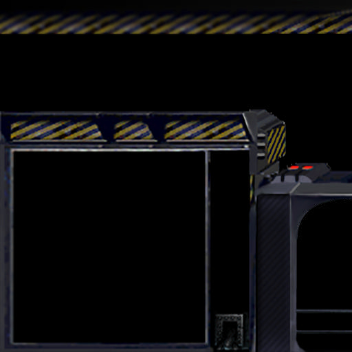
I agree! Should look something more like the Terran UI in Starcraft. Would be a nice fit.
I don't think you did get my criticism and suggestions. It wasn't about the art rendition of the UI, but the layout of the information within. Art should reinforce the setting, obviously.
 

Vault Dweller

Commissar, Red Star Studio
Developer
Joined
Jan 7, 2003
Messages
28,044
I get this is a test level and all, but it looks exactly like some popamole shooter combat event. I bet EA covets your sublime box layout.
It's an arena built for entertainment. The layout isn't final.
 

Eyestabber

Arcane
Patron
Joined
Jan 15, 2015
Messages
4,733
Location
HUEland
PC RPG Website of the Year, 2015
Important question: will the demo showcase the gory death animations? Here is my wishlist for the release version:

- Classic fallout-like burst fire death animation
- Hilarious "looks down in confusion and notices a large chunk of his/her chest is missing after eating a shotgun blast, then falls down dead"
- Enemy runs around screaming due to being set on fire
- X-ray eletrocution -> body crumbles into dust
- Head explosion with model's hands reaching to where his head used to be. Probably a fun one for snipers
- Rocket INSTAGIB
- Leg gets ripped off by aimed shot, bandit still tries to "hopscotch" towards you, but then falls down dead
- Entire lower half of an enemy's body gets blown off by shotgun, he still crawls a bit forward trying to stab your legs
- Railgun-like kill on multiple enemies that end up with matching holes in their bodies
- Explosion blasts that result in enemies losing a couple limbs, while not getting "gibbed" due to not being at the center of the blast
- Plasma induced face MELT

Come on, VD, be the first developer to understand that hilarious death animations are an integral part of fallout's legacy!!!
 

Vault Dweller

Commissar, Red Star Studio
Developer
Joined
Jan 7, 2003
Messages
28,044
Important question: will the demo showcase the gory death animations? Here is my wishlist for the release version:
Demo - probably not. Our animator is very ill, most likely he'll have to be hospitalized. That's the main reason for the delay. The basic animations are done but need some tweaking here and there, probably 2-3 weeks of work. Armor is 30% done. We've found someone else to handle armor but it will still take some time. So extra animations aren't an option in the near future.
 

Eyestabber

Arcane
Patron
Joined
Jan 15, 2015
Messages
4,733
Location
HUEland
PC RPG Website of the Year, 2015
Important question: will the demo showcase the gory death animations? Here is my wishlist for the release version:
Demo - probably not. Our animator is very ill, most likely he'll have to be hospitalized. That's the main reason for the delay. The basic animations are done but need some tweaking here and there, probably 2-3 weeks of work. Armor is 30% done. We've found someone else to handle armor but it will still take some time. So extra animations aren't an option in the near future.

Is he the same guy that did the work for AoD? Because the death animations in AoD/DR are really INSPIRED. I loved how you guys took the time to make sure killing shit wouldn't get repetitive and DAMN those spear death animations looked nice. I was hopping ITS would "up its game" in the "gory death department", hence my suggestions.

Hope your guy is ok, either way.
 

Fenix

Arcane
Vatnik
Joined
Jul 18, 2015
Messages
6,550
Location
Russia atchoum!
Important question: will the demo showcase the gory death animations? Here is my wishlist for the release version:
Demo - probably not. Our animator is very ill, most likely he'll have to be hospitalized. That's the main reason for the delay. The basic animations are done but need some tweaking here and there, probably 2-3 weeks of work. Armor is 30% done. We've found someone else to handle armor but it will still take some time. So extra animations aren't an option in the near future.

Very sorry to hear these news, I wish health to your guy, tell him "Get well soon!".
 
Last edited:

Tigranes

Arcane
Joined
Jan 8, 2009
Messages
10,350
Hope he gets well soon, and that he's set up with decent healthcare wherever he is.
 

Vault Dweller

Commissar, Red Star Studio
Developer
Joined
Jan 7, 2003
Messages
28,044
He's in a hospital now, getting proper treatment, should be out in 10 days, hopefully good as new. In other news, the gadgets are in and working well, the demo is feature-complete, so things are progressing well.
 

As an Amazon Associate, rpgcodex.net earns from qualifying purchases.
Back
Top Bottom