Putting the 'role' back in role-playing games since 2002.
Donate to Codex
Good Old Games
  • Welcome to rpgcodex.net, a site dedicated to discussing computer based role-playing games in a free and open fashion. We're less strict than other forums, but please refer to the rules.

    "This message is awaiting moderator approval": All new users must pass through our moderation queue before they will be able to post normally. Until your account has "passed" your posts will only be visible to yourself (and moderators) until they are approved. Give us a week to get around to approving / deleting / ignoring your mundane opinion on crap before hassling us about it. Once you have passed the moderation period (think of it as a test), you will be able to post normally, just like all the other retards.

Game News Wasteland 2 Kickstarter Update #31: OMG DISTRIBUTION DEAL, also new HUD screenshots

Gondolin

Arcane
Joined
Oct 6, 2007
Messages
5,827
Location
Purveyor of fine art
The UI is meh, but not a major problem. I can live with it. Modders will fix it and all that.
 

Alex_Steel

Arcane
Patron
Joined
Jul 7, 2011
Messages
2,548
The UI is ugly and inconsistent. Why do they insist on putting parts that look like paper?
 

Misconnected

Savant
Joined
Jan 18, 2012
Messages
587
Speaking of better thans, we'd actually love to get some of that from people: tell us what UIs from videogaming you really like, and what you really liked about it. Cite specific games or show us screenshots. That'd be some great input to have.


Visually I liked the GUI style of the Fallout/Infinity Engine era. The solid & slightly ornate framing of the view of the gamespace mostly doesn't actively remind me I'm playing a game in the same way cut out, floaty and/transparent buts of GUI scattered across my view of the gamespace does.

Similarily I like GUIs that are built to convey all the system information I need. Floating health bars, active playing piece indicators and whatnot can be extremely useful, especially while learning how to play a game. But ideally it should be possible for the GUI to convey all of such information, and the for the gamespace to - at best - only convey the parts that are in-fiction information and only convey it as in-fiction information (like wounds on a model instead of a health bar, if the GFX budget allows). This extends to interactive objects and such, by the way. Holding a key to hilight interactive stuff is useful - it circumvents pixel hunting. Having every interactive thing in the gameworld shine all the time as if covered in a revolting mix of radioactive slime and phosphorescent pee is 4th wall wrecking, and a cruel thing to do to a game with half-decent artwork.

In terms of functionality I'm having a hard time thinking of a good real world example. For example the IE games and Fallouts had a tendency to hide arrays of buttons within other buttons. To me it's much, much better to have a big-ass GUI than a fiddly one.

Consistency, however, is even more important. Buttons should always be in the same place no matter what. Keyboard hotkeys should be defined based on speed of use and coordination logic, not on whether a particular letter matches the name of a particular function. I'm not going to use hotkeys because I can sort of maybe possibly guess what they are from the names of the functions. I'm going to use them if they're consistently fast as fuck, designed for no or minimal hand movement, and for consistent execution of commands. StarCraft 2 is hotkey perfection.
This also applies to button layout in the GUI - organise for minimal mouse movement, not for flavour or first implemented whatever the fuck all the GUI geniuses in the industry usually do

Legibility is another huge one. Games like Fallen Enchantress and Distant Worlds might as well not have bothered with any of their written information, because it's borderline invisible and if I had to try to read it I'd end up none the wiser and with a throbbing headache. Actually, this is one of those GUI crimes that just makes me want to punch the responsible git in the dick. With an axe.
 

FeelTheRads

Arcane
Joined
Apr 18, 2008
Messages
13,716
Speaking of better thans, we'd actually love to get some of that from people: tell us what UIs from videogaming you really like, and what you really liked about it. Cite specific games or show us screenshots. That'd be some great input to have.
One thing that I think you're doing wrong is going for both modularity and umm... connections between elements and decorations, like cables and all that stuff. Either do it simple and modular or do it nice looking and static.
As it is, there's a lot of work wasted on making stuff fit together in different configurations. It's pointless, I think.

And there's way too many shit going on there. What's with all the fucking cables? Get some style, for fuck's sake. And give up on the goddamn papers, you're not Dead State.
 

PlanHex

Arcane
Patron
Joined
Dec 31, 2007
Messages
2,126
Location
Copenhagen, Denmark
Extra + and - next to the map in the first screen. Is that for resizing the HUD element or just a small error?

Also, why are the screenies 1920*1177 and not 1920*1200?
What did you do to the remaining 44160 pixels, YOU BASTARDS?!
 
Joined
Feb 11, 2007
Messages
2,952
Yeah, what's the point of that wiring? Keep it minimal and simple. And GUI parts do need to have a common theme - that paper just doesn't fit with the rest of it.
 

mikaelis

Prophet
Patron
Joined
Nov 28, 2008
Messages
1,448
Location
Land of Danes
Codex 2013 Codex 2014
Extra + and - next to the map in the first screen. Is that for resizing the HUD element or just a small error?

Also, why are the screenies 1920*1177 and not 1920*1200?
What did you do to the remaining 44160 pixels, YOU BASTARDS?!

That's were the quest compass is, I suppose. LYING BASTARDS!!!
 

Smejki

Larian Studios, ex-Warhorse
Developer
Joined
Oct 22, 2012
Messages
710
Location
Belgistan
Speaking of better thans, we'd actually love to get some of that from people: tell us what UIs from videogaming you really like, and what you really liked about it. Cite specific games or show us screenshots. That'd be some great input to have.
Well, functionally:
Civilization 5
Shogun 2 TW (also artistically, very much)
DOTA2 and LoL
Starcraft 2 (also artistically, if only it took less screen space)
Tropico 3 (also artistically)
Diablo 3
Sins of a Solar Empire
Morrowind, kinda
SimCity 4 and as what I remember from the open beta also SimCity 5 has great UI and tools (game sucks balls though).

Artistically:
Dragon Age 1
Fallout 2
Deus Ex: HR (also functionally)
Main menu of Metro Last Light
Witcher 2
Oblivion
Fallout3/New Vegas, partially (but functionally it was horrible)
 

felipepepe

Codex's Heretic
Patron
Joined
Feb 2, 2007
Messages
17,310
Location
Terra da Garoa
UI is trying to hard to be "part of the setting", when it should just focus on not getting in the way... it looks as if the UI artist is making it for screenshots only, not for a actual game...

Speaking of better thans, we'd actually love to get some of that from people: tell us what UIs from videogaming you really like, and what you really liked about it. Cite specific games or show us screenshots. That'd be some great input to have.
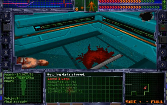
This is your UI now:

system_shock_by_looking_glass_technologies_4.jpg


This is how it should be:

20.jpg


System Shock 2 is 14 years old, it was made to work on 640x480, while you have 16:9 monitors starting at what, 1280x720? FFS, look how it fits things nicely, while the W2 UI waste like 1/8 of the screen with huge pointless paper frame for a smaller text with MASSIVE fontsize... did the artists ever saw that on fullscreen? It looks GIGANTIC.
 

Smejki

Larian Studios, ex-Warhorse
Developer
Joined
Oct 22, 2012
Messages
710
Location
Belgistan
Yes, please, guys, remove the printer paper message window. It breaks the whole image completely.
 
Self-Ejected

Excidium

P. banal
Joined
Aug 14, 2009
Messages
13,696
Location
Third World
System Shock 2 is 14 years old, it was made to work on 640x480, while you have 16:9 monitors starting at what, 1280x720? FFS, look how it fits things nicely, while the W2 UI waste like 1/8 of the screen with huge pointless paper frame for a smaller text with MASSIVE fontsize... did the artists ever saw that on fullscreen? It looks GIGANTIC.
I'm p. sure the artists don't play the game or even video games at all after seeing that inventory screen.
 

Surf Solar

cannot into womynz
Joined
Jan 8, 2011
Messages
8,837
UI is trying to hard to be "part of the setting", when it should just focus on not getting in the way... it looks as if the UI artist is making it for screenshots only, not for a actual game...

Speaking of better thans, we'd actually love to get some of that from people: tell us what UIs from videogaming you really like, and what you really liked about it. Cite specific games or show us screenshots. That'd be some great input to have.
This is your UI now:

system_shock_by_looking_glass_technologies_4.jpg


This is how it should be:

20.jpg


System Shock 2 is 14 years old, it was made to work on 640x480, while you have 16:9 monitors starting at what, 1280x720? FFS, look how it fits things nicely, while the W2 UI waste like 1/8 of the screen with huge pointless paper frame for a smaller text with MASSIVE fontsize... did the artists ever saw that on fullscreen? It looks GIGANTIC.


Eh, I actually like the first screenshot much more...
 

Infinitron

I post news
Patron
Staff Member
Joined
Jan 28, 2011
Messages
99,621
Codex Year of the Donut Serpent in the Staglands Dead State Divinity: Original Sin Project: Eternity Torment: Tides of Numenera Wasteland 2 Shadorwun: Hong Kong Divinity: Original Sin 2 A Beautifully Desolate Campaign Pillars of Eternity 2: Deadfire Pathfinder: Kingmaker Pathfinder: Wrath I'm very into cock and ball torture I helped put crap in Monomyth
Personally, I think the dot matrix printer/paper-style text window is fine, but the color and font need to be tweaked.
 

tuluse

Arcane
Joined
Jul 20, 2008
Messages
11,400
Serpent in the Staglands Divinity: Original Sin Project: Eternity Torment: Tides of Numenera Shadorwun: Hong Kong
Don't use interfaces for first person single character games as evidence for how an interface for a 3rd person pseudo-isometric party based game should look and work. Thank you.
 
Self-Ejected

Excidium

P. banal
Joined
Aug 14, 2009
Messages
13,696
Location
Third World
Don't use interfaces for first person single character games as evidence for how an interface for a 3rd person pseudo-isometric party based game should look and work. Thank you.
I think what he means is that InXile needs to learn how to make proper use of screen space.
 

tuluse

Arcane
Joined
Jul 20, 2008
Messages
11,400
Serpent in the Staglands Divinity: Original Sin Project: Eternity Torment: Tides of Numenera Shadorwun: Hong Kong
Then find an example from a game with at least passing similarities in UI needs.
 

CWagner

Augur
Joined
May 17, 2012
Messages
111
Location
Germany
UI is kinda ugly, but I prefer it ugly and customizable to cool and only for the most common denominator :)

And I gave up on getting annoyed by distributors, I started years ago to buy CDs distributed by RIAA/IFPI members. Only record labels that are members are off limits.
 

felipepepe

Codex's Heretic
Patron
Joined
Feb 2, 2007
Messages
17,310
Location
Terra da Garoa
Don't use interfaces for first person single character games as evidence for how an interface for a 3rd person pseudo-isometric party based game should look and work. Thank you.
Don't be silly, SS2 may be a FPS, but that UI is mouse-controlled, just like W2 is. Besides, the main point was all the "fluff" tying the UI together in W2 UI... those wires, printed papers, chip boards and all, that are just getting in the way.
 

Hobz

Savant
Joined
Apr 17, 2012
Messages
337
Divinity: Original Sin Torment: Tides of Numenera Shadorwun: Hong Kong Divinity: Original Sin 2
I don't have a problem with compact and floatty UI, I think it can be done right and I personally prefer a minimalist UI.

My main gripes with this UI are :

- The inconsistency : The UI seems to be made from scraps, yet we can see clean abstract icons for skills, a font that clearly looks out of place, printed on translucent paper (?!) and the square buttons look like they don't belong here and nobody had a clue where to put them. I'm willing to loose on the customization side if that's what it takes to fix this.
- The poor execution : The brown parts are just on flat color, lots of elements look like they've been hastily copy/pasted either from a screen capture of wires or a quick ms paint job. The square buttons are uggly and so is the AP counter.

I know it's a WIP though, so I'm sure the second point will be addressed before release.
 

As an Amazon Associate, rpgcodex.net earns from qualifying purchases.
Back
Top Bottom