Colony Ship Update #31: The Interface
Colony Ship Update #31: The Interface
Game News - posted by Infinitron on Fri 12 October 2018, 23:27:29
Tags: Colony Ship: A Post-Earth Role Playing Game; Iron Tower Studio; Vince D. WellerWe've gotten a look at Colony Ship's inventory and character screens in previous development updates, but not at its main screen interface. That's the topic of this month's update. It's a slicker take on The Age of Decadence's interface, with pop-up icons for special attacks and additional slots for grenades and other items.

^ we don't have Mercy's portrait yet so we're using a placeholder portrait. As for the design:
I guess it's sort of like Fallout meets Pillars of Eternity, which is fine by me. Check out the full update for images of some (but not all) of the main screen interface elements. I guess it's not completely done yet.
We’re implementing the interface right now so let me show what we have and get some feedback. Let’s start with the standard features:
The icons are grouped in 3 different categories:
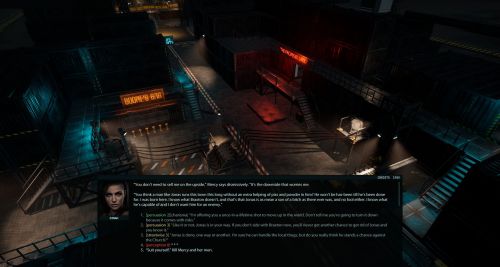
The update also gives us our first look at Colony Ship's dialogue interface, which is thoroughly modernized. For starters, it's a window rather than full screen, and yes, those are skill check thresholds you're looking at.- Two weapon slots showing equipped weapons and selected attack’s stats (damage, AP, ammo)
- An optional textbox giving you detailed blow-by-blow info during combat
- A combat queue we used in Dungeon Rats to show who gets to act when
- 4 belt bags so you can throw grenades or use items in combat without moving them to the weapon slots
The icons are grouped in 3 different categories:
- Basic attacks (fast, regular, power for melee; snap shot and regular shot for ranged; there are no power attacks with guns)
- Aimed attacks (self-explanatory; you get an extra bullseye shot with ranged)
- Special attacks (double shot, short burst, long burst, double strike, flurry (3 strikes), and swing (hits 3 tiles).

^ we don't have Mercy's portrait yet so we're using a placeholder portrait. As for the design:
- The dialogue window won’t take the entire screen, as in AoD since it added nothing but extra work (the camera had to be manually positioned)
- The checks will now display the skill or stat level required to avoid playing a guessing game; if there is no value listed (see the first response), the stat acts as a modifier (strengthening or weakening the reaction) not a check. Strength can be used as a modifier too if you’re trying to intimidate, for example, so it’s not Charisma only.
- Since we’ve decided to show the check values, might as well show your skill levels so that you don’t have to rely on memory alone. Green means your skill level is equal to or higher than the check value. Yellow means it’s lower but you can still make an attempt. Red means no go (what used to be hidden options in AoD). Before you start freaking out, remember that the check system was changed and it’s no longer a binary ‘succeed or fail’ setup, so green lines won’t always be the best and yellow lines won’t always lead to failure and death, so we aren’t highlighting the best and worst options for you here.
- The tags can be turned on and off in the options, so if you don’t like them, turn them off.
There are 58 comments on Colony Ship Update #31: The Interface


