Making Epic 3D Dungeons
Making Epic 3D Dungeons
Editorial - posted by VentilatorOfDoom on Wed 12 May 2010, 10:31:57
Tags: Frayed KnightsJay "Rampant Coyote" Barnson ponders dungeon design.
So anyway, fast forward to today. Making 3D maps for a first-person perspective game. Tracy Hickman was 100% correct. What I think of as an awesome, classic, “old-school” map – like one of the above examples – comes out awfully , squat, boring, and – yes, dumpy – if translated directly into full-on 3D. Oh, and they also turn out pretty maze-like, too. And about 2/3rds of their actual size relative to what should be your “proper” eyepoint. I’m sure there are some things that can be done to make it more interesting and visually appealing (Kevin did wonders for the Temple of Pokmor Xang, which began life as a 2D graph-paper map with very few elevation-change cues). But apparently the direct translation of my vision of a “good map” runs counter to that of visually appealing and functional 3D map design.
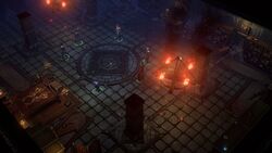
Look at the screenshot. It's not grimdarkgritty enough.
Spotted at: RPGWatch
So anyway, fast forward to today. Making 3D maps for a first-person perspective game. Tracy Hickman was 100% correct. What I think of as an awesome, classic, “old-school” map – like one of the above examples – comes out awfully , squat, boring, and – yes, dumpy – if translated directly into full-on 3D. Oh, and they also turn out pretty maze-like, too. And about 2/3rds of their actual size relative to what should be your “proper” eyepoint. I’m sure there are some things that can be done to make it more interesting and visually appealing (Kevin did wonders for the Temple of Pokmor Xang, which began life as a 2D graph-paper map with very few elevation-change cues). But apparently the direct translation of my vision of a “good map” runs counter to that of visually appealing and functional 3D map design.
Spotted at: RPGWatch


