Putting the 'role' back in role-playing games since 2002.
Donate to Codex
Good Old Games
  • Welcome to rpgcodex.net, a site dedicated to discussing computer based role-playing games in a free and open fashion. We're less strict than other forums, but please refer to the rules.

    "This message is awaiting moderator approval": All new users must pass through our moderation queue before they will be able to post normally. Until your account has "passed" your posts will only be visible to yourself (and moderators) until they are approved. Give us a week to get around to approving / deleting / ignoring your mundane opinion on crap before hassling us about it. Once you have passed the moderation period (think of it as a test), you will be able to post normally, just like all the other retards.

Game News Colony Ship Update #35: Combat Demo Update #2 - More New Screenshots

Infinitron

I post news
Staff Member
Joined
Jan 28, 2011
Messages
97,490
Codex Year of the Donut Serpent in the Staglands Dead State Divinity: Original Sin Project: Eternity Torment: Tides of Numenera Wasteland 2 Shadorwun: Hong Kong Divinity: Original Sin 2 A Beautifully Desolate Campaign Pillars of Eternity 2: Deadfire Pathfinder: Kingmaker Pathfinder: Wrath I'm very into cock and ball torture I helped put crap in Monomyth
Tags: Colony Ship: A Post-Earth Role Playing Game; Iron Tower Studio; Vince D. Weller

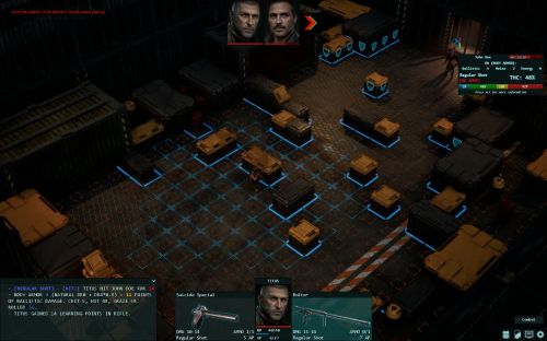
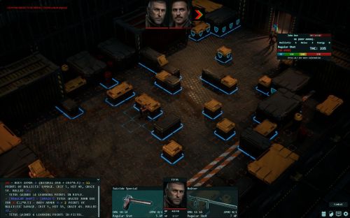
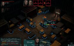
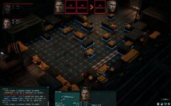
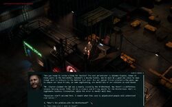
The Colony Ship combat demo has taken a bit longer to finalize than Iron Tower hoped for, mainly due to issues with getting armor to appear on characters properly as well as a lack of portraits. For that reason, this month's development update is very similar to the previous one - a progress report and a batch of screenshots. The most visible new feature of the game's latest build is a mouseover targeting info display.


We made good progress with things that matter (but hard to show) like programming, balance, and scripting but poor progress with relatively minor but highly visible things like armor models and portraits. As (probably) mentioned previously, the demo is fully playable and has 14 fights, 2 of them optional. We're still playing it on a daily basis, ironman-style as there's no save/load system yet, so the demo has already received 2 balance updates as a result. The engine is great and very stable. I didn't have a single crash yet (despite daily updates); there were some occasional freezes earlier (for example, if one enemy knocks you out and his helpful buddy shoots in the face, scoring a knockdown) but I didn't have any in my last 2-hour long play session.

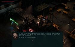
The feats are now working and two gadgets out of three are done (the energy shield and the distortion field). All gadget parts (each gadget consists of 3 upgradeable parts that increase its properties such as shield's regen rate or damage resistance) are nicely modeled and textured. The main new addition is the targeting info (see the screens below). It gives you a full THC breakdown, which will help the player to understand how it's calculated and helps us make sure that bonuses and penalties are implemented properly. RNG is working great, so far the balance between hits and misses is perfect.

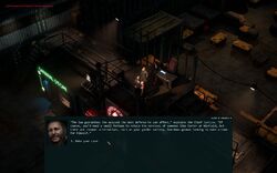
So far the armor thing (the delay) is our biggest problem, which is a good indicator as I can think of worse things to screw up. It's slowly moving forward, so I hope that we'll have it done in 3 weeks. Similar to the weapons, the armor is split into 2 main categories: common Ship-made ballistic armor and rare Earth-made combat and anti-riot armor. You can expect 10 unique models for each category: helmet, body armor, jacket/coat, boots, goggles, mask/respirator. Right now we have about a third (talking about the models).

PS. We'd appreciate if you take a moment to click on that big follow button here:

https://store.steampowered.com/developer/irontowerstudio
The wait continues. Check out the full update for a few details about the combat scenario showcased in the screenshots.
 

Ismaul

Thought Criminal #3333
Patron
Joined
Apr 18, 2005
Messages
1,871,810
Location
On Patroll
Codex 2014 PC RPG Website of the Year, 2015 Codex 2016 - The Age of Grimoire Make the Codex Great Again! Grab the Codex by the pussy Insert Title Here RPG Wokedex Strap Yourselves In Codex Year of the Donut Divinity: Original Sin Project: Eternity Torment: Tides of Numenera Shadorwun: Hong Kong Divinity: Original Sin 2 BattleTech A Beautifully Desolate Campaign My team has the sexiest and deadliest waifus you can recruit.
Eagerly awaiting the game, but I must say the combat UI as it is now is eye cancer. So here goes my unsollicited feedback that you are most likely already aware of:

The font is okay, if a bit hard to read. I can live with it, but it could be better. The ALL CAPS in the detailed combat info should go. The font doesn't do well at all in caps.

The RGB colors, especially in the THC box, are distracting. Hope they're a placeholder and the final version blends in better, with more muted colors.

Finally, text alignment is poor. The THC box is a mess. And the text in the bottom center boxes might use larger border margins, or a slightly different way of presenting the info. The space below the player's porttrait is noisy. Maybe it's the font though. Also there's different font sizes, even if it's the same type of info and not a distinction between a header and the text.

/OCD
 

Vault Dweller

Commissar, Red Star Studio
Developer
Joined
Jan 7, 2003
Messages
28,035
Eagerly awaiting the game, but I must say the combat UI as it is now is eye cancer. So here goes my unsollicited feedback that you are most likely already aware of:
Right now the focus is on functionality; the moment something is done, we switch to the next task. We didn't have time to do any art pass or visual polish.
 

Ismaul

Thought Criminal #3333
Patron
Joined
Apr 18, 2005
Messages
1,871,810
Location
On Patroll
Codex 2014 PC RPG Website of the Year, 2015 Codex 2016 - The Age of Grimoire Make the Codex Great Again! Grab the Codex by the pussy Insert Title Here RPG Wokedex Strap Yourselves In Codex Year of the Donut Divinity: Original Sin Project: Eternity Torment: Tides of Numenera Shadorwun: Hong Kong Divinity: Original Sin 2 BattleTech A Beautifully Desolate Campaign My team has the sexiest and deadliest waifus you can recruit.
Right now the focus is on functionality; the moment something is done, we switch to the next task. We didn't have time to do any art pass or visual polish.
I know full well.

But since we have only screenshots to judge for now...
 

Parabalus

Arcane
Joined
Mar 23, 2015
Messages
17,446
With the way the attack tooltip is set up, with colour coded crit/hit/graze/miss percentage bar, I'd flat out remove the THC = green hit % above it.

The colored bar is much nicer, the THC is just pointless clutter. Remove it and make the bar bigger if needed, by shifting the [ammo] part to where THC was.

There's also damage in the combat log being the same colour as miss% in the tooltip, if you're gonna stick with colours (which is a great idea), one should be changed. Also for green=hp.
 
Last edited:

Vault Dweller

Commissar, Red Star Studio
Developer
Joined
Jan 7, 2003
Messages
28,035
With the way the attack tooltip is set up, with colour coded crit/hit/graze/miss percentage bar, I'd flat out remove the THC = green hit % above it.

The colored bar is much nicer, the THC is just pointless clutter. Remove it and make the bar bigger if needed, by shifting the [ammo] part to where THC was.
In this particular case it's hard to judge it by the screenshots. Think of it as an alternative. If you all you care about is THC, you glance at the big number and fire. If you want to compare two weapons or different attacks, you look at the bar to understand your options better. If you want to understand why your THC is so low against a particular enemy, you hit ALT for full info.
 

Parabalus

Arcane
Joined
Mar 23, 2015
Messages
17,446
With the way the attack tooltip is set up, with colour coded crit/hit/graze/miss percentage bar, I'd flat out remove the THC = green hit % above it.

The colored bar is much nicer, the THC is just pointless clutter. Remove it and make the bar bigger if needed, by shifting the [ammo] part to where THC was.
In this particular case it's hard to judge it by the screenshots. Think of it as an alternative. If you all you care about is THC, you glance at the big number and fire. If you want to compare two weapons or different attacks, you look at the bar to understand your options better. If you want to understand why your THC is so low against a particular enemy, you hit ALT for full info.

I get the intent, but playing the game I'd start glancing the giant green colored bar instead, THC or no. If you stick to crit/hit/graze/miss you could just remove thc as a concept from the game.

It might make some sense if thc was crit+hit, but i'd always want to see the breakdown anyway. Kinda like how in AoD you'd always look first at THC then at crit%, if you had it.

If I want to just glance stuff I'd rather see expected damage, but with crit/hit/graze that's a huge variance.
 

Vault Dweller

Commissar, Red Star Studio
Developer
Joined
Jan 7, 2003
Messages
28,035
I get the intent, but playing the game I'd start glancing the giant green colored bar instead, THC or no.
I don't. I'm not saying my way is better. My point is that different people look at different things: for example, some people really liked the overhead damage/armor indicators we added in DR and then to AoD. It gave them a choice: keep an eye on the textbox for more info or read the overhead indicators. Same here.

Anyway, we'll definitely consider all suggestions and criticism once the demo is released.
 

Blaine

Cis-Het Oppressor
Patron
Joined
Oct 6, 2012
Messages
1,874,666
Location
Roanoke, VA
Grab the Codex by the pussy
I'm sure that I've seen/used that exact monospaced sans serif font before, but I can't quite place it. In any case, it's similar to Courier and derivatives, and if you're ultimately going for a utilitarian font, I think it's great.

I also like the info panel tooltip even as-is. It reminds me of an info panel from a roguelike or other old ASCII-based game. I don't think a numerical breakdown of the opponent's armor stats belongs there, though, now or ever. The name and/or category of the armor is one thing, but exact DR values is too meta. I guess that's an odd line to draw given that people in real life don't have a hit percentage breakdown in the middle of a firefight, either, but for whatever reason that's where the line is for me.

I think it's because guesstimating the armor's abilities from its telltale appearance or description is something that needn't be simulated or abstracted with numbers, unlike most everything else about combat in a computer game. Either you recognize it and are aware of its protective capabilities from experience or guesswork, or you don't.
 

Vault Dweller

Commissar, Red Star Studio
Developer
Joined
Jan 7, 2003
Messages
28,035
I'm sure that I've seen/used that exact monospaced sans serif font before, but I can't quite place it. In any case, it's similar to Courier and derivatives, and if you're ultimately going for a utilitarian font, I think it's great.

I also like the info panel tooltip even as-is. It reminds me of an info panel from a roguelike or other old ASCII-based game. I don't think a numerical breakdown of the opponent's armor stats belong there, though, now or ever. The name and/or category of the armor is one thing, but exact DR values is too meta. I guess that's an odd line to draw given that people in real life don't have a hit percentage breakdown in the middle of a firefight, either, but for whatever reason that's where the line is for me.

I think it's because guesstimating the armor's abilities from its telltale appearance or description is something that needn't be simulated or abstracted with numbers, unlike most everything else about combat in a computer game. Either you recognize it and are aware of its protective capabilities from experience or guesswork, or you don't.
You see it in the texbox anyway when the message tells you how much damage the armor blocked, so the info IS there and therefore there's no need to hide it. We added it to the targeting info so that you can compare your damage to the enemy's armor and if the armor is too heavy, you can switch to a different gun or attack type. Realistically, we can assume that any gunfighter on the Ship would be well familiar with different ballistic vests and would know how effective they are.
 

Shadenuat

Arcane
Joined
Dec 9, 2011
Messages
11,969
Location
Russia
For and idiot, tell what RGB means - RNG spread, modes of shooting, types of damage?...
 

Shadenuat

Arcane
Joined
Dec 9, 2011
Messages
11,969
Location
Russia
Do you get so much fine control over your chance to do something particular out of it like always do graze but never crit that it is necessary?

I guess I like it anyway because unlike say PoE it does provide clarity to d100 system, but it would be nice if it did more than just that.

For some reason chance to miss on the right bothers me. Because I'm right handed or something? Not sure.
Or maybe because overall THC is right where actual Miss below that is, that must be it.

Yeah the more I look at it, positioning

Red HP
THC
Red Miss

is bad.

And since there are only 3 damage types, might just use 3 icons instead of text. HP bar could also be bigger as now I barely see the numbers.
 
Last edited:

tindrli

Arcane
Joined
Jan 5, 2011
Messages
4,469
Location
Dragodol
story must be good. and more importantly it MUST have a totally unexpected if player decide ofcourse mindbogglingly mind blowing branch for game to become legendary and that branch cant be short one
 

Blaine

Cis-Het Oppressor
Patron
Joined
Oct 6, 2012
Messages
1,874,666
Location
Roanoke, VA
Grab the Codex by the pussy
story must be good. and more importantly it MUST have a totally unexpected if player decide ofcourse mindbogglingly mind blowing branch for game to become legendary and that branch cant be short one

The most mind-blowing moment I've had in an RPG this side of the millennium was when the Oculus appeared in Underrail. I was expecting a little ladder or some other hidden transition area to appear, and boy was I surprised.


Ismaul

Thought Criminal #3333
Patron
Joined
Apr 18, 2005
Messages
1,871,810
Location
On Patroll
Codex 2014 PC RPG Website of the Year, 2015 Codex 2016 - The Age of Grimoire Make the Codex Great Again! Grab the Codex by the pussy Insert Title Here RPG Wokedex Strap Yourselves In Codex Year of the Donut Divinity: Original Sin Project: Eternity Torment: Tides of Numenera Shadorwun: Hong Kong Divinity: Original Sin 2 BattleTech A Beautifully Desolate Campaign My team has the sexiest and deadliest waifus you can recruit.
To give some more feedback on the THC tooltip, there might be too much info in the short version of it (non-alt). It already doesn't specify which weapon you're attacking with, since the weapon is clearly selected at the bottom of the screen, so maybe the type of shot and ammo also don't have to be repeated in the short version. Maybe. That would allow the tooltip to be less cluttered, more readable at a glance.

Second thing, is there a reason why the TH percentages in the colored bar add up to 105% rather than 100%? I'm guessing the blue section indicates there's always (a minimum of) 5% chance to crit? If so, wouldn't the green / normal hit chance actually be 28%, so that in total you have 33% THC?

That feeds into what Parabalus was saying. If THC = normal hit chance + crit chance (+ maybe even graze chance, I mean why not it's not a miss it actually hits for dmg), it would be pertinent to also display the THC in addition to the percentage bar.
 

As an Amazon Associate, rpgcodex.net earns from qualifying purchases.
Back
Top Bottom