- Joined
- Jan 28, 2011
- Messages
- 99,623


Tags: Harebrained Schemes; Mike McCain; Shadowrun Returns; Shadowrun: Dragonfall
In their latest Kickstarter update, Harebrained Schemes have published the fourth and final Shadowrun: Dragonfall Director's Cut dev diary. This one's all about the graphics and user interface, and as such it has plenty of screenshots. Here's an excerpt:
In their latest Kickstarter update, Harebrained Schemes have published the fourth and final Shadowrun: Dragonfall Director's Cut dev diary. This one's all about the graphics and user interface, and as such it has plenty of screenshots. Here's an excerpt:
New Visual Effects & Animations
Steven and Hollie (our Effects/Tech Artist and Animator, respectively) dedicated several weeks during Director’s Cut development towards further honing our many combat effects and animation. Our main goals here were to 1. make combat feedback more viscerally satisfying (death, damage, spells, etc.), 2. tighten up timing/polish in some places, and 3. create new effects and animations to support the new abilities that the design team added in the Director’s Cut. I think their efforts have made a big difference! Steven and our engineer Sheridan implemented completely new systems for blood splatter effects, directional deaths (characters used to only be able to fall in one direction when dying), dismemberment, and possibly-slightly-over-the-top-gibs upon critical-hit deaths. We’ve found that these really help make your actions in combat feel powerful and satisfying - check it out:

On the animation front, not only have we been able to tighten up some combat timing (for example, the time it takes to cast certain spells) but we’ve added totally new animations for several new abilities.
Interface Improvements
Last week, Trevor talked about all of the new combat mechanics we’ve implemented. To emphasize the new systems and new data, our combat UI has also seen a similar upgrade to more clearly show you each potential target’s status. You’ll see a different targeting disc beneath enemies depending on whether you have a “clear shot”, i.e. if you are flanking the enemy’s cover position or if they are standing out in the open, vs. if they are in cover. On mouse-over you’ll also be able to see exactly what type of cover the enemy is in, and we’ve made the shield icons representing cover state more obvious above enemy heads.
We’ve also updated our health bar display to show how much Armor each character in combat has, represented by white “pips” above the bar itself. Each attack that hits now includes quick animated feedback on how much armor was applied against the damage being dealt, how much armor (if any) was stripped by special attacks, and how much damage was done. This is complemented by some improvements to our above-head text “floaties” that appear when you attack. Lastly, this is a small thing, but world interaction icons now have a short text description attached to them, similar to characters, that appears when you mouse-over them (or when you hold down the ALT key to reveal them.) This is nice when you’ve got a lot of inspects or pickups in one place and you’d like to know what you’re dealing with before clicking.
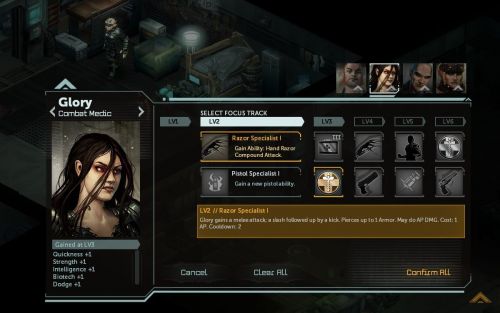
Oh and we also mentioned the new Crew Advancement system a couple weeks ago - here is what that looks like in action:

Check out the full update for screenshots of the game's new areas, images of some of its new portraits and models, and more. There are even achievements now, for all you Steam whores.Steven and Hollie (our Effects/Tech Artist and Animator, respectively) dedicated several weeks during Director’s Cut development towards further honing our many combat effects and animation. Our main goals here were to 1. make combat feedback more viscerally satisfying (death, damage, spells, etc.), 2. tighten up timing/polish in some places, and 3. create new effects and animations to support the new abilities that the design team added in the Director’s Cut. I think their efforts have made a big difference! Steven and our engineer Sheridan implemented completely new systems for blood splatter effects, directional deaths (characters used to only be able to fall in one direction when dying), dismemberment, and possibly-slightly-over-the-top-gibs upon critical-hit deaths. We’ve found that these really help make your actions in combat feel powerful and satisfying - check it out:

On the animation front, not only have we been able to tighten up some combat timing (for example, the time it takes to cast certain spells) but we’ve added totally new animations for several new abilities.
Interface Improvements
Last week, Trevor talked about all of the new combat mechanics we’ve implemented. To emphasize the new systems and new data, our combat UI has also seen a similar upgrade to more clearly show you each potential target’s status. You’ll see a different targeting disc beneath enemies depending on whether you have a “clear shot”, i.e. if you are flanking the enemy’s cover position or if they are standing out in the open, vs. if they are in cover. On mouse-over you’ll also be able to see exactly what type of cover the enemy is in, and we’ve made the shield icons representing cover state more obvious above enemy heads.
We’ve also updated our health bar display to show how much Armor each character in combat has, represented by white “pips” above the bar itself. Each attack that hits now includes quick animated feedback on how much armor was applied against the damage being dealt, how much armor (if any) was stripped by special attacks, and how much damage was done. This is complemented by some improvements to our above-head text “floaties” that appear when you attack. Lastly, this is a small thing, but world interaction icons now have a short text description attached to them, similar to characters, that appears when you mouse-over them (or when you hold down the ALT key to reveal them.) This is nice when you’ve got a lot of inspects or pickups in one place and you’d like to know what you’re dealing with before clicking.
Oh and we also mentioned the new Crew Advancement system a couple weeks ago - here is what that looks like in action:


![The Year of Incline [2014] Codex 2014](/forums/smiles/campaign_tags/campaign_incline2014.png)


