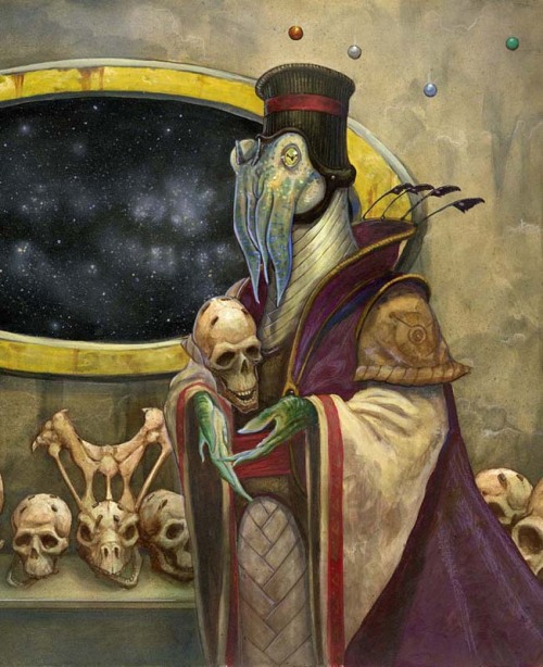
It's a card in the Gwent Game, and there is a big rendition of the picture in the "World of the Witcher" artbook.You know where this is from, right?
The Witcher games.
-
Welcome to rpgcodex.net, a site dedicated to discussing computer based role-playing games in a free and open fashion. We're less strict than other forums, but please refer to the rules.
"This message is awaiting moderator approval": All new users must pass through our moderation queue before they will be able to post normally. Until your account has "passed" your posts will only be visible to yourself (and moderators) until they are approved. Give us a week to get around to approving / deleting / ignoring your mundane opinion on crap before hassling us about it. Once you have passed the moderation period (think of it as a test), you will be able to post normally, just like all the other retards.
You are using an out of date browser. It may not display this or other websites correctly.
You should upgrade or use an alternative browser.
You should upgrade or use an alternative browser.
Baldur's Gate Baldur's Gate 3 Pre-Release Thread [EARLY ACCESS RELEASED, GO TO NEW THREAD]
- Thread starter Belegarsson
- Start date

- Joined
- Apr 16, 2012
- Messages
- 9,462


Anyone thinking Larian will ditch their cartoonish artstyle approach and adopt one more grounded in functionality, reality and give us a throwback at the 90's rule book drawings, is delusional.
Delusional as the ones that expected Blizzard to make Diablo 3 visually and in spirit similar to Diablo 2 which was made by Blizzard North that had a totally different DNA.
Delusional as the ones that expected Blizzard to make Diablo 3 visually and in spirit similar to Diablo 2 which was made by Blizzard North that had a totally different DNA.
- Joined
- Oct 3, 2015
- Messages
- 13,664
I'm hopeful this thread will continue to host many discussions of D&D/AD&D history rather than deteriorating into conversation about any of the Baldur's Gate games.I'm desperate for gameplay news just so this thread stops being a big D&D lore circlejerk.

DOS2 is already less cartoony than DOS itself, less Blizzardly, less shiny and less saturated colors. That was an intentional move. And Divine Divinity is also even less cartoony, so grittier is possible.Anyone thinking Larian will ditch their cartoonish artstyle approach and adopt one more grounded in functionality, reality and give us a throwback at the 90's rule book drawings, is delusional.
But anyways, Forgotten Realms itself is a cartoony D&D setting. DOS2 type graphics are prefectly suited for it.
And BG2 itself is super cartoony in spirit: the companions are basically anime-tier, giggly cutesy unsufferable emotive cunts. So a realistic artstyle wouldn't fit.
Cryomancer
Arcane

DOS2 is already less cartoony than DOS itself, less Blizzardly, less shiny and less saturated colors. That was an intentional move. And Divine Divinity is also even less cartoony, so grittier is possible.
Divine Divinity is the unique Larian game that i liked.
About Blizzard cartoony, Irvine Blizzard and Blizzard North generally uses compeltely different in artstyle.


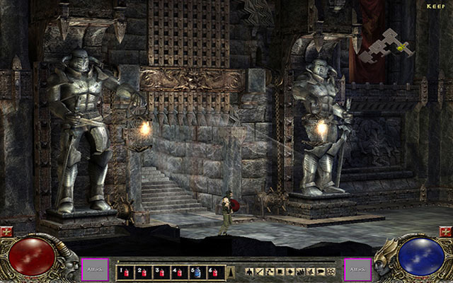
I an an huge fan of Blizzard North. But think that Blizzard Irvine is responsible for a huge decline that affected not only the mmo market thanks to wow... I wish that their D3 version din't got canceled. An screenshot of Diablo 3 - Blizzard North version
And armor sets too. Armor on D1/D2 looks like armor. On D3, looks like Carnival suits. As for catoon graphics on Forgotten realms, depends. For eg, on BG1/2, here is how an armor looks like

And on DOS2

This not mentioning that armor is mechanically more akin to IRL armor in BG1/2, not only visually. Plate armor AC is better vs slashing than blunt weapons for eg. Armor in dos2 works is a more "wow like style" offering damage reduction.
I was with negative expectations about BG3 but i an now neutral.
Some art on modern D&D have cartoonish artstyle but i believe that is to avoid an new satanic panic...
- Joined
- Sep 16, 2018
- Messages
- 38


This is incorrect, armor in DOS2 works like a additional health bar that also grants immunity to certain effects. This awful mechanic has nothing to do with damage reduction seen either in WoW or generally any other RPG.Armor in dos2 works is a more "wow like style" offering damage reduction.
Cryomancer
Arcane

This is incorrect, armor in DOS2 works like a additional health bar that also grants immunity to certain effects. This awful mechanic has nothing to do with damage reduction seen either in WoW or generally any other RPG.
OMG. That is ridiculous. Armor in DOS1 was awful and they managed to make it worse on DOS2? I really miss when armor was used to deflect "blows". That is how armor works, from the ancient Greece to modern armored warfare...
Nines_Anarch
Learned
- Joined
- Mar 3, 2019
- Messages
- 123
Tony DiTerlizzi should be a concept artist for this game...
I mean do you remember how awesome TD art for Planescape was?


Btw

Which version do you preffer?

If I had to choose I would say 2nd Edition by Tony DiTerlizzi. IMO it's the most creative one.
I mean do you remember how awesome TD art for Planescape was?


Btw

Which version do you preffer?

If I had to choose I would say 2nd Edition by Tony DiTerlizzi. IMO it's the most creative one.
Jedi Master Radek
Arcane
- Joined
- Dec 12, 2013
- Messages
- 4,367
5 th edition try to look too cool.
rusty_shackleford
Arcane
- Joined
- Jan 14, 2018
- Messages
- 50,754

I dislike 3/3.5e itself, but in general it(3e) always seems to have the best art when comparing.
- Joined
- Jun 9, 2019
- Messages
- 1,252

He really worked with the posture.5 th edition try to look too cool.
Jedi Master Radek
Arcane
- Joined
- Dec 12, 2013
- Messages
- 4,367
He really worked with the posture.5 th edition try to look too cool.
Posture is fine. I was complaining more about the shiny armor and how everything stylish and distinct from the older clothes is absent. Cool kids wear minimalism and I hate it.
I think the 3rd edition look is the best closely followed by the second edition.
- Joined
- Jun 9, 2019
- Messages
- 1,252

Well, IMHO he became less “for teenagers” in 5e. But sure the one from 3e is the best: freaked out dr. Zoidberg.He really worked with the posture.5 th edition try to look too cool.
Posture is fine. I was complaining more about the shiny armor and how everything stylish and distinct from the older clothes is absent. Cool kids wear minimalism and I hate it.
I think the 3rd edition look is the best closely followed by the second edition.
Deleted Member 16721
Guest
Speaking of cool art, I have the 3 Planescape bestiaries and they are full of neat character and monster art. I really enjoy reading them and seeing the lore behind the creatures. Recommended if you can find them and are interested in the Planescape setting.
Delterius
Arcane
its gonna be based on the hypothetical D&D version of the DOS2 ruleset
Delterius
Arcane
and by that I mean its an action rpgits gonna be based on the hypothetical D&D version of the DOS2 ruleset
Cryomancer
Arcane

RPG (DE)volution.
In 1990s, Armor was used to deflect blows. Then devolved into absorving an % of damage, doesn't matter if is against a knife or an warhammer. Then devolved agains to determine your charname's IQ/muscle mass(WoW), Larian managed to devolve it further by making armor an secondary health bar...
In 1990s, Armor was used to deflect blows. Then devolved into absorving an % of damage, doesn't matter if is against a knife or an warhammer. Then devolved agains to determine your charname's IQ/muscle mass(WoW), Larian managed to devolve it further by making armor an secondary health bar...
Yosharian
Arcane
I dunno if I would class FR as cartoony. It's definitely zany at times.
Space Satan
Arcane

I am rather ok with 5th edition as they rolled back all the retarded ideas and spellplague noone liked. The only thing I don't like is how they also rolled back wall of fathless and afterlife shit. The idea in 4th Ed. that adventurers, who do not want to worship gods or, like Planescape faction deem they not worty of worship, just vanish to some Great Unknown was okay for everyone, because it was a good compromise. Wall of fathless was a shitty and lazy concept, especially when you compare it to other descriptions of seemingly worthless fluff.
LESS T_T
Arcane
- Joined
- Oct 5, 2012
- Messages
- 13,582
![The Year of Incline [2014] Codex 2014](/forums/smiles/campaign_tags/campaign_incline2014.png)
FWIW they've been looking for contract testers and other QA related positions from last month.
https://larian.com/jobs/1cd40c60-87fb-4985-b82d-e03f2886f50e
Posts on Linkedin from QA leads directly refer this is for Baldur's Gate 3: https://www.linkedin.com/posts/anne...t-est-venu-activity-6577320833637724160-D4tC/
https://larian.com/jobs/1cd40c60-87fb-4985-b82d-e03f2886f50e
With multiple awards to our name, Larian Studios has proven that we’re dedicated to delivering high-quality role-playing games. We are now looking for a Gameplay Tester to help test and improve our games. This is an initial 12 month contract.
Posts on Linkedin from QA leads directly refer this is for Baldur's Gate 3: https://www.linkedin.com/posts/anne...t-est-venu-activity-6577320833637724160-D4tC/
Ladies and Gents, now is the time to rejoice since Larian studios is now looking for gameplay testers to join their talented team and help them make Baldur's Gate 3 the best game it can possibly be. Be sure to check out our other openings to have the opportunity to be a part of the wonderful journey that will be the making of Baldur's Gate 3!!
- Joined
- Oct 10, 2010
- Messages
- 1,179


Tony DiTerlizzi should be a concept artist for this game...
I mean do you remember how awesome TD art for Planescape was?


Btw

Which version do you preffer?

If I had to choose I would say 2nd Edition by Tony DiTerlizzi. IMO it's the most creative one.
Who knows? Maybe he is already working with them. I think his art suits Larian style quite well.
hell bovine
Arcane
If you're talking about the IE games, then that system didn't make sense to begin with. Armor wasn't used to deflect hits, it was used to avoid hits. It's the equivalent of implementing a kevlar vest that makes you dodge bullets, instead of absorbing the impact.RPG (DE)volution.
In 1990s, Armor was used to deflect blows. Then devolved into absorving an % of damage, doesn't matter if is against a knife or an warhammer. Then devolved agains to determine your charname's IQ/muscle mass(WoW), Larian managed to devolve it further by making armor an secondary health bar...
Viata
Arcane
Did we get some gameplay videos already?


![Glory to Codexia! [2012] Codex 2012](/forums/smiles/campaign_tags/campaign_slushfund2012.png)


