


Will there be any indoor environments?


-
Welcome to rpgcodex.net, a site dedicated to discussing computer based role-playing games in a free and open fashion. We're less strict than other forums, but please refer to the rules.
"This message is awaiting moderator approval": All new users must pass through our moderation queue before they will be able to post normally. Until your account has "passed" your posts will only be visible to yourself (and moderators) until they are approved. Give us a week to get around to approving / deleting / ignoring your mundane opinion on crap before hassling us about it. Once you have passed the moderation period (think of it as a test), you will be able to post normally, just like all the other retards.
You are using an out of date browser. It may not display this or other websites correctly.
You should upgrade or use an alternative browser.
You should upgrade or use an alternative browser.
Battle Brothers Pre-Release Thread
- Thread starter rapsdjff
- Start date
V_K
Arcane
Will it have bromances? 
Absoluetly. We already have the assets to create indoors like natural caves. Actual Buildings are a little more tricky, because of the hex tiles, but we´ll manage eventually I hopeWill there be any indoor environments?
However our priority right now is to implement the most important gameplay features and after that we start creating in all the content and different environments.
I´m not sure about that, but there´ll definitely be tons of BrofistsWill it have bromances?

theSavant
Self-Ejected
- Joined
- Oct 3, 2012
- Messages
- 2,009
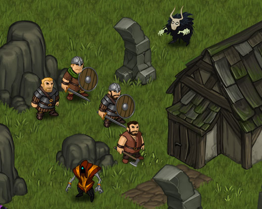
The style looks very consistent and professional, however...
...it looks like your army has been decapitated. This is awful. Really. I never had this feeling in any blobber RPG I played, but when I look here this is the 1st thought which comes to my mind.
...it looks like your army has been decapitated. This is awful. Really. I never had this feeling in any blobber RPG I played, but when I look here this is the 1st thought which comes to my mind.
This looks really promising. I'm looking forward to playing the demo!
Cosmo
Arcane
- Joined
- Nov 6, 2010
- Messages
- 1,388

This is awful. Really.
Go die in a ditch somewhere. Really.
Last edited:
Thanks for the support ")
Concering this:
There are actually some reasons why we decided to go with busts instead of complete figurines.
The main reason is the workload. We are a very small (4 guys) indie team and we had to go for a simplified (or abstracted) graphics style because we simply dont have enough ressources for complete body models (let alone animations). It would make a lot of things more complicated.
On top of that you can better identify your characters faces and we can just put icons of shields/weapons on the busts, because we are already using an mildly abstract style.
I know it´s pretty unusual when you first look at it, but you´ll get used to ist soon. It´s a pretty unique look and I think we can get away with it, as it underlines the "boardgamy" look of the whole game.
Nevertheless, as Rap mentioned we are reworking the bases right now to make them stand out more from the environment.
We´ll keep you updated
Cheers!
Paul
Concering this:
...it looks like your army has been decapitated. This is awful.
There are actually some reasons why we decided to go with busts instead of complete figurines.
The main reason is the workload. We are a very small (4 guys) indie team and we had to go for a simplified (or abstracted) graphics style because we simply dont have enough ressources for complete body models (let alone animations). It would make a lot of things more complicated.
On top of that you can better identify your characters faces and we can just put icons of shields/weapons on the busts, because we are already using an mildly abstract style.
I know it´s pretty unusual when you first look at it, but you´ll get used to ist soon. It´s a pretty unique look and I think we can get away with it, as it underlines the "boardgamy" look of the whole game.
Nevertheless, as Rap mentioned we are reworking the bases right now to make them stand out more from the environment.
We´ll keep you updated
Cheers!
Paul


zeitgeist
Magister
- Joined
- Aug 12, 2010
- Messages
- 1,444
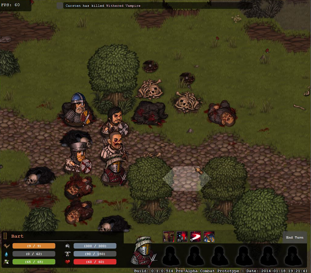
Have you considered adding stands to your busts? Someone asked that but it didn't get answered.
The way they look now, the busts would probably look better if they were just portraits in a circular token, but for that the battlefield would have to be from a more top-down perspective.
The main problem at the moment is that it's not visually apparent what they're trying to simulate - they look like a cross between 3D busts standing on a circular base and 2D busts standing on a circular base which is confusing.

I'd say it should either go one of these ways fully: 1) 3D busts with a raised pedestal, 2) 2D (paper) busts on a stand similar to the above pic, or 3) 2D circular tokens with the portrait on the face of the token (so pretty much the above pic without the stand).
Hey there,
the topic of the busts is very controversial and everybody thinks different about it.
Maybe I can give some more insights on the whole theme.
We started development with full body figures painted and animated in flash. I soon discovered this would be way too much work (I am working a fulltime office job on the side). On top of that its extremely important to us that you see ALL equipped gear on the character. The exact helmet, shield, weapon, armor. This multiplies the workload.
The next step was to cut animations, but we still had the full body. So where do you put the weapon icon for example? You have to put it on his hand of course. But what about two handed weapons? The character would need a completey different pose to wield them.
So it turned out that just cutting animations wouldnt be enough. We knew about "Unity of Command" and decided to try a similar look, with busts. Allthough we´ve got sockets to make them even more "figurine like".
This solved a lot of our problems. We could still go with a painted and detailed look and on top of that include all the customization we wanted without too much work by just layering everything.
Concerning the raised pedestal:
The character would stand out more, but for gameplay reasons it´s very important to see exactly what tile the character is standing on (height levels are important, terrain type, hiding places etc). Our requirement was that the figurine should cover up as little space as possible on the board and blend in a little. For my taste it would´t look good, maybe as if the guys would be flying over the battlefield
A 2D marker "Card Hunter style":
This requires the whole environment painted in a consistent cardboard style. CardHunter did this perfectly already, so no need to do it again I wanted "painted stuff".
2D Tokens:
Also a step of abstraction too far for the painted Environment. We actually show tokens in place of characters when they are off screen or if your viewpoint is on a lower height level.
By the way, there´s a rework of the small pedestals coming in to make them stand out more and with faction specific styles.
Hope this explains a little of why it looks the way it looks
Cheers!
Paul
PS here´s one of the first mockups I made for the game. Notice that its squares, not hexes and behold the flash characters
the topic of the busts is very controversial and everybody thinks different about it.
Maybe I can give some more insights on the whole theme.
We started development with full body figures painted and animated in flash. I soon discovered this would be way too much work (I am working a fulltime office job on the side
The next step was to cut animations, but we still had the full body. So where do you put the weapon icon for example? You have to put it on his hand of course. But what about two handed weapons? The character would need a completey different pose to wield them.
So it turned out that just cutting animations wouldnt be enough. We knew about "Unity of Command" and decided to try a similar look, with busts. Allthough we´ve got sockets to make them even more "figurine like".
This solved a lot of our problems. We could still go with a painted and detailed look and on top of that include all the customization we wanted without too much work by just layering everything.
Concerning the raised pedestal:
The character would stand out more, but for gameplay reasons it´s very important to see exactly what tile the character is standing on (height levels are important, terrain type, hiding places etc). Our requirement was that the figurine should cover up as little space as possible on the board and blend in a little. For my taste it would´t look good, maybe as if the guys would be flying over the battlefield
A 2D marker "Card Hunter style":
This requires the whole environment painted in a consistent cardboard style. CardHunter did this perfectly already, so no need to do it again
2D Tokens:
Also a step of abstraction too far for the painted Environment. We actually show tokens in place of characters when they are off screen or if your viewpoint is on a lower height level.
By the way, there´s a rework of the small pedestals coming in to make them stand out more and with faction specific styles.
Hope this explains a little of why it looks the way it looks
Cheers!
Paul
PS here´s one of the first mockups I made for the game. Notice that its squares, not hexes and behold the flash characters


The busts look amazing, but they really don't gel well with their environment. Have you considered playing up the board-gamey abstraction for the background as well? I feel like it would look a lot nicer with cleanly defined hexes, at least; those jutting pieces of hex-terrain look just odd.
The board-gamey style the busts give off is really distinct, if I were you I would try to push the visual design as strongly in that direction as possible; I feel like they'd look fantastic on a Populous-style diegetic 'board':
The busts look a lot better in the .gif above, too. In the screenshot they seem really desaturated.
I think it looks great the way it is now. Much better than the flash version.
Just change the name to Battle Bros and it'll be ready to ship!
Severian Silk
Guest
Popamole? It certainly looks like it.
I´ll just ignore your snide remark.Popamole? It certainly looks like it.
...but only because of your Terror from the deep avatar.
Hehe
By the way, I really want to show more, but I dont want to spam this thread with my Battle Brothers work-in-progress art stuff. So if you´d like to see some more just have a look at my Art corner http://battlebrothersgame.com/forums/topic/pauls-art-corner/#post-346
Cheers!
Cheers!


It sounds like a promising project ")
The new bases look better, but we'd need to see them in their usual environment to tell. Good luck with your game anyway.
The new bases look better, but we'd need to see them in their usual environment to tell. Good luck with your game anyway.
Hey guys, thanks for the support again
We´ll try out the new sockets in game and see how it works out.
Right now I´m reworking alle the weapon icons. As an appetizer here´s the two handed Axe, ready to chop down some Trees. I know it looks kinda funny without the arms right now, but still way better than before.
By the way, we just talked through our time schedule and open alpha (basically a demo of the tactical combat) may be online as soon as the end of the month.
Cheers!


As an Amazon Associate, rpgcodex.net earns from qualifying purchases.