Surf Solar
cannot into womynz
- Joined
- Jan 8, 2011
- Messages
- 8,837
Looks awesome, eerie and proper 'alien'!


https://store.steampowered.com/app/648410/Colony_Ship_A_PostEarth_Role_Playing_Game/
^ new update with new screens and inventory icons


No, but I don't want to neglect our Steam page ether. I won't post monthly updates there but screens and in-game art every 3-4 months.


A very blunt question.This is very important: are we to understand there will be unarmed combat available to us as an option?
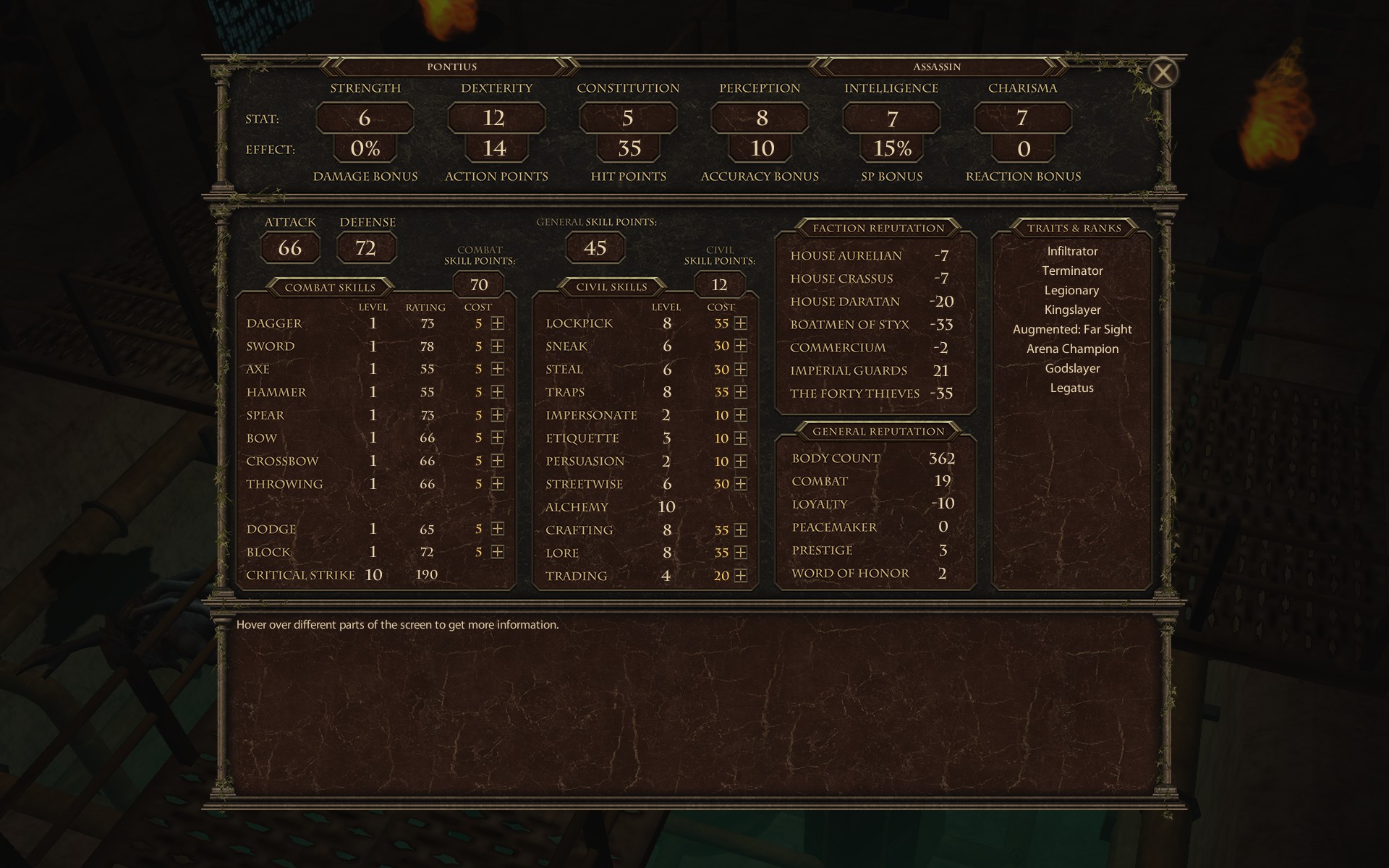
I can't pinpoint it but AoD character screen is much more clear/readable to me. Not sure if it's because of the colours or better contrast or font, or maybe because there are no green rectangles which blend/merge into one another but somehow there was better separation between each label.
The new character screen.


Not anymore (we had to cut it once it became clear that animations became our biggest problem and reason for delays).I am noticing that melee weapons come in two categories: bladed and blunt.
This is very important: are we to understand there will be unarmed combat available to us as an option?
In Colony Ship we show more and explain more. For example, in AoD you see the value of Critical Strike but you don't know what it means. In CS we show the % and the modifier, so when you acquire different feats you see how they affect the derived stats. As a result the screen is very busy and adding frames (or separators) around different sections might make it even busier.I can't pinpoint it but AoD character screen is much more clear/readable to me.
I can't pinpoint it but AoD character screen is much more clear/readable to me. Not sure if it's because of the colours or better contrast or font, or maybe because there are no green rectangles which blend/merge into one another but somehow there was better separation between each label.
The new character screen.

In Colony Ship we show more and explain more. For example, in AoD you see the value of Critical Strike but you don't know what it means. In CS we show the % and the modifier, so when you acquire different feats you see how they affect the derived stats. As a result the screen is very busy and adding frames (or separators) around different sections might make it even busier.
I think it is a given that a cRPG of this kind will be filled to the brim with information. It's the nature of the beast. Therefore, additional separators are expected and natural. Trying to shy away from complexity in the character system is a pointless endeavor. What is the point of having elegance if things look confusing? Clarity trumps elegance. Separators are needed.As a result the screen is very busy and adding frames (or separators) around different sections might make it even busier.

I agree in general (this screen is wip and Oscar is already making changes - he moved THC bonuses to skills and addd implants under feats) but right now the focus is not on prettying it up but on displaying info. Still, if anyone has specific suggestions, they're welcome to post them here.I think it's the way space is being used. Colony separates everything into columns, which feels unnatural and creates unnecessary empty spaces. Also i believe you are right about colours and contrast. The problem with UI is also that although minimalism fits the sci-fi theme, minimalism nowadays is so overused in UI design that it makes screen look non distinct.
We can but we'd rather show you the full picture at glance rather than tell you to gather bits and pieces via tooltips.Can't you just use a hover over tooltip?
Still, if anyone has specific suggestions, they're welcome to post them here.


It's not that simple. First, yes, the first iteration left column looked very nice, probably the best out of the three. Second, I'm not sure why Mazin changed the color scheme, but when it comes to art, I trust Mazin's opinion a lot more than I trust my own. Similarly, I trust Oscar's opinion even when we disagree on things. Third, things like color schemes and gui design are extremely subjective, so it's hard (but most importantly time-consuming) to find the idea version that would please everyone (or at least most people).IMO first iteration is the best (font and contrast are way better) and third the worst, so probably exactly the opposite than what you guys think :D.
I agree, but the third iteration is the most didactic. The color and the font of the first character screen are still better thou.IMO first iteration is the best (font and contrast are way better) and third the worst, so probably exactly the opposite than what you guys think :D.


