Putting the 'role' back in role-playing games since 2002.
Donate to Codex
Good Old Games
  • Welcome to rpgcodex.net, a site dedicated to discussing computer based role-playing games in a free and open fashion. We're less strict than other forums, but please refer to the rules.

    "This message is awaiting moderator approval": All new users must pass through our moderation queue before they will be able to post normally. Until your account has "passed" your posts will only be visible to yourself (and moderators) until they are approved. Give us a week to get around to approving / deleting / ignoring your mundane opinion on crap before hassling us about it. Once you have passed the moderation period (think of it as a test), you will be able to post normally, just like all the other retards.

Game News Colony Ship Update #39: User Interface Improvements

Deleted Member 22431

Guest
For instance, the stats are spread around, but only because they want to emphasize the stats that are relevant for each feature. Dexterity and perception are relevant for action points, evasion, reaction, and base accuracy. On the other hand, the type of person who will play this game for the combat doesn't need this help, so they could just make things more elegant anyway.
 

MRY

Wormwood Studios
Developer
Joined
Aug 15, 2012
Messages
5,719
Location
California
Flipping of beliefs has two interesting effects: (1) it inverts right/left political valences and (2) it flips which seems more desirable because in a game/in tech, moving right is viewed as advancing. That said, for reason #2, it's not crazy that "progress" is on the right and "tradition" on the left, so maybe the current orientation is the right one. Hard to say.
 

EverlastingLove

Learned
Joined
May 2, 2018
Messages
97
First iteration:

7NyX9LH.jpg

I really like this one. I can easily find all the information that I need. Basic stats are just under the avatar, all in one place just like in Fallout 1, maybe even better, because I can see them all at a glance, they are also close to derived stats but I can effortlessly tell them apart. Skills are presented a bit differently, which really helps. General reputation, faction standing, beliefs - they are all grouped together nicely (and what the heck are those Feats doing on the far right in the second iteration?). Feats should be close to Skills and they are in the 1st and 3rd iteration, imo.

The third iteration is so generic and boring, yawn.
 

Goral

Arcane
Patron
The Real Fanboy
Joined
May 4, 2008
Messages
3,570
Location
Poland
First iteration:

7NyX9LH.jpg

I really like this one. I can easily find all the information that I need. Basic stats are just under the avatar, all in one place just like in Fallout 1, maybe even better, because I can see them all at a glance, they are also close to derived stats but I can effortlessly tell them apart. Skills are presented a bit differently, which really helps. General reputation, faction standing, beliefs - they are all grouped together nicely (and what the heck are those Feats doing on the far right in the second iteration?). Feats should be close to Skills and they are in the 1st and 3rd iteration, imo.

The third iteration is so generic and boring, yawn.
QFT.
Plus everything is 4K Crisp(y), razor sharp but in the other two outer glow is overused (at least I think it's outer glow) so they look a bit blurry. And yeah, positioning is much more tidy and logical.

I trust Oscar's opinion even when we disagree on things.
A sensible approach, however if quite a few people say that 1st iteration is better maybe Elhoim could provide us with an explanation/reasoning behind his decision. Maybe we can't see something obvious? Or maybe it's hard to look at your own work from a distance to judge it without bias.
Kos_Koa
 

Vault Dweller

Commissar, Red Star Studio
Developer
Joined
Jan 7, 2003
Messages
28,044
Plus everything is 4K Crisp(y), razor sharp but in the other two outer glow is overused (at least I think it's outer glow) so they look a bit blurry. And yeah, positioning is much more tidy and logical.
Not seeing any glow on my end. The 'bit blurry' thing is the result of shrinking the original screen. Also, iteration 1 is a mockup not a working interface, hence the 4k sharpness.

A sensible approach, however if quite a few people say that 1st iteration is better maybe Elhoim could provide us with an explanation/reasoning behind his decision. Maybe we can't see something obvious? Or maybe it's hard to look at your own work from a distance to judge it without bias.
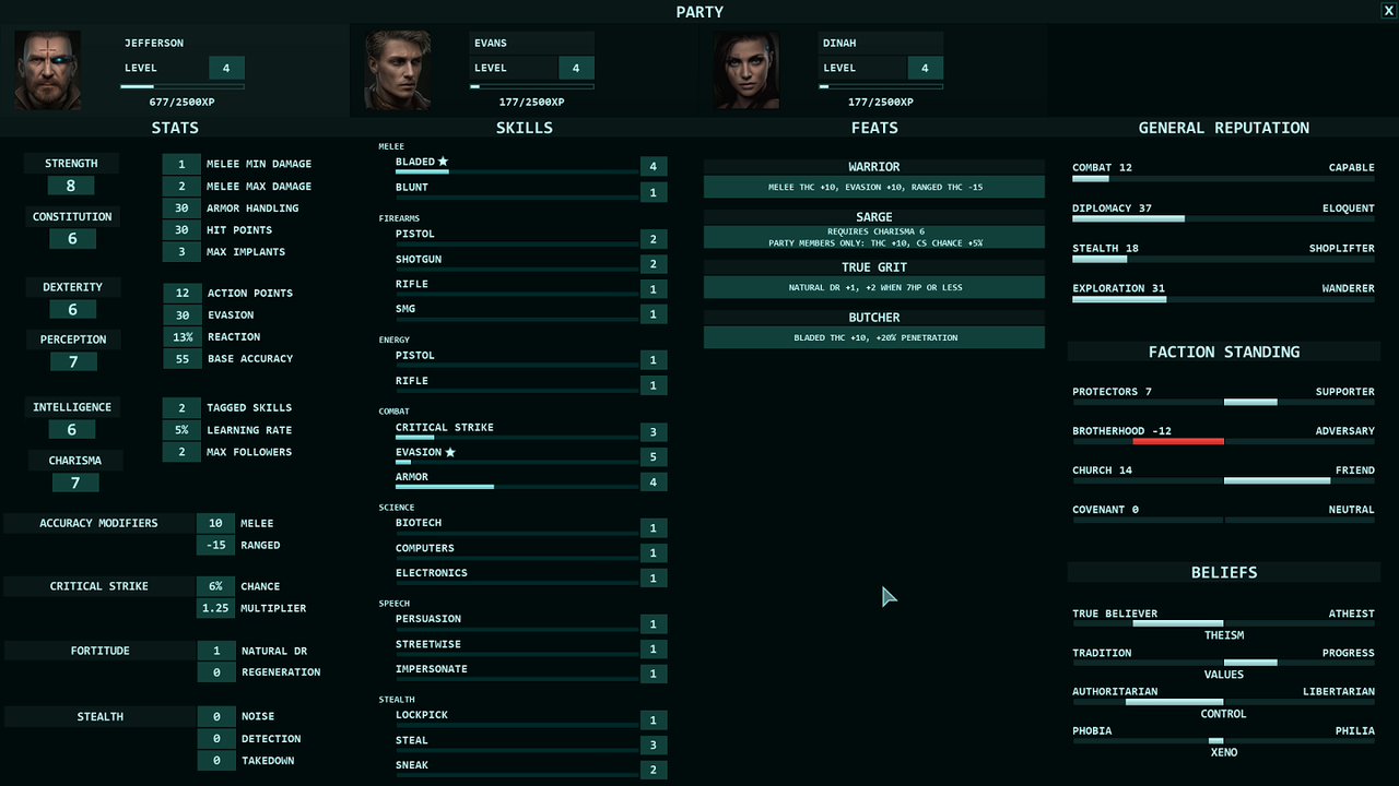
Well, let's go step by step. First, while I prefer stats and skills in one neat column on the left, I don't think it's possible to shrink the skills section to fit it the stats. I assume that's one of the reasons Mazin moved the stats to the second column when he did the actual interface (iteration 2). Second, when Mazin did the mockup we didn't have full picture of all derived stats and we didn't have the playtesting experience (we've been playing the demo for almost a year now) that tells you what secondary stats are important. As you can see we have quite the list now and we even had to move the resistances to the inventory screen as they are mainly driven by your equipment, so displaying the derived stats and feats in one ciolumn is no longer an option.

Plus at the moment, we're discussing strictly the function and layout, not the form, colors, and separators. So in my opinion, the skills, feats (and soon implants), and reputation columns are perfect. The stat and derived stats aren't but I don't know how to improve this part of the character screen. If someone has a suggestion, we'll gladly consider it.
 

Goral

Arcane
Patron
The Real Fanboy
Joined
May 4, 2008
Messages
3,570
Location
Poland
Well, let's go step by step.
Stopped reading right there, when it comes to art, I trust Mazin's and Oscar's opinion a lot more than salesman's so I'll wait on their explanations.

:troll:
In all seriousness though I disagree, although I see where you're coming from. In the end whatever you will decide to go with for the UI won't be a deal breaker for me (inb4 challenge accepted) but I would suggest to consider going with the hover over tooltip like in AoD.
 

Deleted Member 22431

Guest
Plus at the moment, we're discussing strictly the function and layout, not the form, colors, and separators. So in my opinion, the skills, feats (and soon implants), and reputation columns are perfect. The stat and derived stats aren't but I don't know how to improve this part of the character screen. If someone has a suggestion, we'll gladly consider it.
The derived stats would look better under their respective stats (AoD style). In the third version of the character screen, they are on the right side of their respective stats, which makes the stats look spread and leaves needlessly unused space. Just keep the stats in the position they are now and move the derived stats to the left under the stats. Melee and range should be under accuracy modifiers, not on the right side. The same thing holds for the effects of critical strike, fortitude and stealth. If you do this, you can fill the vacant space with the feats on the bottom. Thus, you will have on the first column (stats and their derivated stats; then critical strike, fortitude, stealth; and finally, feats); second column (skills) and third column (reputation). That way you will have the elegant look of the first iteration without losing all the information of the third version.
 

Deleted Member 22431

Guest
Just another suggestion. You guys should add a rank or achievement section at the bottom of the reputation column. There are two reasons for this. First, you will probably recognize certain achievements in the game, so you could just as well present them in the character screen—I’m thinking about AoD here. Second, it would make the third column of the character screen fuller and look more evenly with the rest.
 

Vault Dweller

Commissar, Red Star Studio
Developer
Joined
Jan 7, 2003
Messages
28,044
When we can expect combat demo so we can test it.
No idea. We were weeks away when Ivan passed away. Of course, it's not just the animations but also the knowledge of the engine (and over a decade of experience in general) that died with Ivan. Ivan worked with the engine for 3 years, so what he could do in an hour it would take another person days just to figure out. Anyway, we hired another animator a couple of months ago to help Ivan with the workload (he'd do creature animations and Ivan would hook them up). The new animator doesn't know Unreal 4 at all. He can learn but learning will take time. Once we've made any progress at all, I'll let you know. Here is what's missing:

- 1h animations and some gun animations that Ivan finished but didn't add to the game; that would be the new animator's first task
- animations that Ivan didn't finish (throwing grenades and 2H melee)
- adding new armor meshes to the character model
- female animations (Ivan was planning to transfer the movements to the female skeleton; the test animations he did looked pretty good, we posted them on the Codex before); he said he'd need a day or two to transfer them, now it's in limbo
- jackets and coats; fortunately Ivan did two models that work very well, leaving us a template we can follow
- would be nice to have different hair styles, right now everyone's fashionably bald

The derived stats would look better under their respective stats (AoD style).
Too many. In AoD INT defined only the skill bonus, in CS it defines the learning rate and # of tagged skills. CON defines HP, # of implants, and contributes to armor handling; some derived stats draw bonuses from two stats, etc. It would look very messy.

Just another suggestion. You guys should add a rank or achievement section at the bottom of the reputation column. There are two reasons for this. First, you will probably recognize certain achievements in the game, so you could just as well present them in the character screen—I’m thinking about AoD here. Second, it would make the third column of the character screen fuller and look more evenly with the rest.
I'm afraid it would look too busy (last thing I want is to add more info) but we can certainly consider it. Although I'd rather add true achievements that mean something as automatically granted feats.
 

Ismaul

Thought Criminal #3333
Patron
Joined
Apr 18, 2005
Messages
1,871,810
Location
On Patroll
Codex 2014 PC RPG Website of the Year, 2015 Codex 2016 - The Age of Grimoire Make the Codex Great Again! Grab the Codex by the pussy Insert Title Here RPG Wokedex Strap Yourselves In Codex Year of the Donut Divinity: Original Sin Project: Eternity Torment: Tides of Numenera Shadorwun: Hong Kong Divinity: Original Sin 2 BattleTech A Beautifully Desolate Campaign My team has the sexiest and deadliest waifus you can recruit.
I like the layout of the 3rd iteration (Stats > Skills > Feats > Rep), and the looks of the second. The 2nd iteration has a much more readable style than the 3rd despite not being that different, and uses the space better than the first. In the 2nd, the column headings (font and background) are better and blend less with everything else than the 3rd, there are separators between columns, and I really like the skill track, it's great.

I get what you're trying to do with the Stats and Derived Stat layout in the 3rd iteration, but it is somehow less clear than the 2nd. But if you can make it clearer, showing the link between stats and derived stats is a positive gain.
 

Deleted Member 22431

Guest
Too many. In AoD INT defined only the skill bonus, in CS it defines the learning rate and # of tagged skills. CON defines HP, # of implants, and contributes to armor handling; some derived stats draw bonuses from two stats, etc. It would look very messy.
I know that they are more numerous, but you can try with different font sizes, brackets, etc. It's only a matter of size and organization, really. Trust me. You can pack a ton of information if you use vacant spaces.

I'm afraid it would look too busy (last thing I want is to add more info) but we can certainly consider it. Although I'd rather add true achievements that mean something as automatically granted feats.
The character screen will look busy, no matter what. The point of achievements is that (1) is a cool idea well implemented in your previous game; (2) it will make the third column look more harmonious with the "busyness" of the other two columns. If only one column is lean, it will look weird, not good.
 

Deleted Member 22431

Guest
Vince, you can break the character screen on different screens. The problem here is the stats and the derived stats. You can make one screen just for them, and so on. Is either this less elegant approach, hover over tooltip (less intuitive, but more elegant) or relocating the derived stats (busy solution).
 

Lady_Error

█▓▒░ ░▒▓█
Patron
Joined
Oct 14, 2012
Messages
1,879,250
The stat and derived stats aren't but I don't know how to improve this part of the character screen. If someone has a suggestion, we'll gladly consider it.

What about something like this:

2RtGRvx.png


That way you have the main stats in a column at a glance, but also see the derived stats related to those due to the slight separation in-between.
 

Ismaul

Thought Criminal #3333
Patron
Joined
Apr 18, 2005
Messages
1,871,810
Location
On Patroll
Codex 2014 PC RPG Website of the Year, 2015 Codex 2016 - The Age of Grimoire Make the Codex Great Again! Grab the Codex by the pussy Insert Title Here RPG Wokedex Strap Yourselves In Codex Year of the Donut Divinity: Original Sin Project: Eternity Torment: Tides of Numenera Shadorwun: Hong Kong Divinity: Original Sin 2 BattleTech A Beautifully Desolate Campaign My team has the sexiest and deadliest waifus you can recruit.
And here's my suggestion.

Basically Iteration 2 with the layout of 3, with a reworked the Stat section. The bottom section of the Stats column, the one called "Derived Stats", is just a placeholder. Rename it to "Secondary Stats" and put the Accuracy mods, Critical strike, Fortitude and Stealth stats there. I think the separation helps understand what is going on; the main stats are much clearer that way.


Zgz1MZN.jpg
 

Deleted Member 22431

Guest
Here is another suggestion: you can place Implants under Feats. That way you can have similar things and fill that vacant space.
 

Fenix

Arcane
Vatnik
Joined
Jul 18, 2015
Messages
6,544
Location
Russia atchoum!
IMO first iteration is the best

Agree - more clearly readable.

I'm not an artist and I'm not working on the interface. Mazin did the original design and then Oscar took over. If he decides that white font is better I won't argue, but if you ask me, light green is easier on the eyes.

PS.

First iteration:

7NyX9LH.jpg

I really like first iteration, and that's why:
First is its logical grouping of information, information gathered/put in thematical blocks.
In a game where I can configure interface I always do logical themed blocks for info, tools available etc.

So I think I perfectly understand Ivan's logic behind such placement of information - foundation of character's build is base stats, they define the opportunities and possibilities, the potential. Skeleton of the character.
Second it's the skills that matter and often used and looked for.
Then it's secondary derived stuff, which important and in the center - the heart of the build is its feats.
To the left are things that not require immediate attention like reputation etc.

I mean, it's much better (in my opinion of course) when information put in lthemed blocks rather then smeared across the screen lke in 2d and 3d iterations.
Logic is this - the more often information is seeked by players, the closer it to the top left corner and the more seldom it is - to the bottom right.
At least approximately.

Second thing I like in 1st iteration - font, its size and colour and colour of the background is more readable, like twice in comparison with next iterations.


Also, maybe it's worth to spent some time and do at least some quick variants without much polishing and put it there and make a poll about them?
 
Last edited:

As an Amazon Associate, rpgcodex.net earns from qualifying purchases.
Back
Top Bottom