Putting the 'role' back in role-playing games since 2002.
Donate to Codex
Good Old Games
  • Welcome to rpgcodex.net, a site dedicated to discussing computer based role-playing games in a free and open fashion. We're less strict than other forums, but please refer to the rules.

    "This message is awaiting moderator approval": All new users must pass through our moderation queue before they will be able to post normally. Until your account has "passed" your posts will only be visible to yourself (and moderators) until they are approved. Give us a week to get around to approving / deleting / ignoring your mundane opinion on crap before hassling us about it. Once you have passed the moderation period (think of it as a test), you will be able to post normally, just like all the other retards.

Just what is ISOMETRIC?

Joined
Apr 2, 2010
Messages
7,428
Location
Villainville
MCA
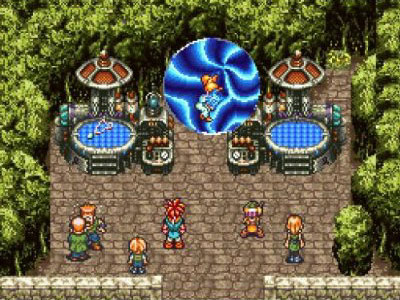
By the way, this kind of view is missing from the original post, what is its technical name? It's quite common for old arcade games and jRPGs and one of my favourite perspectives, kinda a mix between iso and top-down

l1.jpg

B001E27DLM-2-lg.jpg

Something something projection :lol: According to wikipedia, those top-down images are examples of cavalier projection which is a type of oblique projection which is a type of parallel projection and those and Divine Divinity are both examples of oblique projection.

There's a dozen names for all kinds of projections with very arbitrary minutia differences. All I check out is: is the image made up of parallelogram elements and with a distinct lack of a focal point? If yes and yes, then it's a parallel projection but I think "top-down" is pretty much an established term for the kind of games in your images. When I search for +"top down" +game, I get more than 5M results, which is more than what I get for +"isometric" +game at around 2.5M, which is telling, I think.


The fact that the camera points down at the action at an angle.

Yes and isn't that the most common element to the games people like to call "isometric" nowadays? Which is why I wrote an inclusive description, though something like "camera points down at the action" has better clarity than "overview", perhaps.

Cool article, btw but it also sports some errors (my post possibly does too) and is a little ignorant of gaming history. He attributes "fixed 3D views" with pre-rendered backgrounds to Resident Evil and Grim Fandango, for instance. I mean, FFS... Anyway, şt's a fucked up business with all these projection types. These projections are making me thirsty!

Look at the screenshot of TQ above. Are objects in the back harder to click? Do huge heads obscure the view in the front? The perspective is perfect and would work just as well if it were a tactical game. The difference to isometric in that case is minimal.

Titan Quest is a forgiving game because it's a consolized shitty action game. In a game with a grids and tiles, it becomes a nuisance because further away you move the cursor, more sensitive the mouse movement becomes and when there are big objects closer to the camera, they limit player's ability to see more of the field as opposed to the same object obstructing a camera-independent amount of space in a parallel projection which means it's less likely to obstruct as much stuff and you're less likely to wrestle with shit camera (and camera is almost always shit in a 3D perspective game. Camera in AoD combat demo was no exception. Utter shit and a bitch to constantly adjust). There is an inherent incentive to continuously manipulate the camera in 3D perspective because perspective itself will always get in your way. In a parallel projection, you only need to pan the camera. Makes a huge difference. For me at least. Which is also one of the reasons I miss 2D games. You don't deal with any of that shit. You just pan the camera and not worry about anything.

Of course, ultimately, it's a personal choice. I'm of the opinion that perspective adds no inherent value to a tactical game and on the contrary, it takes away. There's no argument for me there.

Villain, this thread has just turned into a "games you should check out" for me.

Thanks to you, I'll be digging.

Trap worked. Enjoy your shit games :lol:

Kidding.
 
Joined
Sep 17, 2011
Messages
574
Location
right here brah
Emmm, actually responding to my post is not ignoring. Now you just look butthurt. You also promised to not interact with me in other thread some time ago. But you just did.
those top-down images are examples of cavalier projection which is a type of oblique projection which is a type of parallel projection
- Hey bro, there's this new cool RPG game, you wanna check out? The camera is above, sorta like in Fallout.
- Oh, cool, i like such games. Thanks bro, i'll check it.
 

made

Arcane
Joined
Dec 18, 2006
Messages
5,130
Location
Germany
lolz, edited old post instead of making new one. fuck codex 2.0 too next gen for me
 

made

Arcane
Joined
Dec 18, 2006
Messages
5,130
Location
Germany
Furthermore, you go on about how games with parallel projection "smell of pure gameplay" and claim that perspective in general, no matter how negligible, somehow destroys that because DK2 with its heavily distorted 3D view was annoying to control. Look at your own screenshots of Vanburen etc. Notice that there is very little distortion at the screen edges in any of them, and none of the other issues you claim go hand in hand with perspective. 3D and perspective are not at fault here. It's poor implementation of camera angle and -controls.
 
Joined
Apr 2, 2010
Messages
7,428
Location
Villainville
MCA
Furthermore, you go on about how games with parallel projection "smell of pure gameplay" and claim that perspective in general, no matter how negligible, somehow destroys that because DK2 with its heavily distorted 3D view was annoying to control. Look at your own screenshots of Vanburen etc. Notice that there is very little distortion at the screen edges in any of them, and none of the other issues you claim go hand in hand with perspective. 3D and perspective are not at fault here. It's poor implementation of camera angle and -controls.

The distortion in Van Buren screenshot is very noticeable to me but you are right, it's one of the better, more sensible implementations I've seen in a 3D perspective with a very narrow FOV. Tech demo also looked better outdoors. When I first played it, I almost thought that the rendering might have been parallel. So you have a point.

Nonetheless, to be realistic, this is not very different than arguing whether RTwP is good or bad. Do I think it can be done right and really fun? I do. Do I trust in a single developer, living or dead, to get it right? No. I know no one will ever get it right and RTwP will always be synonymous with shit combat system for me. It will be BG2/IWD2 level good at best, which is no great feat not to mention no game since hasn't come even close. Likewise with perspective thing: 3D games have been being made for so long now and I don't think I have played a single one that involved a considerable level of detail in your interaction with the environment and managed to avoid screwing you up.

Likewise with camera controls. Perspective camera controls have been shit in almost every game released. Not "even" VD, with his years of experience deconstructing and criticising poor game design could avoid the same crap with his own game (or combat demo, to be fair). Oh but can it be done "right"? Well, TBH, StarCraft 2 did it right if you ask me. Game didn't bog me down with extensive camera controls and maps were set up just the perfect way to give you good views anyway. But can the same be applied to every type of game? I don't know. Why not just give me the parallel option along with perspective so I can comfortably not give a fuck and be happy that I'm catered to?

Inherent beauty of parallel projection is that you can set the camera angles to your liking and then not bother with it again for a long while (maybe except for rotating it clock/counter-clockwise every now and then) because there will be no distortion. You can click on a tile on the edge of the screen and sit back whereas that tile could well be obstructed in perspective so you have to constantly adjust the camera.

I'm really repeating myself on this. For me, parallel > perspective, both aesthetically and functionally. I don't like perspective obstructions. I don't like shit looking up in different sizes in my isometric and requiring me to work the camera to the get the same level of detail/feedback on the top of the of the screen that I get from the bottom of the screen. END OF RHINE!
 

nihil

Augur
Joined
Jun 11, 2006
Messages
490
Location
Sweden
Project: Eternity
Informative post. Orthogonal (parallel) projection is of course used by 2D games because it's the only (or at least most straight forward) way to give a 2D scene 3D appearance and still allow the viewport to move across it. With real time 3D, a scene can be rendered with perspective on the fly, so from a technical standpoint, there's no need for orthogonal projection.

However, I also really like the feel of orthogonal projection. It has a certain "crispness" or purity to it, since all distances stay the same as you scroll, and as a result the size of all objects. It has a more "schematic" feel, while perspective makes it feel more like you in fact are the camera, on location, in the scene. The room bends around you.

Another example of almost orthogonal projection is sattelite images. Look at Google Maps, for example. The perspective is more or less lost because the pictures are so zoomed in that the light rays that enter the lens are almost parallel.
 

mondblut

Arcane
Joined
Aug 10, 2005
Messages
22,696
Location
Ingrija
It means top down but tilted a bit to simulate or show actual depth. If the exact degree of "a bit" is important to you you're an asshole.

This I am. And as far as I am concerned, "isometry" in vidyagames means taking pains at simulating realistic angles, proportions and depth. Not just skewing horizontal or vertical walls for lulz. Otherwise we might just as well list here every fucking 2d game in history that looks more advanced than Ultima 1 or Montezuma's Revenge.
 

MMXI

Arcane
Joined
Apr 28, 2011
Messages
2,196
In a game with a grids and tiles, it becomes a nuisance because further away you move the cursor, more sensitive the mouse movement becomes and when there are big objects closer to the camera, they limit player's ability to see more of the field as opposed to the same object obstructing a camera-independent amount of space in a parallel projection which means it's less likely to obstruct as much stuff and you're less likely to wrestle with shit camera (and camera is almost always shit in a 3D perspective game.
Yes. It's especially annoying in a game with a grid. The grid spaces at the top of the screen are usually a hell of a lot smaller than the grid spaces at the bottom of the screen. With a parallel projection it doesn't change at all. All grid spaces on the screen are of equal size and equal shape. It's hugely beneficial for tactical/strategic games, including party-based RPGs.

The distortion in Van Buren screenshot is very noticeable to me but you are right, it's one of the better, more sensible implementations I've seen in a 3D perspective with a very narrow FOV. Tech demo also looked better outdoors. When I first played it, I almost thought that the rendering might have been parallel. So you have a point.
That's because it has a very narrow field of view. The thickness of the walls at the top of the screen is less than half that of the walls at the bottom of the screen. The wall height is even less different, with the walls at the top of the screen being only 10% shorter. It's not that noticeable because it's very close to a parallel projection. This is why it works fine.
 
Joined
Jan 7, 2012
Messages
15,219
Look at the screenshot of TQ above. Are objects in the back harder to click? Do huge heads obscure the view in the front? The perspective is perfect and would work just as well if it were a tactical game. The difference to isometric in that case is minimal.

Did you not play until the one part in the game where you had to follow a path south and your character suddenly had the effective range of their attacks cut in half because of the perspective? Meanwhile enemy archers had no problem, hitting you from 2x as far away as you could begin your attacks, leaving anyone who wasn't built to tank their powerful attacks a smoldering sack of shit? Perspective works but only if you don't fuck it up, and that one section of TQ demonstrated just how bad it is when you do fuck it up.
 

Murk

Arcane
Joined
Jan 17, 2008
Messages
13,459
It's pretty jarring how Divinity 1 looks so fucked up in screenshots but in play it looks fine.
 

gromit

Arcane
Joined
Jan 31, 2005
Messages
2,771
Location
Gentrification Station
For anyone really interested in this, I recommend this page (which I'm glad to see is still up 10+ years later) http://www.compuphase.com/axometr.htm. Feel free to let your eyes glaze over for the math bits, because it has excellent diagrams (and even a couple "oh, duh!"-style historical examples.)

You missed the go-to example for "rotated military projection" (a.k.a. "gonna barf sideways projection") so named because it was so used: it has the distinction of preserving unmolested floorplans while providing height information and orienting major features on the cardinal. It's also piss-easy to code for, because the worldspace X/Y remain at 1:1, both to each other and the screenspace.
jl2dfq.jpg
 

gromit

Arcane
Joined
Jan 31, 2005
Messages
2,771
Location
Gentrification Station
Another interesting (and fairly unique) property of military-style is the projection remains equally "valid" across 90 degrees of rotation, as seen below.
35itauf.png

hwmxsj.png
 
Joined
Nov 12, 2009
Messages
191
heh thats pretty cool with the U7 pics, my god they should have done the game with that 45 degree rotation, it is insanely more pleasing to the eye than the regular fuckedupness
 

gromit

Arcane
Joined
Jan 31, 2005
Messages
2,771
Location
Gentrification Station
heh thats pretty cool with the U7 pics, my god they should have done the game with that 45 degree rotation, it is insanely more pleasing to the eye than the regular fuckedupness
I agree it looks much better - and this one was more mouse-friendly, so they could've gotten away with it too. However in this case it has the benefit of Exult's resolution, Exult's filtering, and Photoshop's rotation. There's likely no way they'd've gotten the bold-lined scenery to look so crisp on the 45 at lower resolutions in the days before sub-pixel shenanigans (perhaps the sprites would look better for it though?) We can only speculate, but it would have been a very different looking game for more than just the most obvious reason.
 

made

Arcane
Joined
Dec 18, 2006
Messages
5,130
Location
Germany
Look at the screenshot of TQ above. Are objects in the back harder to click? Do huge heads obscure the view in the front? The perspective is perfect and would work just as well if it were a tactical game. The difference to isometric in that case is minimal.

Did you not play until the one part in the game where you had to follow a path south and your character suddenly had the effective range of their attacks cut in half because of the perspective? Meanwhile enemy archers had no problem, hitting you from 2x as far away as you could begin your attacks, leaving anyone who wasn't built to tank their powerful attacks a smoldering sack of shit? Perspective works but only if you don't fuck it up, and that one section of TQ demonstrated just how bad it is when you do fuck it up.
I don't remember anything of that sort, though I mostly played a full melee build anyway. But if it was just "the one part" that caused issues and the rest of the game was fine, then it seems like a problem with area design/bad coding rather than perspective per se.
 

PorkaMorka

Arcane
Joined
Feb 19, 2008
Messages
5,090
Ultima pictures definitely inclined this thread.

It is really odd, the regular U7 pics stand out as some of the worst in the thread due to that angle.

But with the 45 degree rotation they're suddenly far, far more palatable.

Is there some reason it looks so much more appealing or have I just been conditioned to expect things to be at that angle?
 

Vault Dweller

Commissar, Red Star Studio
Developer
Joined
Jan 7, 2003
Messages
28,044
Likewise with camera controls. Perspective camera controls have been shit in almost every game released. Not "even" VD, with his years of experience deconstructing and criticising poor game design could avoid the same crap with his own game (or combat demo, to be fair).
I've never criticized technical aspects, including camera controls. My interests lie in systems, world, quest design. Besides, all the deconstructive experience in the world can't help you make an old and clunky WW2 engine do exactly what you want it to do.
 

Lyric Suite

Converting to Islam
Joined
Mar 23, 2006
Messages
58,255
Interesting thread, and the pictures are definitely lovely, but yeah, the entire PEAPLE DONT KNOW NOTHIN ABOUT ISOMTERIMATHINGING shtick is sort of unnecessary. Isometric view is still easier to say than top down view with perspective, even if the perspective in question isn't really isometric.

What i would really like to know is how companies still believe top down/isometric/whatever perspective is no longer commercially viable when you have stupid shit like faggotville bankrolling on big publishers and their shitty AAA next gen crap.
 

As an Amazon Associate, rpgcodex.net earns from qualifying purchases.
Back
Top Bottom