-
Welcome to rpgcodex.net, a site dedicated to discussing computer based role-playing games in a free and open fashion. We're less strict than other forums, but please refer to the rules.
"This message is awaiting moderator approval": All new users must pass through our moderation queue before they will be able to post normally. Until your account has "passed" your posts will only be visible to yourself (and moderators) until they are approved. Give us a week to get around to approving / deleting / ignoring your mundane opinion on crap before hassling us about it. Once you have passed the moderation period (think of it as a test), you will be able to post normally, just like all the other retards.
You are using an out of date browser. It may not display this or other websites correctly.
You should upgrade or use an alternative browser.
You should upgrade or use an alternative browser.
Master of Magic remake from Thea developers and Slitherine
- Thread starter LESS T_T
- Start date
Mortmal
Arcane
- Joined
- Jun 15, 2009
- Messages
- 9,615
Dont think anyone here will defend that . Really odd as the other protagonist is much more closer to the original one . The tiefling stands out and not in a good way , maybe it's a new mage , seems more like some dnd amateur art you could find inn reddit subforums.So it's kinda fitting with the modernity.View attachment 19199
does xer's horns just lights on fire when xer casts that shitty looking fireball?
this is not even funny anymore...
Incantatar
Cipher
- Joined
- Jan 9, 2012
- Messages
- 456
Caster of Magic for Windows (fine on Linux too) is absolutely fantastic. Not even interested in the remake.
That shitshow of an intro says everything...
That shitshow of an intro says everything...
Last edited:
Yeah I shouldn't have said love in my previous post as the 90s kid in me was a bit excited lol.. I like the new intro, especially the new audio, but I do see those 'flash presentation' vibes others are talking about and yeah I'm not a fan at all of the new Tauron!
Yup you got it. If you look closely at the Wizard selection area screenshot they posted you can see there's a red dot pure chaos wizard that looks just like the Boy George demon in the intro. Tauron was the pure chaos wizard in the original so yup, it's him. I made some polite suggestions to MuHa make him more menacing (eg keep the horns if you must, but drop the earrings, bring back the facial hair, as well as the protruding evil frown and caped cloak).. but then I got hit with all the "who cares about graphics and intros, gameplay is what matters" fan responses so that was the end of that lol. Oh well, I tried..
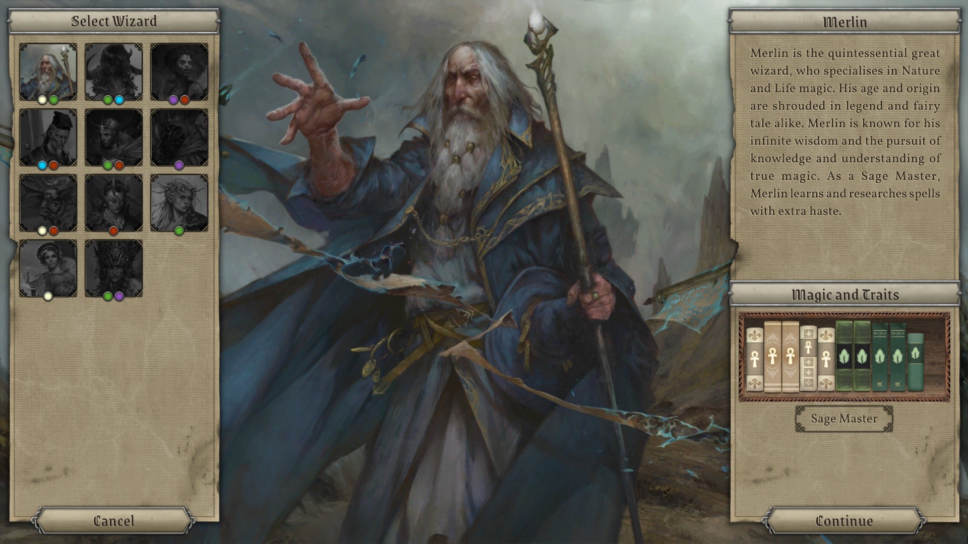
I'm not sure who the horned guy (?) is supposed to represent. In the original, it's obviously Tauron with a hooded cloak. But now? Rjak maybe? We never see his face, though.
Yup you got it. If you look closely at the Wizard selection area screenshot they posted you can see there's a red dot pure chaos wizard that looks just like the Boy George demon in the intro. Tauron was the pure chaos wizard in the original so yup, it's him. I made some polite suggestions to MuHa make him more menacing (eg keep the horns if you must, but drop the earrings, bring back the facial hair, as well as the protruding evil frown and caped cloak).. but then I got hit with all the "who cares about graphics and intros, gameplay is what matters" fan responses so that was the end of that lol. Oh well, I tried..

Last edited:

That is wrong on many levels. Good art cannot save a bad game, but bad art can sure drag a good one down(just look at Deity Empires for confirmation...). Also, there is a difference between art direction, and high fidelity graphics. The older Master of Magic is a good exemple of that actually. It is weird because I really liked the presentation of Thea.Yeah I shouldn't have said love in my previous post.. was being lazy and just copied the comment from the MuHa discord where I was being nicer lol. I still like the intro, especially the new audio, but I do see those 'flash presentation' vibes others are talking about and yeah I'm not a fan at all of the new Tauron!
I'm not sure who the horned guy (?) is supposed to represent. In the original, it's obviously Tauron with a hooded cloak. But now? Rjak maybe? We never see his face, though.
Yup you got it. If you look closely at the Wizard selection area screenshot they posted you can see there's a red dot pure chaos wizard that looks just like the Boy George demon in the intro. Tauron was the pure chaos wizard in the original so yup, it's him. I made some polite suggestions to MuHa make him more menacing (eg keep the horns if you must, but drop the earrings, bring back the facial hair, as well as the protruding evil frown and caped cloak).. but then I got hit with all the "who cares about graphics and intros, gameplay is what matters" fan responses so that was the end of that lol. Oh well, I tried..
Regarding Muha games, I really liked the presentation in Thea actually. Do you know how closely Slitherine is monitoring them?
One of the members of my MoM discord found the artist that did the new wizards.
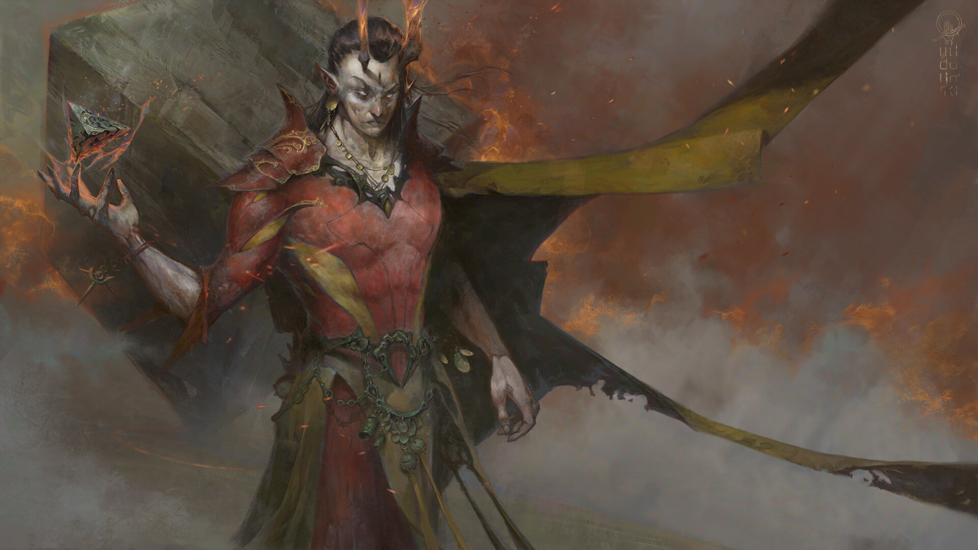
The new Tauron doesn't look as bad here.. which just shows how bad a job the intro people did lol..
https://www.artstation.com/artwork/q9m8yR
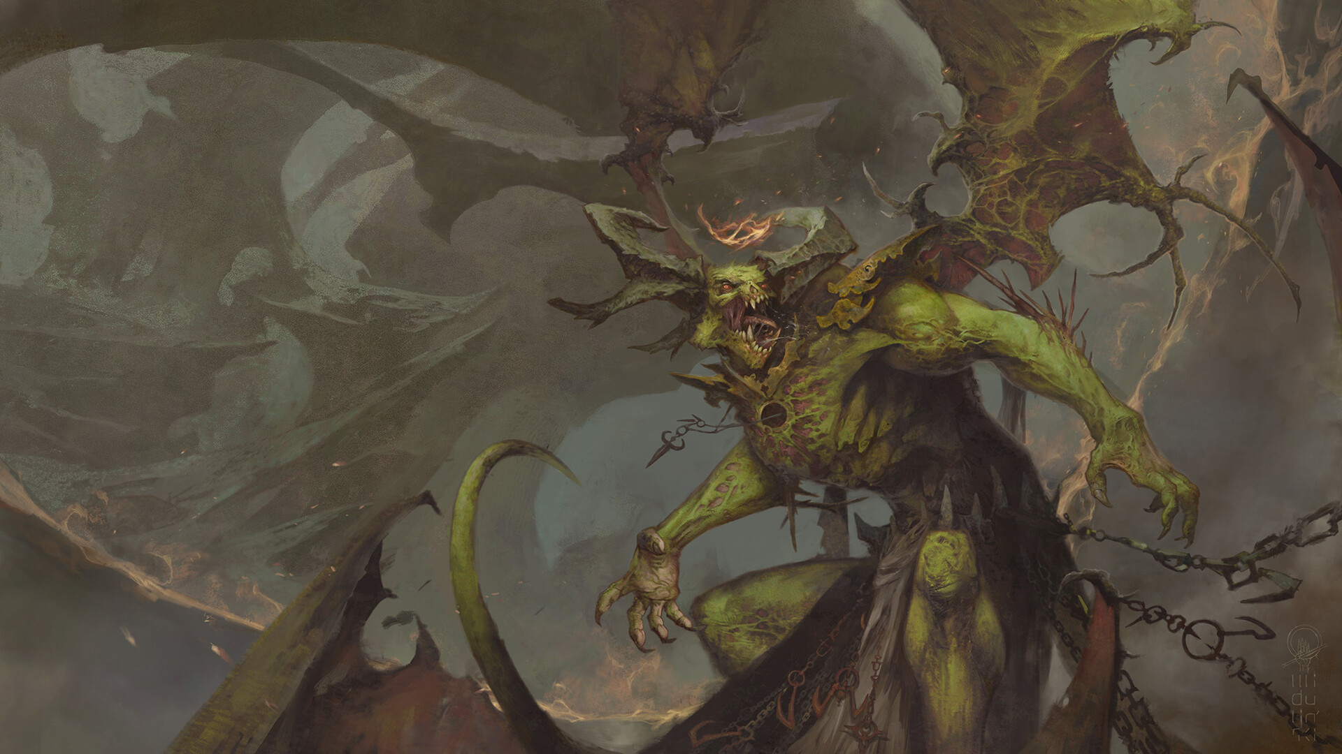
The new Sss'ra is there too..
Looks cool but.. do you even lift bro?
https://www.artstation.com/artwork/nY5Gk4
The new Tauron doesn't look as bad here.. which just shows how bad a job the intro people did lol..
https://www.artstation.com/artwork/q9m8yR

The new Sss'ra is there too..
Looks cool but.. do you even lift bro?
https://www.artstation.com/artwork/nY5Gk4

Hobo Elf
Arcane
I don't think the atmosphere and style of the artist came across quite as intended in the animated video. They could just revert back to the original one and they'd be better off for it. Everything else looks fine to me.
View attachment 19199
does xer's horns just lights on fire when xer casts that shitty looking fireball?
this is not even funny anymore...
This gay twink is Tauron?
Fuck me sideways...
oasis789
Arcane
- Joined
- Oct 9, 2012
- Messages
- 406
is there any 4X with a decent AIHow so? The original still holds up against all the recent fantasy 4X, including Endless Legends and Age of Wonders. Its main issues were AI and UI, but these can be improved by a remake.What I am hoping is that they don't hew too closely to the original design. It was cool and impressive *at the time* but it is backwards and limited now. Graphical updates or adding a couple new spells isn't worth buying a new game, especially at Slitherine prices.
Axioms
Arcane

- Joined
- Jul 11, 2019
- Messages
- 1,630
How so? The original still holds up against all the recent fantasy 4X, including Endless Legends and Age of Wonders. Its main issues were AI and UI, but these can be improved by a remake.What I am hoping is that they don't hew too closely to the original design. It was cool and impressive *at the time* but it is backwards and limited now. Graphical updates or adding a couple new spells isn't worth buying a new game, especially at Slitherine prices.
Nonsense. It holds up in the minds of people chained to nostalgia.
Alex
Arcane
That's the one thing that needed no update
Together with everything else.
Dungeon Lord
Scholar
- Joined
- Oct 16, 2015
- Messages
- 240
because imbeciles like you would not understand what is happeningdoes xer's horns just lights on fire when xer casts that shitty looking fireball?

The first time I tried it was on gog. It sounds more like it doesn't hold up in the eyes of people blinded by the cult of the new.How so? The original still holds up against all the recent fantasy 4X, including Endless Legends and Age of Wonders. Its main issues were AI and UI, but these can be improved by a remake.What I am hoping is that they don't hew too closely to the original design. It was cool and impressive *at the time* but it is backwards and limited now. Graphical updates or adding a couple new spells isn't worth buying a new game, especially at Slitherine prices.
Nonsense. It holds up in the minds of people chained to nostalgia.
- Joined
- Jan 28, 2011
- Messages
- 100,315


http://muhagames.com/dev-diary-1-june-2021/
Dev Diary #1 June 2021

Welcome to the first of our Dev Diaries for Master of Magic. Seeing as this one is the first in the ‘series’ we will offer a quick recap of the development info so far, but perhaps offering a few more details.
Who is MuHa Games?

An artistic render of the MuHa team.
We’re an indie studio based in Poland. Our previous two games are called Thea: The Awakening, and Thea 2: The Shattering, and they are best described as a: gritty, dark fantasy, survival games set within a post apocalyptic world, inhabited by a combination of classical fantasy critters and an abundance of mythical and folkloric influences. So, while MoM is a very different game in its core, we certainly have experience with the 4x/strategy genre. As such, when we were approached by Slitherine about remaking such a beloved classic of the genre, we were very excited to say yes. Our design ideology is simple, we try to make games that we’d want to play ourselves and we do our best to communicate with our fans and thus make the best product we can.

The old and the new.

Our design philosophy is to attempt to recreate the mechanics and gameplay of MoM as faithfully as we can, while also making an awesome game for new fans. So, with that in mind, here are a few things we already have that you may recognise from the original. Now, these things may return with some changes, all the features that are visual will of course have new graphics, and some mechanics may be altered if we were unable to recreate them.
This list is not an exhaustive list, but should give you an idea of where we’re going with it.
- All of the wizards will make a return in MoM (Most however, got a strong makeover from our wonderful artist.So while we hope you will still recognise your favourites, they did change in the thirty years…)
- All of the champions and heroes are coming back(As with the wizards, although perhaps less drastically, many of the heroes got a facelift. But they are all back with their own 2D art and 3D model and even a little back story for those who will bother reading it somewhere…)
- All of the races and their units (Given a new lease of artistic life, but kept their core skills and attributes. Of course tweaks may be necessary once we get to balancing, but for now, we are painstakingly recreating them all)
- All of the spells and skills (As with everything else, we are recreating them as best we can for now, then we may need to tweak them later.)
- All traits (formerly known as retorts)
- All basic events, and possibly some additional ones (with the option to turn them off as it was in the original)
- Arcanus and Myrror as playable planes
- All building types
- Mana management system (so you will be able to distribute your power to go into research/casting skill/mana points)
- Strategy vs tactical map – battles will take place on a tactical map, like in the original
- Familiars – they’re back, and we have an extra one for those who choose mixed magic books

Arcanus and Myrror races, each race has its own flavour and gives different bonuses that can influence your playthrough.

Orc Swordsman returns with new artwork, but retains his stats and skills.

Lizardman Spearman similarly new yet largely unchanged.

Sprites.
The new: Areas that warranted some change so far.

Hex map.
- Hexes (we decided they made more sense in terms of gameplay, as well as our own experience with them)
- AI (the original was, well, you know… so yes, the AI is being built from the grounds up and will hopefully be a more robust and fun experience – this does not mean we intend for the game to be harder, we will have difficulty settings)
- Complex difficulty settings (we want the game to be very customizable)
- QOL improvements, so far we’ve added things like production ques; more MP; pathfinding that doesn’t split your group when some units have MP left and others don’t (pet hate of mine in original!); starting the game with a settler unit;
- Auto combat function that will show you the range of outcomes possible and give you the option to either auto resolve, accepting these estimates, or resolve the fight manually;
- Extensive modding tools
- Tooltips
- Fog of war

A WIP sneak peak at the auto resolve screen.

The production queue in city management.
That’s it for this month, but here’s a sneak peak at what’s coming next…

The wizards! Who stayed unchanged and who got a makeover – if that’s a question that’s been on your mind, we’ll answer it in the next dev diary.
For a discussion of the dev diary, please join us on our MuHa Discord channel, or join the official MoM Discord HERE! You can also wishlist MoM on Steam.
The Avatar
Pseudodragon Studios

The original MoM is my favorite strategy game. Too early to say with this, but I don't like the UI. The background panel looks like they took a photo texture of a burlap sack, slapped some dirty grunge overlay texture on top of it, and called it a day.


Zboj Lamignat
Arcane
- Joined
- Feb 15, 2012
- Messages
- 5,840
Low effort. I'd rather have some sort of prosper-hd version of the original than this. MoM is a game with name recognition and active fanbase, put some money and talent into this or don't bother.
HeroMarine
Irenaeus


Dudes rock, chicks suck.
I'll keep playing the original and pretend this never existed (in a few years so will everyone else).
Humanophage
Arcane
- Joined
- Dec 20, 2005
- Messages
- 5,588
Thea 1 and 2 are highly inventive, reasonably challenging, and there is a big emphasis on the setting and exploration. However, the technical side isn't that well done, like the engine is not well-optimised and the main map looks messy. It looks about the same as Civilization 4 or even a bit worse, and is dramatically slower. I'd be more excited if they were making something of their own from scratch to capitalise more on their gameplay-related ideas.
That said, neither MuHa nor Slitherine are popamole rubbish at all, so it will be a pity if they fail.
The 2D parts of the interface look okay so far, pretty clean. They need to make it less blurry and mobile-y though. The interface in Thea has never been very pretty, although it is quite clever. The 2D art in Thea is very good though, well-used, and there's no shortage of it, so let's hope they insert more of it:
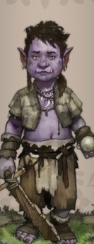
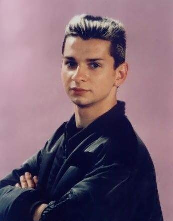
And it has a Dave Gahan orc child:


Last edited:
SerratedBiz
Arcane
- Joined
- Mar 4, 2009
- Messages
- 4,143
MoM is also one of my favorite games and I'm reasonably optimistic that the developers behind Thea can do a good job with this. If it was a big studio or something like Cyanide I'd ignore this thread and lay down and cry, but MuHa delivered some surprisingly good games out of nowhere.
And if modding is in, there's always a chance that modders will fix it.
And if modding is in, there's always a chance that modders will fix it.


